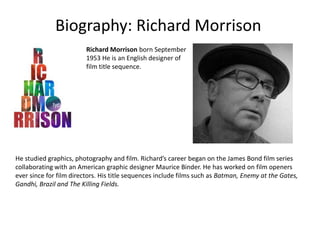
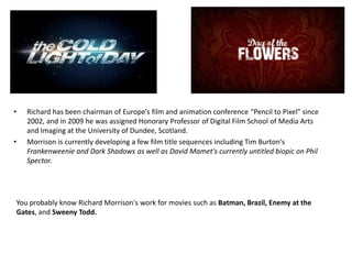
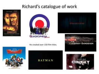
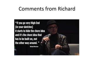
Biography: Richard Morrison
Richard Morrison born September
1953 He is an English designer of
film title sequence.

He studied graphics, photography and film. Richard’s career began on the James Bond film series
collaborating with an American graphic designer Maurice Binder. He has worked on film openers
ever since for film directors. His title sequences include films such as Batman, Enemy at the Gates,
Gandhi, Brazil and The Killing Fields.
•

•

Richard has been chairman of Europe’s film and animation conference “Pencil to Pixel” since
2002, and in 2009 he was assigned Honorary Professor of Digital Film School of Media Arts
and Imaging at the University of Dundee, Scotland.
Morrison is currently developing a few film title sequences including Tim Burton's
Frankenweenie and Dark Shadows as well as David Mamet's currently untitled biopic on Phil
Spector.

You probably know Richard Morrison's work for movies such as Batman, Brazil, Enemy at the
Gates, and Sweeny Todd.
Richard’s catalogue of work

He created over 150 film titles.
Title Sequence Analysis: Sweeny Todd
http://www.artofthetitle.com/title/sweene
y-todd-the-demon-barber-of-fleet-street/

In this title sequence, we see in the first two seconds the production company in
white writing with a black background. The first thing to notice is the night with white fog.
This suggests that the film is quite a dark film and it might be sinister. The colour red is
shown which is cooperated in with the rain drops. We begin to see a red rain drop being
stretched so that it runs down things. We see that the red (connoting blood) rain drop goes
through the title sequence from the start to the end. The first half of the title sequence,
Richard Morrison has the text in the middle and on the right hand side of the screen to
show what different things people have done for the movie. When the title of the film is
presented, the text colour changes from white to red. It goes back to the white text. Then
the names of people start to go to the left hand side of the screen. The images such as
the pies, are some thing that actually appears in the film. We are shown it but it is not
what we would expect it to be from watching the title sequence. The text goes back into
the middle. The sound is an upbeat chasing kind of sound. At the end it softens. The text
is a bit skinny but with a bit of a italic style font.
Title Sequence Analysis: Batman

http://www.artofthetitle.com/title/batman/

In the first two seconds of this title sequence the production company is also shown as the traditional
Warner Bros. Pictures Company. The first thing we see is the dark night sky going down to a kind of
ledge. The text is yellow which is the famous batman colour. The camera is moving at a low angle
searching for something. The text is always in the middle of the screen perhaps to keep things simple.
As the logo BATMAN is shows we can see that the text size goes bigger. As the film sequence goes on,
you start to feel that feeling of suspense which is correlated in the music chosen. The text looks like
the standard Arial bold text kind of. As the title sequenced comes to an end, we begin to see and
recognise that what we were being shown was the batman logo.
Comments from Richard

Richard Morrison Resarch and Analysis

  • 1.
  • 2.
    Biography: Richard Morrison RichardMorrison born September 1953 He is an English designer of film title sequence. He studied graphics, photography and film. Richard’s career began on the James Bond film series collaborating with an American graphic designer Maurice Binder. He has worked on film openers ever since for film directors. His title sequences include films such as Batman, Enemy at the Gates, Gandhi, Brazil and The Killing Fields.
  • 3.
    • • Richard has beenchairman of Europe’s film and animation conference “Pencil to Pixel” since 2002, and in 2009 he was assigned Honorary Professor of Digital Film School of Media Arts and Imaging at the University of Dundee, Scotland. Morrison is currently developing a few film title sequences including Tim Burton's Frankenweenie and Dark Shadows as well as David Mamet's currently untitled biopic on Phil Spector. You probably know Richard Morrison's work for movies such as Batman, Brazil, Enemy at the Gates, and Sweeny Todd.
  • 4.
    Richard’s catalogue ofwork He created over 150 film titles.
  • 5.
    Title Sequence Analysis:Sweeny Todd http://www.artofthetitle.com/title/sweene y-todd-the-demon-barber-of-fleet-street/ In this title sequence, we see in the first two seconds the production company in white writing with a black background. The first thing to notice is the night with white fog. This suggests that the film is quite a dark film and it might be sinister. The colour red is shown which is cooperated in with the rain drops. We begin to see a red rain drop being stretched so that it runs down things. We see that the red (connoting blood) rain drop goes through the title sequence from the start to the end. The first half of the title sequence, Richard Morrison has the text in the middle and on the right hand side of the screen to show what different things people have done for the movie. When the title of the film is presented, the text colour changes from white to red. It goes back to the white text. Then the names of people start to go to the left hand side of the screen. The images such as the pies, are some thing that actually appears in the film. We are shown it but it is not what we would expect it to be from watching the title sequence. The text goes back into the middle. The sound is an upbeat chasing kind of sound. At the end it softens. The text is a bit skinny but with a bit of a italic style font.
  • 6.
    Title Sequence Analysis:Batman http://www.artofthetitle.com/title/batman/ In the first two seconds of this title sequence the production company is also shown as the traditional Warner Bros. Pictures Company. The first thing we see is the dark night sky going down to a kind of ledge. The text is yellow which is the famous batman colour. The camera is moving at a low angle searching for something. The text is always in the middle of the screen perhaps to keep things simple. As the logo BATMAN is shows we can see that the text size goes bigger. As the film sequence goes on, you start to feel that feeling of suspense which is correlated in the music chosen. The text looks like the standard Arial bold text kind of. As the title sequenced comes to an end, we begin to see and recognise that what we were being shown was the batman logo.
  • 7.