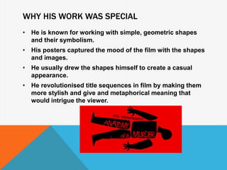
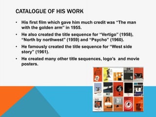
M I C H A E L K N I G H T
M E D I A S T U D I E S
WHO HE IS
• Saul Bass was born in New York on May 8 1920.
• He studied design at the art students league in
Manhattan.
• After apprenticeships , he worked as a free lance graphic
designer.
• He was a graphic designer and academy award winning
filmmaker.
• He was best known for his design of motion picture title
sequences, film posters, and corporate logos.
• He has worked with famous filmmakers such as Alfred
Hitchcock, Martin Scorsese, Billy Wilder and Stanley
Kubrick
WHY HIS WORK WAS SPECIAL
• He is known for working with simple, geometric shapes
and their symbolism.
• His posters captured the mood of the film with the shapes
and images.
• He usually drew the shapes himself to create a casual
appearance.
• He revolutionised title sequences in film by making them
more stylish and give and metaphorical meaning that
would intrigue the viewer.
CATALOGUE OF HIS WORK
• His first film which gave him much credit was “The man
with the golden arm” in 1955.
• He also created the title sequence for “Vertigo” (1958),
“North by northwest” (1959) and “Psycho” (1960).
• He famously created the title sequence for “West side
story” (1961).
• He created many other title sequences, logo’s and movie
posters.
ANALYSIS OF TITLE SEQUENCE 1 – MAN WITH
THE GOLD ARM
• The title sequence was very unique by using lines
interchanging with each other to create patterns which
the audience could work out as being images.
• They are supposedly meant to look like veins or syringes
relating to the film’s storyline.
• There is a sense of jabbing with awkward angles which
creates a sense of unsettled atmosphere.
ANALYSIS OF TITLE SEQUENCE 2 – WEST SIDE
STORY
• Specifically placed vertical bars cover the screen with abstract
form.
• The static image is in unison with the varied overture; as the
“mood” of the score changes the colour follows suit.
• It pulls backward to reveal the film title below.
• The image goes to an aerial shot of Manhattan, and the source
of the vertical pattern is confirmed.
• The abstract bars, even, resemble a perforated music roll.

Saul bass

  • 1.
    M I CH A E L K N I G H T M E D I A S T U D I E S
  • 2.
    WHO HE IS •Saul Bass was born in New York on May 8 1920. • He studied design at the art students league in Manhattan. • After apprenticeships , he worked as a free lance graphic designer. • He was a graphic designer and academy award winning filmmaker. • He was best known for his design of motion picture title sequences, film posters, and corporate logos. • He has worked with famous filmmakers such as Alfred Hitchcock, Martin Scorsese, Billy Wilder and Stanley Kubrick
  • 3.
    WHY HIS WORKWAS SPECIAL • He is known for working with simple, geometric shapes and their symbolism. • His posters captured the mood of the film with the shapes and images. • He usually drew the shapes himself to create a casual appearance. • He revolutionised title sequences in film by making them more stylish and give and metaphorical meaning that would intrigue the viewer.
  • 4.
    CATALOGUE OF HISWORK • His first film which gave him much credit was “The man with the golden arm” in 1955. • He also created the title sequence for “Vertigo” (1958), “North by northwest” (1959) and “Psycho” (1960). • He famously created the title sequence for “West side story” (1961). • He created many other title sequences, logo’s and movie posters.
  • 5.
    ANALYSIS OF TITLESEQUENCE 1 – MAN WITH THE GOLD ARM • The title sequence was very unique by using lines interchanging with each other to create patterns which the audience could work out as being images. • They are supposedly meant to look like veins or syringes relating to the film’s storyline. • There is a sense of jabbing with awkward angles which creates a sense of unsettled atmosphere.
  • 6.
    ANALYSIS OF TITLESEQUENCE 2 – WEST SIDE STORY • Specifically placed vertical bars cover the screen with abstract form. • The static image is in unison with the varied overture; as the “mood” of the score changes the colour follows suit. • It pulls backward to reveal the film title below. • The image goes to an aerial shot of Manhattan, and the source of the vertical pattern is confirmed. • The abstract bars, even, resemble a perforated music roll.