Research into specific
features- Text
By Nicole mcclelland
Feature film text:- styles

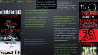
What we see here is typical colour
connotations of red, what and
black. The majority of the stronger
texts seem to be in block capitals
for a stronger effect.

The return has a blurred effect as well as
the R being “Turned” around this was
intentional relating to the film title.
All on a black background with red or
white coloured fonts. The fonts seem
to be typically similar, I have seen
that this font it quite popular in the
horror film world in relation to titles.
It is very simplistic yet extremely
powerful, strong in block capitals.

All of these are similar in the fact of
cracks or lines protruding from the
letters in relation to the title. It is very
wild and seems out of control

These are edited in a very
stereotypical child like
handwriting, which immediately
makes it look quite terrifying
due to the fundability of a child.

These text styles are block capitals and
bold unlike the skinnyish text to the
left. They also have a type of gradient/
texture added for effect. Very
effective and in your face. A good way
to advertise a movie.
These two film titles have there own
individual tinge to it compare to all the
other being edited in a similar style. I
like the slant and scratched effect The
Flesheater has it clearly related to
zombies. I dislike the 30 Days of Night. I
think it looks too childish and is quite
unprofessional looking.
These texts have been edited and made
solely on the purpose of the title i.e.
Paranormal Activity in the style of a fuzzy
camera insert and The Mist has been
carefully edited in the way we would
perceive actual mist. This is a very clever,
eye capturing editing style
Generated textGoogle
exemplars
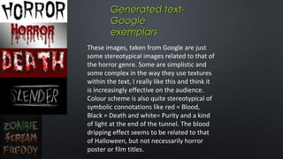
These images, taken from Google are just
some stereotypical images related to that of
the horror genre. Some are simplistic and
some complex in the way they use textures
within the text, I really like this and think it
is increasingly effective on the audience.
Colour scheme is also quite stereotypical of
symbolic connotations like red = Blood,
Black = Death and white= Purity and a kind
of light at the end of the tunnel. The blood
dripping effect seems to be related to that
of Halloween, but not necessarily horror
poster or film titles.
Created by an online
My own horror text- including online generator generating
site which I believe to be very
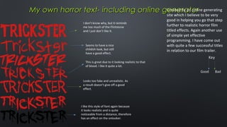
I don’t know why, but it reminds
me too much of the Flintstone
and I just don’t like it.

Seems to have a nice
childish look, but still
have a good effect.
This is great due to it looking realistic to that
of blood. I like it quite a lot.

Looks too fake and unrealistic. As
a result doesn’t give off a good
effect.

I like this style of font again because
it looks realistic and is quite
noticeable from a distance, therefore
has an effect on the onlooker.

good in helping you go that step
further to realistic horror film
titled effects. Again another use
of simple yet effective
programming. I have come out
with quite a few successful titles
in relation to our film trailer.
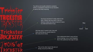
Too skinny and usually related to vampires
which is completely irrelevant to our storyline
as well as the titles meaning.

Too fuzzy and doesn’t really relate to the
title, it doesn’t go very well, it also at a
distance makes you have to look at it twice
to understand what it says.

Like how retro it seems to be. Very old
style something you would relate to
the rocky horror show.
Cant understand what it says and too
skinny looking, so as a result depletes
the in the audiences face type of style.

This on the other hand I like do to it
being unusual yet effective.
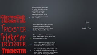
Possibly my most favourite of
the online generated fonts. I
just think its perfect and
stands out very well in
relation to the other, it can
most definitely be recognised
from a distance

Great distribution of thickness and
thinness along with the good,
effective blood like theme. Typical
to that of a horror film title.
Too unrealistic and jagiddy for my
liking. It also doesn’t really relate well
with the title of the film.
Looks very stereotypical to the horror
genre, but in a positive light. I really
like this font because of this reason.
Very simple, the thing that sells this font
for me is the blood splatters on the first
letter. Makes it entail some sort of action
pact horror. Its also very noticeable.
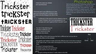
I think this looks too childish
and unprofessional.

Photoshop

Here are all own person Photoshop edited versions
done on Photoshop Elements 11. Some are very
simple looking and other more effective. I shall
individually annotate 3-4 explaining why I like them
and a further 3-4 explaining why they were not so
likable in my own opinion and why they are not so
effective.

I think this text is very effective as it is the
type you’d associate with a trickster/ joker.
Therefore directly linking to the title of the
film.
Is effective in the sense it can be related to that of
a joker/ trickster, but is too stereotypical in my
opinopn and I just in general feel it wouldn’t work

Too slim in the lettering and
therefore ineffective as it
doesn’t stand out to the
audience very clearly.

Key

I like the effect of this style because the font is different but not too slim to
degrade the effect on the onlooker.
Very gothic and I believe it looks extremely effective due to the direct emphasis
of the style of taxt. It also looks stereotypical to that of previously selected film
titles.
This doesn’t look good because
everybody knows this font and its just
too overly used but not in the horror
genre
Too girly looking and doesn’t really relate to the title

Good

Bad

Research into specific features - text

  • 1.
    Research into specific features-Text By Nicole mcclelland
  • 2.
    Feature film text:-styles What we see here is typical colour connotations of red, what and black. The majority of the stronger texts seem to be in block capitals for a stronger effect. The return has a blurred effect as well as the R being “Turned” around this was intentional relating to the film title. All on a black background with red or white coloured fonts. The fonts seem to be typically similar, I have seen that this font it quite popular in the horror film world in relation to titles. It is very simplistic yet extremely powerful, strong in block capitals. All of these are similar in the fact of cracks or lines protruding from the letters in relation to the title. It is very wild and seems out of control These are edited in a very stereotypical child like handwriting, which immediately makes it look quite terrifying due to the fundability of a child. These text styles are block capitals and bold unlike the skinnyish text to the left. They also have a type of gradient/ texture added for effect. Very effective and in your face. A good way to advertise a movie. These two film titles have there own individual tinge to it compare to all the other being edited in a similar style. I like the slant and scratched effect The Flesheater has it clearly related to zombies. I dislike the 30 Days of Night. I think it looks too childish and is quite unprofessional looking. These texts have been edited and made solely on the purpose of the title i.e. Paranormal Activity in the style of a fuzzy camera insert and The Mist has been carefully edited in the way we would perceive actual mist. This is a very clever, eye capturing editing style
  • 3.
    Generated textGoogle exemplars These images,taken from Google are just some stereotypical images related to that of the horror genre. Some are simplistic and some complex in the way they use textures within the text, I really like this and think it is increasingly effective on the audience. Colour scheme is also quite stereotypical of symbolic connotations like red = Blood, Black = Death and white= Purity and a kind of light at the end of the tunnel. The blood dripping effect seems to be related to that of Halloween, but not necessarily horror poster or film titles.
  • 4.
    Created by anonline My own horror text- including online generator generating site which I believe to be very I don’t know why, but it reminds me too much of the Flintstone and I just don’t like it. Seems to have a nice childish look, but still have a good effect. This is great due to it looking realistic to that of blood. I like it quite a lot. Looks too fake and unrealistic. As a result doesn’t give off a good effect. I like this style of font again because it looks realistic and is quite noticeable from a distance, therefore has an effect on the onlooker. good in helping you go that step further to realistic horror film titled effects. Again another use of simple yet effective programming. I have come out with quite a few successful titles in relation to our film trailer.
  • 5.
    Too skinny andusually related to vampires which is completely irrelevant to our storyline as well as the titles meaning. Too fuzzy and doesn’t really relate to the title, it doesn’t go very well, it also at a distance makes you have to look at it twice to understand what it says. Like how retro it seems to be. Very old style something you would relate to the rocky horror show. Cant understand what it says and too skinny looking, so as a result depletes the in the audiences face type of style. This on the other hand I like do to it being unusual yet effective.
  • 6.
    Possibly my mostfavourite of the online generated fonts. I just think its perfect and stands out very well in relation to the other, it can most definitely be recognised from a distance Great distribution of thickness and thinness along with the good, effective blood like theme. Typical to that of a horror film title. Too unrealistic and jagiddy for my liking. It also doesn’t really relate well with the title of the film. Looks very stereotypical to the horror genre, but in a positive light. I really like this font because of this reason. Very simple, the thing that sells this font for me is the blood splatters on the first letter. Makes it entail some sort of action pact horror. Its also very noticeable.
  • 7.
    I think thislooks too childish and unprofessional. Photoshop Here are all own person Photoshop edited versions done on Photoshop Elements 11. Some are very simple looking and other more effective. I shall individually annotate 3-4 explaining why I like them and a further 3-4 explaining why they were not so likable in my own opinion and why they are not so effective. I think this text is very effective as it is the type you’d associate with a trickster/ joker. Therefore directly linking to the title of the film. Is effective in the sense it can be related to that of a joker/ trickster, but is too stereotypical in my opinopn and I just in general feel it wouldn’t work Too slim in the lettering and therefore ineffective as it doesn’t stand out to the audience very clearly. Key I like the effect of this style because the font is different but not too slim to degrade the effect on the onlooker. Very gothic and I believe it looks extremely effective due to the direct emphasis of the style of taxt. It also looks stereotypical to that of previously selected film titles. This doesn’t look good because everybody knows this font and its just too overly used but not in the horror genre Too girly looking and doesn’t really relate to the title Good Bad