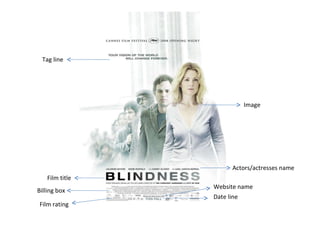
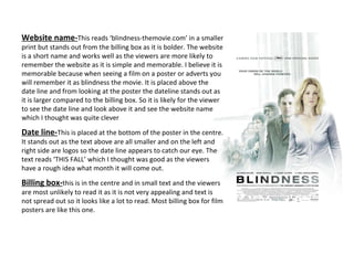
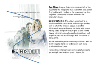
2. Tag line Film title Actors/actresses name Website name Date line Billing box Film rating Image
3. Image- I thought the image worked effectively with the whole blindness atmosphere. This is because the image slowly fades and has a blurred effect to the characters at the back. There are more than one character on the poster which may indicate these are the important characters in the film; so when watching the film we will have a fair idea of who they are. We can see through the image that the lady who is in front is the main character as she is more appealing to the eye because of her position in the poster. From watching the teaser trailer we find out Julianne Moore is the only one with eye sight and from this the poster may show us that she has clear vision as she is not blurred and at the front. The image of characters goes in a line the man behind her is her partner and it may be that he is behind her as he is the closest to someone with visual sight and so on. It also may make us feel like we are in the whole atmosphere of blind by having clear vision seeing the characters and suddenly becomes blurred. The image also shows the importance of the characters the more blur on the character the less important Tag Line- This reads ‘your vision of the world will change forever’. This is written in black and approximately size 12, the font used is sans serif and I believe works well as sans serif font is usually for small amount of text and also gives the effect to stand out. The tag line stands out as it is on a white background and contrasts. It is more appealing to the eye as it is positioned in two lines. The sentence is short and catchy and gives information on the film with short description. The sentence is ironic as there vision will change forever as they can’t see. Through just looking at the poster and title then reading the tag line we imagine the world will go blind or along those lines. It also uses direct mode of address making you included.
4. Film title- The title is the largest text making it stand out and the letters are spread out between them making it hard to miss the title. This again is in sans serif font; in fact the whole poster is in sans serif which is ideal as it is used for adverts that have small amount of text and a large headline. The text is in black and slowly fades to a dark grey. The dark colours used on a white background makes the text more noticeable along with the font size etc. The blurring effect on the title again is effective through the fact it is about vision being blurred and showing it through the poster can interest the viewer and question it; what is going on?, who is going blind? The effect of the title and image are both similar to each other as the image is in a straight line going from vision to blurred vision and same with the title. Actors/actresses name- This is placed just above the film title and spread out to be aligned with the other text making it look professional. Once again it’s a sans serif font as I said above. The text reads Julianne Moore, Mark Ruffalo with Danny Glover and Gael Garcia Bernal. They are the main characters as film posters usually list the main characters rather then everyone. From first glance at this I straight away thought the characters listed where all in the image as from the rest of the people behind there faces are clear and visual to the viewers. I then researched and found out it was true and the list goes from the most important character just as it does in the image so in a way the text and film title effect links to the images effect as well. We also know that Julianne Moore and Mark Ruffalo have a more important role than Danny Glover and Gael Garcia Bernal through the text saying ‘with...’
5. Website name- This reads ‘blindness-themovie.com’ in a smaller print but stands out from the billing box as it is bolder. The website is a short name and works well as the viewers are more likely to remember the website as it is simple and memorable. I believe it is memorable because when seeing a film on a poster or adverts you will remember it as blindness the movie. It is placed above the date line and from looking at the poster the dateline stands out as it is larger compared to the billing box. So it is likely for the viewer to see the date line and look above it and see the website name which I thought was quite clever Date line- This is placed at the bottom of the poster in the centre. It stands out as the text above are all smaller and on the left and right side are logos so the date line appears to catch our eye. The text reads ‘THIS FALL’ which I thought was good as the viewers have a rough idea what month it will come out. Billing box- this is in the centre and in small text and the viewers are most unlikely to read it as it is not very appealing and text is not spread out so it looks like a lot to read. Most billing box for film posters are like this one.
6. Eye Flow- The eye flows from the third left of the tag line to the image and than to the film title. When first looking at it I looked at the image and tag line together then to the film title and then the characters listed. Colour scheme- The colours were kept to a minimum of black and white and I thought worked well to what the film was about. As the film blindness is about vision and not being able to see having just a few plain colours give us that feel to having minimal vision whereas having colours such as yellow, red etc would not go with the theme of being blind. All the text in the poster are in capital letters which I think helps to stand out and make it look more professional and clear. I chose this poster as I want to look at all genres to get a rough idea on what genre I should do