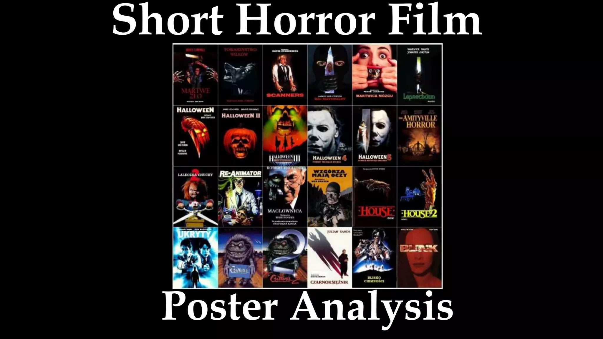
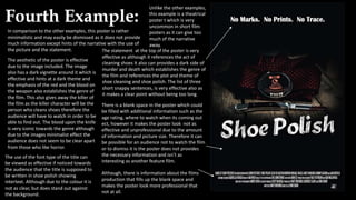
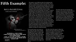
Short Horror Film
Poster Analysis
First Example:
Very brief description is given as for short films there are
very rarely any other sources of Media such as trailers that
would give the audience context of the narrative such as a
trailer that provides information about the plot of the film.
From this description, the hinted genre of a dark fairy-tale
(due to its reference to the Grimm’s Brothers fairy tales) is
given this may trigger interest to the audience if they
would want to see the film. In regard to its reference, it
also give a hint towards a slightly older audience such as
teens as it would be very unlikely for young children to
know about the fairy tales and a hint of the word
‘grimmer’ that the context of the storyline would include a
dark theme, proving it may be inappropriate for children.
By accompany the narrative with a character photo this
use also directs the audience to the overall aesthetic of the
film and the characters that are featured within, giving
direct information of the films storyline but without giving
away too much information to the audience so they do not
want to watch the film.
Unlike other short films, this poster is advertising the series
therefore no detail towards specific episodes can be given and
a brief description about the series must be given to keep the
audience interested.
As well as brief, this poster is also very informative on the type
and genre of the series and also includes information such as
the length, production company, amount of episodes within
the series and type of animation it is. However, not many
people will know what 3D and 2D animation is, especially
towards the suspected target audience therefore this
information can be overlooked by individuals and instead only
will notice that the film is animated by the Picture or word
animation.
As this is a character poster rather than a theatrical poster, the
picture does not hint at any action or setting within the storyline.
Instead the use of the character poster introduces a character
featured within the plot. As there is no other person within the
shot, this can indicate to the audience that she is the main
character of the film. In addition, the old lady presented and title is
a clear visual that she is Granny Grimm and the image uses
traditional stereotype such as a cane, grey hair and glasses to
indicate this to the younger audience. Her facial expression and
overall body language also displays to be warm and inviting
although the canted angle of the photo displays an uncertainty
that may be a hint of the plot. . Although, the information on the
narrative goes against traditional conventions of the granny
character and informs that another slightly darker narrative will be
introduced. This is also used throughout the dark colour scheme of
the photo as it includes no child like colours that are usually bright.
The title of the film is the biggest font size and thus is the
most important text within the poster this makes the
audience take note of the short film. In addition the font
type of the title is written in very traditional gothic
calligraphy, which gives clear indication that the short
film may be dark and also include conventions of the
horror genre. The ink drips also play a part in the
aesthetic and indication of the genre however like the
picture, displays uncertainty and enigma upon the
audience that the short film will not be as uplifting as the
traditional fairy tale or child/teen audience film. Also the
use of the title ‘Grimm’ displays intertextuality of the
Grimm's fairy tales however the font type goes against
the typical fairy tale conventions, again hinting at the
plot.
Provides no information about where or when you can
watch the film series therefore additional searching
needs to be made by the audience.
Second Example: The statement on the poster
makes the hint of the storyline
of the film and displays to the
audience that the film may
contain scenes or has a
running theme of creativity or
craft. This is backed up by the
films title ‘The maker’ as well
as the character who looks
like he has been crafted
himself. However, although
this hints at the films plot the
statement is very positive and
moral which also displays to
the audience that the film will
include a possible life lesson
of positive outlook about life
itself which is usually based
on younger child audiences
who learn life morals and
what to do and not to do. It is
also written in an elaborate
but simple typefont which
again is typical of the
traditional gothic style,
displaying the dark aesthetic
and genre but includes a
positive life lesson.
The film’s title is the same aesthetic as the one
included as the title of the film and is designed
to look like it is stitched like within the film (as
pictured). However, as the audience will not
know this information, this does not look as
effective in the colour and in font type
therefore the only creative element would be
the name of the film and not how it is
supposed to be viewed as stitching.
Additional information such as the
director, company names ect are
included on the bottom of the
poster however, as a short film and
small production company this may
not be as effective to include as
much information as a feature
length film poster as it is quite
unlikely that the audience will know
about this information therefore this
film may be based at a niche
audience and placed where a niche
audience may view it e.g. cinema
screens niche audience
magazines/websites.
These symbols are commonly used throughout music (traditionally in the
carvings of violins) therefore the use of violin music may be involved within the
short film. They are also placed in an unusual place of the character making
them stand out as no other character has this element in this aesthetic. This
indicates that music and the theme of music is used within the short film
therefore its use may attract a wider audience who may be interested in music.
The aesthetic of the character and poster holds an old-fashioned steampunk
look therefore the genre of music is also assumed.
The aesthetic of the poster plays a big part in its promotion as its very uncommon.
Its use suggests a steampunk or old fashioned theme due to the characters look
and the use of a sepia toned and textured vignette boarder also plays a part in
displaying a suggestion of an old vintage feel within the film, introducing a new
audience who may be interested in vintage or steampunk aesthetic., which is
clearly viewed the most important factor within the animated film.
Like the other film poster, this
also does not display to the
audience where to watch the
film but acts as a character
poster of a clearly animated film.
Third Example:
Unlike the other two poster examples, this is a short film featuring live action, which is established to the audience by
the use of the demonic entity. This characters influence on the poster also establishes the traditional horror genre of a
supernatural horror. The use of this poster is very effective on an audience as it also includes key narratives,
stereotypes and conventions like the TV static which hints that technology such as a TV or video camera is used
(suggesting a found footage film) and the use of the whited out eyes which is an obvious indication of the
supernatural, most commonly a demon, that are usually included in horror films such as Paranormal Activity an
Poltergeist meaning there will also be a wider audience to attract to the film.
Although, the character included established the genre well, it may be off-putting to may audiences who are not part
of the target audience and therefore in public places may not be put up as it may cause distruptance to the area
therefore the poster would probably be put into magazines or websites that can be easily concealed if necessary and
where the appropriate age range and target audience can view it.
There is a good use of text within the poster by including aspects such as the films awards, displaying that the film has
received good reviews and therefore the audience would want to see an awarded short film rather than a horror film
with no reward. Its involvement with narrative is also included and a good use as it makes the audience question the
poster rather than give a statement about the narrative as the picture states to the audience the films narrative and
genre, although interoperates to the audience that there will be death included within the storyline. This sentence also
stands out due to its colour scheme that triggers danger and violence but is also effective in its aesthetic, again
displaying its genre and horror theme to the audience. However this is clear to the audience that the film is not
appropriate as the film also includes a clear age certificate to the film about their audience however, as a short film
that hints its release online (due to its website link) this may not be as effective as many can view a film online without
being a certain age, meaning its advertisement must be effective in attracting the right audience and where it can be
viewed.
Like The Maker poster, this poster includes additional information about the production company but also provides
information such as a website where more information can be found abut the films release and where to watch the
film. Although this is provides effort of the audience having to search for the film it does provide information of where
to go to find this additional information which makes the poster more conventional and provides more information to
the audience in order to look professional and official, like a feature length film as some audiences are put off by
watching a short film that a feature length film.
Fourth Example:
Unlike the other examples,
this example is a theatrical
poster t which is very
uncommon in short film
posters as it can give too
much of the narrative
away.
In comparison to the other examples, this poster is rather
minimalistic and may easily be dismissed as it does not provide
much information except hints of the narrative with the use of
the picture and the statement.
There is a blank space in the poster which could
be filled with additional information such as the
age rating, where to watch when its coming out
ect, however it makes the poster look not as
effective and unprofessional due to the amount
of information and picture size. Therefore it can
be possible for an audience not to watch the film
or to dismiss it is the poster does not provides
the necessary information and isn’t as
interesting as another feature film.
Although, there is information about the films
production that fills up the blank space and
makes the poster look more professional that
not at all.
The statement at the top of the poster is very
effective as although it references the act of
cleaning shoes it also can provides a dark side of
murder and death which establishes the genre of
the film and references the plot and theme of
shoe cleaning and shoe polish. The list of three
short snappy sentences, is very effective also as
it makes a clear point without being too long.
The aesthetic of the poster is effective
due to the image included. The image
also has a dark vignette around it which is
effective and hints at a dark theme and
the emphasis of the red and the blood on
the weapon also establishes the genre of
the film. This also gives away the killer of
the film as the killer character will be the
person who cleans shoes therefore the
audience will have to watch in order to be
able to find out. The blood upon the knife
is very iconic towards the genre although
due to the images minimalist effect the
audience does not seem to be clear apart
from those who like horror.
The use of the font type of the title can
be viewed as effective if noticed towards
the audience that the title is supposed to
be written in shoe polish showing
intertext. Although due to the colour it is
not as clear, but does stand out against
the background.
Fifth Example: This poster is very effective when first looking as the
image is very effective as well as the aesthetic. This is
also very similar to the previous example, as the colour
scheme of the red blood has been emphases to stand
out more, indicating the genre which may be a slasher
or gory film due to its possibly sensitive image.
Therefore like the third example, this poster , it may be
off-putting to may audiences who are not part of the
target audience and therefore the placement to the
poster is key. The image also hints to the character
within the film who may be the main characters. These
also may be in a relationship due to how close they are
to each other and how the girl is trying to save the
boys life by applying pressure to the wound. This also
hints at the narrative of the film and the relationship of
the characters. Unlike the other examples, 2 characters
are quite uncommon to be included within the film
poster and therefore stands out and is more suited to a
character poster than a theatrical one however does
display a concept of a theatrical poster.
As the poster does not contain an
age rating, the age of the possible
protagonists hints to the age range
of the possible target market and
possibly the age range may apply to
how relatable the characters lives
are. Therefore the late teens such
as 15/18 age certificate may apply
due to how graphic the images and
plot is.
The title of the film doesn’t reflect the
obvious font type of the horror or gothic
culture but appears to be written in
typefont. Therefore typefont is usually
associated with technology and the
possibly association may suggest the film
may be found footage or the amount of
blood within the image may suggest a
horror film.
The Poster like the first example also
displays to the audience that the film is a
short film which provides information
upon the audience. However due to its
semi professionalism this can put off the
audience as it is a clear indication that
death will be the ending of the film and
the rest of the narrative will be spent
catching the characters or the killer.

Short Horror Film Poster Analysis

  • 1.
  • 2.
    First Example: Very briefdescription is given as for short films there are very rarely any other sources of Media such as trailers that would give the audience context of the narrative such as a trailer that provides information about the plot of the film. From this description, the hinted genre of a dark fairy-tale (due to its reference to the Grimm’s Brothers fairy tales) is given this may trigger interest to the audience if they would want to see the film. In regard to its reference, it also give a hint towards a slightly older audience such as teens as it would be very unlikely for young children to know about the fairy tales and a hint of the word ‘grimmer’ that the context of the storyline would include a dark theme, proving it may be inappropriate for children. By accompany the narrative with a character photo this use also directs the audience to the overall aesthetic of the film and the characters that are featured within, giving direct information of the films storyline but without giving away too much information to the audience so they do not want to watch the film. Unlike other short films, this poster is advertising the series therefore no detail towards specific episodes can be given and a brief description about the series must be given to keep the audience interested. As well as brief, this poster is also very informative on the type and genre of the series and also includes information such as the length, production company, amount of episodes within the series and type of animation it is. However, not many people will know what 3D and 2D animation is, especially towards the suspected target audience therefore this information can be overlooked by individuals and instead only will notice that the film is animated by the Picture or word animation. As this is a character poster rather than a theatrical poster, the picture does not hint at any action or setting within the storyline. Instead the use of the character poster introduces a character featured within the plot. As there is no other person within the shot, this can indicate to the audience that she is the main character of the film. In addition, the old lady presented and title is a clear visual that she is Granny Grimm and the image uses traditional stereotype such as a cane, grey hair and glasses to indicate this to the younger audience. Her facial expression and overall body language also displays to be warm and inviting although the canted angle of the photo displays an uncertainty that may be a hint of the plot. . Although, the information on the narrative goes against traditional conventions of the granny character and informs that another slightly darker narrative will be introduced. This is also used throughout the dark colour scheme of the photo as it includes no child like colours that are usually bright. The title of the film is the biggest font size and thus is the most important text within the poster this makes the audience take note of the short film. In addition the font type of the title is written in very traditional gothic calligraphy, which gives clear indication that the short film may be dark and also include conventions of the horror genre. The ink drips also play a part in the aesthetic and indication of the genre however like the picture, displays uncertainty and enigma upon the audience that the short film will not be as uplifting as the traditional fairy tale or child/teen audience film. Also the use of the title ‘Grimm’ displays intertextuality of the Grimm's fairy tales however the font type goes against the typical fairy tale conventions, again hinting at the plot. Provides no information about where or when you can watch the film series therefore additional searching needs to be made by the audience.
  • 3.
    Second Example: Thestatement on the poster makes the hint of the storyline of the film and displays to the audience that the film may contain scenes or has a running theme of creativity or craft. This is backed up by the films title ‘The maker’ as well as the character who looks like he has been crafted himself. However, although this hints at the films plot the statement is very positive and moral which also displays to the audience that the film will include a possible life lesson of positive outlook about life itself which is usually based on younger child audiences who learn life morals and what to do and not to do. It is also written in an elaborate but simple typefont which again is typical of the traditional gothic style, displaying the dark aesthetic and genre but includes a positive life lesson. The film’s title is the same aesthetic as the one included as the title of the film and is designed to look like it is stitched like within the film (as pictured). However, as the audience will not know this information, this does not look as effective in the colour and in font type therefore the only creative element would be the name of the film and not how it is supposed to be viewed as stitching. Additional information such as the director, company names ect are included on the bottom of the poster however, as a short film and small production company this may not be as effective to include as much information as a feature length film poster as it is quite unlikely that the audience will know about this information therefore this film may be based at a niche audience and placed where a niche audience may view it e.g. cinema screens niche audience magazines/websites. These symbols are commonly used throughout music (traditionally in the carvings of violins) therefore the use of violin music may be involved within the short film. They are also placed in an unusual place of the character making them stand out as no other character has this element in this aesthetic. This indicates that music and the theme of music is used within the short film therefore its use may attract a wider audience who may be interested in music. The aesthetic of the character and poster holds an old-fashioned steampunk look therefore the genre of music is also assumed. The aesthetic of the poster plays a big part in its promotion as its very uncommon. Its use suggests a steampunk or old fashioned theme due to the characters look and the use of a sepia toned and textured vignette boarder also plays a part in displaying a suggestion of an old vintage feel within the film, introducing a new audience who may be interested in vintage or steampunk aesthetic., which is clearly viewed the most important factor within the animated film. Like the other film poster, this also does not display to the audience where to watch the film but acts as a character poster of a clearly animated film.
  • 4.
    Third Example: Unlike theother two poster examples, this is a short film featuring live action, which is established to the audience by the use of the demonic entity. This characters influence on the poster also establishes the traditional horror genre of a supernatural horror. The use of this poster is very effective on an audience as it also includes key narratives, stereotypes and conventions like the TV static which hints that technology such as a TV or video camera is used (suggesting a found footage film) and the use of the whited out eyes which is an obvious indication of the supernatural, most commonly a demon, that are usually included in horror films such as Paranormal Activity an Poltergeist meaning there will also be a wider audience to attract to the film. Although, the character included established the genre well, it may be off-putting to may audiences who are not part of the target audience and therefore in public places may not be put up as it may cause distruptance to the area therefore the poster would probably be put into magazines or websites that can be easily concealed if necessary and where the appropriate age range and target audience can view it. There is a good use of text within the poster by including aspects such as the films awards, displaying that the film has received good reviews and therefore the audience would want to see an awarded short film rather than a horror film with no reward. Its involvement with narrative is also included and a good use as it makes the audience question the poster rather than give a statement about the narrative as the picture states to the audience the films narrative and genre, although interoperates to the audience that there will be death included within the storyline. This sentence also stands out due to its colour scheme that triggers danger and violence but is also effective in its aesthetic, again displaying its genre and horror theme to the audience. However this is clear to the audience that the film is not appropriate as the film also includes a clear age certificate to the film about their audience however, as a short film that hints its release online (due to its website link) this may not be as effective as many can view a film online without being a certain age, meaning its advertisement must be effective in attracting the right audience and where it can be viewed. Like The Maker poster, this poster includes additional information about the production company but also provides information such as a website where more information can be found abut the films release and where to watch the film. Although this is provides effort of the audience having to search for the film it does provide information of where to go to find this additional information which makes the poster more conventional and provides more information to the audience in order to look professional and official, like a feature length film as some audiences are put off by watching a short film that a feature length film.
  • 5.
    Fourth Example: Unlike theother examples, this example is a theatrical poster t which is very uncommon in short film posters as it can give too much of the narrative away. In comparison to the other examples, this poster is rather minimalistic and may easily be dismissed as it does not provide much information except hints of the narrative with the use of the picture and the statement. There is a blank space in the poster which could be filled with additional information such as the age rating, where to watch when its coming out ect, however it makes the poster look not as effective and unprofessional due to the amount of information and picture size. Therefore it can be possible for an audience not to watch the film or to dismiss it is the poster does not provides the necessary information and isn’t as interesting as another feature film. Although, there is information about the films production that fills up the blank space and makes the poster look more professional that not at all. The statement at the top of the poster is very effective as although it references the act of cleaning shoes it also can provides a dark side of murder and death which establishes the genre of the film and references the plot and theme of shoe cleaning and shoe polish. The list of three short snappy sentences, is very effective also as it makes a clear point without being too long. The aesthetic of the poster is effective due to the image included. The image also has a dark vignette around it which is effective and hints at a dark theme and the emphasis of the red and the blood on the weapon also establishes the genre of the film. This also gives away the killer of the film as the killer character will be the person who cleans shoes therefore the audience will have to watch in order to be able to find out. The blood upon the knife is very iconic towards the genre although due to the images minimalist effect the audience does not seem to be clear apart from those who like horror. The use of the font type of the title can be viewed as effective if noticed towards the audience that the title is supposed to be written in shoe polish showing intertext. Although due to the colour it is not as clear, but does stand out against the background.
  • 6.
    Fifth Example: Thisposter is very effective when first looking as the image is very effective as well as the aesthetic. This is also very similar to the previous example, as the colour scheme of the red blood has been emphases to stand out more, indicating the genre which may be a slasher or gory film due to its possibly sensitive image. Therefore like the third example, this poster , it may be off-putting to may audiences who are not part of the target audience and therefore the placement to the poster is key. The image also hints to the character within the film who may be the main characters. These also may be in a relationship due to how close they are to each other and how the girl is trying to save the boys life by applying pressure to the wound. This also hints at the narrative of the film and the relationship of the characters. Unlike the other examples, 2 characters are quite uncommon to be included within the film poster and therefore stands out and is more suited to a character poster than a theatrical one however does display a concept of a theatrical poster. As the poster does not contain an age rating, the age of the possible protagonists hints to the age range of the possible target market and possibly the age range may apply to how relatable the characters lives are. Therefore the late teens such as 15/18 age certificate may apply due to how graphic the images and plot is. The title of the film doesn’t reflect the obvious font type of the horror or gothic culture but appears to be written in typefont. Therefore typefont is usually associated with technology and the possibly association may suggest the film may be found footage or the amount of blood within the image may suggest a horror film. The Poster like the first example also displays to the audience that the film is a short film which provides information upon the audience. However due to its semi professionalism this can put off the audience as it is a clear indication that death will be the ending of the film and the rest of the narrative will be spent catching the characters or the killer.