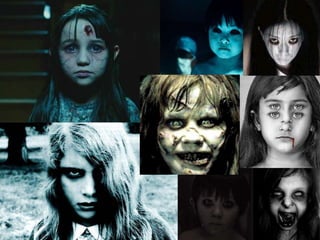
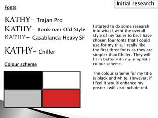
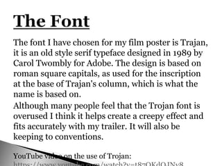
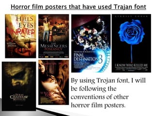
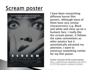
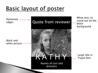
This document discusses the initial research done for a film poster project. It includes four fonts considered for the title, with a preference for the simpler first three. A black and white color scheme is chosen, with potential addition of red. The poster will feature a black and white picture of the actress with her eyes retained in color. Research on other horror posters found most use similar characteristics and the Scream poster in particular created an eye-catching design through these conventions.