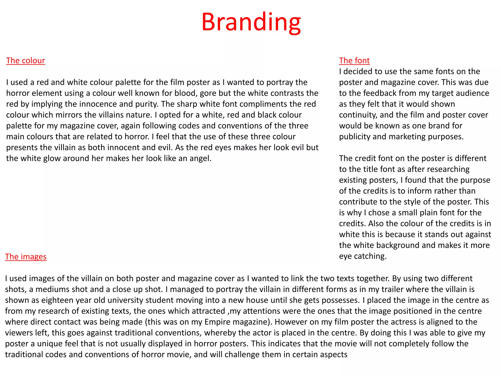
How effective is the combination of
your main product & ancillary tasks?
Comparison to industry standard
On my poster I included a
tagline “Just when you
thought it was safe to go back
inside”, the tagline is relevant
to the trailer. Also it makes
the audience why is not safe
to go back inside?. on the left
is my inspiration for my
poster, they did not include a
tagline but they included a
quote, I also included a
quote. The tagline is in red
which makes it stand out.
I included credits on my poster which makes it look professional. On the industry poster
(Rec 2) they haven't included a date which is unusual however I still included a date on
my poster to tell the audience when the film is coming out. I placed the date underneath
the credits, the font colour was white this is because as the release date will break the
colour of red up. In the Rec 2 poster they wrote the distributors and films url, I also done
that (www.paramountpictures.com and www.thetormented.com) this is if the audience
want to found out more information. For the websites the font colour is white, this is
because it breaks the colour of the red up.
The title on my poster is
simple as the Rec 2 title
is. The title is white with a
red outline, this makes it
out to be that it is glowing
like an angel but the red
outline counteract that by
symbolizing blood and
danger. On the Rec 2
poster the font colour is
also white but it has no
red outline, this is where I
challenged that specific
poster.
There is information about the producers and people involved in
the making of the film. The production logo makes loyal
audience members want to go and see the film because they
know it’s a big budget and high quality film.
On the poster there is two
websites; the distributors
website (Magnet) and the
films website. This promotes
the film and encourages the
audience to visit the website
to find out more information.
In the bottom right hand side
corner, there is the ‘Magnet’ logo.
Magnet have distributed well
known films such as Monsters.
The quote is used to further
encourage audiences to go and
watch the film. Within the
quote the word ‘Terrifying’
stands out because they have
purposely made that word
bigger to show the audience
this is a frightening film. Also
the quote is in red which
represents danger. In contrast
to the person who said the
quote is in white. The colour
white is to be considered the
colour of perfection. This is
telling the audience that
everyone should go and watch
the film.
The tagline ‘Fear revisited’, as this
is a sequel this is telling the
audience to expect more than the
first film.
The image is an close up of a face.
A close up is useful for showing
detail. A close up of a person
emphasizes their emotional state.
The feature of the image that
really stands out is the red
eye, which looks like that person is
recording and they could be
possessed. Also the colour of the
eye is red which means danger and
stay away. Looking closely at the
image there is feint lines going
across this could mean that
someone is watching and
recording them. On the face there
is a glow/ light this could represent
the opening of a dark beginning.
Some features of the face have
characteristics such as it only
shows half of the nose that
represents that half of the power
has disappeared and it only
includes one eye which means that
the person has no authority.
As the background of the poster is black it diminishes
readability and makes it more eye catching with the red and
white fonts. This poster does not include a release date.
The title stands out as it is in white
also the title has been sliced
randomly this implies that this film
has a serious killer.
The word ‘Terrifying’ in the quote is
a bigger font size, I deliberately
done this because when the
audience are looking at my poster
their eyes will be drawn to that
word. Especially as the word is
‘terrifying’ which makes them feel
fear for the subject on the poster.
However the subject on the poster
is not the victim, which is the irony.
Underneath the quote I wrote the
name of who said the quote, this is
to authenticity to my poster. It tells
the audience that the person has
had a ‘sneak preview’ of the film.
The use of the quotes shows that
the sentence has been taken from a
article, which they maybe
encouraged to find.
The credits give the
audience
information about
the producers and
people involved in
the making of the
film.
I did not follow the codes and conventions of the date as I did not write the full date of release creates a sense of mystery and suspense
leading the audience to feel as though they want to know more. Due to the fact that the movie is being released in October, I decided to
incorporate an white tone to the release date, so that the elements of Halloween such as fear, horror and trickery are also added to the
poster as an additional tone or feeling to the poster alongside the the elements from the poster as a whole.
The title of the film is simple but it
still conveys a strong message as
the majority of the title is white it
represents a positive connation
like innocence and purity but that it
taken away because it has a red
outline which means danger and
blood. Also it is on a black
background which contrasts with
the white by informing them of evil
and mystery.
The image has a unique feature
that I have edited the actual
colour of the eye. By doing this
some of the plot of the trailer is
been given away, as it will
remind the audience of a
recording symbol found on
video recorders. That represents
that subject is watching
someone or is being watched. I
will incorporate this feature on
my magazine to show
continuity.
The image that I took is a close
up of the subjects face this is
similar to the Rec 2 poster. Only
one side of the face is shown
and the other side is black this
tells the audience that this
person has a dark side but on
the other side there is some
white light which could be
contrasting the side of evil and
actually the subject could be
the heroin. The darkness was
done by how I took the picture
with a torch in a dark
room., but in Photoshop I
played around with the
blending options of the image. I
blurred the image to give the
effect of that she is coming out
of the background, also the
audience are unable to tell the
difference of the picture o the
face as it could be a female or
male.
On my poster the tagline is at the top and it covers the entire width of the poster which makes it look professional. The reason as to why
I placed the tagline above the title is because this makes the title appear as though it is an ironic extension of the tagline, almost like the
conclusion of the title, when you think it’s finally safe to go back inside, you’ll only be greeted by a horrific ordeal of torment.
Comparison to industry standard
This was the inspiration for the layout of
my magazine.
This was the inspiration for the style of
my image.
I chose a similar masthead with the issue number embedded in the ‘M’ as this was a
convention for Empire magazine. The banner is placed at the top of the page where the black
and red font choice make it stand out against the white background. I decided to use ‘The
ultimate exclusive horror issue’ as it tells the audience that this is Empires best issue about
horror and entices the readers to purchase the magazine to find out why.
I used the same layout from the Tron
Legace tilte but instead of using the
blue outline I used a red outline to go
with the house style of my magazine.
Also the cololur red is associated with
Horror.
The image style was taken from a special issue
of empire ‘the hobbit’. I think that the style of
the image suited my magazine as it contradicts
two different ideas (good vs evil. This is done by
the actresses colour of costume and the white
glow.
On the bottom of the page I have included an plus
sign with other horror films that are included in this
issue. As this feature is not on the one on the left
and right hand side. I took this feature from Empires
pirates of the Caribbean issue (pictured left). Also I
used this feature in my foundation portfolio music
magazine.
In this instance the barcode is
positioned on the right hand side
in the middle. A barcode is
necessary for it to be scanned in
the shops.
This is telling the reader that
there is other editions to collect.
Which increases the Tron Legacy
franchise.
This is telling the readers what
else is included in the issue. By
positioning it on the right it is
challenging the codes and
conventions of magazines as it is
should be placed on the left side
third. Also all the headlines are in
yellow to attract the audiences
eye. The use of the colour white
stands out against the
background.
In all Empire issues the person is
in front of the masthead but in
this occasion the masthead is in
front this could represent her
importance as she has part of
the background, meaning that’s
where she belongs. The date and
price are traditionally placed in
the middle of the ‘M’.
The banner is at the top of the magazine because when it is placed on the shelves in the shop this is
will attract the audience eye and it is using the font of the title ‘Tron Legacy’. It is also telling the
audience that this film will be in 3D which will attract more audience and this film is really good as it
is the event of the year.
Instead of writing Empires
website, Empire have wrote ‘Magazine
of the year’ this is to attract more
audiences.
The image is a mid shot. The actresses
hair, outline of her eye and her costume
are black. This is symbolizing her power,
mystery and strength. Also the black
denotes strength and authority. As her
iris is blue it symbolizes her trust, loyalty,
wisdom, confidence and intelligence.
The background gives the audience a
glimpse of what the film is like (sci-fi).
The magazine also shows that it’s up
to date with the latest events such as
the Oscars. It shows the audience
that is you purchase the magazine
you can read about a mixture of films
and celebrities who were at the
Oscars.
The magazine layout is based on the ‘Tron legacy’ title. Underneath the magazine is also promoting
itself as ‘ the ultimate guide’ which implies that Empire magazine have a high knowledge of the latest
films.
The barcode is positioned on the
bottom right hand side in a horizontal
position. A barcode is necessary for it to
be scanned in the shops.
The issue number, price and date
of publication are positioned
between the ‘M’ which is a
convention for Empire magazine.
The small font means that it is
not very noticeable for readers as
a result, it is the last thing the
readers will look at. I have not t
challenged the conventions of
the Empire masthead and also I
have placed the website under
the ‘E’.
The close up of Caroline
instantly stands out from the
other magazine covers on the
shelf. As from my poster I have
continued with the red eye
effect also her eyes are looking
directly at the reader. The
white glow makes gives the
impression of she is an angel
but the black dress contradicts
that idea and portrays her as
evil also with the red eyes.
The extra cover lines is a conventional feature in Empire
magazine covers and it provides extra stories for the
reader. Other films are features on the front page with
short descriptions to engage the reader.
The banner "The ultimate exclusive horror issue", by using the words 'ultimate' and 'exclusive' this draws the reader by thinking its the
best ,magazine Empire have ever done. As the letters are all capitalised which adds impact to the audience and stand out. I changed the
colour of the word 'Horror' to red because when audiences think about the colour red its associated with danger. As all horror trailers and
films conform to the feature of danger which adds to the tension.
The main cover line titles are in red and
the story is written in red, first I did all
the cover lines in red but it wasn't
readable so I thought I would use two
colours which break it up. Some of the
words in the cover lines are bold, these
words are related to horror and also as I
have included actors/ressess I made
their surname bold. I made "Devil",
"Saw", "Side effects" and "Black". The
words put emphasis on them and
highlights things the audience may be
interested in.
The title is similar to the Tron
Legacy empire issue . The
choice of the colours red and
white are are conflicting
ideas this makes the
audience feel uneasy as
they’re contradictory by
creating a sense of fear.
Branding
The font
I decided to use the same fonts on the
poster and magazine cover. This was due
to the feedback from my target audience
as they felt that it would shown
continuity, and the film and poster cover
would be known as one brand for
publicity and marketing purposes.
The credit font on the poster is different
to the title font as after researching
existing posters, I found that the purpose
of the credits is to inform rather than
contribute to the style of the poster. This
is why I chose a small plain font for the
credits. Also the colour of the credits is in
white this is because it stands out against
the white background and makes it more
eye catching.The images
I used images of the villain on both poster and magazine cover as I wanted to link the two texts together. By using two different
shots, a mediums shot and a close up shot. I managed to portray the villain in different forms as in my trailer where the villain is
shown as eighteen year old university student moving into a new house until she gets possesses. I placed the image in the centre as
from my research of existing texts, the ones which attracted ,my attentions were the ones that the image positioned in the centre
where direct contact was being made (this was on my Empire magazine). However on my film poster the actress is aligned to the
viewers left, this goes against traditional conventions, whereby the actor is placed in the centre. By doing this I was able to give my
poster a unique feel that is not usually displayed in horror posters. This indicates that the movie will not completely follow the
traditional codes and conventions of horror movie, and will challenge them in certain aspects
The colour
I used a red and white colour palette for the film poster as I wanted to portray the
horror element using a colour well known for blood, gore but the white contrasts the
red by implying the innocence and purity. The sharp white font compliments the red
colour which mirrors the villains nature. I opted for a white, red and black colour
palette for my magazine cover, again following codes and conventions of the three
main colours that are related to horror. I feel that the use of these three colour
presents the villain as both innocent and evil. As the red eyes makes her look evil but
the white glow around her makes her look like an angel.

Question 2

  • 1.
    How effective isthe combination of your main product & ancillary tasks?
  • 2.
    Comparison to industrystandard On my poster I included a tagline “Just when you thought it was safe to go back inside”, the tagline is relevant to the trailer. Also it makes the audience why is not safe to go back inside?. on the left is my inspiration for my poster, they did not include a tagline but they included a quote, I also included a quote. The tagline is in red which makes it stand out. I included credits on my poster which makes it look professional. On the industry poster (Rec 2) they haven't included a date which is unusual however I still included a date on my poster to tell the audience when the film is coming out. I placed the date underneath the credits, the font colour was white this is because as the release date will break the colour of red up. In the Rec 2 poster they wrote the distributors and films url, I also done that (www.paramountpictures.com and www.thetormented.com) this is if the audience want to found out more information. For the websites the font colour is white, this is because it breaks the colour of the red up. The title on my poster is simple as the Rec 2 title is. The title is white with a red outline, this makes it out to be that it is glowing like an angel but the red outline counteract that by symbolizing blood and danger. On the Rec 2 poster the font colour is also white but it has no red outline, this is where I challenged that specific poster.
  • 3.
    There is informationabout the producers and people involved in the making of the film. The production logo makes loyal audience members want to go and see the film because they know it’s a big budget and high quality film. On the poster there is two websites; the distributors website (Magnet) and the films website. This promotes the film and encourages the audience to visit the website to find out more information. In the bottom right hand side corner, there is the ‘Magnet’ logo. Magnet have distributed well known films such as Monsters. The quote is used to further encourage audiences to go and watch the film. Within the quote the word ‘Terrifying’ stands out because they have purposely made that word bigger to show the audience this is a frightening film. Also the quote is in red which represents danger. In contrast to the person who said the quote is in white. The colour white is to be considered the colour of perfection. This is telling the audience that everyone should go and watch the film. The tagline ‘Fear revisited’, as this is a sequel this is telling the audience to expect more than the first film. The image is an close up of a face. A close up is useful for showing detail. A close up of a person emphasizes their emotional state. The feature of the image that really stands out is the red eye, which looks like that person is recording and they could be possessed. Also the colour of the eye is red which means danger and stay away. Looking closely at the image there is feint lines going across this could mean that someone is watching and recording them. On the face there is a glow/ light this could represent the opening of a dark beginning. Some features of the face have characteristics such as it only shows half of the nose that represents that half of the power has disappeared and it only includes one eye which means that the person has no authority. As the background of the poster is black it diminishes readability and makes it more eye catching with the red and white fonts. This poster does not include a release date. The title stands out as it is in white also the title has been sliced randomly this implies that this film has a serious killer.
  • 4.
    The word ‘Terrifying’in the quote is a bigger font size, I deliberately done this because when the audience are looking at my poster their eyes will be drawn to that word. Especially as the word is ‘terrifying’ which makes them feel fear for the subject on the poster. However the subject on the poster is not the victim, which is the irony. Underneath the quote I wrote the name of who said the quote, this is to authenticity to my poster. It tells the audience that the person has had a ‘sneak preview’ of the film. The use of the quotes shows that the sentence has been taken from a article, which they maybe encouraged to find. The credits give the audience information about the producers and people involved in the making of the film. I did not follow the codes and conventions of the date as I did not write the full date of release creates a sense of mystery and suspense leading the audience to feel as though they want to know more. Due to the fact that the movie is being released in October, I decided to incorporate an white tone to the release date, so that the elements of Halloween such as fear, horror and trickery are also added to the poster as an additional tone or feeling to the poster alongside the the elements from the poster as a whole. The title of the film is simple but it still conveys a strong message as the majority of the title is white it represents a positive connation like innocence and purity but that it taken away because it has a red outline which means danger and blood. Also it is on a black background which contrasts with the white by informing them of evil and mystery.
  • 5.
    The image hasa unique feature that I have edited the actual colour of the eye. By doing this some of the plot of the trailer is been given away, as it will remind the audience of a recording symbol found on video recorders. That represents that subject is watching someone or is being watched. I will incorporate this feature on my magazine to show continuity. The image that I took is a close up of the subjects face this is similar to the Rec 2 poster. Only one side of the face is shown and the other side is black this tells the audience that this person has a dark side but on the other side there is some white light which could be contrasting the side of evil and actually the subject could be the heroin. The darkness was done by how I took the picture with a torch in a dark room., but in Photoshop I played around with the blending options of the image. I blurred the image to give the effect of that she is coming out of the background, also the audience are unable to tell the difference of the picture o the face as it could be a female or male. On my poster the tagline is at the top and it covers the entire width of the poster which makes it look professional. The reason as to why I placed the tagline above the title is because this makes the title appear as though it is an ironic extension of the tagline, almost like the conclusion of the title, when you think it’s finally safe to go back inside, you’ll only be greeted by a horrific ordeal of torment.
  • 6.
    Comparison to industrystandard This was the inspiration for the layout of my magazine. This was the inspiration for the style of my image. I chose a similar masthead with the issue number embedded in the ‘M’ as this was a convention for Empire magazine. The banner is placed at the top of the page where the black and red font choice make it stand out against the white background. I decided to use ‘The ultimate exclusive horror issue’ as it tells the audience that this is Empires best issue about horror and entices the readers to purchase the magazine to find out why. I used the same layout from the Tron Legace tilte but instead of using the blue outline I used a red outline to go with the house style of my magazine. Also the cololur red is associated with Horror. The image style was taken from a special issue of empire ‘the hobbit’. I think that the style of the image suited my magazine as it contradicts two different ideas (good vs evil. This is done by the actresses colour of costume and the white glow. On the bottom of the page I have included an plus sign with other horror films that are included in this issue. As this feature is not on the one on the left and right hand side. I took this feature from Empires pirates of the Caribbean issue (pictured left). Also I used this feature in my foundation portfolio music magazine.
  • 7.
    In this instancethe barcode is positioned on the right hand side in the middle. A barcode is necessary for it to be scanned in the shops. This is telling the reader that there is other editions to collect. Which increases the Tron Legacy franchise. This is telling the readers what else is included in the issue. By positioning it on the right it is challenging the codes and conventions of magazines as it is should be placed on the left side third. Also all the headlines are in yellow to attract the audiences eye. The use of the colour white stands out against the background. In all Empire issues the person is in front of the masthead but in this occasion the masthead is in front this could represent her importance as she has part of the background, meaning that’s where she belongs. The date and price are traditionally placed in the middle of the ‘M’. The banner is at the top of the magazine because when it is placed on the shelves in the shop this is will attract the audience eye and it is using the font of the title ‘Tron Legacy’. It is also telling the audience that this film will be in 3D which will attract more audience and this film is really good as it is the event of the year. Instead of writing Empires website, Empire have wrote ‘Magazine of the year’ this is to attract more audiences. The image is a mid shot. The actresses hair, outline of her eye and her costume are black. This is symbolizing her power, mystery and strength. Also the black denotes strength and authority. As her iris is blue it symbolizes her trust, loyalty, wisdom, confidence and intelligence. The background gives the audience a glimpse of what the film is like (sci-fi). The magazine also shows that it’s up to date with the latest events such as the Oscars. It shows the audience that is you purchase the magazine you can read about a mixture of films and celebrities who were at the Oscars. The magazine layout is based on the ‘Tron legacy’ title. Underneath the magazine is also promoting itself as ‘ the ultimate guide’ which implies that Empire magazine have a high knowledge of the latest films.
  • 8.
    The barcode ispositioned on the bottom right hand side in a horizontal position. A barcode is necessary for it to be scanned in the shops. The issue number, price and date of publication are positioned between the ‘M’ which is a convention for Empire magazine. The small font means that it is not very noticeable for readers as a result, it is the last thing the readers will look at. I have not t challenged the conventions of the Empire masthead and also I have placed the website under the ‘E’. The close up of Caroline instantly stands out from the other magazine covers on the shelf. As from my poster I have continued with the red eye effect also her eyes are looking directly at the reader. The white glow makes gives the impression of she is an angel but the black dress contradicts that idea and portrays her as evil also with the red eyes. The extra cover lines is a conventional feature in Empire magazine covers and it provides extra stories for the reader. Other films are features on the front page with short descriptions to engage the reader. The banner "The ultimate exclusive horror issue", by using the words 'ultimate' and 'exclusive' this draws the reader by thinking its the best ,magazine Empire have ever done. As the letters are all capitalised which adds impact to the audience and stand out. I changed the colour of the word 'Horror' to red because when audiences think about the colour red its associated with danger. As all horror trailers and films conform to the feature of danger which adds to the tension. The main cover line titles are in red and the story is written in red, first I did all the cover lines in red but it wasn't readable so I thought I would use two colours which break it up. Some of the words in the cover lines are bold, these words are related to horror and also as I have included actors/ressess I made their surname bold. I made "Devil", "Saw", "Side effects" and "Black". The words put emphasis on them and highlights things the audience may be interested in. The title is similar to the Tron Legacy empire issue . The choice of the colours red and white are are conflicting ideas this makes the audience feel uneasy as they’re contradictory by creating a sense of fear.
  • 9.
    Branding The font I decidedto use the same fonts on the poster and magazine cover. This was due to the feedback from my target audience as they felt that it would shown continuity, and the film and poster cover would be known as one brand for publicity and marketing purposes. The credit font on the poster is different to the title font as after researching existing posters, I found that the purpose of the credits is to inform rather than contribute to the style of the poster. This is why I chose a small plain font for the credits. Also the colour of the credits is in white this is because it stands out against the white background and makes it more eye catching.The images I used images of the villain on both poster and magazine cover as I wanted to link the two texts together. By using two different shots, a mediums shot and a close up shot. I managed to portray the villain in different forms as in my trailer where the villain is shown as eighteen year old university student moving into a new house until she gets possesses. I placed the image in the centre as from my research of existing texts, the ones which attracted ,my attentions were the ones that the image positioned in the centre where direct contact was being made (this was on my Empire magazine). However on my film poster the actress is aligned to the viewers left, this goes against traditional conventions, whereby the actor is placed in the centre. By doing this I was able to give my poster a unique feel that is not usually displayed in horror posters. This indicates that the movie will not completely follow the traditional codes and conventions of horror movie, and will challenge them in certain aspects The colour I used a red and white colour palette for the film poster as I wanted to portray the horror element using a colour well known for blood, gore but the white contrasts the red by implying the innocence and purity. The sharp white font compliments the red colour which mirrors the villains nature. I opted for a white, red and black colour palette for my magazine cover, again following codes and conventions of the three main colours that are related to horror. I feel that the use of these three colour presents the villain as both innocent and evil. As the red eyes makes her look evil but the white glow around her makes her look like an angel.