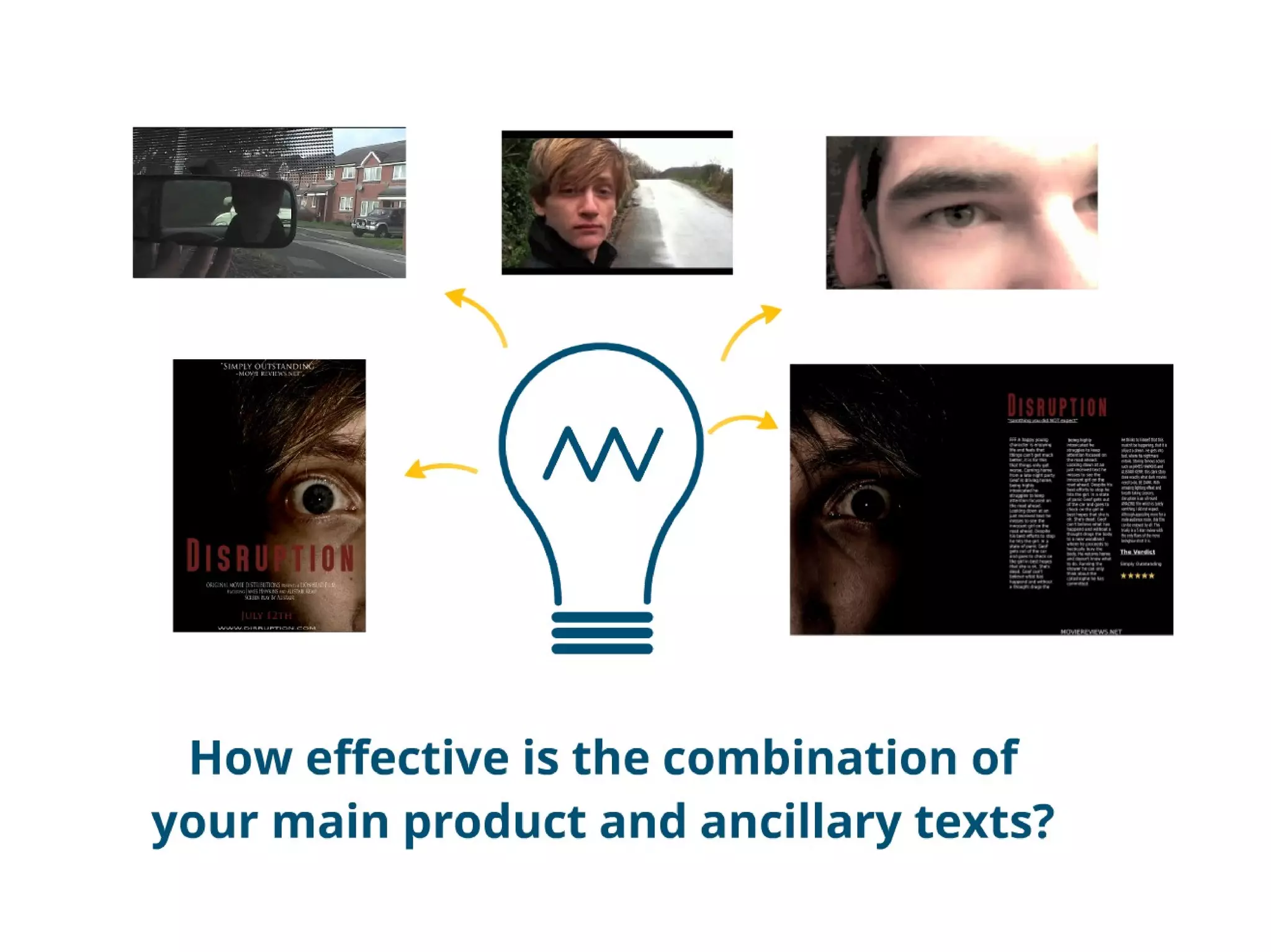
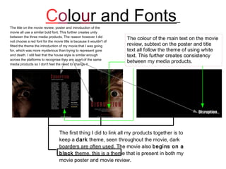
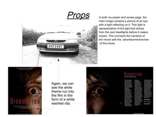
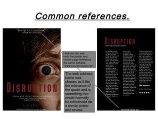
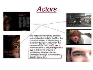
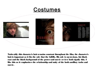
The movie title, review, and poster use similar bold fonts and white text to create consistency across media. Dark themes and colors are also used to link the pieces. Both the poster and review feature an image of an eye with a reflective light, connecting to the movie's narrative. Common references to a fictional movie review website further tie the works together. The main character's hair, clothes, and mysterious role remain constant throughout to emphasize unity.
2. Colour and Fonts
The title on the movie review, poster and introduction of the
movie all use a similar bold font. This further creates unity
between the three media products. The reason however I did
not choose a red font for the movie title is because it wouldn't of
The colour of the main text on the movie
fitted the theme the introduction of my movie that I was going review, subtext on the poster and title
for, which was more mysterious than trying to represent gore text all follow the theme of using white
and death. I still feel that the house style is similar enough text. This further creates consistency
across the platforms to recognise they are apart of the same
media products so I don't feel the need to change it.
between my media products.
The first thing I did to link all my products together is to
keep a dark theme, seen throughout the movie, dark
boarders are often used. The movie also begins on a
black theme, this is a theme that is present in both my
movie poster and movie review.
3. Props In both my poster and review page, the
main image contains a picture of an eye
with a light reflecting on it. This light is
representative of the light that shines
from the cars headlights before it makes
impact. This connects the narrative of
the movie with the advertisement/review
of the movie.
Again, we can
see the white
theme run into
the film in the
form of a white
washed clip.
4. Common references.
Here we can see
both the poster and
review page reference
the same website,
“www.moviereviews.net”
The web address
name was
chosen as it fits
the relevance of
the quote and is
something that
would normally
be referenced on
a movie poster
and review.
5. Actors
The actors in both of my ancillary
tasks related directly to the film, the
character shown in the ancillary is
the main “bad guy”. However, the
close up of the “bad guy's” eye is
representative of the protagonist's
eye in the movie showing a
relationship between the two
characters through my ancillaries
directly to my film.
6. Costumes
Noticeably this character's hair remains constant throughout the film, the character's
hair is important as it fits the role that the fulfills. H role is mysterious, his black
is
coat and the black background of the poster and movie review both signify this. I
like this as it emphasises the relationship and unity of the both ancillary tasks and
movie.
7. Conclusion
Strengths
Colours across the poster and review page are strong and
easily identifiable to one another, they also tie well in with
the movie, these being primarily red, which represent the
style of movie, and the black and white, black
representing the mystery of the character himself and
white a key element of the plot.
Weaknesses
There was little to represent the protagonist across the
three pieces and the review held to few refferences to
the movie, to counter this I could of included images of
the protagonist himself in the review along with the
other character shown on the poster.
Looking at my strengths and weaknesses together the combination
was overall effective. The font showing the title of the movie at the
beginning of the film was enough to relate the movie to the poster
and review straight away. The connotations shown in the
ancillaries were also a strong connection between the three.