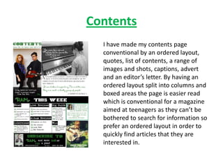
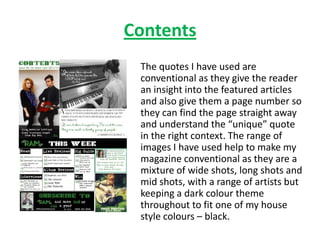
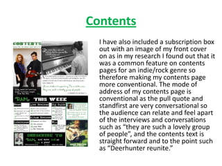
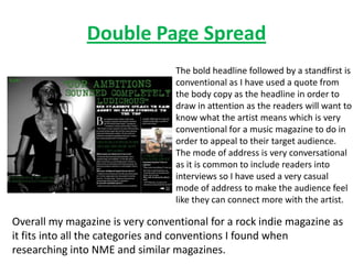
The document discusses the conventions used in creating the layout and design of a magazine cover and contents page for an indie/rock genre magazine.
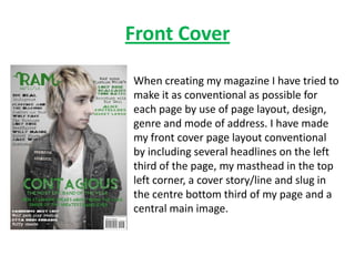
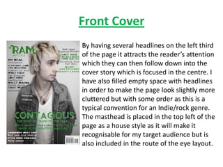
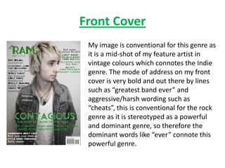
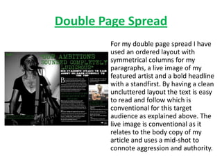
The front cover includes headlines on the left third, a masthead in the top left, a central cover story, and a central image of the featured artist. The contents page uses an ordered layout with columns and boxes for easy reading, quotes from articles, a range of images, and an advertisement.
Both pages aim to be conventional and recognizable to the target audience through their layout, use of images and text, and addressing the expected conventions of the genre.