
Recommended
More Related Content
What's hot
What's hot (20)
Similar to Evaluation question 1
Similar to Evaluation question 1 (20)
Recently uploaded
Recently uploaded (20)
Evaluation question 1
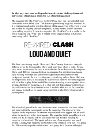
- 1. In what ways does your media product use, develop or challenge forms and conventions of real media products? (i.e. of music magazines) My magazine title ‘Re-Wired’ uses the font ‘Dolce Vita’ that I downloaded from the website ‘www.dafont.com’. This font was good for my magazine masthead as it is bold and stands out to grab the attention of the reader. This style of text is seen and used in the majority of music magazines, as they want to achieve the same eye-catching magazine. I chose the magazine title ‘Re-Wired’ as it is similar to the music magazine title ‘Wire’, also it appeals to my target audience as Kasabian have a song called ‘Re-Wired’. The front cover is very simple; I have used ‘Neou’ on my front cover using the different styles the font provides. I have used larger text, which is bolder for my band name, to make sure the band is known before the audience read the magazine. I have used different coloured fonts on my magazine but kept the monochrome style by using white text and coloured background and black text on white background to make the text revealing on a contradicting colour. I used black text for the price and issue, to make sure the audience can see how much the magazine will be before buying. I also used different artists featuring in the magazine, these are important for my magazine, as it is what will grab the audience’s attention, as they will want to see their favoured artists. I used the white text on the cover line, as it needed to stand out on a dark background; this is also the key topic/article in my magazine. The white background is the most dominant colour to make the text more visible and stand out for the customers to notice the magazine. The sizing of my text depends on the importance, for example my masthead is the biggest text, as it will attract the customers to buy the magazine. The cover line is the second largest text as this will be the second text the customers will look for after noticing the magazine title/masthead. The layout and structure of my magazine was based around ‘Loud&Quiet’ magazine as this follows the simplistic style that I was going for. This was the magazine and structure I was going for at the start, although I
- 2. gave my own perspective. I developed my own ideas after inserting a barcode and price which the ‘Loud&Quiet’ magazine does not follow as they gave their magazine out for free. I followed the usual convention of music magazines with my masthead being the main focus and largest part of the magazine and placing it on the top of the page as the main focus. I also wanted my magazine to be simple and basic with not much on the page, similar to ‘Clash’ or ‘Fantastic Man’. The costumes and iconography I used will attract my target audience. This is because my target audience is ‘New Casuals’ so to fit their preferences I have my models wearing typical ‘casual’ clothing with brands such as Fred Perry, Pretty Green, and Ellesse. I found this from Clash magazine as they use fashion to style their magazine to fit and suit their target audience. My two models on the cover can be seen wearing Ellesse and Pretty Green to fit the style of my magazine. In the image I have used in my magazine, the models have city building in the background making the magazine seem street to attract different target audiences. My models were styled in multiple different outfits to find the one that fit the audience the best. To ensure my magazine kept the fashion side, I ensured that my models were dressed appropriately for them to feature in my magazine. I am using the conventions of real media products as my artists fit the magazine style and genre of Indie, with the certain target audience. My models do not look out of place and they fit the genre of my magazine in my cover, contents and double page continuing the monotone layout throughout.
- 3. On my contents page, I continued the greyscale scheme with one image in colour. I did this as the two either side of the middle picture were black and white so this emphasised the colour of the trainers in the image. This is similar to the ideas of Loud&Quiet as although they use black and white, they use coloured images to add emphasis to the pictures and their detail. My contents page has a clear layout from the top left of the page, to the bottom left. There are images down the right side of the page leaving the text isolate along the left, this structure is similar to Clash magazine as they have a simple contents layout which is effective as it still includes the key details of the content of the music magazine. The contents page has significance as this is the page that the reader will visit to find the parts of the magazine they wish to read. For my double page spread, I have adopted the structure of many magazines by having a page dedicated to a photo and one with text. The text follows the typical magazine structure of the use of columns to split the text apart, they fit across the page enforcing image text cohesion. The image I used was of one of my models, I chose to only use one as the article is very much interacting with one band member, with the image being the band member spoken to. I wanted to follow this structure of double page spread as it is very effective with the drop capital to start off the article. The article mainly focuses on interacting with the band and questioning them about their career. I have questioned them as an interview would but I have adopted a story-like structure to my writing to make the audience feel involved and can relate to it.