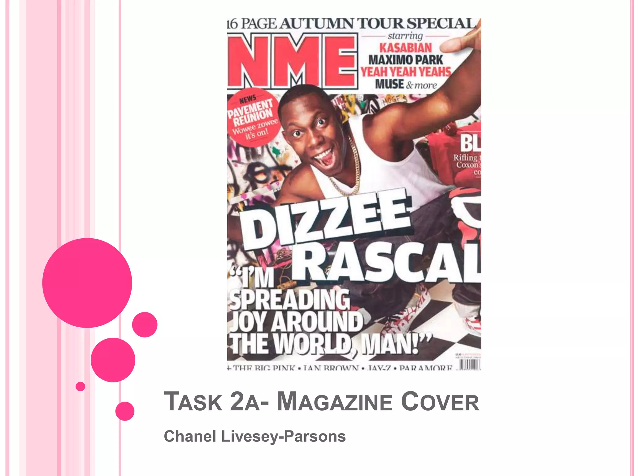
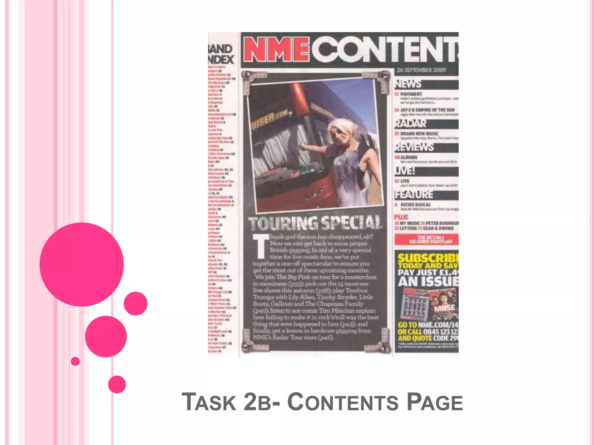
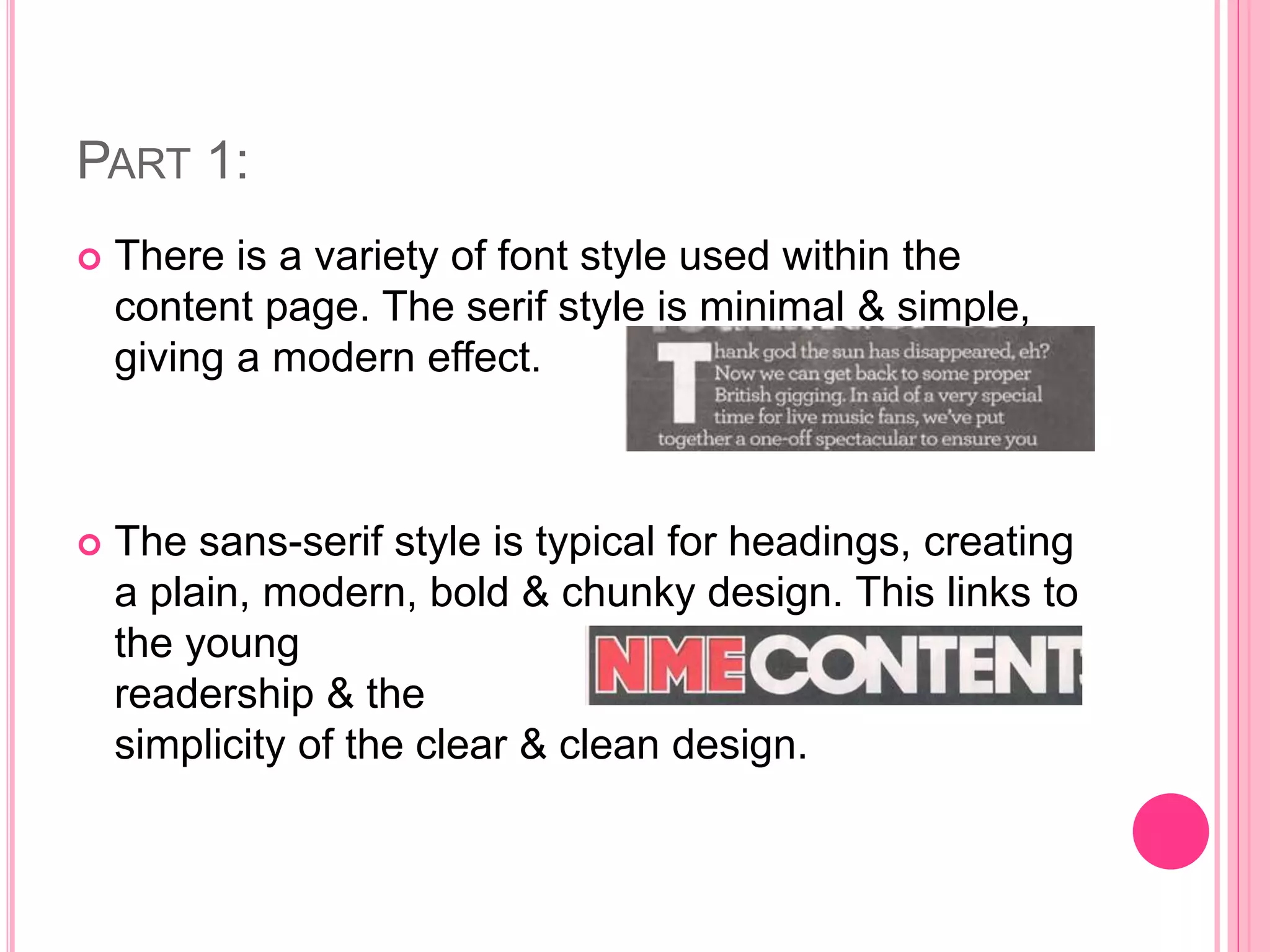
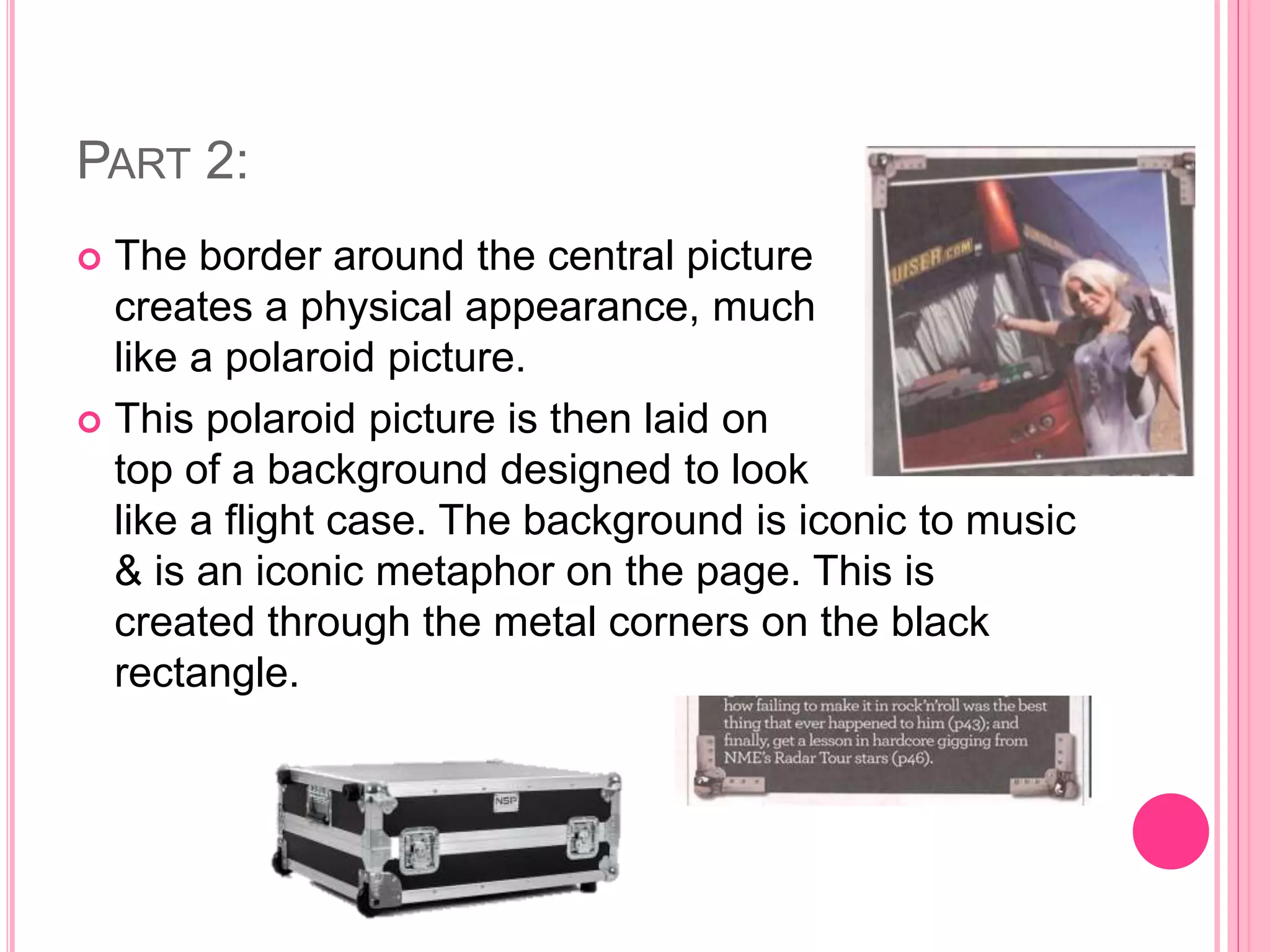
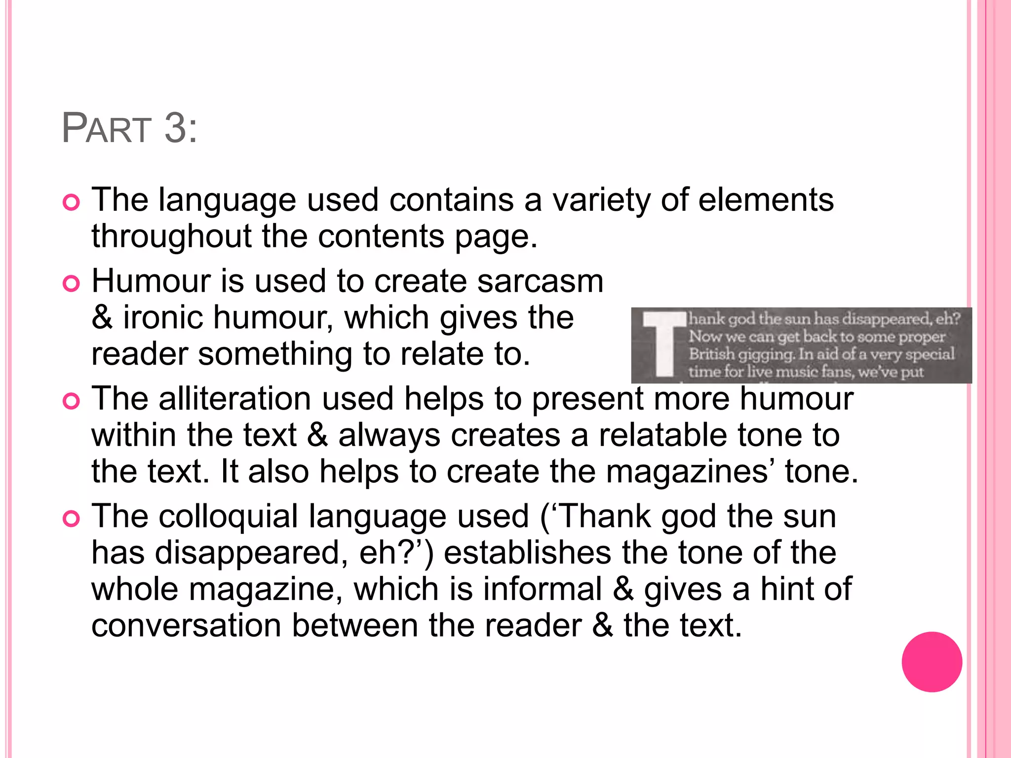
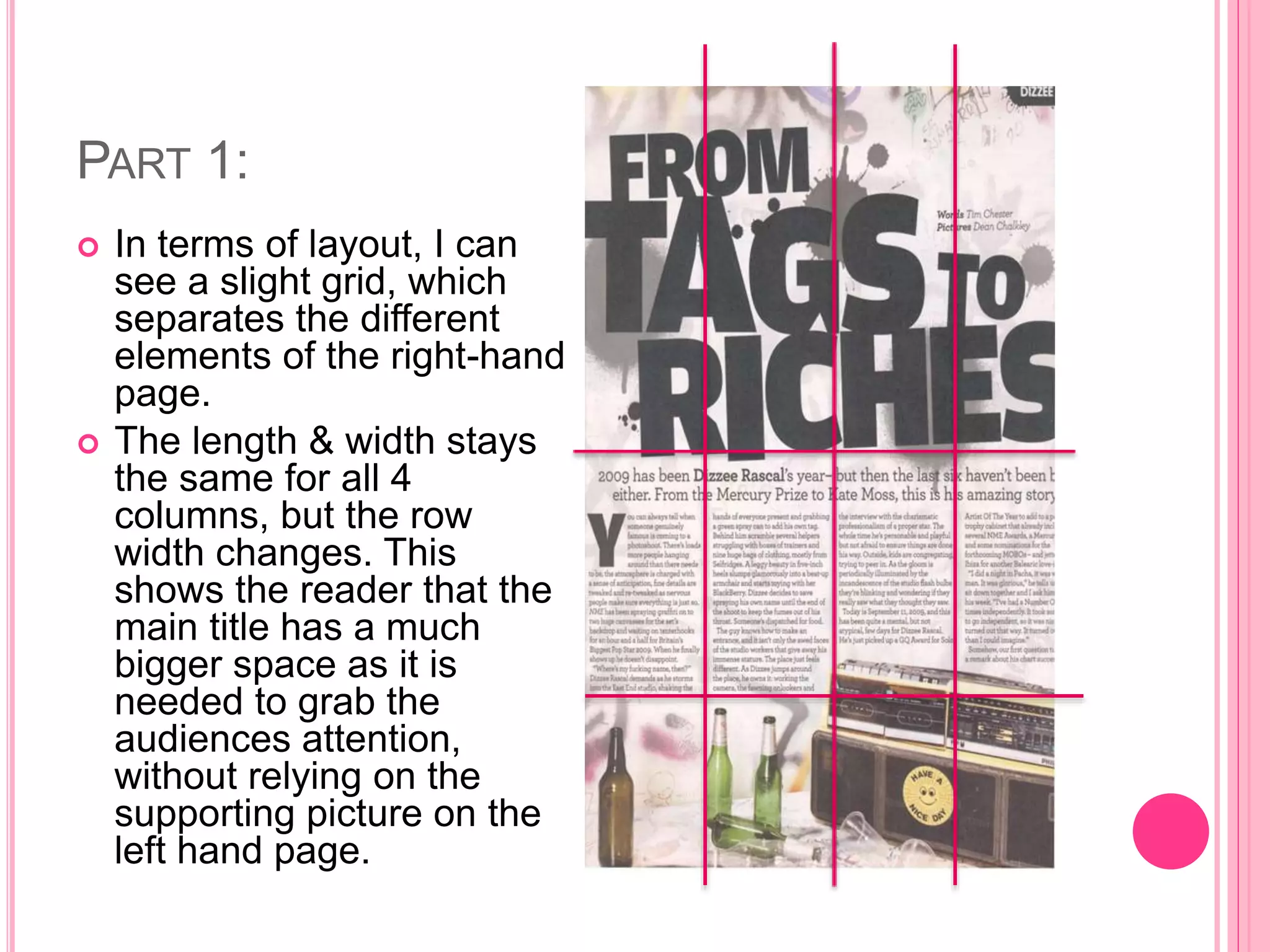
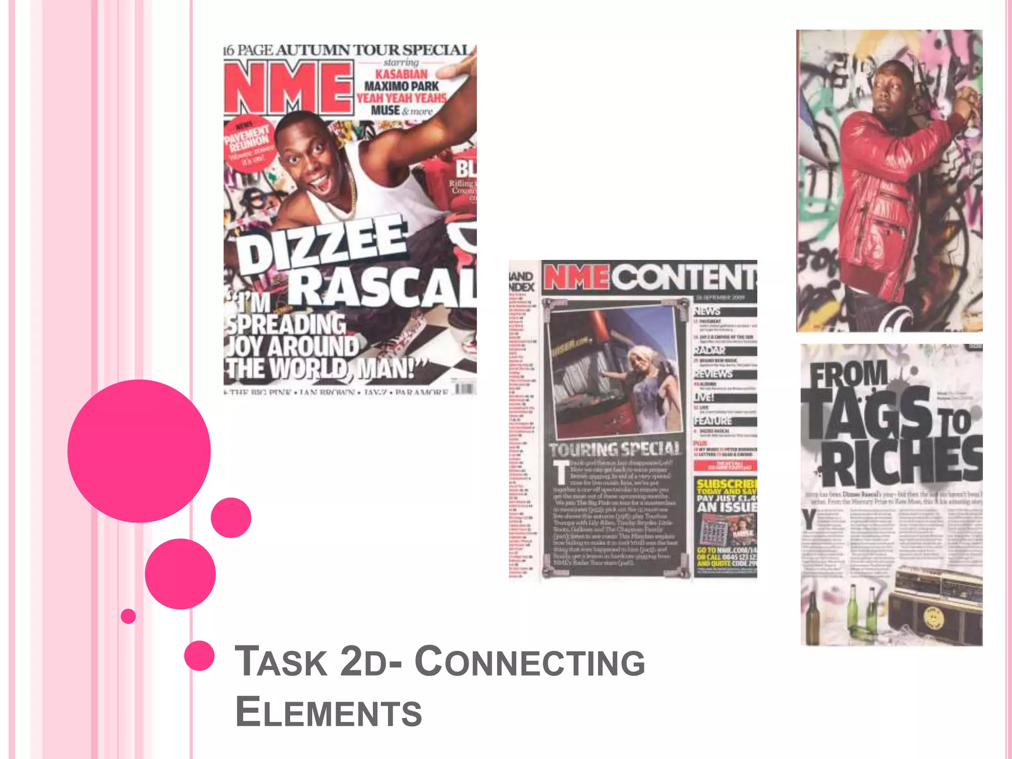
TASK 2A- MAGAZINE COVER
Chanel Livesey-Parsons
PART 1:
 The magazine cover shows us the link to music
through the use of band names & cover lines.
 The main cover image requires us to know &
recognise Dizzee Rascal as an artist or recognise
NME as a music magazine.
 The denotation & connotation of this
cover gives a sense of rebellion &
freedom. This is due to the layout,
main cover image & the background
used (graffiti).
PART 2:
 The rule of thirds isn't used in its standard way as
the layout draws the reader in to focus on the left
hand side of the cover.
 The main cover line goes across the
page to create an impact for the
audience.
 The NME logo is quite recognisable while in the left
hand corner. This doesn't need to stick with
standard design convention by going across the top
of the page.
PART 3:
 The model on the cover has a largely male
audience, so he makes the magazine appeal to a
wider audience.
 The casual dress presents Dizzee in a
relatable way towards the audience & also
links to the genre of music as it is
conventional to the rap genre. It connotes
a particular culture, identity and musical
style.
 Also, the way he is posed (reaching out to the
audience) gives a strong connection with the
readers.
PART 4:
 In regards to the layout, the rule of thirds division
goes across in 4 strips. This gives each element
huge impact on the cover.
 The ‘messy’ style doesn’t look conventional and is
breaking standard patterns. The tilted text gives a
sense of freedom & rule-breaking which links to the
rap genre, due to the feel of rebellion & not
conforming to normal standards.
 The ‘messy’ style also creates a sense of energy
and vibrancy on the cover.
PART 5:
 The graffiti used in the background fits with the
genre & linking to the clothes, these also help to
present the rap genre.
 Clothing worn/shown matches the magazines’
colour scheme, which is a hidden design skill used
by the magazine designers.
 The main cover image is a long shot but we are
given the impression of a medium close-up due to
the text cover. This gives the reader a sense of
connection but always showing us his clothing.
PART 6:
 The colour scheme is showing a
more masculine design due to the
bold, strong colour presented.
 The strapline refers to a particular
topic. This presents the audience
with a wider variety of topics being discussed which
can help to widen the amount of hopeful readers.
PART 7:
 The target audience would typically be students
who belong in the upper/lower middle class. The
image is not representing this social class as it isn't
an obvious fir but it fits with the idea of student
becoming rebellious.
TASK 2B- CONTENTS PAGE
PART 1:
 There is a variety of font style used within the
content page. The serif style is minimal & simple,
giving a modern effect.
 The sans-serif style is typical for headings, creating
a plain, modern, bold & chunky design. This links to
the young
readership & the
simplicity of the clear & clean design.
PART 2:
 The border around the central picture
creates a physical appearance, much
like a polaroid picture.
 This polaroid picture is then laid on
top of a background designed to look
like a flight case. The background is iconic to music
& is an iconic metaphor on the page. This is
created through the metal corners on the black
rectangle.
PART 3:
 The language used contains a variety of elements
throughout the contents page.
 Humour is used to create sarcasm
& ironic humour, which gives the
reader something to relate to.
 The alliteration used helps to present more humour
within the text & always creates a relatable tone to
the text. It also helps to create the magazines’ tone.
 The colloquial language used (‘Thank god the sun
has disappeared, eh?’) establishes the tone of the
whole magazine, which is informal & gives a hint of
conversation between the reader & the text.
PART 4:
 The use of the pronoun ‘we’ is collective and refers
to staff of the whole magazine and creates a sense
of unity when reading.
 ‘Pick out, play, listen & get a lesson’ are all verbs
used within the main body of text on the contents
page. These create a sense of action & dynamic
interest towards the reader.
 Finally, the semantic field, for example ‘touring’,
presents a tone of slang/jargon. This is through
words such as tourbus & tour stars.
PART 5:
 The use of columns helps to separate
the different types of text used. The
columns split the text & create a more
professional look for the audience.
 The articles & title content give a direct link into the
genre of music that this magazine covers & allows
audiences to get an insight into the whole magazine
before they read it.
 Linking to titles, the main heading is simple, yet
effective. This is due to the magazine logo & what
the page represents (For example, the magazine
contents
PART 6:
 Brand identity is easily spotted as the logo is used
again, which makes this page instantly
recognisable by NME readers. Also, the page is
designed with a style similar to other NME issues,
which helps to promote brand identity.
 The sub-headings used as simple &
basic, which makes the page very
effective. This is because the magazine
is clearly split into categories which
makes navigation through the
magazine easy.
PART 7:
 A medium shot is used for
the main image as it allows
the reader to see both the
models’ expression & the
surroundings. This links to
mise-en-scene (see below).
 The tour bus in the image
link to the flight case design
for the rectangle. This helps
to create a clear image for
the genre type that this
magazine is promoting.
PART 8:
 The grab quotes used in the main body of text
present the audience with a preview of what to
expect upon reading this music magazine.
 The date & issue number are given
to clearly identify the magazine.
 The target audience are likely to be young, male
adults as the article titles & main body of text
suggest/ show evidence of this. For example, under
the heading ‘news’, it begins to talk about Jay-z.
This artists is commonly known to produce music
for a predominantly male audience.
TASK 2C- DOUBLE PAGE SPREAD
PART 1:
 In terms of layout, I can
see a slight grid, which
separates the different
elements of the right-hand
page.
 The length & width stays
the same for all 4
columns, but the row
width changes. This
shows the reader that the
main title has a much
bigger space as it is
needed to grab the
audiences attention,
without relying on the
supporting picture on the
left hand page.
PART 2:
 Linking to the title of the article, the font type and
style is the same as shown on the cover. This
allows the audience to clearly see that this is the
features article without looking at the supporting
picture on the left-hand page.
 The colour scheme used is a continuation of the
magazine cover & contents page. This creates a
professional & presents a sense of brand loyalty
throughout the magazine.
 The drop cap at the start of the
text draws in the reader & makes
them focus on the given text. This
adds to the professional nature of
the magazine.
PART 3:
 The use of space on the both pages contrast
each other. On the right-hand page, there is
only a small amount of space which is free
from text/ images. Whereas, the left-hand
page has much more space which
represents the freedom that Dizzee Rascal
has when creating his music.
 This contrast also links to denotation &
connotation. The connotation of the graffiti
represents the freedom & rebellious nature
of the readers. This is also presented
through the empty bottles on the right-hand
page.
PART 4:
 The page numbers are simple yet effective &
professional as they are continuously reminding the
reader of what magazine they are reading & they
issue date.
 There is only one main image one this double-page
spread as the reader doesn’t need to be
overwhelmed with multiple images of different shot
types. The background to the image clearly shows
what Dizzee Rascal represents & gives the reader
an insight into what type of music genre this. The
music genre is also represented by the empty beer
bottles & the stereo on the right-hand page.
PART 5:
 The way in which the images and text are
integrated in that way so that
it can draw the audience in
without them losing interest
when reading the article.
This is because the main body of text is present in
one row, which makes it seem minimal.
 This links to design. The article is presented is a
basic & bold fashion which creates emphasis on the
text & image. This also links to the masculine
nature of the front cover, in terms of being simple
yet effective.
PART 6:
 Informal mode of address is used to allow the
audience to relate to the feature article. This
informal style is created through how Dizzee is
presented in the image & the way in which the title
has been written.
 Linking to the title, the article has an informal style
overall which is created through the language used
in the title. “From tags to riches” allows the
audience to relate to his rise to fame & how he has
coped with the major change. “Where’s my f**king
name then?” shows the reader that Dizzee Rascal
can be relatable in more than one way & this shown
throughout the article.
PART 7:
 The overall impression of this double-page spread
is that it has an informal style & is used to appeal to
the magazines audience in many ways. This is
achieved through language, images, style & overall
presentation of the article.
 These features are all used to allow the audience to
relate to the featured artist in more ways than one.
TASK 2D- CONNECTING
ELEMENTS
PART 1:
 The first element that connect these 3 parts is the
layout. Each of the 3 parts has a similar layout
which gives a sense of repetition, similarity & brand
loyalty.
 The second way is through the use of font style &
types. On the cover, contents & double-page
spread, a bold, sans-serif font is used to allow the
reader to see a continuous style throughout the
music magazine.
 Colour scheme is formed to represent NME and
helps the reader quickly identify the magazine on
any of the 3 parts analysed.
PART 2:
 The jargon-like language is representative of the
majority of the magazines audience (young males)
and this, again, helps to create a particular style in
which NME are known for.
 Another way in which the 3 parts are connected is
through the images & how they have been
presented on the page. All 3 images used help to
show the music genre being discussed throughout
the magazine.
 Finally, the most obvious way in which the prts
connect together is the way in which Dizzee is
mentioned/ featured within each of the 3 parts.

Task 2- magazine cover, contents & double page spread

  • 1.
    TASK 2A- MAGAZINECOVER Chanel Livesey-Parsons
  • 2.
    PART 1:  Themagazine cover shows us the link to music through the use of band names & cover lines.  The main cover image requires us to know & recognise Dizzee Rascal as an artist or recognise NME as a music magazine.  The denotation & connotation of this cover gives a sense of rebellion & freedom. This is due to the layout, main cover image & the background used (graffiti).
  • 3.
    PART 2:  Therule of thirds isn't used in its standard way as the layout draws the reader in to focus on the left hand side of the cover.  The main cover line goes across the page to create an impact for the audience.  The NME logo is quite recognisable while in the left hand corner. This doesn't need to stick with standard design convention by going across the top of the page.
  • 4.
    PART 3:  Themodel on the cover has a largely male audience, so he makes the magazine appeal to a wider audience.  The casual dress presents Dizzee in a relatable way towards the audience & also links to the genre of music as it is conventional to the rap genre. It connotes a particular culture, identity and musical style.  Also, the way he is posed (reaching out to the audience) gives a strong connection with the readers.
  • 5.
    PART 4:  Inregards to the layout, the rule of thirds division goes across in 4 strips. This gives each element huge impact on the cover.  The ‘messy’ style doesn’t look conventional and is breaking standard patterns. The tilted text gives a sense of freedom & rule-breaking which links to the rap genre, due to the feel of rebellion & not conforming to normal standards.  The ‘messy’ style also creates a sense of energy and vibrancy on the cover.
  • 6.
    PART 5:  Thegraffiti used in the background fits with the genre & linking to the clothes, these also help to present the rap genre.  Clothing worn/shown matches the magazines’ colour scheme, which is a hidden design skill used by the magazine designers.  The main cover image is a long shot but we are given the impression of a medium close-up due to the text cover. This gives the reader a sense of connection but always showing us his clothing.
  • 7.
    PART 6:  Thecolour scheme is showing a more masculine design due to the bold, strong colour presented.  The strapline refers to a particular topic. This presents the audience with a wider variety of topics being discussed which can help to widen the amount of hopeful readers.
  • 8.
    PART 7:  Thetarget audience would typically be students who belong in the upper/lower middle class. The image is not representing this social class as it isn't an obvious fir but it fits with the idea of student becoming rebellious.
  • 9.
  • 10.
    PART 1:  Thereis a variety of font style used within the content page. The serif style is minimal & simple, giving a modern effect.  The sans-serif style is typical for headings, creating a plain, modern, bold & chunky design. This links to the young readership & the simplicity of the clear & clean design.
  • 11.
    PART 2:  Theborder around the central picture creates a physical appearance, much like a polaroid picture.  This polaroid picture is then laid on top of a background designed to look like a flight case. The background is iconic to music & is an iconic metaphor on the page. This is created through the metal corners on the black rectangle.
  • 12.
    PART 3:  Thelanguage used contains a variety of elements throughout the contents page.  Humour is used to create sarcasm & ironic humour, which gives the reader something to relate to.  The alliteration used helps to present more humour within the text & always creates a relatable tone to the text. It also helps to create the magazines’ tone.  The colloquial language used (‘Thank god the sun has disappeared, eh?’) establishes the tone of the whole magazine, which is informal & gives a hint of conversation between the reader & the text.
  • 13.
    PART 4:  Theuse of the pronoun ‘we’ is collective and refers to staff of the whole magazine and creates a sense of unity when reading.  ‘Pick out, play, listen & get a lesson’ are all verbs used within the main body of text on the contents page. These create a sense of action & dynamic interest towards the reader.  Finally, the semantic field, for example ‘touring’, presents a tone of slang/jargon. This is through words such as tourbus & tour stars.
  • 14.
    PART 5:  Theuse of columns helps to separate the different types of text used. The columns split the text & create a more professional look for the audience.  The articles & title content give a direct link into the genre of music that this magazine covers & allows audiences to get an insight into the whole magazine before they read it.  Linking to titles, the main heading is simple, yet effective. This is due to the magazine logo & what the page represents (For example, the magazine contents
  • 15.
    PART 6:  Brandidentity is easily spotted as the logo is used again, which makes this page instantly recognisable by NME readers. Also, the page is designed with a style similar to other NME issues, which helps to promote brand identity.  The sub-headings used as simple & basic, which makes the page very effective. This is because the magazine is clearly split into categories which makes navigation through the magazine easy.
  • 16.
    PART 7:  Amedium shot is used for the main image as it allows the reader to see both the models’ expression & the surroundings. This links to mise-en-scene (see below).  The tour bus in the image link to the flight case design for the rectangle. This helps to create a clear image for the genre type that this magazine is promoting.
  • 17.
    PART 8:  Thegrab quotes used in the main body of text present the audience with a preview of what to expect upon reading this music magazine.  The date & issue number are given to clearly identify the magazine.  The target audience are likely to be young, male adults as the article titles & main body of text suggest/ show evidence of this. For example, under the heading ‘news’, it begins to talk about Jay-z. This artists is commonly known to produce music for a predominantly male audience.
  • 18.
    TASK 2C- DOUBLEPAGE SPREAD
  • 19.
    PART 1:  Interms of layout, I can see a slight grid, which separates the different elements of the right-hand page.  The length & width stays the same for all 4 columns, but the row width changes. This shows the reader that the main title has a much bigger space as it is needed to grab the audiences attention, without relying on the supporting picture on the left hand page.
  • 20.
    PART 2:  Linkingto the title of the article, the font type and style is the same as shown on the cover. This allows the audience to clearly see that this is the features article without looking at the supporting picture on the left-hand page.  The colour scheme used is a continuation of the magazine cover & contents page. This creates a professional & presents a sense of brand loyalty throughout the magazine.  The drop cap at the start of the text draws in the reader & makes them focus on the given text. This adds to the professional nature of the magazine.
  • 21.
    PART 3:  Theuse of space on the both pages contrast each other. On the right-hand page, there is only a small amount of space which is free from text/ images. Whereas, the left-hand page has much more space which represents the freedom that Dizzee Rascal has when creating his music.  This contrast also links to denotation & connotation. The connotation of the graffiti represents the freedom & rebellious nature of the readers. This is also presented through the empty bottles on the right-hand page.
  • 22.
    PART 4:  Thepage numbers are simple yet effective & professional as they are continuously reminding the reader of what magazine they are reading & they issue date.  There is only one main image one this double-page spread as the reader doesn’t need to be overwhelmed with multiple images of different shot types. The background to the image clearly shows what Dizzee Rascal represents & gives the reader an insight into what type of music genre this. The music genre is also represented by the empty beer bottles & the stereo on the right-hand page.
  • 23.
    PART 5:  Theway in which the images and text are integrated in that way so that it can draw the audience in without them losing interest when reading the article. This is because the main body of text is present in one row, which makes it seem minimal.  This links to design. The article is presented is a basic & bold fashion which creates emphasis on the text & image. This also links to the masculine nature of the front cover, in terms of being simple yet effective.
  • 24.
    PART 6:  Informalmode of address is used to allow the audience to relate to the feature article. This informal style is created through how Dizzee is presented in the image & the way in which the title has been written.  Linking to the title, the article has an informal style overall which is created through the language used in the title. “From tags to riches” allows the audience to relate to his rise to fame & how he has coped with the major change. “Where’s my f**king name then?” shows the reader that Dizzee Rascal can be relatable in more than one way & this shown throughout the article.
  • 25.
    PART 7:  Theoverall impression of this double-page spread is that it has an informal style & is used to appeal to the magazines audience in many ways. This is achieved through language, images, style & overall presentation of the article.  These features are all used to allow the audience to relate to the featured artist in more ways than one.
  • 26.
  • 27.
    PART 1:  Thefirst element that connect these 3 parts is the layout. Each of the 3 parts has a similar layout which gives a sense of repetition, similarity & brand loyalty.  The second way is through the use of font style & types. On the cover, contents & double-page spread, a bold, sans-serif font is used to allow the reader to see a continuous style throughout the music magazine.  Colour scheme is formed to represent NME and helps the reader quickly identify the magazine on any of the 3 parts analysed.
  • 28.
    PART 2:  Thejargon-like language is representative of the majority of the magazines audience (young males) and this, again, helps to create a particular style in which NME are known for.  Another way in which the 3 parts are connected is through the images & how they have been presented on the page. All 3 images used help to show the music genre being discussed throughout the magazine.  Finally, the most obvious way in which the prts connect together is the way in which Dizzee is mentioned/ featured within each of the 3 parts.