This document discusses the conventions used in the design of a music magazine called PRESTIGE.
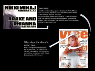
The cover follows conventions such as including a masthead, date, cover lines, price, cover photo and headline. Unconventional elements include the placement of the price and use of two cover photos.
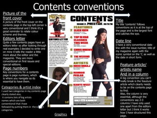
The contents page includes conventional elements like the title, date line, cover photo, editors letter, feature article name, page numbers and artist index. It differs by only using one column instead of two or three.
The article layout includes a title, subheading, questions and answers with quotes, and photos on both sides of the pages. It is similar to a Nikki Minaj interview article. Un