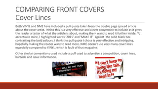
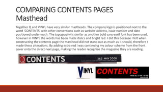
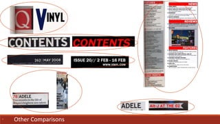
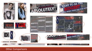
SlideShare a Scribd company logo
1 of 20
In what ways do your media
product use, develop or
challenge forms and conventions
of real media products?
EVALUATION – QUESTION 1
Before beginning to construct my magazine I researched into
the common conventions of my magazine genre, particularly
looking at NME. I also looked at other similar magazine such as
Q and KERRANG where I learnt about the main conventions
needed to make my magazine look realistic. These conventions
included masthead, coverlines, pull quote, page number,
barcode etc… The more I looked at different front covers,
contents pages and double page spreads the more I knew how
to apply these conventions on a page. The style and format of
my magazine needed to be consistent throughout in order to
make the genre obvious and represent my audience
accurately.
PURPOSES OF EACH PRODUCT
To ensure a product of a magazine looks sophisticated, official and professional the standard
conventions should be used correctly to their full purpose.
The front cover is the most important page of a magazine for a company as it represents the style
and content of the rest of the magazine. The page must look aesthetically pleasing, be easy to
read and stand out against other products. It is the first thing a potential customer will see
therefore advertisement is key via coverlines and puffs to attract them to open the magazine and
read on.
The contents page is the next page which should inform the reader what the magazine contains
by chronologically listing each article. The page should also be easy to read so the reader can
navigate across the page to find the article/s they want to look at. Articles should be again be
advertised e.g. through pictures, linking to a article.
A double page spread is an article spread across two pages which could be an interview, review,
report or advertisement. Standardly, conventions such as pull quotes, images and text are used.
CONVENTIONS USED
• Front Cover
Puff
Masthead/logo
Pull Quote
Strapline Barcode – issue date, website address and
price
Slogan
CoverlinesMain coverline/
headline
Issue number
Main image central on the page
Buzz word
Thirds
INSPIRATION – FRONT COVER
COMPARING FRONT COVERS
Mastheads
My issue of VINYL and this issue of NME are very similar in that style and conventions used are
almost the same. Firstly the standard convention of positioning the masthead in the top left
hand corner of the page has been used, enabling the Z theory to be followed. The masthead as
well as the logo both use a very blocky and bold sans-serif font making it easy to read from a
variety of distances. When choosing possible fonts for my masthead I was inspired by the style
of NME as I really liked the shape of the letters and thought they were effective and confirmed
to their purpose. Unlike NME I wanted to make my masthead look more stylish and quirky to suit
the ‘indie’ persona, therefore I stretched the V to make it more iconic and memorable like a logo
should be. I found my inspiration for this idea from Q magazine’s logo which is simply consists of
a stylish capital q against a red box. I also changed the colour of the V to a dark electric blue
which has obvious connotations of music as well linking in with my colour scheme. The word
VINYL also has connotations of music, mainly older more retro music emphasising that my
magazine includes older indie artists as well as new ones.
COMPARING FRONT COVERS
Main Image
The two main images are very similar in the fact that the subject matter is a young teenage girl.
By using a female on the front cover of my magazine subverts the traditional stereotypes of an
indie music magazine. Usually only males feature on the front cover denoting that the
magazine is aimed at men. I found this out after struggling to find a indie magazine on the
internet that had a female as the cover model. The compositions of the models are very similar
as a mid almost close-up shot has been captured, a standard convention of a front cover. Both
images have also been taken from a slightly higher vantage point with the model looking
towards the lens. This creates an intense and intimate relationship between the artist and
reader which is an important way of engaging the reader and catching their eye. Both images
have been captured against a white backdrop making it easy to layer other colours around the
shape of the model, another common convention. However the poses the models are
expressing are very dissimilar. Usually artists would show no obvious facial expression
connoting seriousness. However my artist subverts this idea as she is smiling whilst sticking her
tongue out and winking adding more fun and creating a light-hearted mood. I think this pose is
more appropriate for my age group especially as it connotes Millie is a happy fun person,
making her more interesting to read about.
The mise en scene of the models is very homogeneous as they both wear tartan flannel shirts
in a very untidy scruffy way. Their hair is not perfectly styled and they both wear minimal
make-up.
COMPARING FRONT COVERS
Cover Lines
Both VINYL and NME have included a pull quote taken from the double page spread article
about the cover artist. I think this is a very effective and clever convention to include as it gives
the reader a taster of what the article is about, making them want to read it further inside. To
accentuate mine, I highlighted words ‘2015’ and ‘MAKE IT’ against the solid black box
contrasting the bold colours. I think the pull quote I chose is very effective and intriguing,
hopefully making the reader want to read more. NME doesn’t use very many cover lines
especially compared to VINYL, which is fault of that magazine.
Other similar conventions used include a puff used to advertise a competition, cover lines,
barcode and issue information.
• Other Comparisons
CONVENTIONS USED
• Contents Page
Masthead
Menu of main
articles – main written content
Page numbers
Image captions
Subscription offer advertisement
Social media information
Summary of this issue
Logo
Images
Issue information and website address
Page number
Side Headings
INSPIRATION – CONTENTS PAGE
COMPARING CONTENTS PAGES
Masthead
Together Q and VINYL have very similar mastheads. The company logo is positioned next to the
word ‘CONTENTS’ with other conventions such as website address, issue number and date
positioned underneath. The typography is similar as another bold sans-serif font has been used,
however in VINYL the words has been made italics and bright red. I did this because I felt when
constructing the contents page the masthead did not stand out as much as it should, therefore I
made these alterations. By adding extra red I was continuing my colour scheme from the front
cover onto the direct next page, making the reader recognise the magazine they are reading.
COMPARING CONTENTS PAGES
Main Menu Text
Both my magazine and Q’s challenges the
convention of dividing the page into three columns.
This is a common convention seen on most
contents pages. However instead I divided mine
into two columns, still making the page look
organised, easy to read and navigate around.
I also organised the list of articles in chronological
order under three main side headings; news,
reviews and features. I chose these features after
researching into other contents pages including
NME, Q and KERRANG. I liked the look of white text
backed behind red boxes as it clearly divided up the
sections more clearly. I also added grey
backgrounds to some sections of the page, again to
add clear divided sections.
• Other Comparisons
CONVENTIONS USED
• Double Page Spread
Logo
Credits
Main article text
Main headline/pull
quote
Page number
Pull quote
Photograph
information
Artist name
Drop Cap
Summary of artist
In relation to article/
kicker
Main image
Columns
INSPIRATION – DOUBLE PAGE SPREAD
COMPARING DOUBLE PAGE SPREADS
Masthead // Pull Quote
To introduce the reader and captivate them to the article I used a pull quote as the masthead of
my spread. The quote taken from the main article is a standard convention of a double page
spread. In resemblance to KERRANG, I rotated the pull quote and added coloured boxes behind
the text to really absorb the reader. I also emphasized the word ‘BIGGEST’ hugely just like
KERRANG emphasized ‘ABSOLUTELY’. This is very effective technique as these words are both
very powerful and important to what the article is about. I also thought it made sense to make
‘BIGGEST’ the largest word on the page, making the masthead shout out to the reader. In the
masthead I have also used all the main colours from my chosen colour scheme.
COMPARING DOUBLE PAGE SPREADS
Main Image
The main similarity between these two articles is the main images used. Both individual artist's
are positioned left of the shot allowing the text to be positioned to cover the right. The
background colour behind the singers consist of grey, however mine is far more interesting as it
detailed street art. The model’s poses are very chilled and casual, where they look comfortable
in front of the camera, possibly connoting that they feel comfortable opening up to their fans via
their interview. Both shots are mid- shorts with a lot background space, the image has then
been stretched over two pages. This then makes the spread successfully flow across the two
pages instead of making them look separate.
• Other Comparisons
HOUSE STYLE
A common form of VINYL is that very relaxed and informal language is used to appeal to my young audience.
However standard and correct English is used to make the product seem official and legitamle. I have used a
consistent colour scheme consisting of mostly red, blue and black with random bursts of other neutral colours such
as white and grey. On the front cover and contents page I also included a dark burgundy shade taken from the
cover models t-shirt she wears in the main image of the front cover. The font style is also very fluent as I have used
very similar or the same font throughout including mostly ‘Microsoft Sans Serif’ and ‘Segeo UI’. I used mostly sans-
serif fonts as these are the easiest to read and a common style used on indie music magazines. Whilst analysing
NME magazine I discovered that bold round fonts are used which is where I gained inspiration for the font of my
masthead. I really like NME’s font therefore I wanted to find one very similar using dafont.com. To make my logo
slightly more quirky and different from others like NME, I deliberately stretched the V and made it a different
colour to make it more prominent and noticeable. I also added a slight dark shadow around the letter to project it
off the page and make it stand out increasingly against the white background. Another common form of this issue
is using the colour red to highlight artist name or important words. For example, on the front cover I used red
boxes positioned behind the text to highlight the exclusive and exciting artists featured inside the magazine.
Following the contents page I used red for the masthead and side headings, then pull quote on double page
spread.
Overall I feel have successfully followed and applied well the conventions of a music magazine. Due to the fluency
of my three products I feel my magazine looks very professional and well-designed.

More Related Content

What's hot

Evaluation - Question 1
Evaluation  - Question 1Evaluation  - Question 1
Evaluation - Question 1beccaweight16
 
Evaluation question 1
Evaluation   question 1Evaluation   question 1
Evaluation question 1beccaweight16
 
Magazine Analysis - Kerrang
Magazine Analysis - KerrangMagazine Analysis - Kerrang
Magazine Analysis - Kerrangguestb26673
 
AS Media Studies Evaluation Question 1
AS Media Studies Evaluation Question 1AS Media Studies Evaluation Question 1
AS Media Studies Evaluation Question 1Christopher Slemensek
 
Media evaluation q1
Media evaluation  q1Media evaluation  q1
Media evaluation q1jgamble14
 
Media evaluation question 1
Media evaluation question 1Media evaluation question 1
Media evaluation question 1Brandon Nolan
 
As evaluation question 1
As evaluation question 1As evaluation question 1
As evaluation question 110riccinie
 
As evaluation question 1
As evaluation question 1As evaluation question 1
As evaluation question 110riccinie
 
Q1 in what ways does your media product use, develop or challenge forms and...
Q1   in what ways does your media product use, develop or challenge forms and...Q1   in what ways does your media product use, develop or challenge forms and...
Q1 in what ways does your media product use, develop or challenge forms and...superandy93
 
Evaluation Question 1
Evaluation Question 1Evaluation Question 1
Evaluation Question 1samdwayne18
 
Codes and conventions contents
Codes and conventions contentsCodes and conventions contents
Codes and conventions contentsToby Allen
 
Contents Codes and Conventions Research - AS Media Studies
Contents Codes and Conventions Research - AS Media StudiesContents Codes and Conventions Research - AS Media Studies
Contents Codes and Conventions Research - AS Media StudiesAlexiPaphiti
 
Magazine cover analysis
Magazine cover analysisMagazine cover analysis
Magazine cover analysismrcaptainpanda
 

What's hot (20)

Evaluation - Question 1
Evaluation  - Question 1Evaluation  - Question 1
Evaluation - Question 1
 
Evaluation question 1
Evaluation   question 1Evaluation   question 1
Evaluation question 1
 
Evaluation
Evaluation Evaluation
Evaluation
 
Magazine Analysis - Kerrang
Magazine Analysis - KerrangMagazine Analysis - Kerrang
Magazine Analysis - Kerrang
 
AS Media Studies Evaluation Question 1
AS Media Studies Evaluation Question 1AS Media Studies Evaluation Question 1
AS Media Studies Evaluation Question 1
 
Question 1
Question 1Question 1
Question 1
 
Magazine Cover
Magazine CoverMagazine Cover
Magazine Cover
 
Media evaluation q1
Media evaluation  q1Media evaluation  q1
Media evaluation q1
 
Eval 1
Eval 1Eval 1
Eval 1
 
Evaluation 1
Evaluation 1 Evaluation 1
Evaluation 1
 
Magazine research
Magazine researchMagazine research
Magazine research
 
Media evaluation question 1
Media evaluation question 1Media evaluation question 1
Media evaluation question 1
 
As evaluation question 1
As evaluation question 1As evaluation question 1
As evaluation question 1
 
As evaluation question 1
As evaluation question 1As evaluation question 1
As evaluation question 1
 
Q1 in what ways does your media product use, develop or challenge forms and...
Q1   in what ways does your media product use, develop or challenge forms and...Q1   in what ways does your media product use, develop or challenge forms and...
Q1 in what ways does your media product use, develop or challenge forms and...
 
Evaluation Question 1
Evaluation Question 1Evaluation Question 1
Evaluation Question 1
 
Q1
Q1Q1
Q1
 
Codes and conventions contents
Codes and conventions contentsCodes and conventions contents
Codes and conventions contents
 
Contents Codes and Conventions Research - AS Media Studies
Contents Codes and Conventions Research - AS Media StudiesContents Codes and Conventions Research - AS Media Studies
Contents Codes and Conventions Research - AS Media Studies
 
Magazine cover analysis
Magazine cover analysisMagazine cover analysis
Magazine cover analysis
 

Similar to Q1 (20)

Evaluation 1
Evaluation 1Evaluation 1
Evaluation 1
 
Q1a
Q1aQ1a
Q1a
 
Evaluationmedia
EvaluationmediaEvaluationmedia
Evaluationmedia
 
Music Magazine Analysis: Lyrics
Music Magazine Analysis: LyricsMusic Magazine Analysis: Lyrics
Music Magazine Analysis: Lyrics
 
Q1finished
Q1finishedQ1finished
Q1finished
 
Media Evaluation - Question 1
Media Evaluation - Question 1Media Evaluation - Question 1
Media Evaluation - Question 1
 
Exam q 1
Exam q 1Exam q 1
Exam q 1
 
Ev1 in what ways does your media product use1
Ev1 in what ways does your media product use1Ev1 in what ways does your media product use1
Ev1 in what ways does your media product use1
 
Evaluation Q1
Evaluation Q1 Evaluation Q1
Evaluation Q1
 
Question 1
Question 1Question 1
Question 1
 
Main task evaluation! 4
Main task evaluation! 4Main task evaluation! 4
Main task evaluation! 4
 
Main task evaluation!
Main task evaluation!Main task evaluation!
Main task evaluation!
 
Q1a
Q1aQ1a
Q1a
 
Question 3
Question 3Question 3
Question 3
 
Evaluation (Q1)
Evaluation (Q1)Evaluation (Q1)
Evaluation (Q1)
 
Question 1 Evaluation
Question 1 EvaluationQuestion 1 Evaluation
Question 1 Evaluation
 
Evaluation
EvaluationEvaluation
Evaluation
 
Evaluation – Question 1
Evaluation – Question 1Evaluation – Question 1
Evaluation – Question 1
 
QUESTION 1
QUESTION 1QUESTION 1
QUESTION 1
 
Evaluation of my music magazine production
Evaluation of my music magazine productionEvaluation of my music magazine production
Evaluation of my music magazine production
 

Recently uploaded

URLs and Routing in the Odoo 17 Website App
URLs and Routing in the Odoo 17 Website AppURLs and Routing in the Odoo 17 Website App
URLs and Routing in the Odoo 17 Website AppCeline George
 
Employee wellbeing at the workplace.pptx
Employee wellbeing at the workplace.pptxEmployee wellbeing at the workplace.pptx
Employee wellbeing at the workplace.pptxNirmalaLoungPoorunde1
 
Contemporary philippine arts from the regions_PPT_Module_12 [Autosaved] (1).pptx
Contemporary philippine arts from the regions_PPT_Module_12 [Autosaved] (1).pptxContemporary philippine arts from the regions_PPT_Module_12 [Autosaved] (1).pptx
Contemporary philippine arts from the regions_PPT_Module_12 [Autosaved] (1).pptxRoyAbrique
 
Paris 2024 Olympic Geographies - an activity
Paris 2024 Olympic Geographies - an activityParis 2024 Olympic Geographies - an activity
Paris 2024 Olympic Geographies - an activityGeoBlogs
 
SOCIAL AND HISTORICAL CONTEXT - LFTVD.pptx
SOCIAL AND HISTORICAL CONTEXT - LFTVD.pptxSOCIAL AND HISTORICAL CONTEXT - LFTVD.pptx
SOCIAL AND HISTORICAL CONTEXT - LFTVD.pptxiammrhaywood
 
APM Welcome, APM North West Network Conference, Synergies Across Sectors
APM Welcome, APM North West Network Conference, Synergies Across SectorsAPM Welcome, APM North West Network Conference, Synergies Across Sectors
APM Welcome, APM North West Network Conference, Synergies Across SectorsAssociation for Project Management
 
The Most Excellent Way | 1 Corinthians 13
The Most Excellent Way | 1 Corinthians 13The Most Excellent Way | 1 Corinthians 13
The Most Excellent Way | 1 Corinthians 13Steve Thomason
 
Sanyam Choudhary Chemistry practical.pdf
Sanyam Choudhary Chemistry practical.pdfSanyam Choudhary Chemistry practical.pdf
Sanyam Choudhary Chemistry practical.pdfsanyamsingh5019
 
Science 7 - LAND and SEA BREEZE and its Characteristics
Science 7 - LAND and SEA BREEZE and its CharacteristicsScience 7 - LAND and SEA BREEZE and its Characteristics
Science 7 - LAND and SEA BREEZE and its CharacteristicsKarinaGenton
 
Solving Puzzles Benefits Everyone (English).pptx
Solving Puzzles Benefits Everyone (English).pptxSolving Puzzles Benefits Everyone (English).pptx
Solving Puzzles Benefits Everyone (English).pptxOH TEIK BIN
 
Industrial Policy - 1948, 1956, 1973, 1977, 1980, 1991
Industrial Policy - 1948, 1956, 1973, 1977, 1980, 1991Industrial Policy - 1948, 1956, 1973, 1977, 1980, 1991
Industrial Policy - 1948, 1956, 1973, 1977, 1980, 1991RKavithamani
 
Incoming and Outgoing Shipments in 1 STEP Using Odoo 17
Incoming and Outgoing Shipments in 1 STEP Using Odoo 17Incoming and Outgoing Shipments in 1 STEP Using Odoo 17
Incoming and Outgoing Shipments in 1 STEP Using Odoo 17Celine George
 
Measures of Central Tendency: Mean, Median and Mode
Measures of Central Tendency: Mean, Median and ModeMeasures of Central Tendency: Mean, Median and Mode
Measures of Central Tendency: Mean, Median and ModeThiyagu K
 
Introduction to ArtificiaI Intelligence in Higher Education
Introduction to ArtificiaI Intelligence in Higher EducationIntroduction to ArtificiaI Intelligence in Higher Education
Introduction to ArtificiaI Intelligence in Higher Educationpboyjonauth
 
CARE OF CHILD IN INCUBATOR..........pptx
CARE OF CHILD IN INCUBATOR..........pptxCARE OF CHILD IN INCUBATOR..........pptx
CARE OF CHILD IN INCUBATOR..........pptxGaneshChakor2
 
PSYCHIATRIC History collection FORMAT.pptx
PSYCHIATRIC   History collection FORMAT.pptxPSYCHIATRIC   History collection FORMAT.pptx
PSYCHIATRIC History collection FORMAT.pptxPoojaSen20
 
18-04-UA_REPORT_MEDIALITERAСY_INDEX-DM_23-1-final-eng.pdf
18-04-UA_REPORT_MEDIALITERAСY_INDEX-DM_23-1-final-eng.pdf18-04-UA_REPORT_MEDIALITERAСY_INDEX-DM_23-1-final-eng.pdf
18-04-UA_REPORT_MEDIALITERAСY_INDEX-DM_23-1-final-eng.pdfssuser54595a
 
Q4-W6-Restating Informational Text Grade 3
Q4-W6-Restating Informational Text Grade 3Q4-W6-Restating Informational Text Grade 3
Q4-W6-Restating Informational Text Grade 3JemimahLaneBuaron
 
POINT- BIOCHEMISTRY SEM 2 ENZYMES UNIT 5.pptx
POINT- BIOCHEMISTRY SEM 2 ENZYMES UNIT 5.pptxPOINT- BIOCHEMISTRY SEM 2 ENZYMES UNIT 5.pptx
POINT- BIOCHEMISTRY SEM 2 ENZYMES UNIT 5.pptxSayali Powar
 
Introduction to AI in Higher Education_draft.pptx
Introduction to AI in Higher Education_draft.pptxIntroduction to AI in Higher Education_draft.pptx
Introduction to AI in Higher Education_draft.pptxpboyjonauth
 

Recently uploaded (20)

URLs and Routing in the Odoo 17 Website App
URLs and Routing in the Odoo 17 Website AppURLs and Routing in the Odoo 17 Website App
URLs and Routing in the Odoo 17 Website App
 
Employee wellbeing at the workplace.pptx
Employee wellbeing at the workplace.pptxEmployee wellbeing at the workplace.pptx
Employee wellbeing at the workplace.pptx
 
Contemporary philippine arts from the regions_PPT_Module_12 [Autosaved] (1).pptx
Contemporary philippine arts from the regions_PPT_Module_12 [Autosaved] (1).pptxContemporary philippine arts from the regions_PPT_Module_12 [Autosaved] (1).pptx
Contemporary philippine arts from the regions_PPT_Module_12 [Autosaved] (1).pptx
 
Paris 2024 Olympic Geographies - an activity
Paris 2024 Olympic Geographies - an activityParis 2024 Olympic Geographies - an activity
Paris 2024 Olympic Geographies - an activity
 
SOCIAL AND HISTORICAL CONTEXT - LFTVD.pptx
SOCIAL AND HISTORICAL CONTEXT - LFTVD.pptxSOCIAL AND HISTORICAL CONTEXT - LFTVD.pptx
SOCIAL AND HISTORICAL CONTEXT - LFTVD.pptx
 
APM Welcome, APM North West Network Conference, Synergies Across Sectors
APM Welcome, APM North West Network Conference, Synergies Across SectorsAPM Welcome, APM North West Network Conference, Synergies Across Sectors
APM Welcome, APM North West Network Conference, Synergies Across Sectors
 
The Most Excellent Way | 1 Corinthians 13
The Most Excellent Way | 1 Corinthians 13The Most Excellent Way | 1 Corinthians 13
The Most Excellent Way | 1 Corinthians 13
 
Sanyam Choudhary Chemistry practical.pdf
Sanyam Choudhary Chemistry practical.pdfSanyam Choudhary Chemistry practical.pdf
Sanyam Choudhary Chemistry practical.pdf
 
Science 7 - LAND and SEA BREEZE and its Characteristics
Science 7 - LAND and SEA BREEZE and its CharacteristicsScience 7 - LAND and SEA BREEZE and its Characteristics
Science 7 - LAND and SEA BREEZE and its Characteristics
 
Solving Puzzles Benefits Everyone (English).pptx
Solving Puzzles Benefits Everyone (English).pptxSolving Puzzles Benefits Everyone (English).pptx
Solving Puzzles Benefits Everyone (English).pptx
 
Industrial Policy - 1948, 1956, 1973, 1977, 1980, 1991
Industrial Policy - 1948, 1956, 1973, 1977, 1980, 1991Industrial Policy - 1948, 1956, 1973, 1977, 1980, 1991
Industrial Policy - 1948, 1956, 1973, 1977, 1980, 1991
 
Incoming and Outgoing Shipments in 1 STEP Using Odoo 17
Incoming and Outgoing Shipments in 1 STEP Using Odoo 17Incoming and Outgoing Shipments in 1 STEP Using Odoo 17
Incoming and Outgoing Shipments in 1 STEP Using Odoo 17
 
Measures of Central Tendency: Mean, Median and Mode
Measures of Central Tendency: Mean, Median and ModeMeasures of Central Tendency: Mean, Median and Mode
Measures of Central Tendency: Mean, Median and Mode
 
Introduction to ArtificiaI Intelligence in Higher Education
Introduction to ArtificiaI Intelligence in Higher EducationIntroduction to ArtificiaI Intelligence in Higher Education
Introduction to ArtificiaI Intelligence in Higher Education
 
CARE OF CHILD IN INCUBATOR..........pptx
CARE OF CHILD IN INCUBATOR..........pptxCARE OF CHILD IN INCUBATOR..........pptx
CARE OF CHILD IN INCUBATOR..........pptx
 
PSYCHIATRIC History collection FORMAT.pptx
PSYCHIATRIC   History collection FORMAT.pptxPSYCHIATRIC   History collection FORMAT.pptx
PSYCHIATRIC History collection FORMAT.pptx
 
18-04-UA_REPORT_MEDIALITERAСY_INDEX-DM_23-1-final-eng.pdf
18-04-UA_REPORT_MEDIALITERAСY_INDEX-DM_23-1-final-eng.pdf18-04-UA_REPORT_MEDIALITERAСY_INDEX-DM_23-1-final-eng.pdf
18-04-UA_REPORT_MEDIALITERAСY_INDEX-DM_23-1-final-eng.pdf
 
Q4-W6-Restating Informational Text Grade 3
Q4-W6-Restating Informational Text Grade 3Q4-W6-Restating Informational Text Grade 3
Q4-W6-Restating Informational Text Grade 3
 
POINT- BIOCHEMISTRY SEM 2 ENZYMES UNIT 5.pptx
POINT- BIOCHEMISTRY SEM 2 ENZYMES UNIT 5.pptxPOINT- BIOCHEMISTRY SEM 2 ENZYMES UNIT 5.pptx
POINT- BIOCHEMISTRY SEM 2 ENZYMES UNIT 5.pptx
 
Introduction to AI in Higher Education_draft.pptx
Introduction to AI in Higher Education_draft.pptxIntroduction to AI in Higher Education_draft.pptx
Introduction to AI in Higher Education_draft.pptx
 

Q1

  • 1. In what ways do your media product use, develop or challenge forms and conventions of real media products? EVALUATION – QUESTION 1
  • 2. Before beginning to construct my magazine I researched into the common conventions of my magazine genre, particularly looking at NME. I also looked at other similar magazine such as Q and KERRANG where I learnt about the main conventions needed to make my magazine look realistic. These conventions included masthead, coverlines, pull quote, page number, barcode etc… The more I looked at different front covers, contents pages and double page spreads the more I knew how to apply these conventions on a page. The style and format of my magazine needed to be consistent throughout in order to make the genre obvious and represent my audience accurately.
  • 3. PURPOSES OF EACH PRODUCT To ensure a product of a magazine looks sophisticated, official and professional the standard conventions should be used correctly to their full purpose. The front cover is the most important page of a magazine for a company as it represents the style and content of the rest of the magazine. The page must look aesthetically pleasing, be easy to read and stand out against other products. It is the first thing a potential customer will see therefore advertisement is key via coverlines and puffs to attract them to open the magazine and read on. The contents page is the next page which should inform the reader what the magazine contains by chronologically listing each article. The page should also be easy to read so the reader can navigate across the page to find the article/s they want to look at. Articles should be again be advertised e.g. through pictures, linking to a article. A double page spread is an article spread across two pages which could be an interview, review, report or advertisement. Standardly, conventions such as pull quotes, images and text are used.
  • 4. CONVENTIONS USED • Front Cover Puff Masthead/logo Pull Quote Strapline Barcode – issue date, website address and price Slogan CoverlinesMain coverline/ headline Issue number Main image central on the page Buzz word Thirds
  • 6. COMPARING FRONT COVERS Mastheads My issue of VINYL and this issue of NME are very similar in that style and conventions used are almost the same. Firstly the standard convention of positioning the masthead in the top left hand corner of the page has been used, enabling the Z theory to be followed. The masthead as well as the logo both use a very blocky and bold sans-serif font making it easy to read from a variety of distances. When choosing possible fonts for my masthead I was inspired by the style of NME as I really liked the shape of the letters and thought they were effective and confirmed to their purpose. Unlike NME I wanted to make my masthead look more stylish and quirky to suit the ‘indie’ persona, therefore I stretched the V to make it more iconic and memorable like a logo should be. I found my inspiration for this idea from Q magazine’s logo which is simply consists of a stylish capital q against a red box. I also changed the colour of the V to a dark electric blue which has obvious connotations of music as well linking in with my colour scheme. The word VINYL also has connotations of music, mainly older more retro music emphasising that my magazine includes older indie artists as well as new ones.
  • 7. COMPARING FRONT COVERS Main Image The two main images are very similar in the fact that the subject matter is a young teenage girl. By using a female on the front cover of my magazine subverts the traditional stereotypes of an indie music magazine. Usually only males feature on the front cover denoting that the magazine is aimed at men. I found this out after struggling to find a indie magazine on the internet that had a female as the cover model. The compositions of the models are very similar as a mid almost close-up shot has been captured, a standard convention of a front cover. Both images have also been taken from a slightly higher vantage point with the model looking towards the lens. This creates an intense and intimate relationship between the artist and reader which is an important way of engaging the reader and catching their eye. Both images have been captured against a white backdrop making it easy to layer other colours around the shape of the model, another common convention. However the poses the models are expressing are very dissimilar. Usually artists would show no obvious facial expression connoting seriousness. However my artist subverts this idea as she is smiling whilst sticking her tongue out and winking adding more fun and creating a light-hearted mood. I think this pose is more appropriate for my age group especially as it connotes Millie is a happy fun person, making her more interesting to read about. The mise en scene of the models is very homogeneous as they both wear tartan flannel shirts in a very untidy scruffy way. Their hair is not perfectly styled and they both wear minimal make-up.
  • 8. COMPARING FRONT COVERS Cover Lines Both VINYL and NME have included a pull quote taken from the double page spread article about the cover artist. I think this is a very effective and clever convention to include as it gives the reader a taster of what the article is about, making them want to read it further inside. To accentuate mine, I highlighted words ‘2015’ and ‘MAKE IT’ against the solid black box contrasting the bold colours. I think the pull quote I chose is very effective and intriguing, hopefully making the reader want to read more. NME doesn’t use very many cover lines especially compared to VINYL, which is fault of that magazine. Other similar conventions used include a puff used to advertise a competition, cover lines, barcode and issue information.
  • 10. CONVENTIONS USED • Contents Page Masthead Menu of main articles – main written content Page numbers Image captions Subscription offer advertisement Social media information Summary of this issue Logo Images Issue information and website address Page number Side Headings
  • 12. COMPARING CONTENTS PAGES Masthead Together Q and VINYL have very similar mastheads. The company logo is positioned next to the word ‘CONTENTS’ with other conventions such as website address, issue number and date positioned underneath. The typography is similar as another bold sans-serif font has been used, however in VINYL the words has been made italics and bright red. I did this because I felt when constructing the contents page the masthead did not stand out as much as it should, therefore I made these alterations. By adding extra red I was continuing my colour scheme from the front cover onto the direct next page, making the reader recognise the magazine they are reading.
  • 13. COMPARING CONTENTS PAGES Main Menu Text Both my magazine and Q’s challenges the convention of dividing the page into three columns. This is a common convention seen on most contents pages. However instead I divided mine into two columns, still making the page look organised, easy to read and navigate around. I also organised the list of articles in chronological order under three main side headings; news, reviews and features. I chose these features after researching into other contents pages including NME, Q and KERRANG. I liked the look of white text backed behind red boxes as it clearly divided up the sections more clearly. I also added grey backgrounds to some sections of the page, again to add clear divided sections.
  • 15. CONVENTIONS USED • Double Page Spread Logo Credits Main article text Main headline/pull quote Page number Pull quote Photograph information Artist name Drop Cap Summary of artist In relation to article/ kicker Main image Columns
  • 16. INSPIRATION – DOUBLE PAGE SPREAD
  • 17. COMPARING DOUBLE PAGE SPREADS Masthead // Pull Quote To introduce the reader and captivate them to the article I used a pull quote as the masthead of my spread. The quote taken from the main article is a standard convention of a double page spread. In resemblance to KERRANG, I rotated the pull quote and added coloured boxes behind the text to really absorb the reader. I also emphasized the word ‘BIGGEST’ hugely just like KERRANG emphasized ‘ABSOLUTELY’. This is very effective technique as these words are both very powerful and important to what the article is about. I also thought it made sense to make ‘BIGGEST’ the largest word on the page, making the masthead shout out to the reader. In the masthead I have also used all the main colours from my chosen colour scheme.
  • 18. COMPARING DOUBLE PAGE SPREADS Main Image The main similarity between these two articles is the main images used. Both individual artist's are positioned left of the shot allowing the text to be positioned to cover the right. The background colour behind the singers consist of grey, however mine is far more interesting as it detailed street art. The model’s poses are very chilled and casual, where they look comfortable in front of the camera, possibly connoting that they feel comfortable opening up to their fans via their interview. Both shots are mid- shorts with a lot background space, the image has then been stretched over two pages. This then makes the spread successfully flow across the two pages instead of making them look separate.
  • 20. HOUSE STYLE A common form of VINYL is that very relaxed and informal language is used to appeal to my young audience. However standard and correct English is used to make the product seem official and legitamle. I have used a consistent colour scheme consisting of mostly red, blue and black with random bursts of other neutral colours such as white and grey. On the front cover and contents page I also included a dark burgundy shade taken from the cover models t-shirt she wears in the main image of the front cover. The font style is also very fluent as I have used very similar or the same font throughout including mostly ‘Microsoft Sans Serif’ and ‘Segeo UI’. I used mostly sans- serif fonts as these are the easiest to read and a common style used on indie music magazines. Whilst analysing NME magazine I discovered that bold round fonts are used which is where I gained inspiration for the font of my masthead. I really like NME’s font therefore I wanted to find one very similar using dafont.com. To make my logo slightly more quirky and different from others like NME, I deliberately stretched the V and made it a different colour to make it more prominent and noticeable. I also added a slight dark shadow around the letter to project it off the page and make it stand out increasingly against the white background. Another common form of this issue is using the colour red to highlight artist name or important words. For example, on the front cover I used red boxes positioned behind the text to highlight the exclusive and exciting artists featured inside the magazine. Following the contents page I used red for the masthead and side headings, then pull quote on double page spread. Overall I feel have successfully followed and applied well the conventions of a music magazine. Due to the fluency of my three products I feel my magazine looks very professional and well-designed.