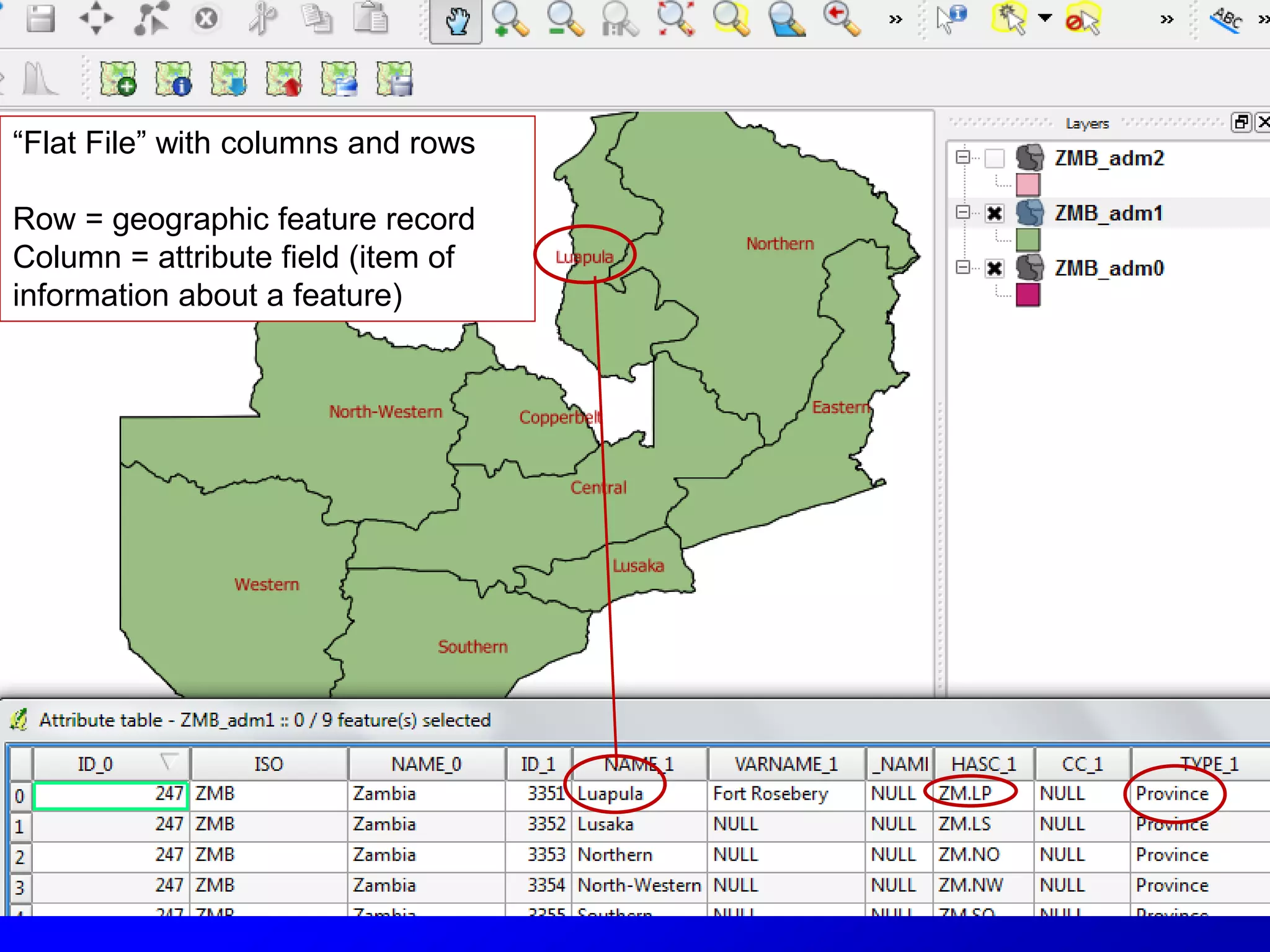
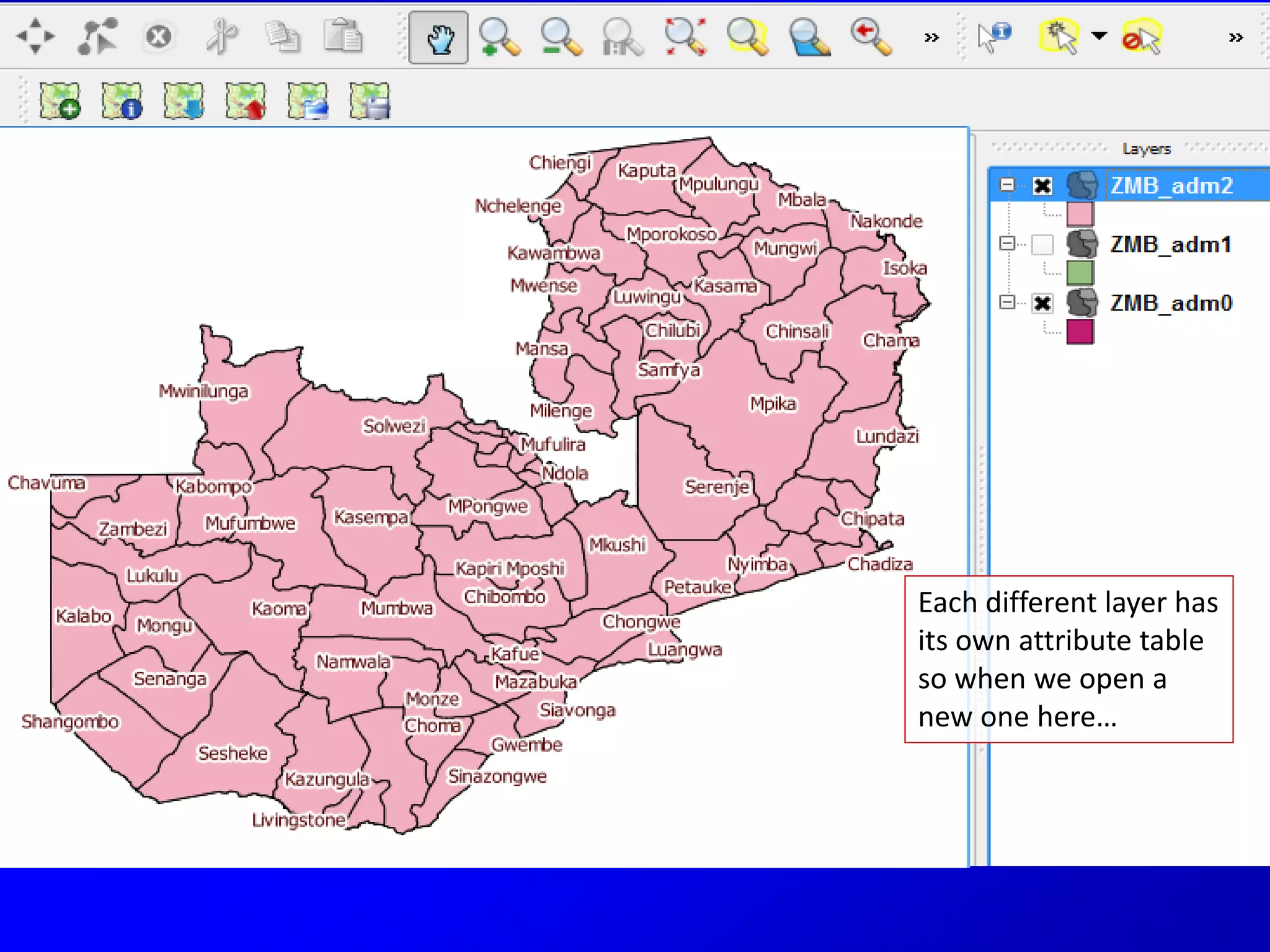
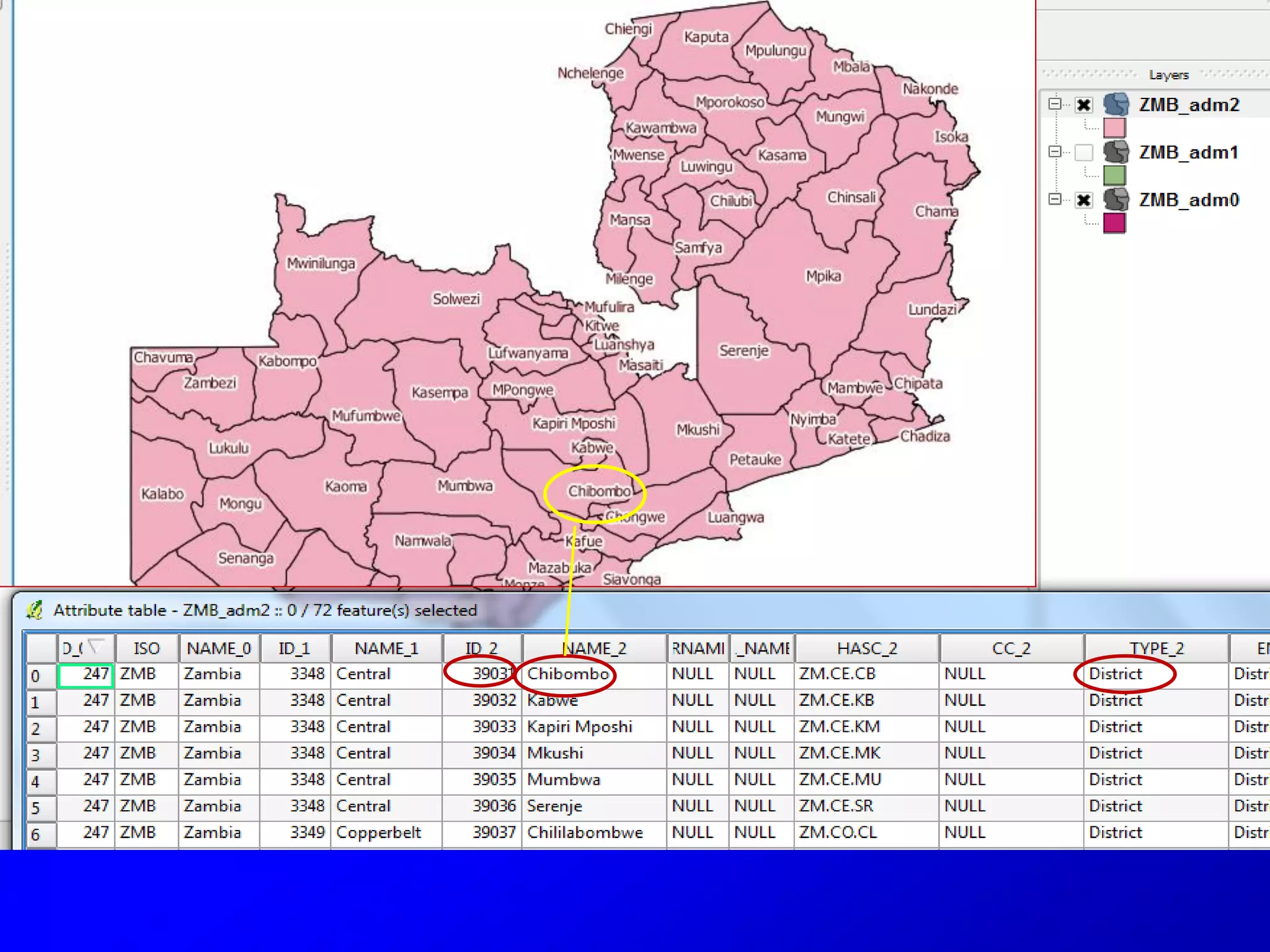
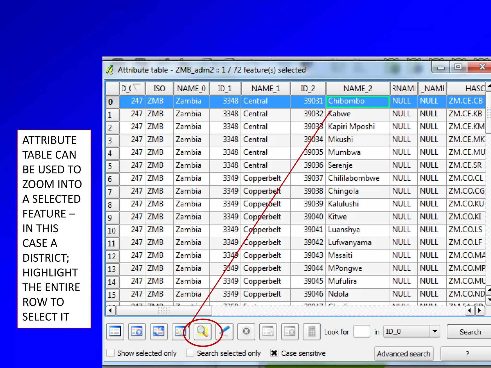
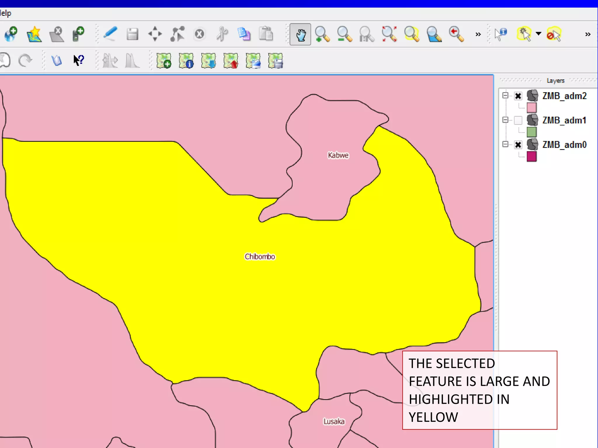
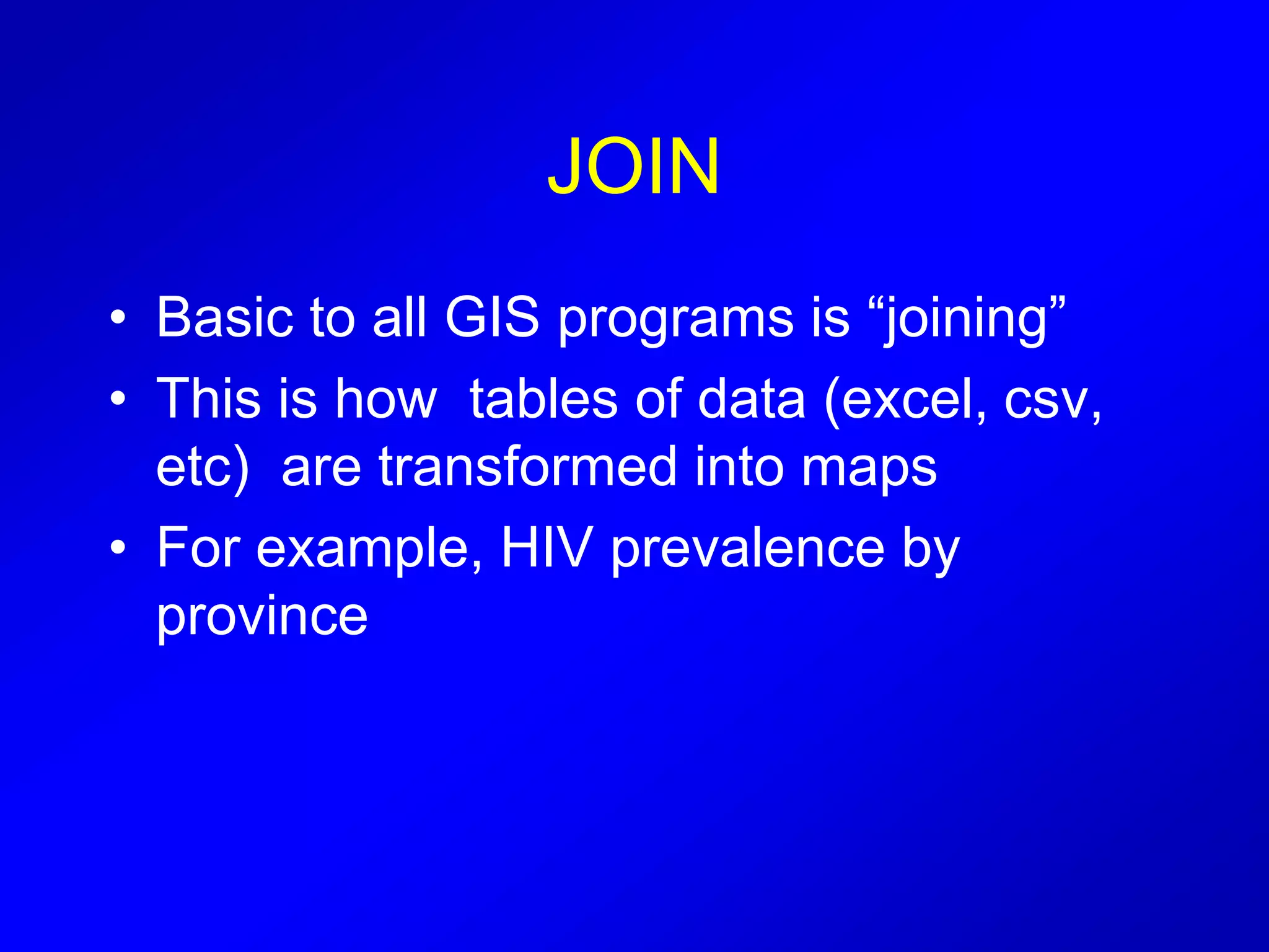
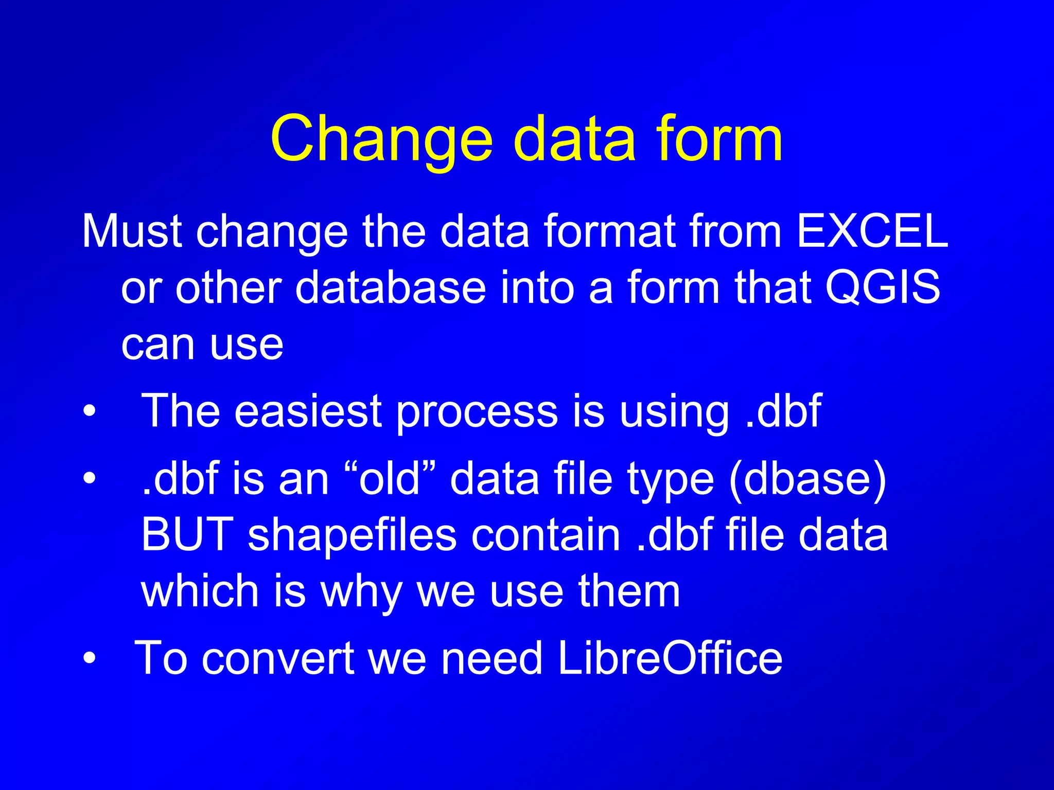
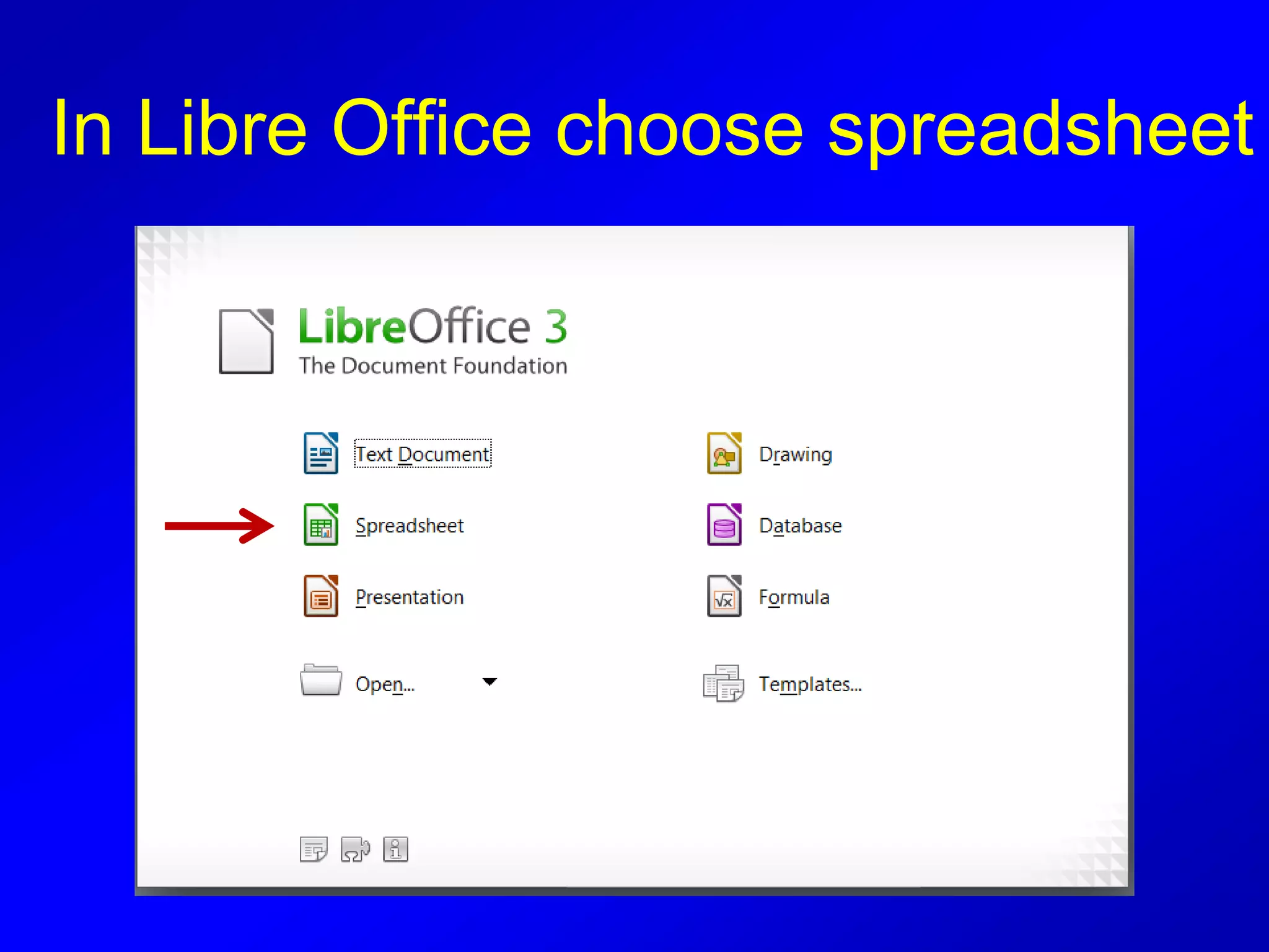
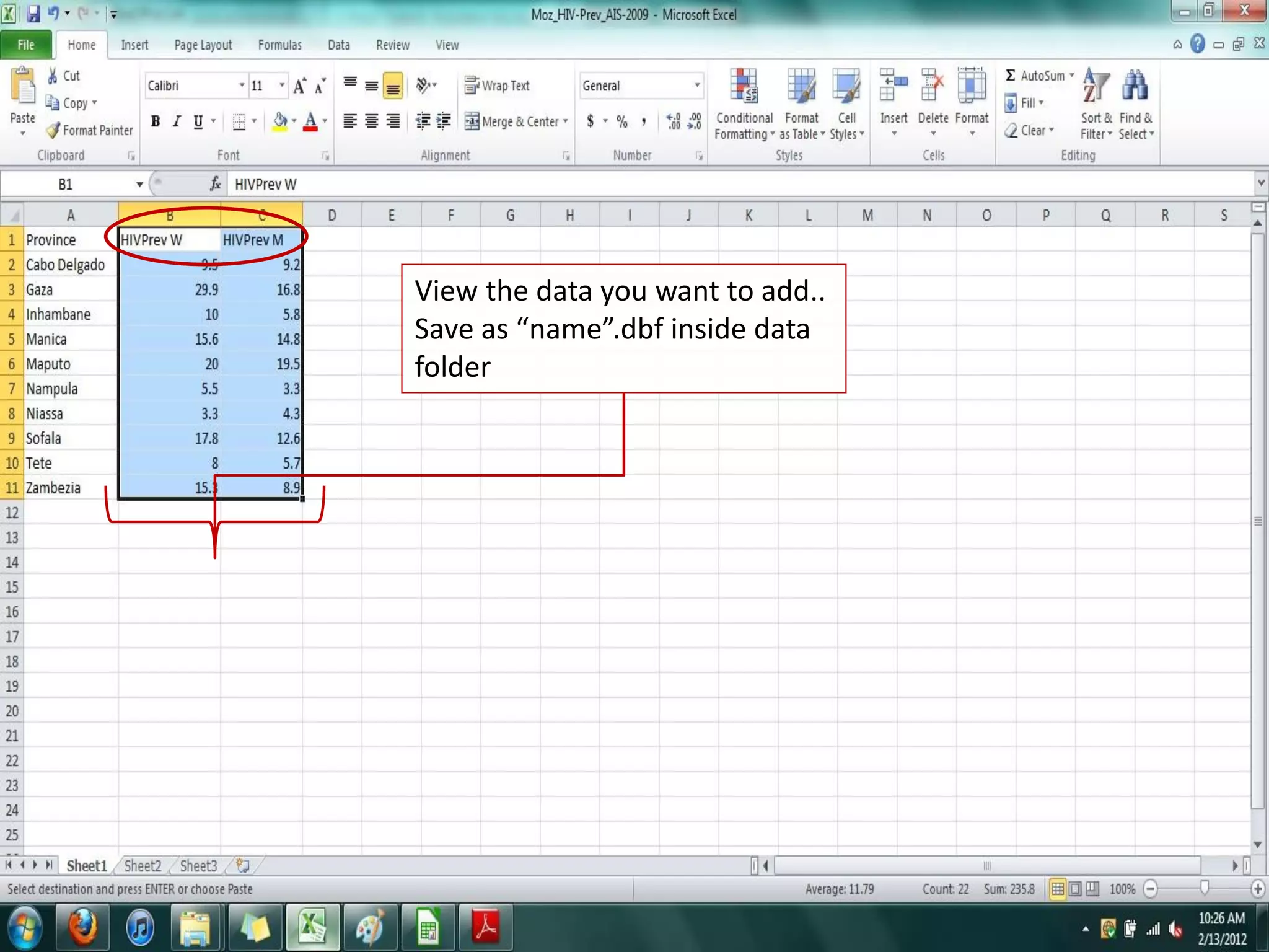
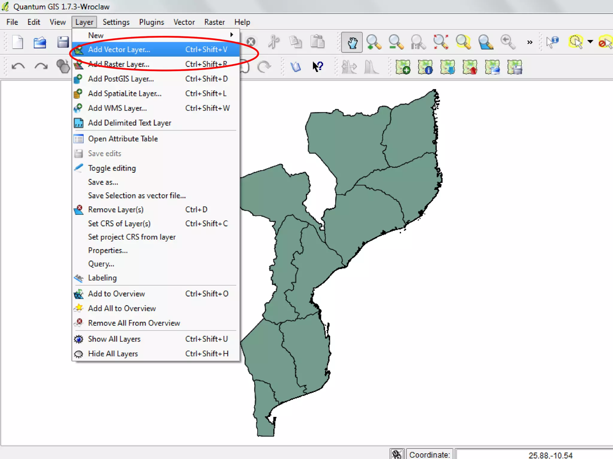
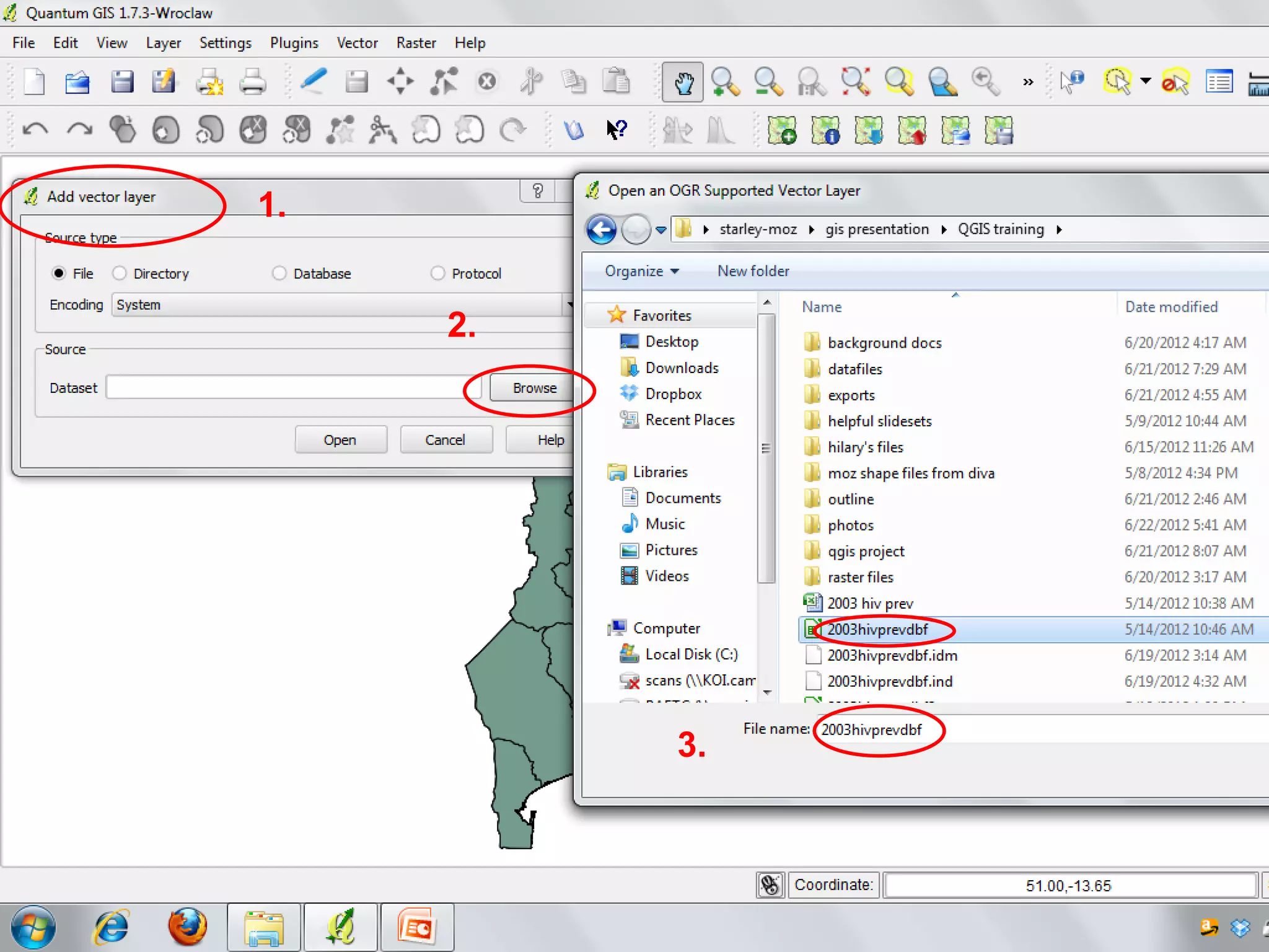
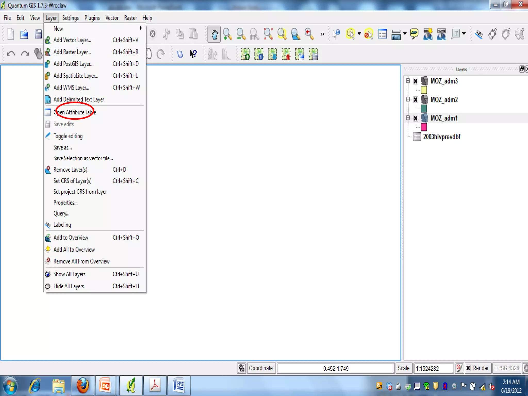
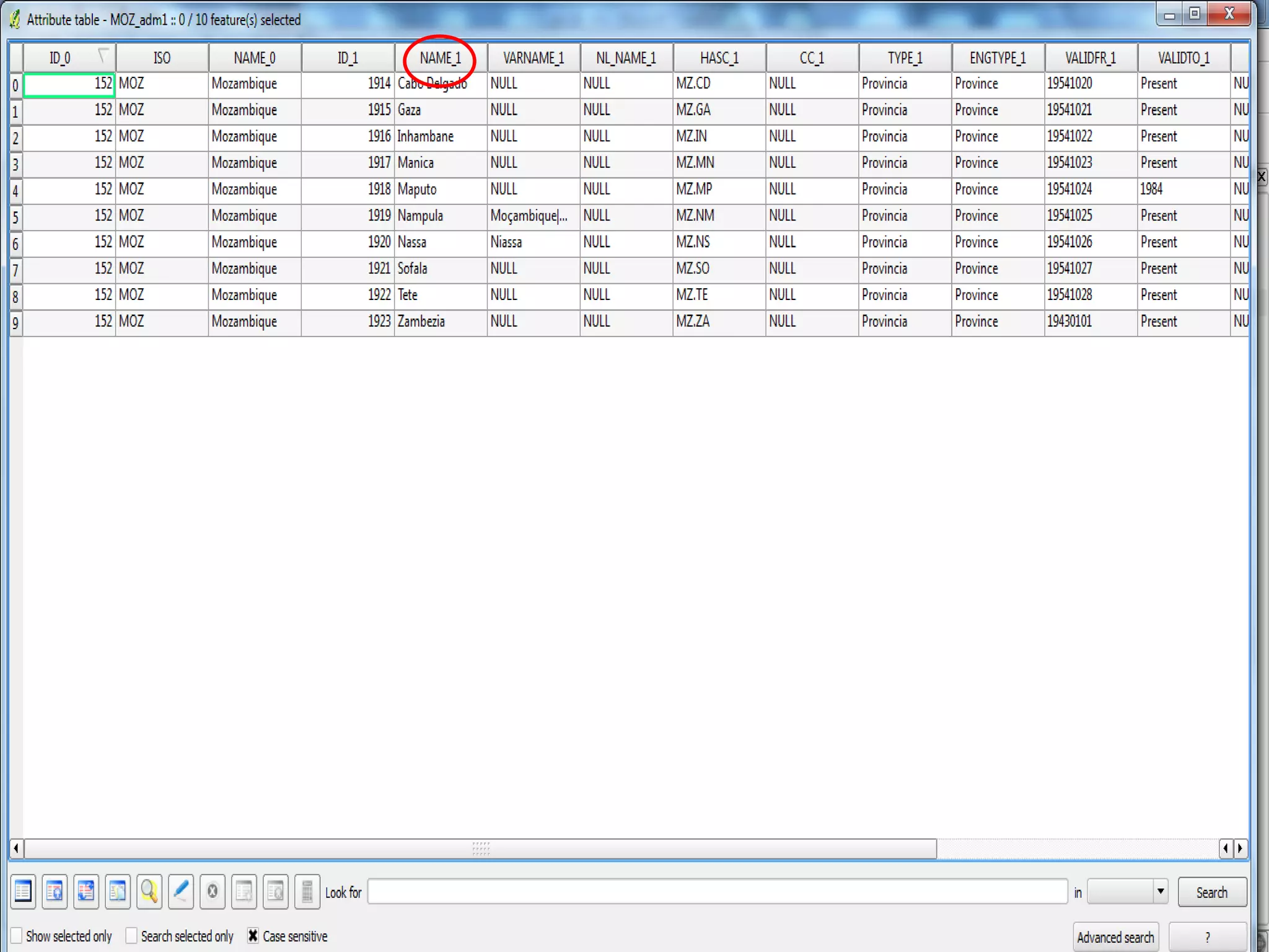
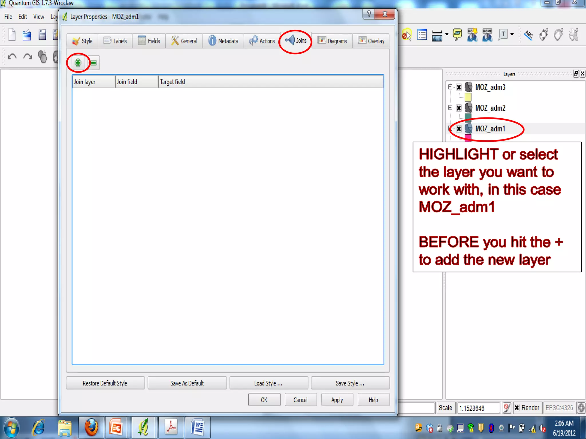
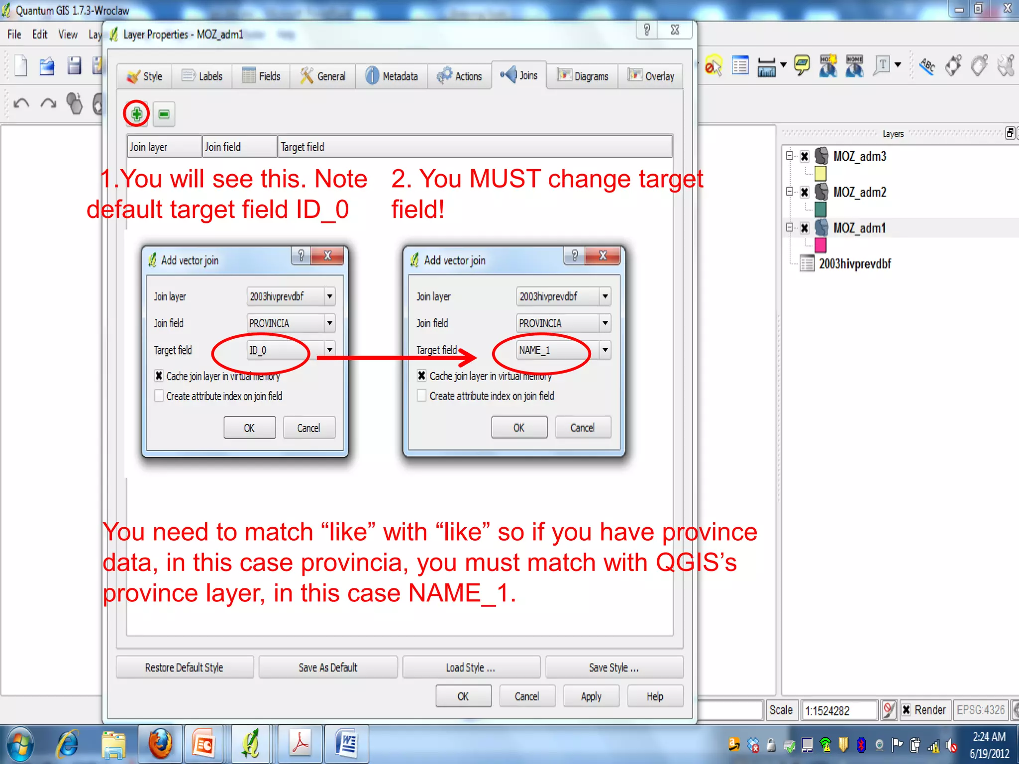
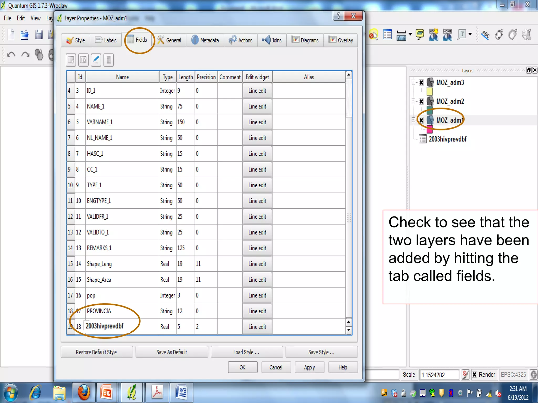
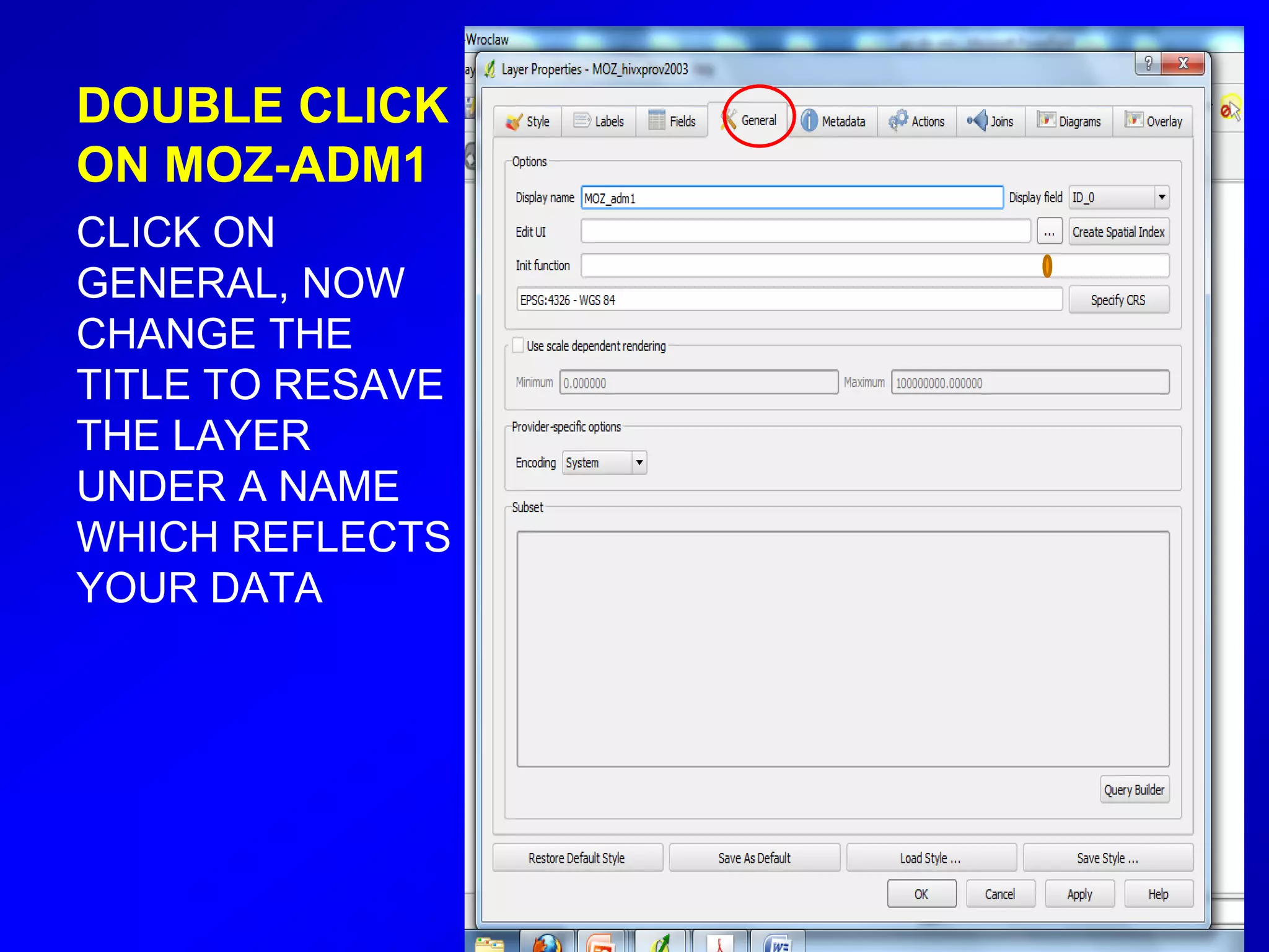
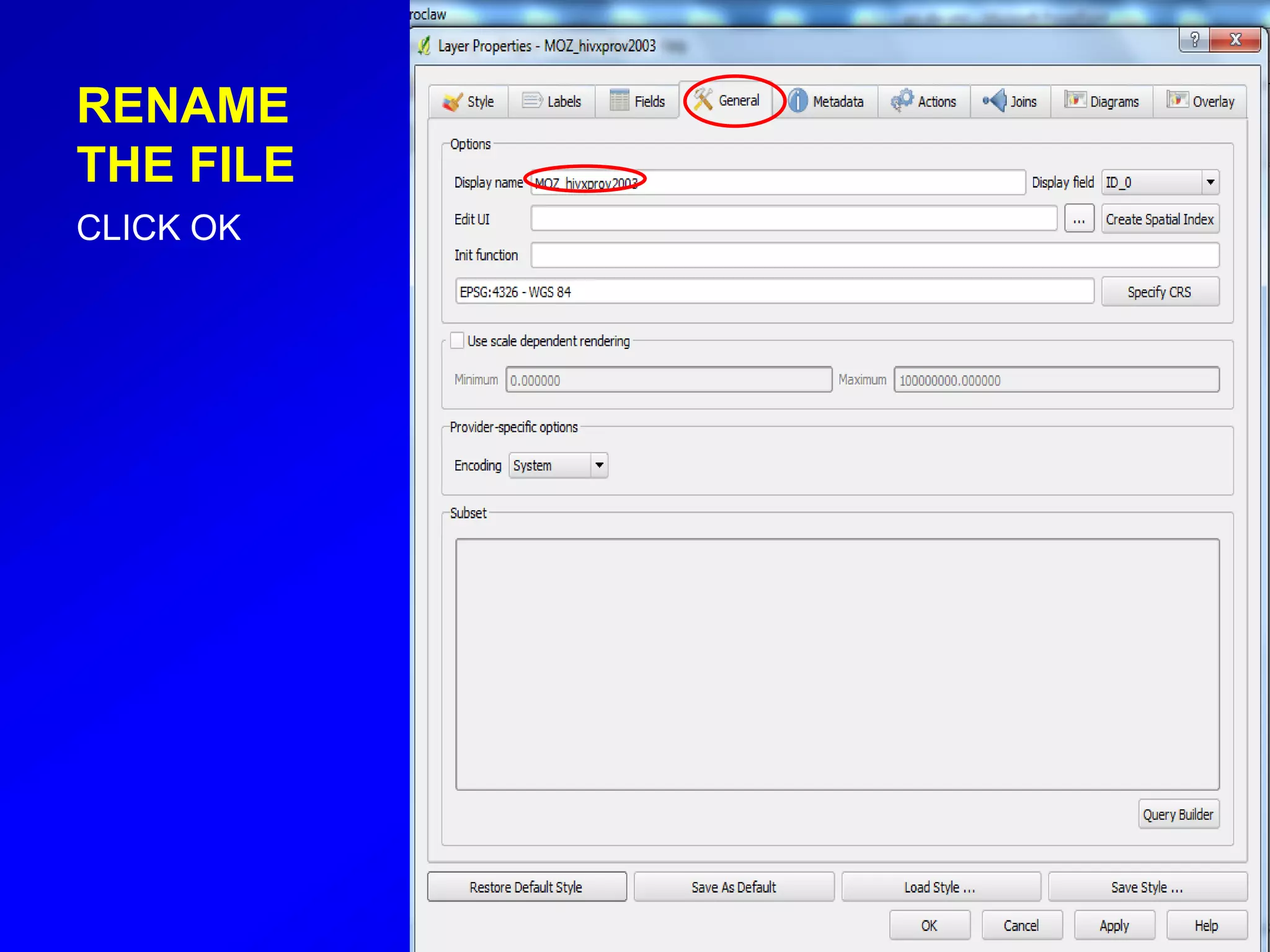
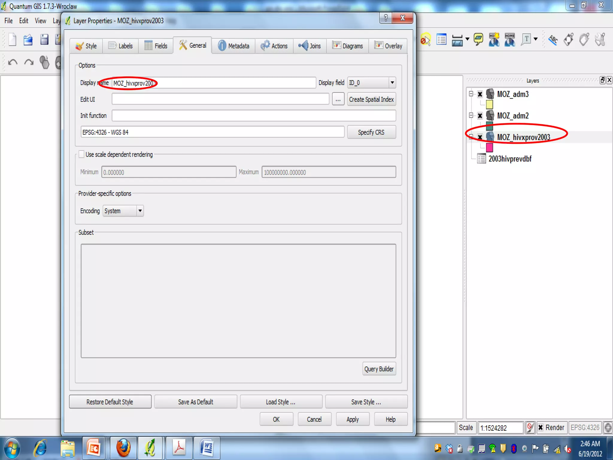
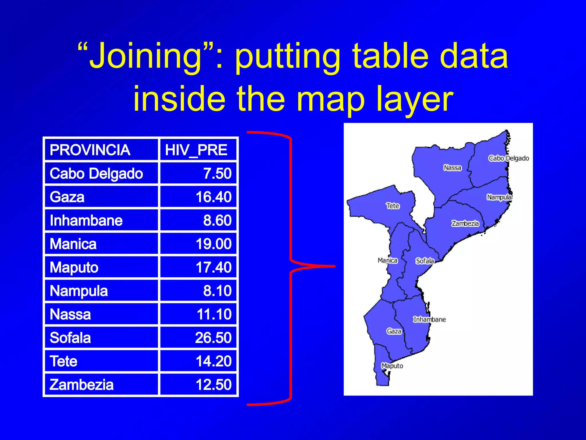
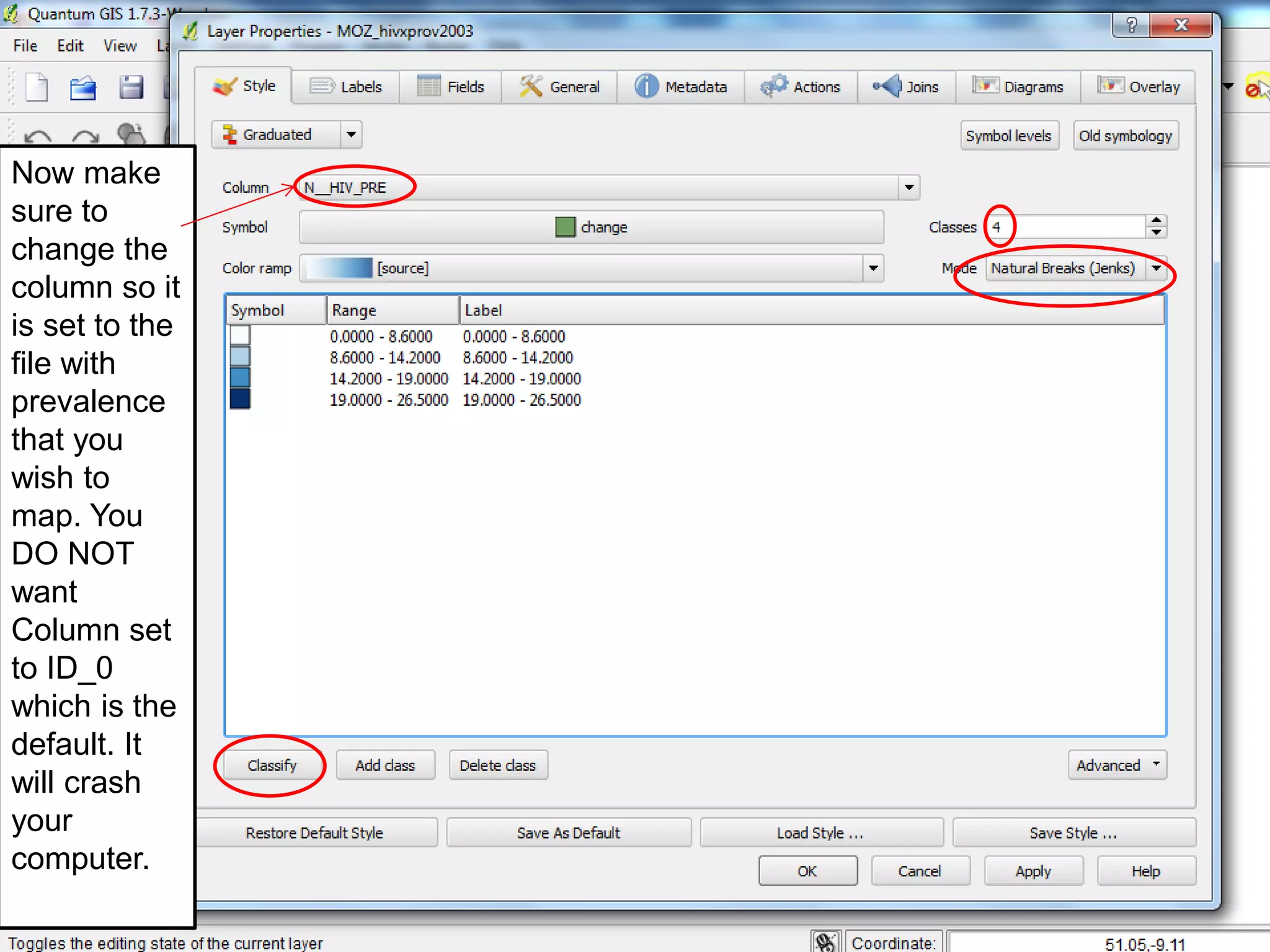
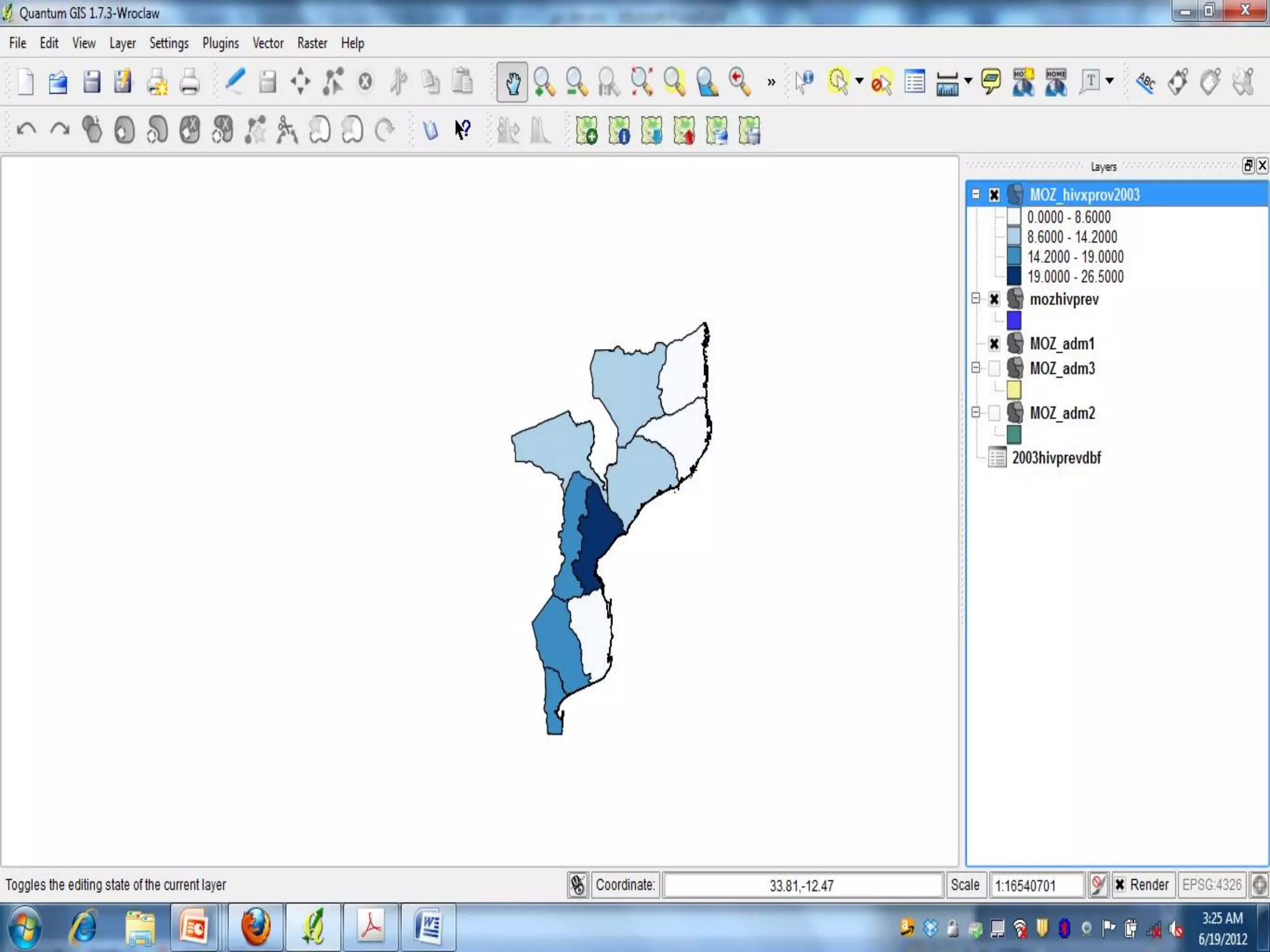
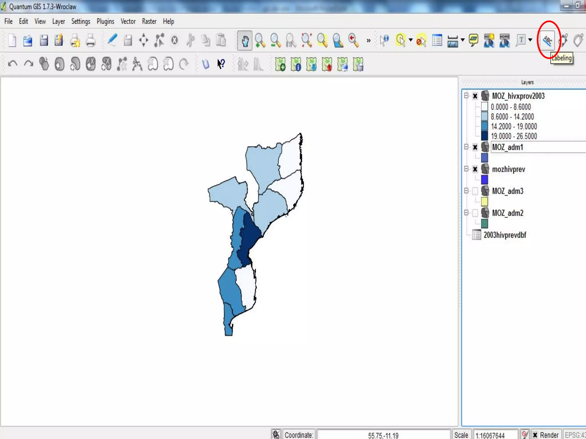
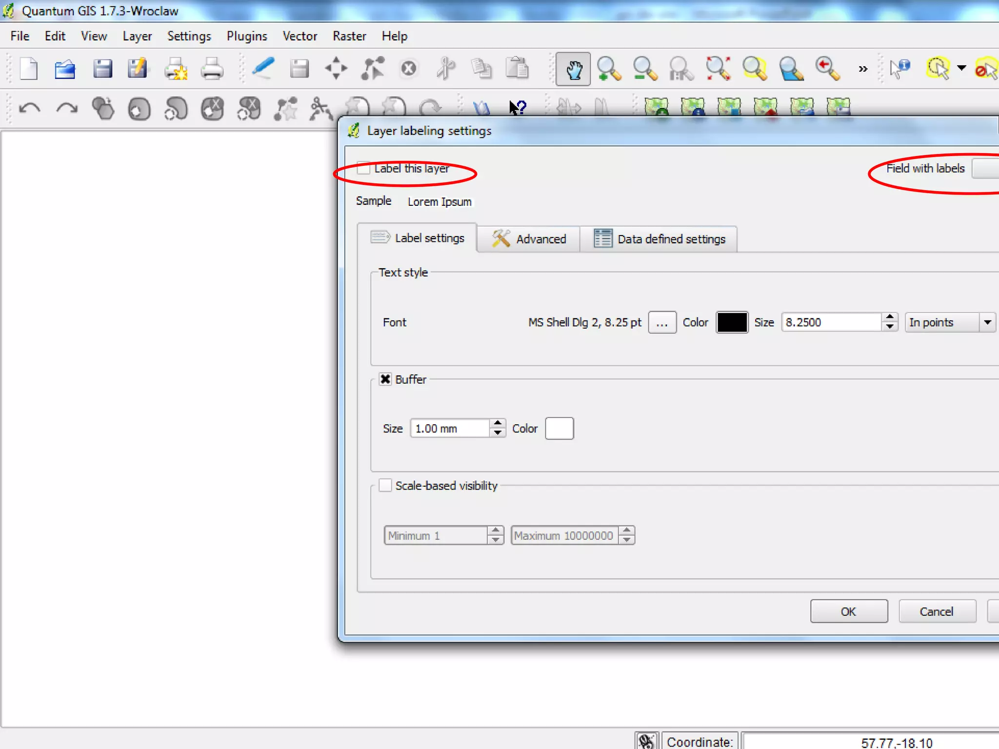
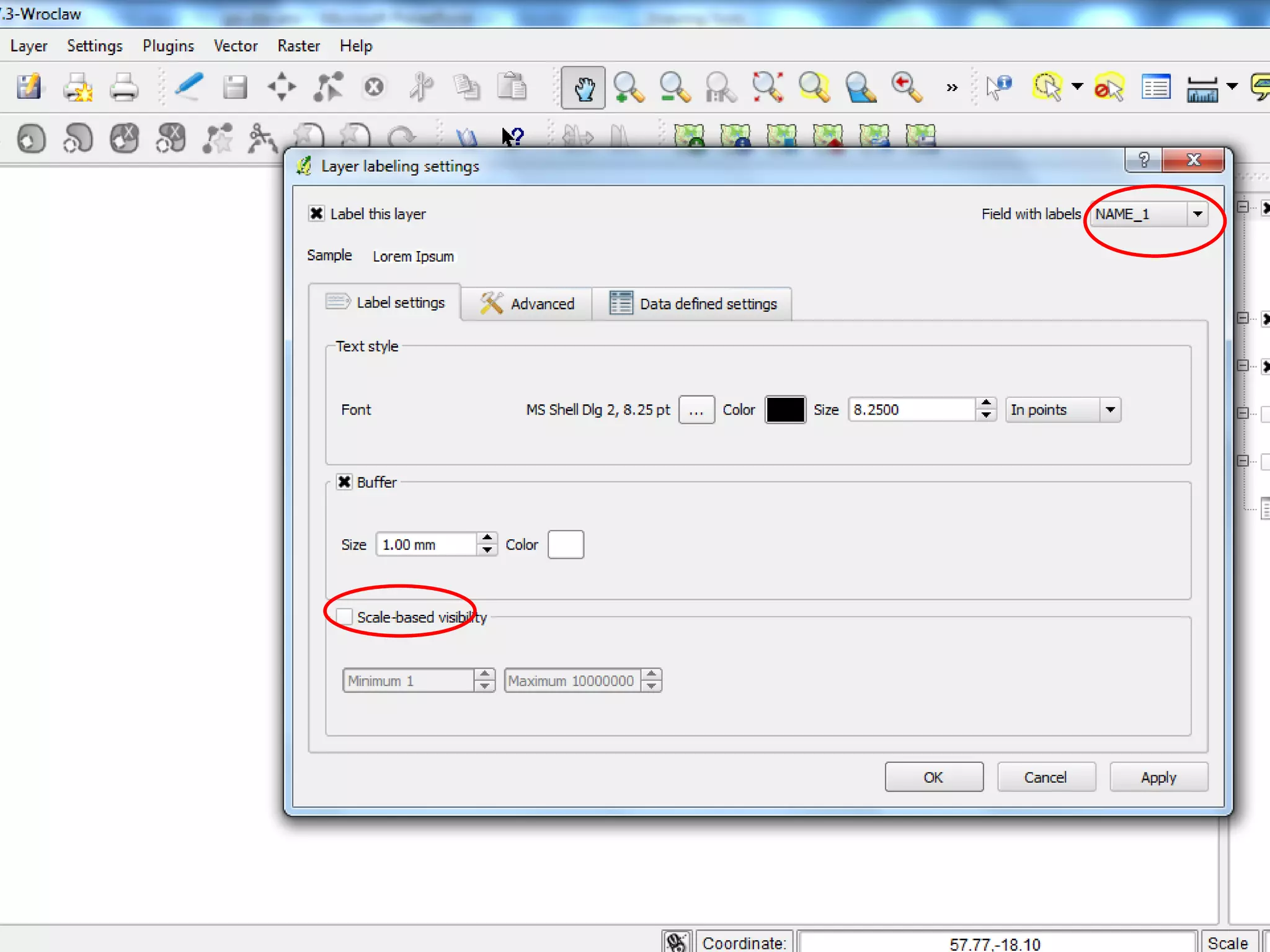
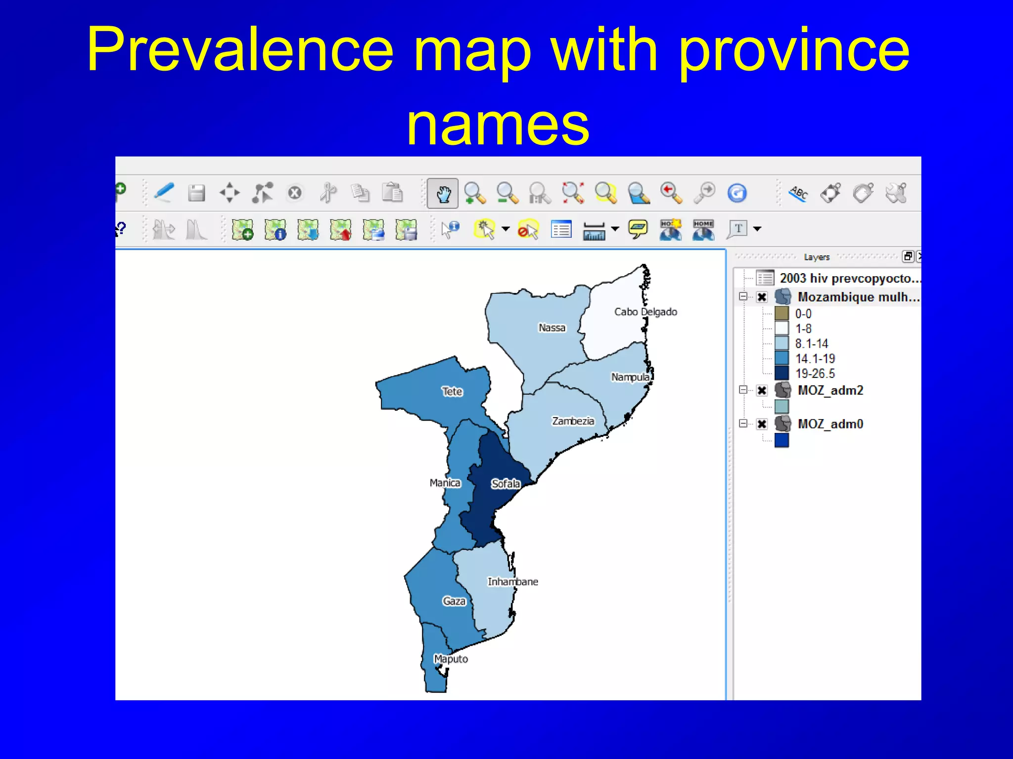
SessionTwo:
•Attribute Tables and
•JOIN: how to add data to QGIS
Why are attribute tables
important?
Attribute tables define the elements of a
shapefile and allow you to see what is
“inside” the layer. They also allow you to
zoom, highlight and select for other
operations.
“Flat File” with columns and rows
Row = geographic feature record
Column = attribute field (item of
information about a feature)
Attribute field general types
• Numeric (integer or decimals)
• Text (string)
• Date
• Blob (binary large object)
Source: http://www.esi.utexas.edu/gk12/workshops/gis/ppts.php
Each different layer has
its own attribute table
so when we open a
new one here…
ATTRIBUTE
TABLE CAN
BE USED TO
ZOOM INTO
A SELECTED
FEATURE –
IN THIS
CASE A
DISTRICT;
HIGHLIGHT
THE ENTIRE
ROW TO
SELECT IT
THE SELECTED
FEATURE IS LARGE AND
HIGHLIGHTED IN
YELLOW
YOU CAN USE THE
ZOOM FEATURES ON
THE TOOLBAR TO
ZOOMOUT TO SEE THE
SELECTION IN
CONTEXT OF THE
COUNTRY
De-select on toolbar to end
the highlighted area
JOIN
• Basic to all GIS programs is “joining”
• This is how tables of data (excel, csv,
etc) are transformed into maps
• For example, HIV prevalence by
province
Change data form
Must change the data format from EXCEL
or other database into a form that QGIS
can use
• The easiest process is using .dbf
• .dbf is an “old” data file type (dbase)
BUT shapefiles contain .dbf file data
which is why we use them
• To convert we need LibreOffice
LIBRE OFFICE
• Open Libre office and open your excel
data (name of excel file or type of data)
In Libre Office choose spreadsheet
View the data you want to add..
Save as “name”.dbf inside data
folder
Open or maximize QGIS
• You will now add your .dbf file that you
created in Libre Office to the map layers
you are already displaying
• Click on “add vector layer”
1.
2.
3.
Open “attribute layer” for
moz_adm1
• Find the column that has the name of
the provinces in it.
JOIN in QGIS
• Double click on moz_adm1
• When layer opens click on “join” tab
11.You will see this. Note
default target field ID_0
2. You MUST change target
field!
You need to match “like” with “like” so if you have province
data, in this case provincia, you must match with QGIS’s
province layer, in this case NAME_1.
Return to Map Layers and
double click on moz_adm1
Check to see that the
two layers have been
added by hitting the
tab called fields.can
you see them?
DOUBLE CLICK
ON MOZ-ADM1
CLICK ON
GENERAL, NOW
CHANGE THE
TITLE TO RESAVE
THE LAYER
UNDER A NAME
WHICH REFLECTS
YOUR DATA
RENAME
THE FILE
CLICK OK
“Joining”: putting table data
inside the map layer
Now make
sure to
change the
column so it
is set to the
file with
prevalence
that you
wish to
map. You
DO NOT
want
Column set
to ID_0
which is the
default. It
will crash
your
computer.
How to change the
classification
Double click on a row to
begin. Be sure to select
“label” afterward to ensure
that your changes are
reflected in your labels. This
is also an opportunity to
simplify the label
presentation.
Prevalence map with province
names
OK! Now try this with your
own data….
If you don’t have data make
up data to practice
Adding two variables to one
map layer
How to map a second
presentation of prevalence
onto one map: using symbols
• This step shows you how to map a
second level of prevalence, HIV
prevalence in men (MHIVPREV) onto a
map where the colors of provinces
represent the HIV prevalence of women
Here is the final map
with the male and
female HIV prevalence
Male HIV
prevalence is
represented as
the pink dots and
female HIV
prevalence is
represented
within the blue
shaded province
layers.
Now go back to the diagram
layer, where you see pie chart
and choose text diagram.
What do you think?
End session 2
Thank you!

QGIS Module 2

  • 1.
  • 2.
    Why are attributetables important? Attribute tables define the elements of a shapefile and allow you to see what is “inside” the layer. They also allow you to zoom, highlight and select for other operations.
  • 3.
    “Flat File” withcolumns and rows Row = geographic feature record Column = attribute field (item of information about a feature)
  • 4.
    Attribute field generaltypes • Numeric (integer or decimals) • Text (string) • Date • Blob (binary large object) Source: http://www.esi.utexas.edu/gk12/workshops/gis/ppts.php
  • 5.
    Each different layerhas its own attribute table so when we open a new one here…
  • 7.
    ATTRIBUTE TABLE CAN BE USEDTO ZOOM INTO A SELECTED FEATURE – IN THIS CASE A DISTRICT; HIGHLIGHT THE ENTIRE ROW TO SELECT IT
  • 8.
    THE SELECTED FEATURE ISLARGE AND HIGHLIGHTED IN YELLOW
  • 9.
    YOU CAN USETHE ZOOM FEATURES ON THE TOOLBAR TO ZOOMOUT TO SEE THE SELECTION IN CONTEXT OF THE COUNTRY
  • 10.
    De-select on toolbarto end the highlighted area
  • 11.
    JOIN • Basic toall GIS programs is “joining” • This is how tables of data (excel, csv, etc) are transformed into maps • For example, HIV prevalence by province
  • 12.
    Change data form Mustchange the data format from EXCEL or other database into a form that QGIS can use • The easiest process is using .dbf • .dbf is an “old” data file type (dbase) BUT shapefiles contain .dbf file data which is why we use them • To convert we need LibreOffice
  • 13.
    LIBRE OFFICE • OpenLibre office and open your excel data (name of excel file or type of data)
  • 14.
    In Libre Officechoose spreadsheet
  • 15.
    View the datayou want to add.. Save as “name”.dbf inside data folder
  • 16.
    Open or maximizeQGIS • You will now add your .dbf file that you created in Libre Office to the map layers you are already displaying • Click on “add vector layer”
  • 18.
  • 19.
    Open “attribute layer”for moz_adm1 • Find the column that has the name of the provinces in it.
  • 22.
    JOIN in QGIS •Double click on moz_adm1 • When layer opens click on “join” tab
  • 24.
    11.You will seethis. Note default target field ID_0 2. You MUST change target field! You need to match “like” with “like” so if you have province data, in this case provincia, you must match with QGIS’s province layer, in this case NAME_1.
  • 25.
    Return to MapLayers and double click on moz_adm1
  • 26.
    Check to seethat the two layers have been added by hitting the tab called fields.can you see them?
  • 27.
    DOUBLE CLICK ON MOZ-ADM1 CLICKON GENERAL, NOW CHANGE THE TITLE TO RESAVE THE LAYER UNDER A NAME WHICH REFLECTS YOUR DATA
  • 28.
  • 31.
    “Joining”: putting tabledata inside the map layer
  • 34.
    Now make sure to changethe column so it is set to the file with prevalence that you wish to map. You DO NOT want Column set to ID_0 which is the default. It will crash your computer.
  • 36.
    How to changethe classification Double click on a row to begin. Be sure to select “label” afterward to ensure that your changes are reflected in your labels. This is also an opportunity to simplify the label presentation.
  • 40.
    Prevalence map withprovince names
  • 41.
    OK! Now trythis with your own data…. If you don’t have data make up data to practice
  • 42.
    Adding two variablesto one map layer
  • 43.
    How to mapa second presentation of prevalence onto one map: using symbols • This step shows you how to map a second level of prevalence, HIV prevalence in men (MHIVPREV) onto a map where the colors of provinces represent the HIV prevalence of women
  • 45.
    Here is thefinal map with the male and female HIV prevalence Male HIV prevalence is represented as the pink dots and female HIV prevalence is represented within the blue shaded province layers.
  • 46.
    Now go backto the diagram layer, where you see pie chart and choose text diagram. What do you think?
  • 47.