
More Related Content
Similar to Arc Gis Traininng.pptx
Similar to Arc Gis Traininng.pptx (20)
Recently uploaded
Recently uploaded (20)
Arc Gis Traininng.pptx
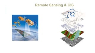
- 1. Remote Sensing & GIS
- 2. REMOTE SENSING Remote sensing is the collection of information about an object without being in direct physical contact with the object. Remote Sensing is a technology for sampling electromagnetic radiation to acquire and interpret non-immediate geospatial data from which to extract information about features, objects, and classes on the Earth's land surface, oceans, and atmosphere.
- 3. Geographic Information System An Information System that is used to input, store , retrieve, manipulate, analyze and output geographically referenced data or geospatial data, in order to support decision making for planning and management of land use, natural resources, environment, transportation, urban facilities, and other administrative records GIS
- 5. Table of Contents Open ArcMap Docking toolbars Add Data Explore the Table of Contents Use the Tools Toolbar to Navigate Within Data View Use the Identify Button Tour of ArcMap
- 6. Edit Features Save Your Edits Reshape an Existing Polygon Digitize Abutting Polygons Create a New Shapefile Edit Data in ArcMap
- 7. Use Select Features Tool Set Selectable Layer(s) Open and Dock an Attribute Table Select Features in an Attribute Table Select By Attributes
- 8. Open ArcCatalog as a Stand-Alone Program Open ArcCatalog Within ArcMap Dock the ArcCatalog Window Add Data from ArcCatalog Manage Data in ArcCatalog Optional: View Datasets using Windows Explorer ArcCatalog
- 9. Import .GPX Data Re-Project Data Add X,Y Coordinate Data to ArcMap Save X,Y Coordinate Data as a Point Shapefile GPS Data
- 10. Edit Features Save Your Edits Reshape an Existing Polygon Digitize Abutting Polygons Create a New Shapefile Edit Data in ArcMap
- 11. Add Graphic Labels Use the Label Tool Use Dynamic Labels The Label Manager Convert to Annotation Save a Layer File Working with Labels
- 12. Explore Layout View Add a North Arrow and Scale Bar to your Layout Add a Legend to your Layout Insert a New Data Frame Copy Layers between Data Frames Change the Active Data Frame Arrange Data Frames in Layout View Insert Text Adjust Legend Text in the Table of Contents Add an Extent Indicator to a Data Frame Working with Legend Properties Aligning Elements in a Layout Layout View
- 13. Tour of ArcMap 1. Open ArcMap a) Start ArcMap by double-clicking on the ArcMap icon on your desktop. If an icon is not present, you can use the Start Menu instead. Usually, you will find ArcMap if you click on: START BUTTON> PROGRAMS> ARCGIS> ARCMAP 10.1 b) When the Getting Started window pops up, click on New Maps under the “Open existing map or make new map using a template” heading on the left. c) Under My Templates, select Blank Map. Click OK at the bottom of the window to open a blank map in ArcMap.
- 15. The ArcMap Graphical User Interface (GUI) will look something like what you see below. If it looks slightly different, it’s because additional functionality (toolbars, etc.) may have been turned on or enabled by a previous user. When ArcMap is closed, it “remembers” these settings and restores them when it is reopened. Explore the ArcMap Interface. As you hold the mouse pointer over a button, a description of its function will appear in a small box below it. Take a few minutes to try out this technique. As you mouse over some of the icons and buttons, try to familiarize yourself with what each one does.
- 16. Some of the major “areas” of the ArcMap interface are labeled below.
- 17. 2. Docking toolbars Toolbars in ArcMap are sets of tools that perform similar types of functions. The Tools toolbar includes tools for navigating around the map display and tools for performing basic query functions. All toolbars can be moved around the ArcMap interface and can be “floating” windows or docked to the left, right, top or bottom of the GUI. The position of toolbars can be manipulated by clicking on the “handle” on its far left side and dragging it to a new location. a) Try moving the Tools toolbar around the ArcMap window. You can even drag it to a location on your desktop that’s completely off the ArcMap GUI, just try not to lose it! After you have finished experimenting with new toolbar locations, move the Tools toolbar back to its original position.
- 18. Add Data Now that you are familiar with the ArcMap GUI, let’s explore some GIS data. In this step, you will add data to your ArcMap document. An ArcMap document does not contain the data itself, but rather includes layers that point to data sources. In ArcMap, click on the ADD DATA button. b) Navigate to D:INTROGISDATAROAD_POLY Click ADD. c) Click the ADD DATA button again, and then navigate to C:INTROGISDATARAYPUR_TAHSIL. Click ADD. d) Click the SAVE button and navigate to D:INTROGISPROJECTS e) Save your map as Exercise1.mxd.
- 19. 4. Explore the Table of Contents The TABLE OF CONTENTS is the pane at the far left of your screen that lists the data layers that you have added to your map document – in this case RAYPUR_TAHSIL and ROAD_POLY. You will work within the TABLE OF CONTENTS anytime you are in ArcMap – it is the place to go to access layer properties, attribute tables, and more. Right now you will just get used to the way ArcMap draws data layers. a) Note that ROAD_POLY is at the top of the TABLE OF CONTENTS, and RAYPUR_TAHSIL below it. ArcMap always draws layers from the bottom of the TABLE OF CONTENTS up, so in this case towns are drawn first, and roads are drawn on top of them. Click on the layer name RAYPUR_TAHSIL and drag it to the top of the Table of Contents. What happens? (You should see that the Tahsil now cover up the roads, because they are drawn on top of the roads layer.) b) Return RAYPUR_TAHSIL to its original position below ROAD_POLY. c) Click the check box next to RAYPUR_TAHSIL on and off. Notice the effect this has. If you like, turn off ROAD_POLY and leave it off for a while – this layer can take a while to redraw
- 20. 5. Use the Tools Toolbar to Navigate Within Data View Let’s start exploring some GIS data. The Tools Toolbar, usually located either horizontally at the top of the screen or vertically at the far left of the screen, has eight tools to help navigate. It also has several other tools to help you with basic functions like selecting and identifying features, measuring distance and area, and finding XY coordinates on your map. The most common tools are briefly described below.
- 21. Take several minutes and try using each of the first 8 navigation tools on the TOOLS TOOLBAR to see how each one works. If you get stuck or lose your place, you can always click on the Earth icon on the toolbar. This is the FULL EXTENT tool. It will restore the map display to its full extent. We will get to some of the other tools later. a) You can explicitly set the display scale of your map by typing a value into the scale window on the STANDARD TOOLBAR. Try typing in something like “1 inch = 1000ft.” You can also select from a set of predefined scales. This set of scales can be customized to include a user defined scale. Give it a try. b) Use your mouse to Pan and Zoom. If your mouse has a scroll wheel, you can use it to zoom in and out and to pan around the display area. Rotate the wheel forward to zoom out and backwards to zoom in. Hold the wheel down and then move the mouse to pan around the display area. This can be a real time saver!
- 23. 6. Use the Identify Button The Identify button is very handy – it will report to you all of the attributes for any feature that you click on in your map. By default it works on the top-most visible layer in your TABLE OF CONTENTS, but you can set it to identify features from a specific layer, from all visible layers, or from all layers. a) Click on the IDENTIFY button in the TOOLS TOOLBAR, and then click somewhere in your map. If ROAD_POLY is turned off, then you will get information for whatever town you clicked on. If roads are visible, then you will get information for whatever feature you clicked on – a road or a town. b) Experiment with drawing a box with the IDENTIFY button (this will give you multiple results) and with changing the layers that the tool works on.
- 24. If you get multiple result,click here to select between them Change the layer to identify from here
- 25. Edit Data in ArcMap In ArcMap, accidentally editing the actual geography of your data (or easily changing its attributes) is prevented by an extra step: opening an editing session. In this chapter, you will start an editing session and create new features, define their attributes, and alter existing features. 1. Edit Features In this exercise, you will edit an existing polygon shapefile. Using aerial photographs for reference, you will digitize new polygons and split, reshape, and attribute existing ones. a) Start ArcMap and open an empty map document. Add some NRDA IMAGE Google imagery via Web Map Service, then add Raipur_tahsil_poly. Shp b) From the CUSTOMIZE menu, select TOOLBARS, and then click the EDITOR TOOL-BAR. c) Dock the EDITOR TOOLBAR at the top of your screen. d) From the EDITOR menu on the new toolbar, choose START EDITING. e) You need to select the folder or workspace in which you will edit. You can just select the layer (or one of the layers) you wish to edit, and its workspace will become editable. f) Double-click on Raipur_tahsil_poly to start editing. g) The Create Features window may appear. It is probably docked at the right hand side of your screen; if not, dock it there now.
- 27. h) The top of the Create Features window displays the layers that are available for editing. In our example, only Raipur_tahsil_poly is available. When you single-click on it, Construction Tools appear in the lower window. i) Start by clicking on Polygon in the CREATE FEATURES pane
- 28. f) Now you will start to digitize an additional managed area to add to the Green Mountain National Forest. Pick an area to the east of the existing polygons, and not touching them; click all the way around its border. When you are done, you can double-click or press F2. The field you just digitized does not touch any of the already digitized areas. If you want, you can practice drawing a few more isolated polygons. As you started editing, you probably noticed the semi-transparent FEATURE CONSTRUCTION TOOLBAR that followed your cursor around. It contains tools that could conceivably be helpful (and that you will use later in this chapter) but the toolbar sometimes really gets in the way! If you want the toolbar to stay visible, but get out of your way, just click the TAB button. After you have practiced with editing a bit, you may decide that you want to close the toolbar and not use it at all; if that is the case, go to EDITOR > OPTIONS > GENERAL tab and remove the check mark next to “Use mini toolbar.”
- 29. 2. Save Your Edits While you are editing, you need to remember to save your edits regularly -- possibly after adding each new feature. a) To save your edits, pull down the EDITOR menu and select SAVE EDITS. b) To save your map, click the SAVE button on the STANDARD TOOLBAR. Saving your edits and saving your map are two different things. You must remember to save your edits! Simply saving your map will not do so!! 3. Reshape an Existing Polygon Pretend for a minute that you are not happy with the job you did tracing that field, and want to change (reshape) a bit of it.
- 30. a) Click on the SELECT tool on the EDITOR TOOLBAR. b) Select the polygon you just drew by clicking on it. c) Click on the RESHAPE tool on the EDITOR TOOLBAR. d) Starting outside your polygon, digitize a half circle that dips into your polygon and finishes outside of it again. Double-click or press F2 when you are done.
- 31. d) The field should have been reshaped as if you had cut along that line and discarded the remainder.
- 32. f) See what happens if you do it the opposite way: start inside the existing polygon, digitize a line that dips out of the polygon and finished inside of it again. Another way to change the shape of your polygon is to move individual vertices. g) Click on the EDIT VERTICES tool on the EDITOR TOOLBAR. h) A new small toolbar is added to your view. i) You can select and drag any of the vertices of your polygon. You can use the + and - tools on the Edit Vertices tool bar to add and delete vertices. When you are done, click F2 j) Save your edits. 4. Digitize Abutting Polygons When digitizing polygons, one would frequently want to create polygons that perfectly abut one another -- that is, they completely share a boundary, and do not slightly overlap or have small gaps between them. This would be very difficult to do if you simply tried to trace along an existing boundary as you digitized a new polygon. Luckily there is a special construction tool just to accomplish it: the Auto Complete Polygon tool. Now you will create a polygon for the managed area to fill in an area not currently in the GMNF. Using Auto Complete Polygon to make it abut an existing polygon. a) Hold down the Shift key and select polygons surrounding an area that is mostly within GMNF. b) Choose the Auto Complete Polygon tool c) Click outside the new polygon to start delineating the area, click along the approximate boundary of the area, then double-click outside the polygon to finish your delineation.
- 34. The actual shape of the area you digitize does not matter right now -- just be sure that you understand where to start and finish when using this tool. To digitize polygons that perfectly abut other polygons, first you must select the existing polygons, then start and finish editing within them. d) After you have completed your polygon, double-click or press F2. e) Save your edits.
- 35. 5. Create a New Shapefile In this exercise, you will create a new shapefile representing either an additional managed area or something more meaningful to you! Before you can start drawing the property boundary, you will need to create an empty shapefile to work in. You will do this in Catalog. a) Open the catalog window, and browse to the folder D:INTROGISDATA. b) Right-click on the folder name and choose New > Shapefile. c) Name your shapefile New Polygon, and make it a polygon shapefile.
- 36. d) Click the Edit button at the bottom of the window to define the new shapefile’s spatial reference. Choose: Projected Coordinate Systems> State Plane> NAD 83 Meters> then scroll down until you find the VT coordinate system. Click on it then click on OK. Then click on OK again. e) Add this new layer to ArcMap, and left click on New Polygon in the Table of Contents to change its fill colour to none and its outline colour to something bright, like orange or fuchsia. f) Add the TRANS_RDSMAJ1_LINE layer to your map, and click its line symbol in the Table of Contents and change the width to 4 so that you can see it clearly f) Right click on New Polygon in the Table of Contents and select Edit Features > Start Editing. 41 g) In the Create Features window, click on New Polygon to display the available construction tools. h) With the Polygon tool, begin delineating the property boundary. Start in the southwest corner. Notice that the FEATURE CONSTRUCTION toolbar follows your cursor around for easy access. Sometimes, however, it just gets in the way. You can grab its title bar and move it out of the way.
- 37. Try the various buttons and tools in the editing toolbar and the create features window. It may be a little hard to tell at first which buttons are “on” and which are “off.” It may also not be obvious what the function of each button is – remember that Tool Tips will define the buttons for you if you hover your cursor over them for a moment. Next you will make a polygon follow the path of a road using the Trace tool. a) From the Feature Construction toolbar, choose the third option – the Trace tool. Click on the nearest road, and follow it as it forms the boundary of your property. b) When you get to the end of the bounding road segment, click once to finish tracing, and then switch tools again. From the Feature Construction toolbar, choose the first option - the Straight Segment tool. c) Continue until you have delineated the entire boundary. When you are done, you can double click to finish your sketch, press F2, or choose the Finish Sketch button on the Feature Construction toolbar. d) From the Editor menu, choose Save Edits.
- 38. Attribute Tables In this exercise you will explore the attribute tables for the layers in your map and learn how to select features based on their attributes or their location. It may seem strange to focus on the task of selecting features based on their attributes or location, but in fact, making selections is a very useful way to examine your data, and is a frequent first step in analyses. For example, if you were working on a project based in a specific town, your first step might be to zoom to that town in your view. You could do that by first selecting the town, and then choosing to zoom to your selected feature. Your next task might be to sub-set a number of state-wide datasets (such as roads or streams) to just the area of your town. To accomplish this, you would also need to first have your town selected. 1. Use Select Features Tool a) If it’s not already open, open ArcMap and the map you were working on earlier: Exercise1.mxd. b) Click on the SELECT FEATURES tool on the TOOLS toolbar , and then click on a feature in your map. c) Any feature or features that you selected should now be outlined in bright turquoise.
- 39. 2. Set Selectable Layer(s) Particularly when using the Select Features tool, it can be very difficult to figure out what you’ve selected once you have clicked somewhere. In the step above, you may have selected some roads and a town or two with just one click of the tool. There is, however, a handy way to control what can get selected: the List By Selection tab. a) Click the 4th icon from the left at the top of the TABLE OF CONTENTS – the List By Selection tab. b) The “regular” TABLE OF CONTENTS view shows you which layers are visible and in what drawing order; the List By Selection view instead shows you which layers are able to be selected and how many features in each are currently selected
- 40. c) In the example above, all layers are selectable, but only the town boundaries and cadastral features have features selected. Raipur_tahsil_poly has 2 features selected, and they are listed by name – the same goes for ROAD_POLY. Experiment with this tool a bit. d) If you had only wanted to select towns, you could click the Clear Selected Features button next to the selection results for Raipur_tahsil_poly , and only the 2 towns would remain selected. e) On your screen, Clear selected features on one of your layers, and then make it NOT selectable by clicking the “Click to toggle selectable” button next to it. f) Return to the “regular” Table of Contents view by clicking on the first icon from the left at the top of the Table of Contents: List By Drawing Order. It is probably a good habit to return to this Table of Contents view, because you will frequently want to do things like turn layers on and off and rearrange the drawing order.
- 41. 3. Open and Dock an Attribute Table a) Right click on the name Raipur_Tahsil_poly in the TABLE OF CONTENTS, and choose OPEN ATTRIBUTE TABLE. b) Drag the attribute table down and dock it at the bottom of the screen. ex: If you drag the table by its blue title bar down to the bottom of the screen until the four- way arrow appears. Hover your mouse pointer over the down arrow, and the table should dock. If you like, turn on AUTO HIDE by clicking the thumbtack in the upper right hand corner of the table. A menu is available from an OPTIONS icon at the top of the table. Other common tasks (Select by Attributes, Switch Selection, Relates) are represented by icons at the top as well.
- 42. c) Click the ADD DATA button and add D:INTROGISDATAROAD_POLY.shp d) Right click on ROAD_POLY shp and select Open Attribute Table. Notice that the ROAD_POLY.shp attribute table is docked as well, right where the RAIPUR_TAHSIL table had been. The RAIPUR_TAHSIL table is still open, and is accessible from a tab at the bottom left.
- 43. e) You can also arrange the tables so they display side by side. To do so, grab one of the tabs (RAIPUR_TAHSIL or ROAD_POLY.shp) and pull it up toward the centre of the table until the blue docking handles appear. Click on the handle to the right, and the table will dock to the right, just next to the other table. Notice that the two tables share one set of tools at the top of the attribute table window (options, select by attributes, etc.). These tools work on whichever table is selected – that is, whichever table’s title bar is blue. f) Close the WATER_WBD8VT_POLY.shp attribute table by clicking the X in its upper left hand corner.
- 44. 4. Select Features in an Attribute Table In an attribute table, you can select features by clicking on the small grey box at the far left of a row. You can click on just one row, drag down for several rows, or hold down the Ctrl key to select multiple rows. a) Experiment with selecting towns by clicking on the grey box at the left. You can clear your selection by clicking the grey box in the very upper left hand corner, or by clicking the CLEAR SELECTION button at the top of the table.
- 45. b) Notice what happens to your map display as you select rows in the table. c) After you have selected some features, try some of the other buttons and tools – use the ZOOM TO SELECTED FEATURES, CLEAR SELECTION, and SWITCH SELECTION buttons – what happens? 5. Select By Attributes The Select By Attributes dialogue lets you write a query to select features based on the values in the attribute table. a) Click the SELECT BY ATTRIBUTES button at the top of the table window. b) Select all of Addison County by the following steps: i. Double click on the field “CNTY” ii. Single click on the = operator iii. Click the GET UNIQUE VALUES button iv. Double click on the number 1 (for Addison County) c) Your statement should read: SELECT * FROM RAIPUR_TAHSIL WHERE: "CNTY" = 1 (Note that by clicking on the options as instructed above, you avoid having to know whether/where to use single quotes/double quotes, etc. You are much better off doing it this way than trying to type the statement in the dialog window!)
- 46. d) Click APPLY, then CLOSE. All of the towns in Addison County should now be selected. e) For more guidance on writing selection queries, click the HELP button in the SELECT BY ATTRIBUTES dialog. ArcGIS’s Help is actually remarkably helpful, and frequently gives very useful examples. Queries can be more complex than the ones we use here – combining multiple expressions, incorporating wild- cards, involving calculations, and so on. The help text gives many examples that may be quite useful to you.
- 47. 6. Select By Location In this next step, you will select from one feature based on its geographic location relative to another feature. Specifically, you will select all towns that Interstate 89 runs through (intersects). First you will need to select I-89, then you will select towns based on their location relative to I-89. a) Clear any selected features you may already have by clicking the CLEAR SELECTED FEATURES button on the TOOLS toolbar. b) Right click on TransRoad_RDSMAJ1_LINE and choose OPEN ATTRIBUTE TABLE. c) Click the Select By Attributes button at the top of the roads attribute table. d) Double click on the field RTNAME then click the = operator, then click the GET UNIQUE VALUES button. e) Double-Click on I-89. Your statement should read: "RTNAME" = 'I 89' f) Click APPLY and then CLOSE. g) From the SELECTION menu, choose SELECT BY LOCATION. h) Select RAIPUR_TAHSIL as the target layer, TransRoad_RDSMAJ1_LINE as the source layer. Make sure the box “Use Selected Features” is checked – otherwise it will search for any town intersected by any road. You want it to only find towns intersected by the selected road: Route 89. Note that if you wanted, you could apply a search distance – say, 10 miles – and find any towns that were within 10 miles of Route 89. i) Click OK. j) Turn off the roads layer and, if necessary, zoom to the full extent of NH so you can see the results of your selection. k) Save your map.
- 50. ArcCatalog 1. Open ArcCatalog as a Stand-Alone Program Now that you have some familiarity with the ArcMap interface, we will open the stand-alone version of ArcCatalog. (There is also a way to open ArcCatalog (with limited functionality) within ArcMap – we will do that later. ArcCatalog is the place to go to manage your data – to move or rename files, to browse through and preview your data sets, to create new empty shapefiles or geodatabases, etc. a) Click the ArcCatalog icon on the desktop or, from the Start menu choose ALL PROGRAMS > ARCGIS > ARCCATALOG 10. b) ArcCatalog is structured somewhat like Windows Explorer – there is a catalog tree on the left, and on the right you can see the contents of whatever folder you have selected in the catalog tree. If you have navigated to a folder and selected a dataset on the left, you can preview it on the right. c) In the left-hand pane, navigate to: C:INTROGISDATAENVIRON_MAREA2004_POLY.SHP. d) At the top of the right-hand pane, click on the Preview tab.
- 52. e) Notice that the same navigation tools (ZOOM, PAN, etc.) and the IDENTIFY tool that we used in ArcMap are available here as well. Feel free to zoom, pan, and identify features in the preview pan f) Right now you are previewing the geography of this dataset. You can also preview its attribute table. Choose TABLE from the drop- down list at the bottom of the preview pane. g) Scroll through the table to get a feel for the type of information it contains. You will learn more about attribute tables in the next exercise (and throughout this workshop). 2. Open ArcCatalog within ArcMap a) When you are finished exploring the ArcCatalog (stand-alone) interface, click the X in the upper right hand corner of the window to close it. Note: it is generally worthwhile to close ArcCatalog if you are not actively using it, as it can sometimes lock up your data files and make it so you cannot edit them or make any permanent changes (like adding attribute fields) to them. b) Return to your ArcMap document. c) You will now open an ArcCatalog window within ArcMap. d) Click the ArcCatalog icon in the STANDARD TOOLBAR.
- 53. e) An ArcCatalog catalog tree should appear. Depending on how the last user on your computer left it, the catalog tree may be floating in the middle of your screen, or it may be docked at the far right side of your screen. (It could actually be docked at the top, left, or bottom of your screen also, but most people seem to dock it to the right.) 3. Dock the ArcCatalog Window One useful feature of ArcGIS 10 is the ability to dock all sorts of windows (such as ArcCatalog, attribute tables, the Identify results window, etc.) along the edges of the interface. a) If your ArcCatalog window is already docked, grab its blue title bar and drag it to the centre of your screen to un-dock it. b) To dock a window in ArcMap, click on its blue title bar and—with the mouse button still depressed—drag it a little bit. As you drag it, you will see sets of blue triangles (anchors) appear. Drag the window until your mouse pointer is on top of the right-most blue anchor triangle, and then release the mouse button.
- 55. c) This technique works for many of the windows that you will use in ArcMap, though using the anchors at the sides of the interface has a slightly different effect than using the anchors at the centre of the screen. As you work in Arc-Map, feel free to experiment with these different anchor locations. d) Once ArcCatalog is docked, a small pushpin icon appears in its title bar, next to the X. If the pushpin is vertical, the docked window will always be visible. If the pushpin is horizontal, the docked window will autohide—that is, it will dis-appear until your cursor hovers over it. e) Click the pushpin to change whether your window autohides or not. Leave it in whichever position you prefer. Note that you cannot drag the window about if Autohide is ON. 4. Add Data from ArcCatalog a) In the ArcCatalog pane, expand the Folder Connections folder, and then browse to C:INTROGISDATARaipur_Tahsil_poly. b) Click on Raipur_Tahsil_poly. .shp and drag it to the left, into your map document. This is an easy way to add data to a map document (though unlike using the Add Data button, you can only add one layer at a time) – Explore this data c) Save your map. (Do this regularly!!)
- 56. 5. Manage Data in ArcCatalog You can copy, paste, move, and rename data layers in ArcCatalog, as well as create new folders, shapefiles, or geodatabases. In this example, you will make a backup version of a shapefile and rename it with today’s date. a) Right click on PRESENT_TAHSIL_MAP_NAYA_RAIPUR In ArcCatalog and choose Copy. b) Right click on the folder name DATA and Choose Paste. c) A new shapefile called PRESENT_TAHSIL_MAP_NAYA_RAIPUR copy is created. e) Rename the shapefile: Click once to select the new shapefile, and then click again to make its name editable. (If you have trouble doing this, just right click on its name and choose Rename.) Give it the name Marea2004_BackupYYYYmmdd
- 57. 7. Optional: View Datasets Using Windows Explorer You just created a new shapefile using ArcCatalog. It was very easy to do: just copy, paste, and rename one file. However, what really happened was a little more complicated: seven files were copied, pasted and renamed. You can see that this is what has occurred if you open Windows Explorer to view the files within your shapefile. The purpose of this step is simply to better understand the files that contribute to a shapefile, and why we use ArcCatalog rather than Windows Explorer to manage data. You will not be making any changes within Windows Explorer. a) Right click on the Start button and choose Explore. b) Browse to D:INTROGISDATAPRESENT_TAHSIL_MAP_NAYA_RAIPUR c) Notice how many files are present. A shapefile is not a single file – it is a collection of three or more files with the same first name (such as PRESENT_TAHSIL_MAP_NAYA_RAIPUR) and diffèrent suffixes (*.shp, *.dbf, *.shx, *.sbx, *.prj, etc.) d) Using ArcCatalog to manage your data means fewer steps for you – instead of copying, pasting, renaming, or moving three or more files, you only have to work on one. It also—vitally—means far fewer chances for error. It is far too easy to accidentally leave out one of the sub-files contributing to a shapefile, or make a typo and mis-name just one of them. Either of these mistakes can be hard to trace back and will make the shapefile unusable.
- 58. Working With Labels There are many different ways of adding text to your map -- some are very quick (and usually don’t look great) and some will take quite a while (and can be customized until they look just the way you want them). In this exercise, you will use graphic labels to label the counties on your census map, use dynamic labels to define road and highway shield labels, and use dynamic labels to label all the towns in the state. You will also set up scale-dependent rendering for some of the labels, so that your map is not too busy with labels when zoomed out, and finally convert labels to annotation so that they can be used again in other maps.
- 59. 1. Add Graphic Labels a) Return to your population map in ArcMap. It should be saved in the C:INTROGISPROJECTS folder and is called Symbology b) If ArcMap is not yet open, open ArcMap using the desktop icon, and select Symbology from the existing maps list. You may have to click “Browse for More” to locate it. c) If ArcMap IS already open, click the OPEN FILE icon and browse to the population map. Make sure that you are in DATA VIEW (not LAYOUT VIEW). One way to identify this is to see if the display looks like a page of paper, with margins around the edges – this is layout view. You can also check if the LAYOUT TOOLBAR is active; if you are in data view, each tool will be greyed out (as below). Perhaps the easiest way to confirm that you are in Data View is simply to click the data view button at the bottom of the screen. If you are already in Data View it won’t do anything; if you are in Layout view it will switch you over.
- 60. When you are labeling your data, do so in data view. If you are labeling your map page (such as adding a title or date), do so in layout view. This chapter is about labeling data, so we will work primarily in data view. a) Make sure the DRAW TOOLBAR is visible -- it is usually docked at the bottom of the screen, and has a menu called DRAWING on its left side. b) If it is not already visible, go to CUSTOMIZE > TOOLBARS > DRAW. c) Turn off all layers except PRESENT_TAHSIL_MAP_NAYA_RAIPUR . You should see just the county boundaries. d) Choose the TEXT tool from the DRAW TOOLBAR. Do this by clicking the A on the Draw Toolbar. (It should be the sixth tool in from the left; it is not available, you may have to click on the arrow next to whatever tool is visible there, and choose the A from the menu that appears.)
- 61. e) The NEW TEXT tool allows you to type text on your map. If you do this in Data View, the text will move with your data as you pan and zoom the data; if you add the text in Layout View it will stay in one place relative to the map page. Here, you will use the NEW TEXT tool to label the counties, so we are working in data view. NOTE: When you use the NEW TEXT tool, you will manually type in the text you want on your map. Later you will use tools that automatically bring in text from the data’s attribute table. f) Click in the middle of any county you know and type the name. You can use the tools on the Draw Toolbar to change the font, font size, colour, etc. of your text. Continue to add county names for the rest of VT's counties. You will need to pick up the text tool again (click on it) each time you want to type a new name.
- 63. If you do not already know the county names, this would actually take some effort to figure out from your GIS data -- you would need to return to the metadata, look at the numerical county codes for the towns, and find the county name that corresponds to each numerical code. Note that the text that you add with the NEW TEXT tool is selectable and editable. If you want, you can select a piece of text and move it to a new location, change its colour, double-click on it and change the text itself, etc. Use the arrow tool on the TOOLS TOOLBAR to select the text. The arrow tool is a handy, neutral tool to return to whenever you want to “drop” whatever tool you currently are using. 2. Use the Label Tool In this step you will practice using the LABEL tool, which will add text to your map by drawing from the data’s attribute table. You will be labeling individual towns in VT. a) Turn on PRESENT_TAHSIL_MAP_NAYA_RAIPUR in the Table of Contents. Turn off any other layers that might be visible. b) Zoom in a bit to focus on a few towns. (A scale of 1:400,000 or so may be good.) c) Choose the LABEL tool from the Draw toolbar. Do this by clicking the tiny triangle next to the on the Draw toolbar -- this will give you a menu of tools to choose from. Select the one that looks like a little luggage tag.
- 64. d) With this tool, click a few times in the middle of different towns. This tool works on whatever VISIBLE layer is on top in the Table of Contents. In this example, we have only one visible layer, so that is what it is labeling: PRESENT_TAHSIL_MAP_NAYA_RAIPUR. Sometimes, you may have many visible layers and not want to turn the rest off. In that case, you can temporarily drag the layer you want to label to the top of the Table of Contents, and remember to drag it back to its original position when you are done labeling. When you choose the tool and click on your map, you will be prompted with a LABEL TOOL OPTIONS window. You may use the default options (letting the computer choose the best placement, and using the properties set for the layer). Alternatively, you can change these options: have it place the label wherever you click, and/or choose a label style through this dialog.
- 65. e) Notice that the computer automatically labeled each town you clicked with the town name as it is recorded in the PRESENT_TAHSIL_MAP_NAYA_RAIPUR attribute table. That is because the GIS by default set the name field as the label field. You can change these settings in the layer properties.
- 66. 3. Use Dynamic Labels It would be difficult and tedious to label every town in the state using the label tool. Instead, there is an easier option: dynamic labels. This will automatically label every feature in a layer -- in this case, every town in VT. a) First, use the arrow tool to select the town labels you just added. b) Click the Delete key on your keyboard to delete them. (You can draw a box with the arrow around multiple labels, or hold down the shift key while you click on multiple labels.) c) Double click on PRESENT_TAHSIL_MAP_NAYA_RAIPUR in the TABLE OF CONTENTS to open its PROPERTIES window.
- 67. d) Click on the Label tab. For each layer that you add to a map, ArcMap chooses a Label Field -- usually “Name” if that is a heading in the attribute table. You can change these default settings -- for example, you could decide that you want to label your towns with their acreage rather than the town name. We will choose “TOWNAME” e) Put a check mark in the box in the upper left hand corner of the window to “Label features in this layer.” f) Click OK. Hooray -- every town is now labeled! And if you are still zoomed in, it might even look OK. However, as you zoom out to the whole state, you will see why this method has some drawbacks: the labels are generally too large for the towns, and -- worse -- they are not selectable or editable. (Try it -- grab the arrow tool and try to select those labels: it just doesn’t work.)
- 68. 4. The Label Manager There are a number of ways that you can refine your labels: change the text size to something smaller; set a scale dependency so that they only show up when you are zoomed in; convert them to annotation so that you can edit them individually. If your map is going to always be an electronic map that you will actively zoom in and out of, changing the text size and setting a scale dependency are good options. If your map will be a printed map and/or will always be viewed at the same scale, converting to annotation will allow you to really fine-tune the labels’ appearance. Like so many things when working with ArcGIS, there are several different paths you can take to get to the same result. Here, you can refine your labels in two different places: the LABELS tab of the PROPERTIES window, or the LABEL MANAGER available through the LABELING TOOLBAR. If you have ArcGIS v.10.1 or higher, you also have a choice of two different labeling methods: the standard label engine or the Maplex label engine. (Maplex was available in earlier versions, but only as an extra extension to the software.) The Maplex Label Engine has a number of special tools for controlling the labels; in general, these will probably make your labels look better, so we will use Maplex in this exercise.
- 69. a) From the CUSTOMIZE > TOOLBARS menu, choose LABELING. b) Dock the Labeling toolbar at the top of your screen. The LABELING toolbar and the LABEL MANAGER that you can access through it work with both label engines -- standard and Maplex. First you will quickly check out how the LABEL MANAGER works and the label options available with the standard label engine. c) Click the first icon on the toolbar to open the LABELING MANAGER.
- 70. Along its left hand side, the LABEL MANAGER displays a list of the feature layers in your TABLE OF CONTENTS. Along the right hand side, it displays basically the same label options that you would find in any layer’s PROPERTIES window, such as you worked with in the previous exercise.
- 71. The main benefit of using the LABEL MANAGER when working with the standard label engine is simply that it collects all the different layers together in one place so you can manage their labels together. Feel free to apply some changes to the PRESENT_TAHSIL_MAP_NAYA_RAIPUR label settings. For example, you may want to experiment with the placement options (horizontal vs. straight (e.g., following the long axis of the polygon)) or set a scale range. When you are done, click OK to close the LABEL MANAGER. 5. The Maplex Label Engine a) From the LABELING menu, choose USE MAPLEX LABEL ENGINE. b) Zoom in a bit if necessary to see the effect of switching to Maplex. You should see that some town names are now on two lines (“stacked” labels).
- 72. c) Open the LABEL MANAGER by clicking the first icon on the LABELING toolbar. Note that the label options are slightly different now. c) Change the PLACEMENT PROPERTIES from “Regular Placement” to “PRESENT_TAHSIL_MAP_NAYA_RAIPUR”. Click OK to see the effect of your changes. e) Scroll in and out on your map to see how the labels scale with your map. (You may find this easiest using the scroll wheel on your mouse.) Note the scale at which you think the labels get too crowded -- is it 1:100,000? 1:300,000? f) Return to the LABEL MANAGER window again. If you like, adjust the font and font size, then click APPLY. g) Click the SCALE RANGE button at the bottom of the window. h) Now click the SCALE RANGE button at the bottom of the label manager window, and within the dialog that pops up, enter the smallest scale at which you think your labels looked OK. You may also want to enter a large scale beyond which you wouldn’t want them to display -- it can look strange to be zoomed in to a very localized area and have a town name in the middle of your map. Values like 1:400,000 and 1:24,000 typically work pretty well. i) Click OK and OK to close the LABEL MANAGER window. Zoom in and out on your map to explore the scale dependent label rendering you just set up.
- 73. 6. Convert to Annotation If you want to really get into your labels and change them individually, you have two options: either you can start with graphic labels (like the County labels you added manually), or you can start with dynamic labels and convert them to annotation. Annotation is wonderful in that it can be saved outside of your map in a geodatabase and added to multiple maps, just like any other data set. Each piece of text (such as each town label) is a separate row in an attribute table, and all of the text’s properties (font, angle, colour, etc.) are attributes in that table. The downsides to using annotation are that it can be time-consuming to set up (though if you use it frequently, it will certainly save you time in the long run); the labels are no longer dynamic -- that is if you change a value in the source data (like fix a typo in a town name), that will not be reflected in the label; and they are specific to one map scale -- they will not zoom in and out with your data. So annotation is most useful for printed maps and electronic maps that are intended for a specific scale. In this exercise, you will convert town labels to annotation for a hypothetical map that will be at 1:200,000.
- 74. a) Zoom your map to 1:200,000. b) Make sure your town labels are visible and are an appropriate size for this scale. If not, make the necessary changes in the PRESENT_TAHSIL_MAP_NAYA_RAIPUR properties window to fix it. c) Create a geodatabase in which to store your annotation. From the catalog pane, expand the catalog tree so you can see the INTROGISDATA folder. Right click on the folder and select NEW > FILE GEODATABASE. d) Name the new geodatabase TownAnnotation.gdb.
- 75. e) Right click on the layer name PRESENT_TAHSIL_MAP_NAYA_RAIPUR in the TABLE OF CONTENTS and Select CONVERT LABELS TO ANNOTATION. f) In the window that appears, confirm that the selections are to store annotation in a database and the reference scale is 1:200,000. g) Click the browse button to identify the geodatabase where the annotation will be stored
- 76. h) Browse to the new geodatabase you just created and double-click to open it. Click SAVE. i) Instead of the default name PRESENT_TAHSIL_MAP_NAYA_RAIPUR, name the new feature class PRESENT_TAHSIL_MAP_NAYA_RAIPUR _200k. This way you know the scale at which the annotation should be used. You could conceivably create several different annotation layers for different scales. j) Click CONVERT. k) Notice that a new layer has been added to the TABLE OF CONTENTS -- this is the annotation. Turn it off, and then on again. l) Because it is a new layer, just like the other layers in your map, it can now be edited. However, that will require starting an editing session - We will work on that later in the Develop New Data chapter. m) Turn the layer off for now, as the next exercises will work on adding other refinements to dynamic labels. 8. Use a Label Expression So far, you have used a field directly from the attribute table to label your data. You can instead formulate an expression for your labels. In this example, you will label each town with its name AND acreage. a) Open the PRESENT_TAHSIL_MAP_NAYA_RAIPUR Properties window again. On the label tab, check the box at the top: “Label features in this layer.” (This turns the labels back on; converting to annotation earlier automatically turned them off.) b) From the Label tab on the PROPERTIES window, click EXPRESSION. c) Enter the following statement in the Expression window: [TOWNNAME] & vbNewLine & round(([area]/1000000),0) & " sq. Kilometres"
- 77. d) You can also enter the field names [TOWNNAME] and [area] by clicking on them in the field list at the top of the Expression window.
- 78. This is a great place to click the HELP button -- it gives a lot of examples of ways to build expressions, with helpful reminders of the necessary syntax. e) Click OK, and then OK again to apply your changes. Depending upon the current scale of your map, you may need to zoom in to see the labels. f) Once you have checked them out, you can turn them off. The quickest way to turn labels on and off is just to right click on the layer name in the Table of Contents and click on Label Features.
- 79. 8. Save a Layer File The changes you made to the layer properties for PRESENT_TAHSIL_MAP_NAYA_RAIPUR can be saved in a layer file -- as can all the settings in the Properties window. This way, the next time you add the PRESENT_TAHSIL_MAP_NAYA_RAIPUR.lyr layer to a map, it will include the label settings you just designed. a) Right click on PRESENT_TAHSIL_MAP_NAYA_RAIPUR in the TABLE OF CONTENTS. b) Choose SAVE AS LAYER FILE. c) Browse to D:INTROGISDATA d) Save your map. You may have noticed that sometimes labels take a long time to draw each time you zoom or pan your map. You can click the PAUSE LABELING button on the LABELING TOOLBAR to just stop labeling for the time being. You will need to click the PAUSE LABELING button again to resume labeling.
- 80. Layout View Layout View is where you prepare your map for exporting, publishing, or printing. It is where you can add all the extra elements that enable it to communicate its message to the reader: title, legend, scale bar, north arrow, date, text about data sources, etc. It also functions a bit like Print Preview for your map – you can see the page margins and how all these map elements will fit together on the page. 1. Explore Layout View a) If it is not already open, open your Symbology map. So far in this workshop, you have always been working in Data View. Now you will switch to Layout View. Layout View is where you can add the elements that your map needs to be understandable to someone else.
- 81. b) Click the tiny Layout View button at the bottom of the ArcMap interface.
- 82. c) When you switch to Layout View, a new toolbar becomes available to you: the LAYOUT TOOLBAR. (It was probably already docked in your ArcMap interface, but until you switch to Layout View, it is all greyed out.) If it is not yet docked, drag it toward the top of your screen and dock it up there. The LAYOUT TOOLBAR contains several tools that probably look familiar – they are very similar to the navigation tools on the TOOLS TOOLBAR. To distinguish them, each of their icons has the image of a sheet of paper in the background. The navigation tools (like Zoom and Pan) on the LAYOUT TOOLBAR and TOOLS TOOLBAR work quite differently. The Layout tools will zoom and pan you around the map page –for example, to look closely at the legend – while the zoom & pan from the TOOLS TOOLBAR will move you around the data itself. You can still use the data zoom and pan while you are in Layout view!
- 83. The zoom and pan tools from the LAYOUT toolbar will change your position on the layout itself -- they will zoom in to the piece of paper, or move the paper to the right or left. They will not change the position of the data in the map. These tools zoom in, out, and pan around your page. The zoom and pan tools from the TOOLS toolbar will zoom in or out of the data itself, or pan the data around, just like they did in data view. d) Practice using the LAYOUT toolbar. i. Pick up the ZOOM tool, and draw a box to zoom in to the layout. ii. Pan around the map with the PAN tool. iii. Zoom back out by clicking the ZOOM TO FULL PAGE button. These tools zoom in, out, and pan around your data.
- 84. e) Now compare what happens when you use the TOOLS toolbar. i. Pick up the ZOOM tool from the TOOLS toolbar, and draw a box to zoom into the data. ii. Pan around the data with the PAN tool from the TOOLS toolbar. iii. Zoom back out by clicking the ZOOM TO FULL EXTENT button.
- 85. 2. Add a North Arrow and Scale Bar to your Layout Without some standard map elements – such as a legend and scale bar – it may be difficult for others to use your map. a) From the INSERT menu, choose INSERT NORTH ARROW. Choose a north arrow style, and click OK. b) The north arrow is placed on the map. It has “handles” at the corners that allow you to resize it, and you can click in the middle and drag it anywhere on your page. If you decide you want to change its style, just double click to open its properties and then you can change it. c) Insert Scale Bar. Choose a style and Click OK. d) To get the scale bar to look the way you want it, you will have to open and manipulate its properties. e) Double-click on the scale bar to open its properties.
- 86. f) On the Scale and Units tab, try changing the instructions for resizing to “Adjust width.” Then you can specify exactly how wide you want each division of the scale bar. g) Try setting the units to Miles, the division length to 10, and the number of divisions to 5. Click OK to see how this affects the scale bar. Feel free to play with these settings until you make it look the way you want. h) Save your map.
- 87. 2. Add a Legend to your Layout a) From the INSERT Menu, choose INSERT LEGEND. The Legend Wizard will appear. b) In the first window, choose which layers to include in the legend. You may want to choose just the census data, or the census data and the political boundaries. To add layers to the legend, use the arrow button to move them from the left-hand pane to the right-hand pane. c) Click Next through the next several windows until you can click Finish. d) The Legend is placed on your map. 4. Insert a New Data Frame Now you will insert a new data frame so your final map can include two geographic areas -- one a view of political boundaries, and the other a view of Census Data. a) Right click on the name Layers at the top of your Table of Contents -- this is the name of your current data frame (the only one now in your map). It is the default name that ArcGIS always gives to the first data frame in a map. Select PROPERTIES. b) On the GENERAL tab, make the name “Political Boundaries.” Click OK. c ) From the INSERT menu, choose DATA FRAME. Your map may disappear -- that is ok! In data view, you can only look at one data frame at a time, and you are now looking at your new, empty one. d ) Scroll down (if necessary) in the Table of Contents, and right click on NEW DATA FRAME. Select PROPERTIES. e) On the GENERAL tab, make the name “Population” f) Click OK.
- 88. 5. Copy Layers between Data Frames The current “active” data frame will be in Bold type text in the Table of Contents, and only the layers from this active Data Frame will be visible in Data View. If your new Population Data Frame is active ( you can make it active if it is not by right-clicking on its name and choosing “Activate”) and if you were to click the Add Data button right now, the data would be added to the Population data frame, not the Political Boundaries one. Another way to get data in to the data frame is just to copy or drag it in from the other data frame – this will make a virtual copy of the data for viewing and mapping, not a real copy. a) Drag the Census data from the Political Boundaries data frame down to the Population data frame 6. Become comfortable Changing the Active Data Frame Right now, the data frame Population is active--that is, it is visible in the DISPLAY AREA, and its scale is reflected in the scale box at the top of the window, and if you were to pan or zoom, you would be doing so in the Population data frame. a) To view the Political Boundaries data frame, right click on Political Boundaries in the TABLE OF CONTENTS, and select ACTIVATE. – note the scale b) Return to the Population data frame by right clicking on Population and selecting ACTIVATE, and notice that you are in a different scale now.
- 89. 9. Arrange Data Frames in Layout View a) Switch to LAYOUT VIEW by clicking the small paper icon at the bottom of the screen. b) Temporarily turn off the census data in each data frame to speed up the time it takes your map to redraw as you move things around. c) Adjust the sizes of the two data frames so that Political Boundaries takes up the entire page, and Population is just a small box. You can adjust the size of a data frame by selecting the data frame and dragging on any of its handles. Remember to use the ZOOM and PAN tools from the TOOLS toolbar, not the LAYOUT TOOLBAR d) Save your map.
- 90. 8. Insert Text a) Click on the NEW TEXT tool on the DRAWING toolbar. b) Click anywhere at the top of the page to insert a text box. You are adding text in Layout view, so the text will stay with your map page as you zoom around or change the extent of your data. This is just like how you added text labels in Chapter 6, but in that case you added them in Data view, so the text stayed with your data as you changed its extent. c) Change the font size to 24 (type it in the font drop down box, and press enter). d) Double-click on the text box to bring up the TEXT PROPERTIES dialogue.
- 91. e) Type “Political Boundaries and Population of Vermont - 2010” in the title text box. Press OK. f) Drag the title to the top of the map. g) From the INSERT menu, choose DYNAMIC TEXT > CURRENT DATE. h) The date is added as a text box in the centre of your map. Drag it to a bottom corner, and make the font smaller. i) Double click on the date to open its properties. You will see that it has the word Date: followed by some tagged text that contains the code to insert whatever the current date is. Replace the word “Date” at the beginning with “Map prepared:” Click OK.
- 92. 9. Adjust Legend Text in the Table of Contents It is somewhat counter-intuitive, but in order to change the text in your legend, you need to make adjustments to the layers themselves – either in the TABLE OF CONTENTS or through the layers’ Properties windows. a) Make sure that the Population frame is the active frame. b) Add a legend by selecting LEGEND from the INSERT menu. Note that the layers available in the legend wizard are based on whatever frame is active right now. 83 c) Click Next through the rest of the wizard pages to add the legend to your map. You will refine it later. d) Remember that the legend is looking at the data in the Population data frame. Therefore, to change the legend, you need to change the look of the census data in the Population data frame not the Political Boundaries one. e) In the TABLE OF CONTENTS, change the layer name “DEMO_COUSUB2010_POLY” to “Population 2010.” You can do this by simply selecting the text and then clicking it again to make it editable. Hit enter when you are done. e) You can change the number formats for the housing vacancy categories in this same manner. For example, if the text reads, “0.000 - 0.03000”, you can select it and change it to “Less than 3%” . “0.03001 - 0.08955” can become “3 - 9%”, and so on. f) If you want to change the actual symbology or classification of the data (e.g., make the classes break at whole numbers, or at equal intervals), you will need to go back to the Symbology tab on the Properties window, click Classify, and make your changes to the Label associated with each Range. g) Change the name Boundary CNTYBNDS in the Political Boundaries data frame to “County Boundaries”. g) Save your map.
- 93. 10. Tips for Working with Legend Properties NOTE: See below (step 11) if you are working with ArcGIS version 10.0 or earlier. The legend editor has changed in version 10.1, and the instructions here pertain to v.10.1. or greater To change the appearance of your legend (other than the wording, which you changed in the TABLE OF CONTENTS, above), you need to open the legend properties. Do this by double-clicking on it or by right clicking and selecting PROPERTIES. The Properties window has five tabs: LEGEND, ITEMS, LAYOUT, FRAME, and SIZE & POSITION. Use the arrow buttons on the General tab if you want to add or remove any layers from your legend. The ITEMS tab is where you will work to change many aspects of your legend’s appearance.
- 94. For example, if you want to remove the heading P003001 from the population item in the legend -- so that it only says “Population 2010” with the symbol colours and labels below it -- you would start on the Items page. First you need to understand that “Population 2010” is the layer name, and “P003001” is the heading, and text like “0-998” is a label. Click the Style button, and then choose from the list of legend thumbnails one that does not show a heading, just the layer name and labels. As you click on different styles, your choice is displayed in the preview thumbnail. The default is to show the Layer Name, Heading and Label; it is often nice to instead choose a style that includes only Layer Name and Label, or even just Label.
- 95. 11. Working with Legend If you want to make the “Legend” title go away (or change it to a different word), go to the LEGEND tab and either click the check mark next to “SHOW” (to hide the title) or type new text in the text window. Remove the checks from the check boxes at the bottom if you want items to stay displayed in the legend even if turned off or re- ordered in the TABLE OF CONTENTS. It can be very frustrating to set up your legend just the way you want it, only to have ArcGIS reorder it for you when you rearrange layers in your map.
- 96. Use the FRAME tab to give your legend a frame (draw a line around it), a solid background (rather than transparent) or a drop-shadow. Adding a value for a gap in both the X & Y directions for the border and the background will make increase the size of the margin from the legend to the border.
- 97. 12. Aligning Elements in a Layout a) Hold down the CTRL key, and select the both title text box and the Political Boundaries data frame. b) Right-click and select ALIGN - ALIGN TO MARGINS. This turns on the ALIGN TO MARGINS option, which means that the next alignment command you give will occur relative to the margins, not to other objects on the page. c) Right-click again, and select ALIGN - CENTER. Both objects are centred between the left and right margins. d) Hold down the CTRL key, and select the Population data frame, and then select the Political Boundaries data frame (in that order). e) Right-click and select ALIGN - ALIGN TO MARGINS. (This turns off the ALIGN TO MARGINS options.) f) Right-click again select ALIGN - LEFT. The left side of the Population data frame, which was the first object you selected, is aligned to the left side of the Political Boundaries data frame, which was the last object you selected. g) It may also be useful to add Guides to your map -- these are lines (invisible when printing) to which you can snap and align objects. To add guides, simply click in the ruler area at the top and side of the layout display window. If you don’t see the ruler or the guides, go to the View menu and make sure both are turned on. h) Save your map.