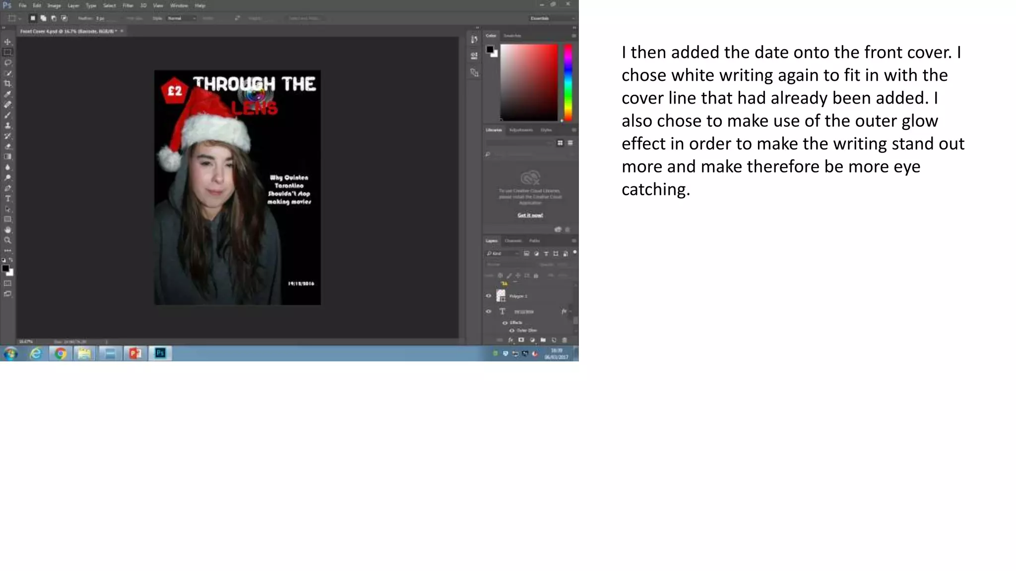
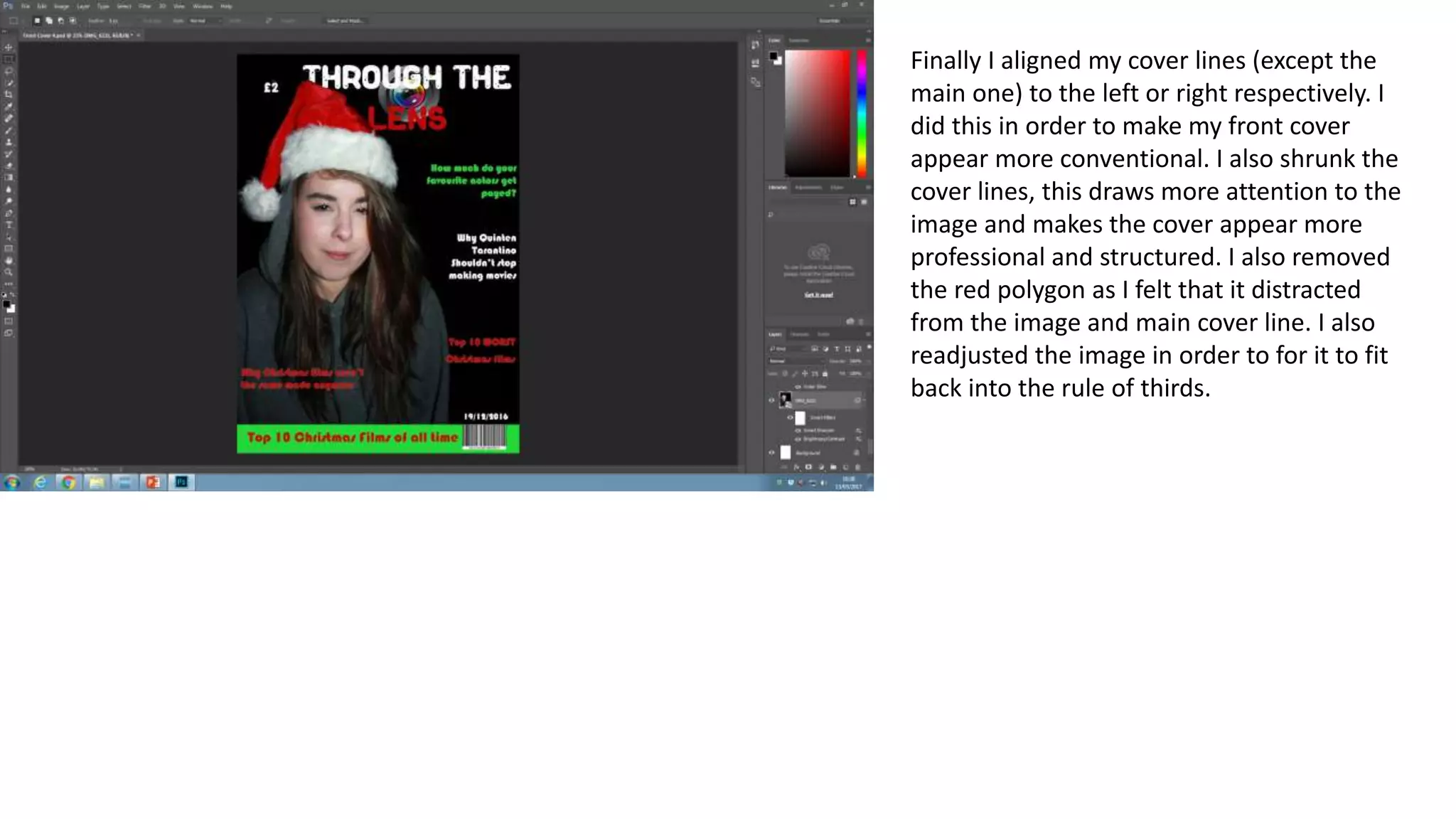
The document describes the steps taken to design a magazine cover in Photoshop. First, the image was cropped and positioned according to the rule of thirds. Then various design elements were added like the masthead in white and red, a lens image behind the masthead, and cover lines in white, red and green to fit the Christmas theme. Additional elements like a barcode, date and rectangles were positioned strategically. Color, font size and effects were adjusted to make the cover visually interesting and professional looking while fitting the theme.
2137ad - Characters that live in Merindol and are at the center of main storiesluforfor
Kurgan is a russian expatriate that is secretly in love with Sonia Contado. Henry is a british soldier that took refuge in Merindol Colony in 2137ad. He is the lover of Sonia Contado.
2137ad Merindol Colony Interiors where refugee try to build a seemengly norm...luforfor
This are the interiors of the Merindol Colony in 2137ad after the Climate Change Collapse and the Apocalipse Wars. Merindol is a small Colony in the Italian Alps where there are around 4000 humans. The Colony values mainly around meritocracy and selection by effort.
Hadj Ounis's most notable work is his sculpture titled "Metamorphosis." This piece showcases Ounis's mastery of form and texture, as he seamlessly combines metal and wood to create a dynamic and visually striking composition. The juxtaposition of the two materials creates a sense of tension and harmony, inviting viewers to contemplate the relationship between nature and industry.
Explore the multifaceted world of Muntadher Saleh, an Iraqi polymath renowned for his expertise in visual art, writing, design, and pharmacy. This SlideShare delves into his innovative contributions across various disciplines, showcasing his unique ability to blend traditional themes with modern aesthetics. Learn about his impactful artworks, thought-provoking literary pieces, and his vision as a Neo-Pop artist dedicated to raising awareness about Iraq's cultural heritage. Discover why Muntadher Saleh is celebrated as "The Last Polymath" and how his multidisciplinary talents continue to inspire and influence.
1. I started by first inserting the image into Photoshop
and then using the crop tool to make the image the
correct size with correct headroom and positioning the
image in a way to make use of the rule of thirds and
ensuring that there is enough space for coverlines. I
also resized the image to fit with conventions of a
magazine.
2. I then added the masthead, choosing to have
‘through the’ in white and ‘lens’ in red in order to fit
in with the theme of this front cover, Christmas. I
also chose to use the rubber tool to make the
masthead look like it is behind the model. I chose to
use the font I did as it fits with the Christmas theme.
3. I then added the image of a lens behind the
masthead, I did this by making sure the layer
that contained the image was lower than the
layer that contained the masthead. I used the
eraser tool to remove the necessary detail of
the image, I did this in order to make sure
that it was just the lens itself that is featured
in the magazine cover.
4. I then added the first cover line, I chose to have
the text appear in white so that it would appear
very clearly on the black background. I placed
the cover line next to the models shoulder as
that is a place where there is the most
background space.
5. Next, I added a polygon, I chose that I would
make this shape red and the writing within it to
be white. I chose these colours to fit into the
Christmas theme of my front cover, I also chose
them as they fit in well with the black
background I chose to use.
6. I then added the date onto the front cover. I
chose white writing again to fit in with the
cover line that had already been added. I
also chose to make use of the outer glow
effect in order to make the writing stand out
more and make therefore be more eye
catching.
7. I then added a green rectangle which I chose
to use a colour overlay on in order to make it
stand out more and fit the Christmas theme. I
then added the main cover line, which I
placed into the green rectangle in order to
make it clear that this is the main and most
important cover line. I chose to have this
cover line be red in order to fit in with the
Christmas theme.
8. I then added in the image of the barcode,
doing this allows my magazine cover to
appear realistic and I chose to place it in the
bottom right corner in order to remain
conventional and so the barcode doesn’t get
in the way of the content of the front cover.
9. I then added the third cover line, this time
however I chose to have the font colour as
red, this is in order to keep within the
Christmas theme and make the cover lines
more diverse and therefore noticeable. I
chose to place this cover line below the 1st
as I planned on placing one above iot that
was green and buy having the 3 different
colours in a line it makes the cover of the
magazine visually interesting.
10. I then added the 3rd cover line which this time I
chose to have in green, this is to fit with the
Christmas theme of this magazine cover. I
decided to position this cover line near the
masthead as there is no green near there, this
makes this cover line more attention grabbing
as it stands out due to being the only green
writing.
11. I then added the final cover line, I chose to have
the font colour as red, a conventional Christmas
colour. I placed it at the bottom of the page in
order for all the red cover lines to be close to
each other, making my front cover appear more
structured.
12. I then adjusted then adjusted the smart
sharpen and the brightness and
contrast. I did this in order to make the
model’s face stand out more, I also
chose to do this as I thought it made
the image more striking and overall
look more proffessional.d
13. Finally I aligned my cover lines (except the
main one) to the left or right respectively. I
did this in order to make my front cover
appear more conventional. I also shrunk the
cover lines, this draws more attention to the
image and makes the cover appear more
professional and structured. I also removed
the red polygon as I felt that it distracted
from the image and main cover line. I also
readjusted the image in order to for it to fit
back into the rule of thirds.