The document describes the process of designing a magazine content page. Key points:
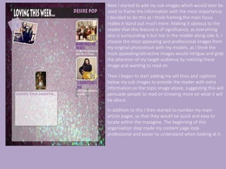
- The creator started by adding generic elements like a masthead and subheading. The masthead "Loving This Week" was positioned in the top left to imply importance while not drawing focus from the central content.
- A subheading with the magazine name was made smaller and less dominant to not take attention from the masthead.
- Transparency was added over the background to make text and features clearer.
- Sub-images were added and framed to draw focus to important topics. Captions were then added below to provide more information.
- Main articles were numbered for easy location. A content table with page