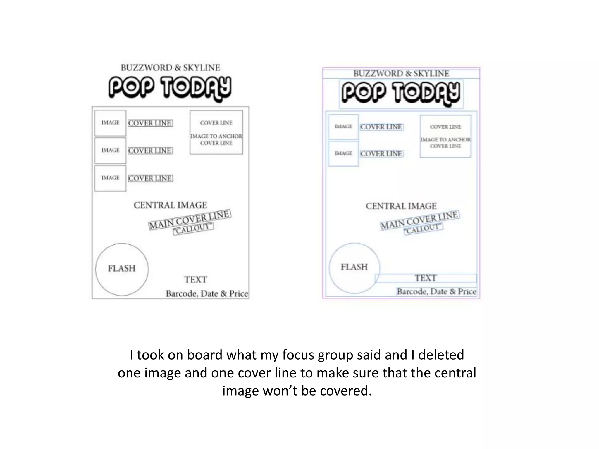
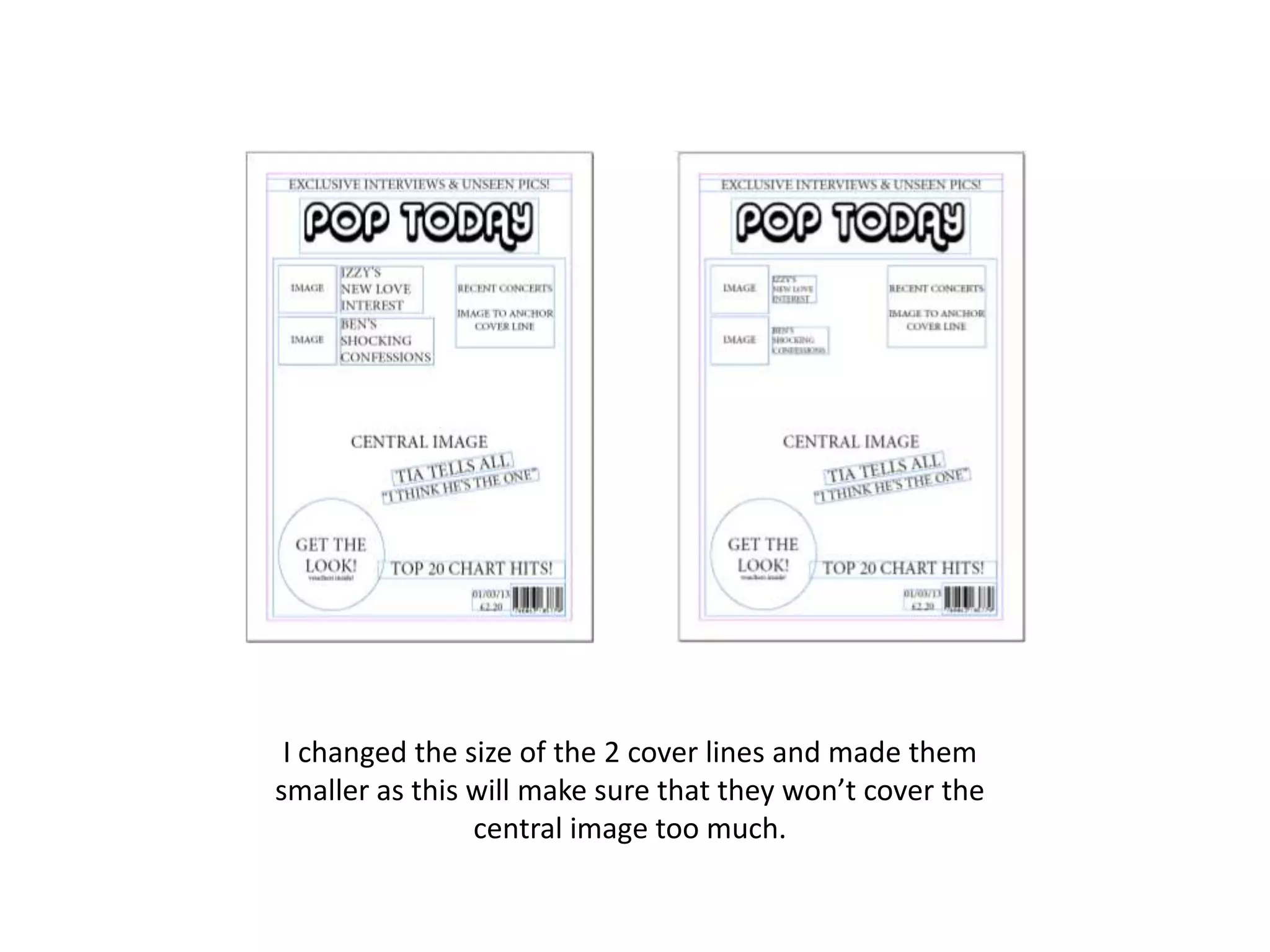
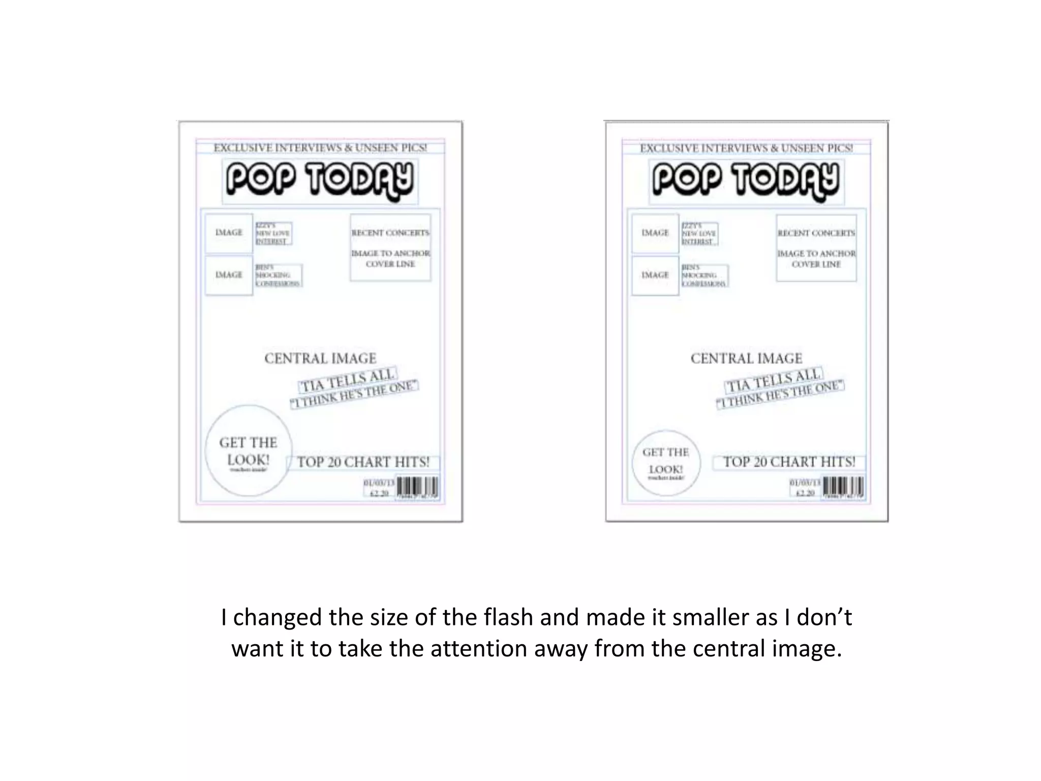
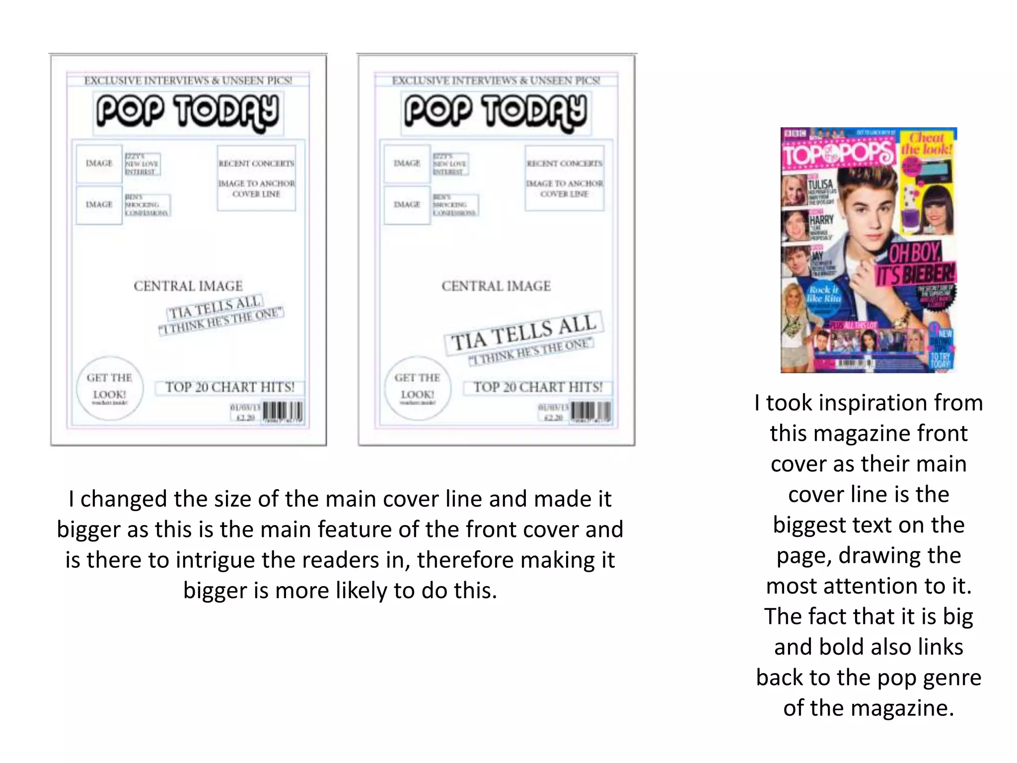
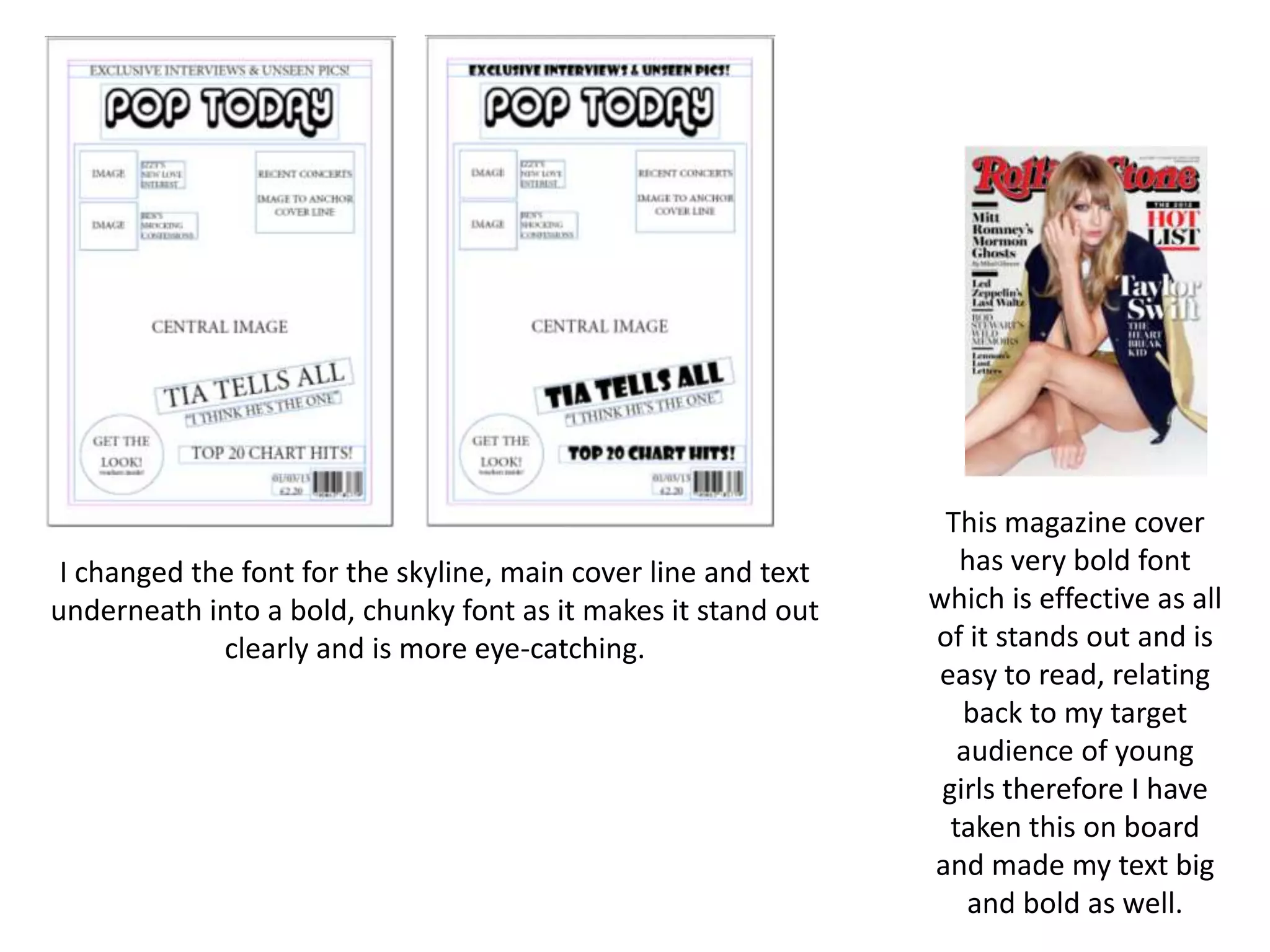
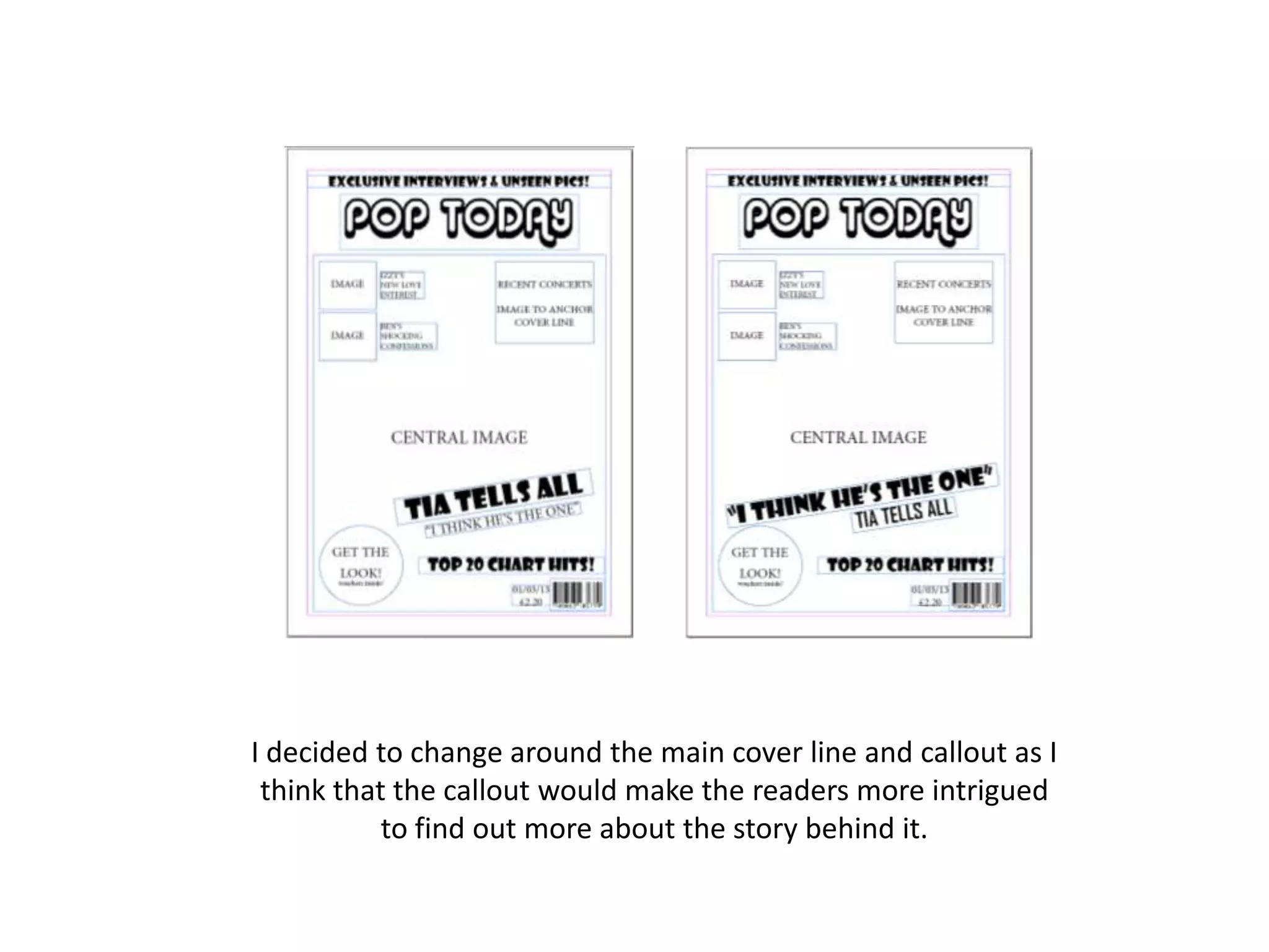
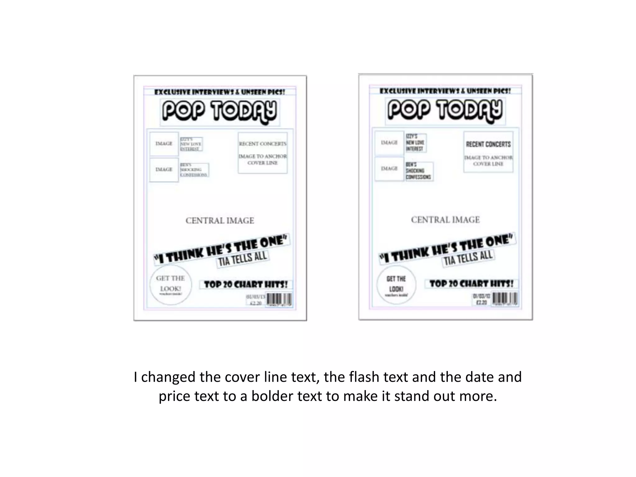
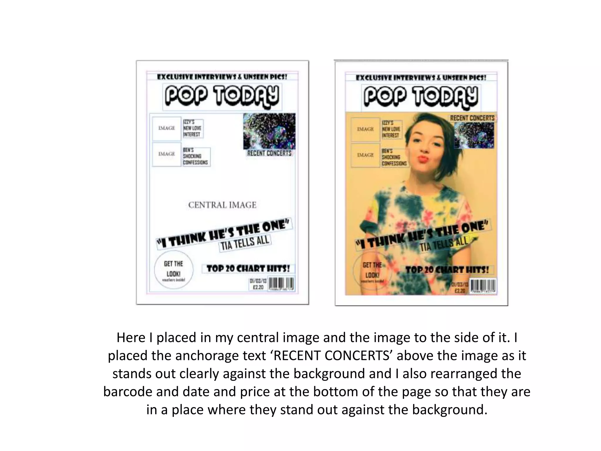
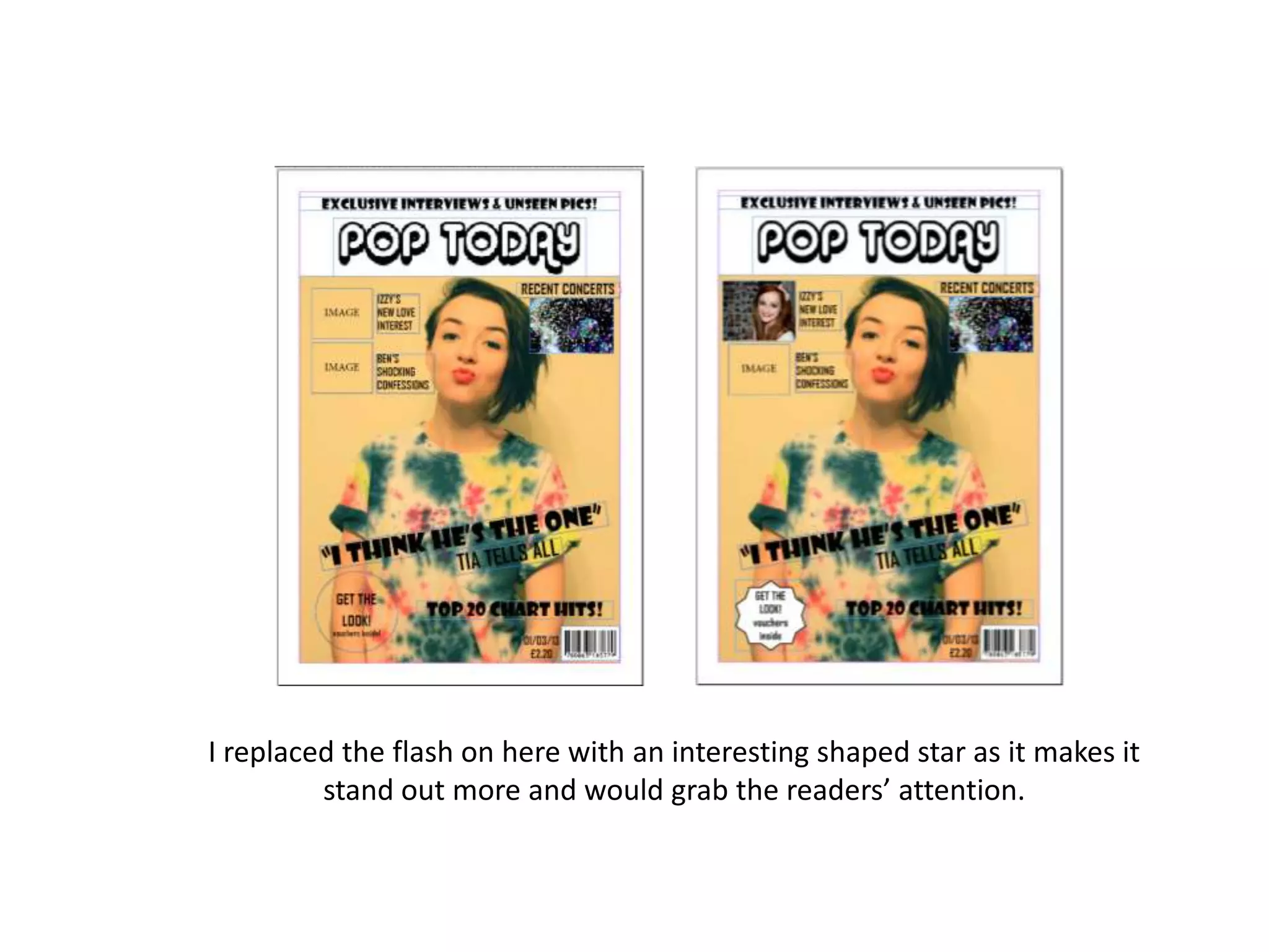
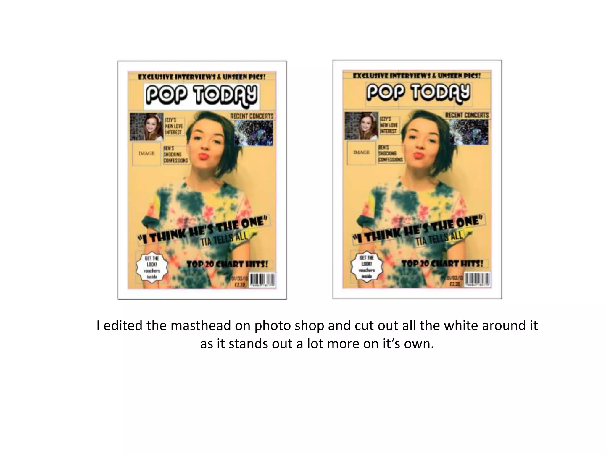
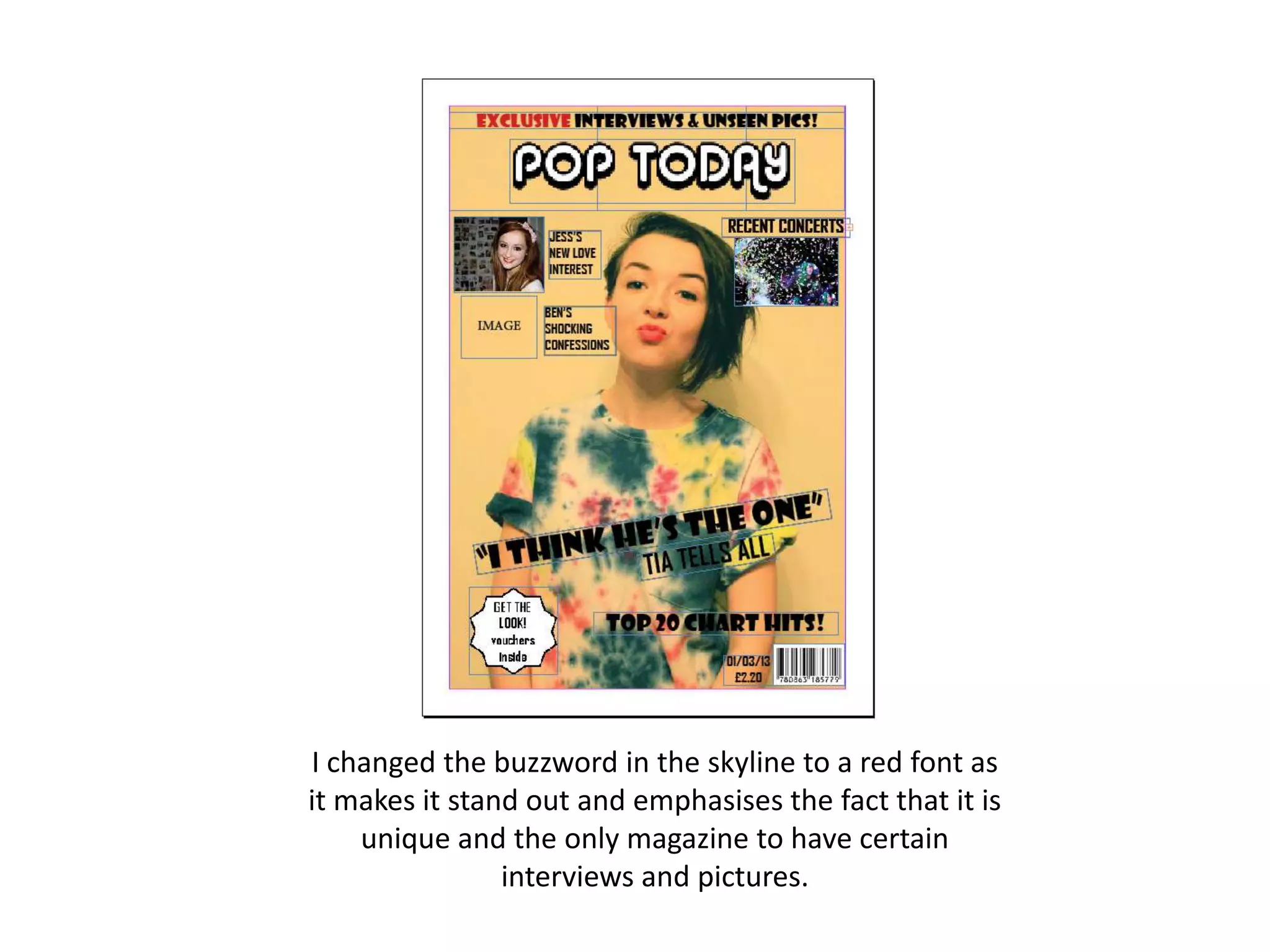
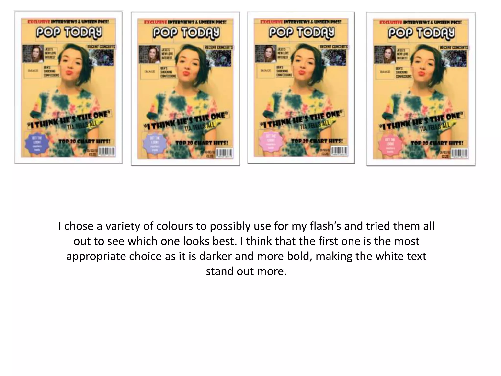
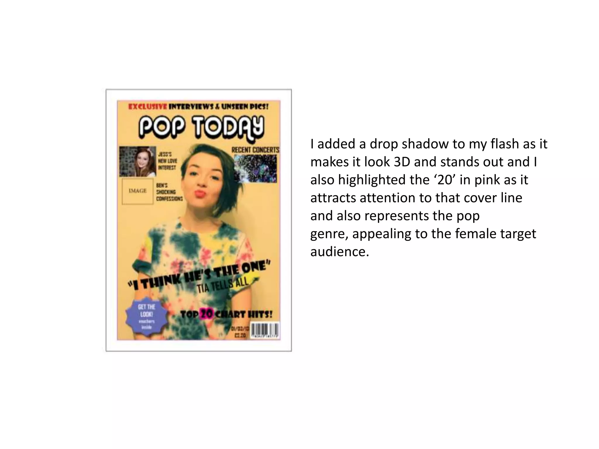
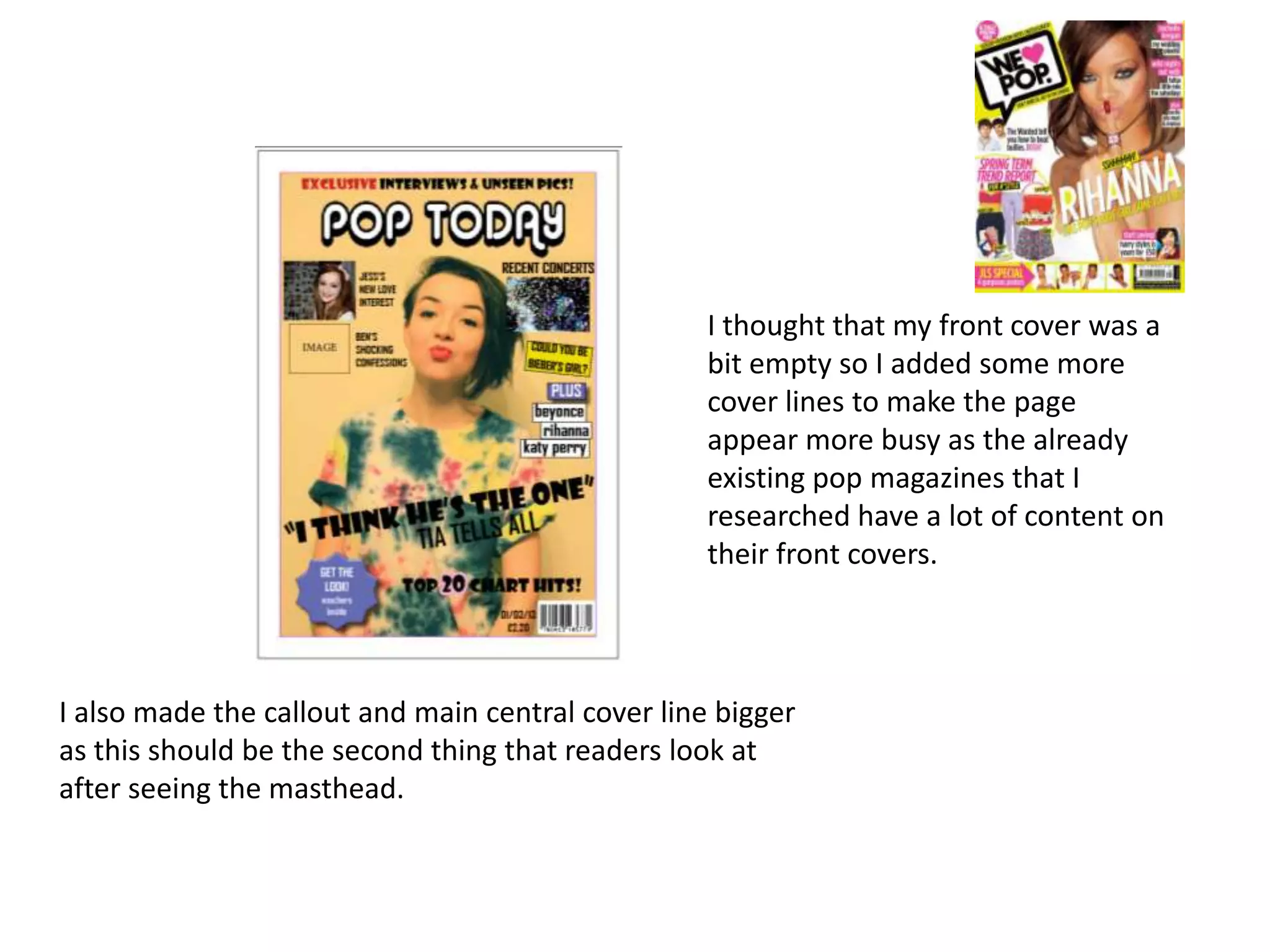
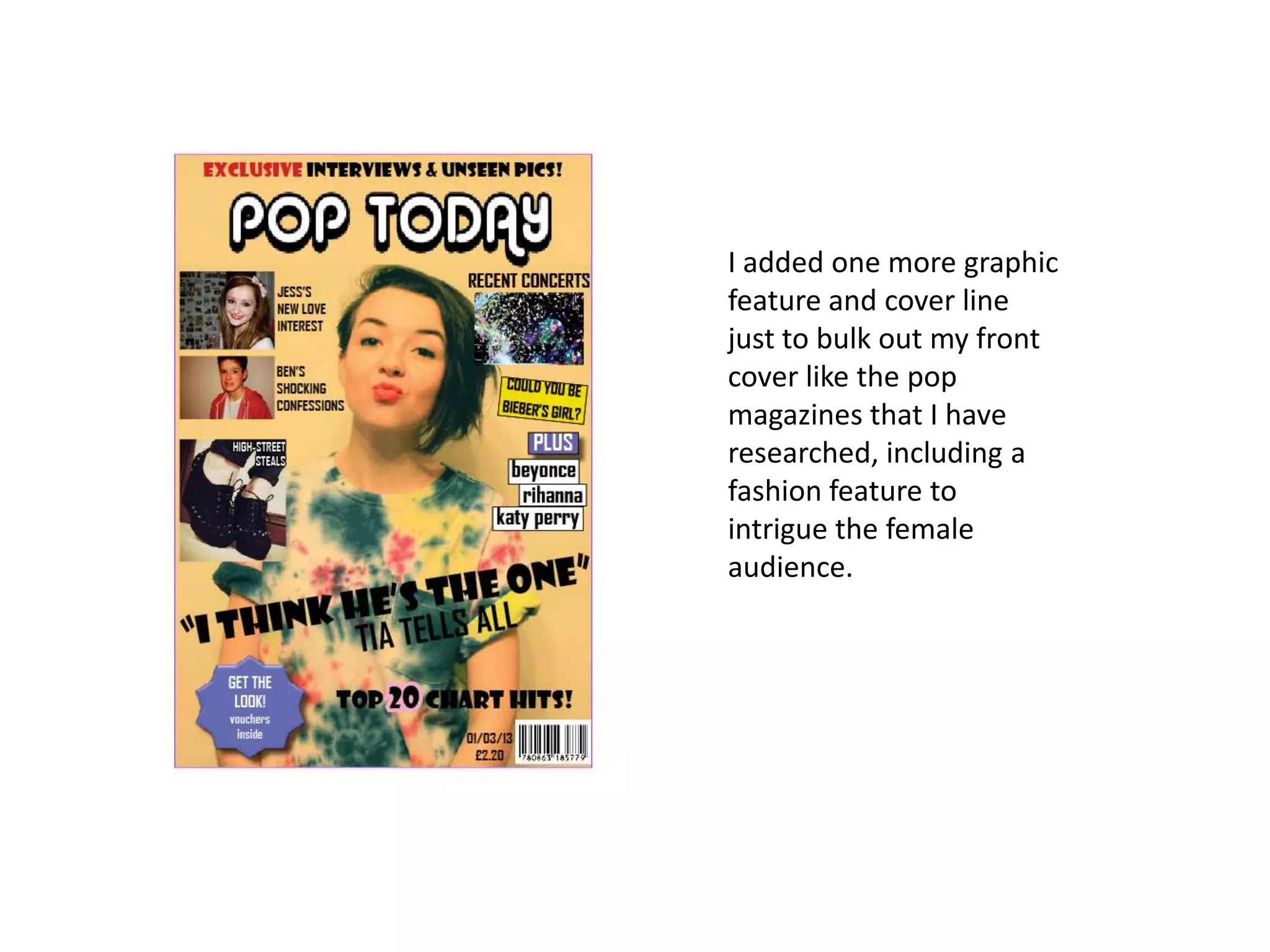
My Final Front Cover Changes
Lauren Morgan
I took on board what my focus group said and I deleted
one image and one cover line to make sure that the central
image won’t be covered.
I changed the size of the 2 cover lines and made them
smaller as this will make sure that they won’t cover the
central image too much.
I changed the size of the flash and made it smaller as I don’t
want it to take the attention away from the central image.
I changed the size of the main cover line and made it
bigger as this is the main feature of the front cover and
is there to intrigue the readers in, therefore making it
bigger is more likely to do this.
I took inspiration from
this magazine front
cover as their main
cover line is the
biggest text on the
page, drawing the
most attention to it.
The fact that it is big
and bold also links
back to the pop genre
of the magazine.
I changed the font for the skyline, main cover line and text
underneath into a bold, chunky font as it makes it stand out
clearly and is more eye-catching.
This magazine cover
has very bold font
which is effective as all
of it stands out and is
easy to read, relating
back to my target
audience of young
girls therefore I have
taken this on board
and made my text big
and bold as well.
I decided to change around the main cover line and callout as I
think that the callout would make the readers more intrigued
to find out more about the story behind it.
I changed the cover line text, the flash text and the date and
price text to a bolder text to make it stand out more.
Here I placed in my central image and the image to the side of it. I
placed the anchorage text ‘RECENT CONCERTS’ above the image as it
stands out clearly against the background and I also rearranged the
barcode and date and price at the bottom of the page so that they are
in a place where they stand out against the background.
I replaced the flash on here with an interesting shaped star as it makes it
stand out more and would grab the readers’ attention.
I edited the masthead on photo shop and cut out all the white around it
as it stands out a lot more on it’s own.
I changed the buzzword in the skyline to a red font as
it makes it stand out and emphasises the fact that it is
unique and the only magazine to have certain
interviews and pictures.
I chose a variety of colours to possibly use for my flash’s and tried them all
out to see which one looks best. I think that the first one is the most
appropriate choice as it is darker and more bold, making the white text
stand out more.
I added a drop shadow to my flash as it
makes it look 3D and stands out and I
also highlighted the ‘20’ in pink as it
attracts attention to that cover line
and also represents the pop
genre, appealing to the female target
audience.
I thought that my front cover was a
bit empty so I added some more
cover lines to make the page
appear more busy as the already
existing pop magazines that I
researched have a lot of content on
their front covers.
I also made the callout and main central cover line bigger
as this should be the second thing that readers look at
after seeing the masthead.
I added one more graphic
feature and cover line
just to bulk out my front
cover like the pop
magazines that I have
researched, including a
fashion feature to
intrigue the female
audience.

My final front cover changes new

  • 1.
    My Final FrontCover Changes Lauren Morgan
  • 2.
    I took onboard what my focus group said and I deleted one image and one cover line to make sure that the central image won’t be covered.
  • 3.
    I changed thesize of the 2 cover lines and made them smaller as this will make sure that they won’t cover the central image too much.
  • 4.
    I changed thesize of the flash and made it smaller as I don’t want it to take the attention away from the central image.
  • 5.
    I changed thesize of the main cover line and made it bigger as this is the main feature of the front cover and is there to intrigue the readers in, therefore making it bigger is more likely to do this. I took inspiration from this magazine front cover as their main cover line is the biggest text on the page, drawing the most attention to it. The fact that it is big and bold also links back to the pop genre of the magazine.
  • 6.
    I changed thefont for the skyline, main cover line and text underneath into a bold, chunky font as it makes it stand out clearly and is more eye-catching. This magazine cover has very bold font which is effective as all of it stands out and is easy to read, relating back to my target audience of young girls therefore I have taken this on board and made my text big and bold as well.
  • 7.
    I decided tochange around the main cover line and callout as I think that the callout would make the readers more intrigued to find out more about the story behind it.
  • 8.
    I changed thecover line text, the flash text and the date and price text to a bolder text to make it stand out more.
  • 9.
    Here I placedin my central image and the image to the side of it. I placed the anchorage text ‘RECENT CONCERTS’ above the image as it stands out clearly against the background and I also rearranged the barcode and date and price at the bottom of the page so that they are in a place where they stand out against the background.
  • 10.
    I replaced theflash on here with an interesting shaped star as it makes it stand out more and would grab the readers’ attention.
  • 11.
    I edited themasthead on photo shop and cut out all the white around it as it stands out a lot more on it’s own.
  • 12.
    I changed thebuzzword in the skyline to a red font as it makes it stand out and emphasises the fact that it is unique and the only magazine to have certain interviews and pictures.
  • 13.
    I chose avariety of colours to possibly use for my flash’s and tried them all out to see which one looks best. I think that the first one is the most appropriate choice as it is darker and more bold, making the white text stand out more.
  • 14.
    I added adrop shadow to my flash as it makes it look 3D and stands out and I also highlighted the ‘20’ in pink as it attracts attention to that cover line and also represents the pop genre, appealing to the female target audience.
  • 15.
    I thought thatmy front cover was a bit empty so I added some more cover lines to make the page appear more busy as the already existing pop magazines that I researched have a lot of content on their front covers. I also made the callout and main central cover line bigger as this should be the second thing that readers look at after seeing the masthead.
  • 16.
    I added onemore graphic feature and cover line just to bulk out my front cover like the pop magazines that I have researched, including a fashion feature to intrigue the female audience.