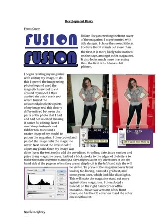
Development Diary

Front Cover

                                           Before I began creating the front cover
                                           of the magazine, I experimented with
                                           title designs. I chose the second title as
                                           I believe that it stands out more than
                                           the first, it is more likely to be noticed
                                           on the page, amongst other magazines.
                                           It also looks much more interesting
                                           than the first, which looks a bit
                                           plainer.

I began creating my magazine
with editing my image, to do
this I opened the image using
photoshop and used the
magnetic lasso tool to cut
around my model, I then
applied the quick mask tool
which turned the
unwanted/deselected parts
of my image red, this clearly
differentiated between the
parts of the photo that I had
and had not selected, making
it easier for editing. Next I
used the paintbrush and
rubber tool to cut out a
neater image of my model to
put on the magazine. I then copied and
pasted the image onto the magazine
cover. Next I used the levels tool to
adjust my photo. Once my image was
done I used the text tool to add the coverlines, strapline, date, issue number and
price to my magazine cover. I added a black stroke to the edges of the letters to
make the main coverline standout.I have aligned all of my coverlines to the left
hand side of the page as when they are on display, it is the left hand side the will
                                    be visible. To prevent the magazine cover from
                                    looking too boring, I added a gradient, and
                                    some green lines, which look like disco lights.
                                    This will make the magazine stand out more
                                    against other magazines. I then placed a
                                    barcode on the right hand corner of the
                                    magazine. I have two versions of the front
                                    cover, one has the CD cover on it and the other
                                    one is without it.


Nicole Keighrey
Contents Page

                         For the contents page I edited the photo in the same way
                         as the previous photo using photoshop. I then put in the
                         title of my magazine and used the text tool to put in all of
                         my listings, page numbers, page title and the editors
                         word. To make the photo stand out moreon the crowded
                         page, I added a blue box behind it. I included lots of
                          colour on the page to make it look more exciting, as
                          there are a lot of words on the page making it boring to
                          look at. However, the colour makes it much more
                          interesting. I have separated the listings so that the
                          coverlines are included in one section and the rest of the
                          listings are included in the rest, this will make it easier
for the readers to navigate through the magazine. The image on my contents
page relates to the main article of the magazine, so I have placed the page
number for that article on top of the photo in a large red font.


Double Page Spread

For the double page spread I added a dark coloured gradient to the
background, I then edited the image as I have previously and copied
and pasted it onto the page. I then added the title and changed the
colour to blue, I have also added a white stroke around the edges of
the letters in the title. Next I put in the text, which included a drop
cap. I created the drop cap by using a separate text box and moving
the text so that the enlarged letter could fit into the letters. I have
also inserted a fact box into the double page spread. This consisted of a photo on
a white box to look like a white background, the photo was cropped in the same
way my other photos have been. To separate the fact box from the rest of the text
I placed two thin white lines around the text. My text also includes a pull quote,
which is enlarged text within the main body, a standfirst, which is an enlarged
introduction and an end blob that I created by placing a small white circle on top
of a small white circle with a black outline. At the bottom of the page I have the
title of the magazine and the page number so the readers can navigate their way
around the magazine.


Nicole Keighrey
CD Cover

To create the CD cover I drew
lines on a white square and
coloured it in with different
colours using the bucket tool.
I then placed this over a
photo that I changed to be
black and white, I made the
coloured shapes slightly
transparent so that the photo is
visible underneath, this made
the photo look as though it was
coloured itself.I then added
text to the cover and it was
completed.


Nicole Keighrey

Development diary

  • 1.
    Development Diary Front Cover Before I began creating the front cover of the magazine, I experimented with title designs. I chose the second title as I believe that it stands out more than the first, it is more likely to be noticed on the page, amongst other magazines. It also looks much more interesting than the first, which looks a bit plainer. I began creating my magazine with editing my image, to do this I opened the image using photoshop and used the magnetic lasso tool to cut around my model, I then applied the quick mask tool which turned the unwanted/deselected parts of my image red, this clearly differentiated between the parts of the photo that I had and had not selected, making it easier for editing. Next I used the paintbrush and rubber tool to cut out a neater image of my model to put on the magazine. I then copied and pasted the image onto the magazine cover. Next I used the levels tool to adjust my photo. Once my image was done I used the text tool to add the coverlines, strapline, date, issue number and price to my magazine cover. I added a black stroke to the edges of the letters to make the main coverline standout.I have aligned all of my coverlines to the left hand side of the page as when they are on display, it is the left hand side the will be visible. To prevent the magazine cover from looking too boring, I added a gradient, and some green lines, which look like disco lights. This will make the magazine stand out more against other magazines. I then placed a barcode on the right hand corner of the magazine. I have two versions of the front cover, one has the CD cover on it and the other one is without it. Nicole Keighrey
  • 2.
    Contents Page For the contents page I edited the photo in the same way as the previous photo using photoshop. I then put in the title of my magazine and used the text tool to put in all of my listings, page numbers, page title and the editors word. To make the photo stand out moreon the crowded page, I added a blue box behind it. I included lots of colour on the page to make it look more exciting, as there are a lot of words on the page making it boring to look at. However, the colour makes it much more interesting. I have separated the listings so that the coverlines are included in one section and the rest of the listings are included in the rest, this will make it easier for the readers to navigate through the magazine. The image on my contents page relates to the main article of the magazine, so I have placed the page number for that article on top of the photo in a large red font. Double Page Spread For the double page spread I added a dark coloured gradient to the background, I then edited the image as I have previously and copied and pasted it onto the page. I then added the title and changed the colour to blue, I have also added a white stroke around the edges of the letters in the title. Next I put in the text, which included a drop cap. I created the drop cap by using a separate text box and moving the text so that the enlarged letter could fit into the letters. I have also inserted a fact box into the double page spread. This consisted of a photo on a white box to look like a white background, the photo was cropped in the same way my other photos have been. To separate the fact box from the rest of the text I placed two thin white lines around the text. My text also includes a pull quote, which is enlarged text within the main body, a standfirst, which is an enlarged introduction and an end blob that I created by placing a small white circle on top of a small white circle with a black outline. At the bottom of the page I have the title of the magazine and the page number so the readers can navigate their way around the magazine. Nicole Keighrey
  • 3.
    CD Cover To createthe CD cover I drew lines on a white square and coloured it in with different colours using the bucket tool. I then placed this over a photo that I changed to be black and white, I made the coloured shapes slightly transparent so that the photo is visible underneath, this made the photo look as though it was coloured itself.I then added text to the cover and it was completed. Nicole Keighrey