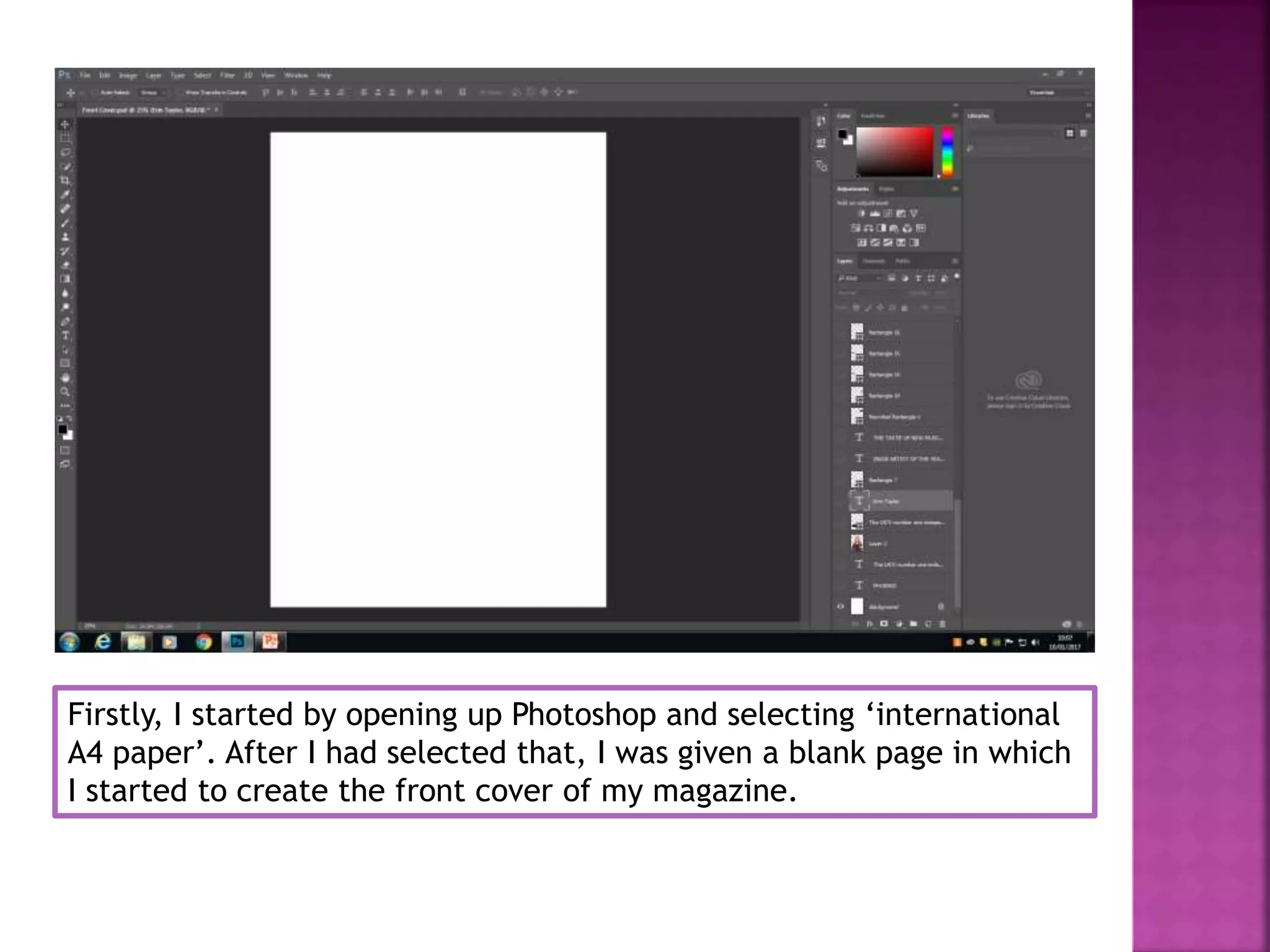
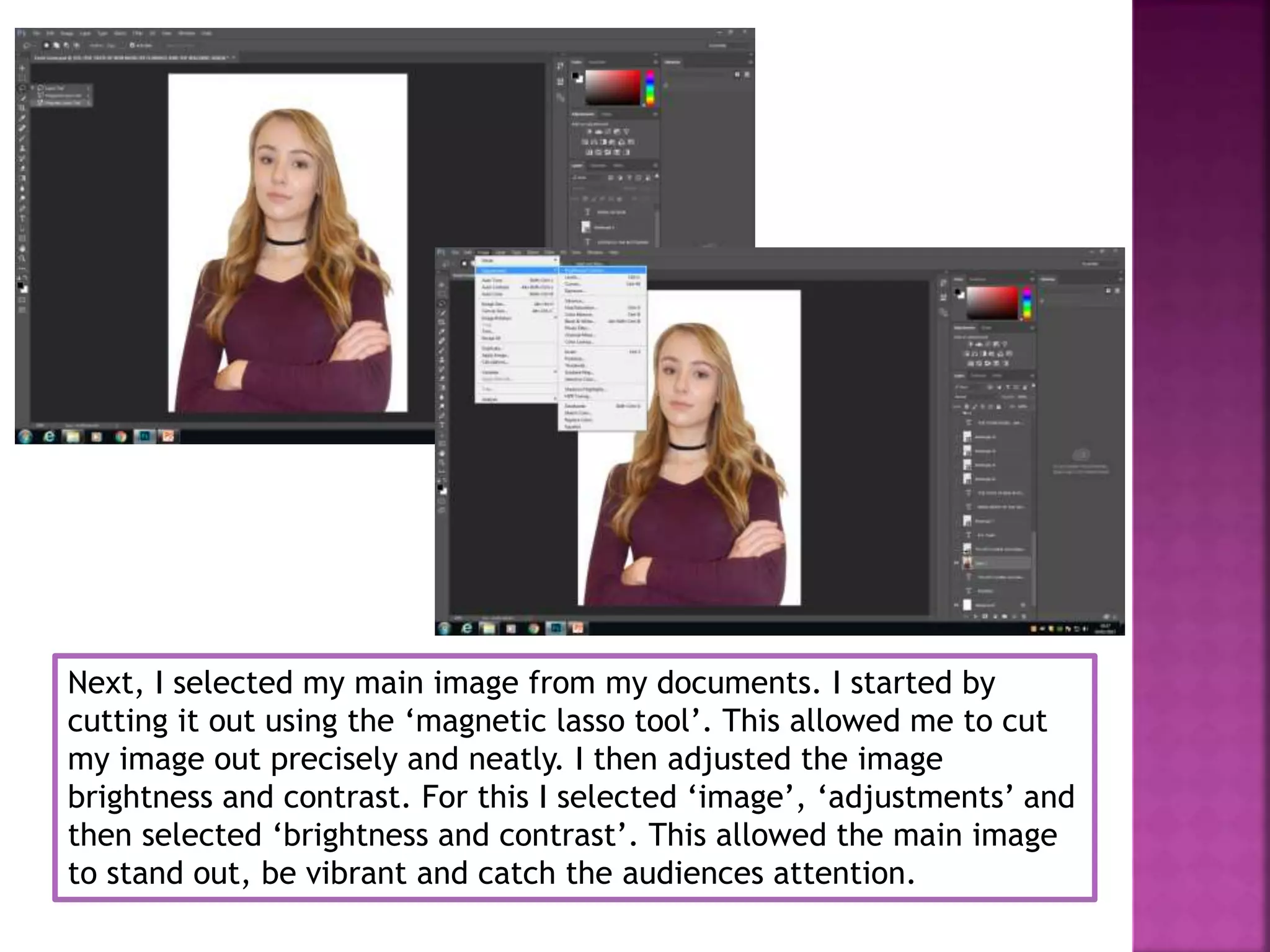
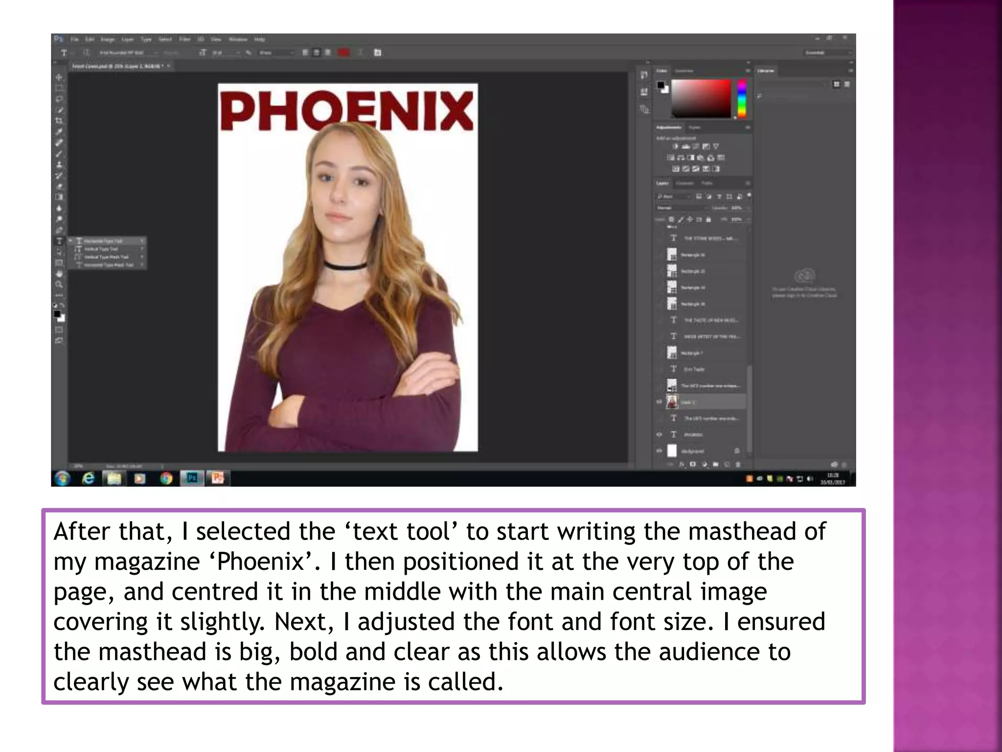
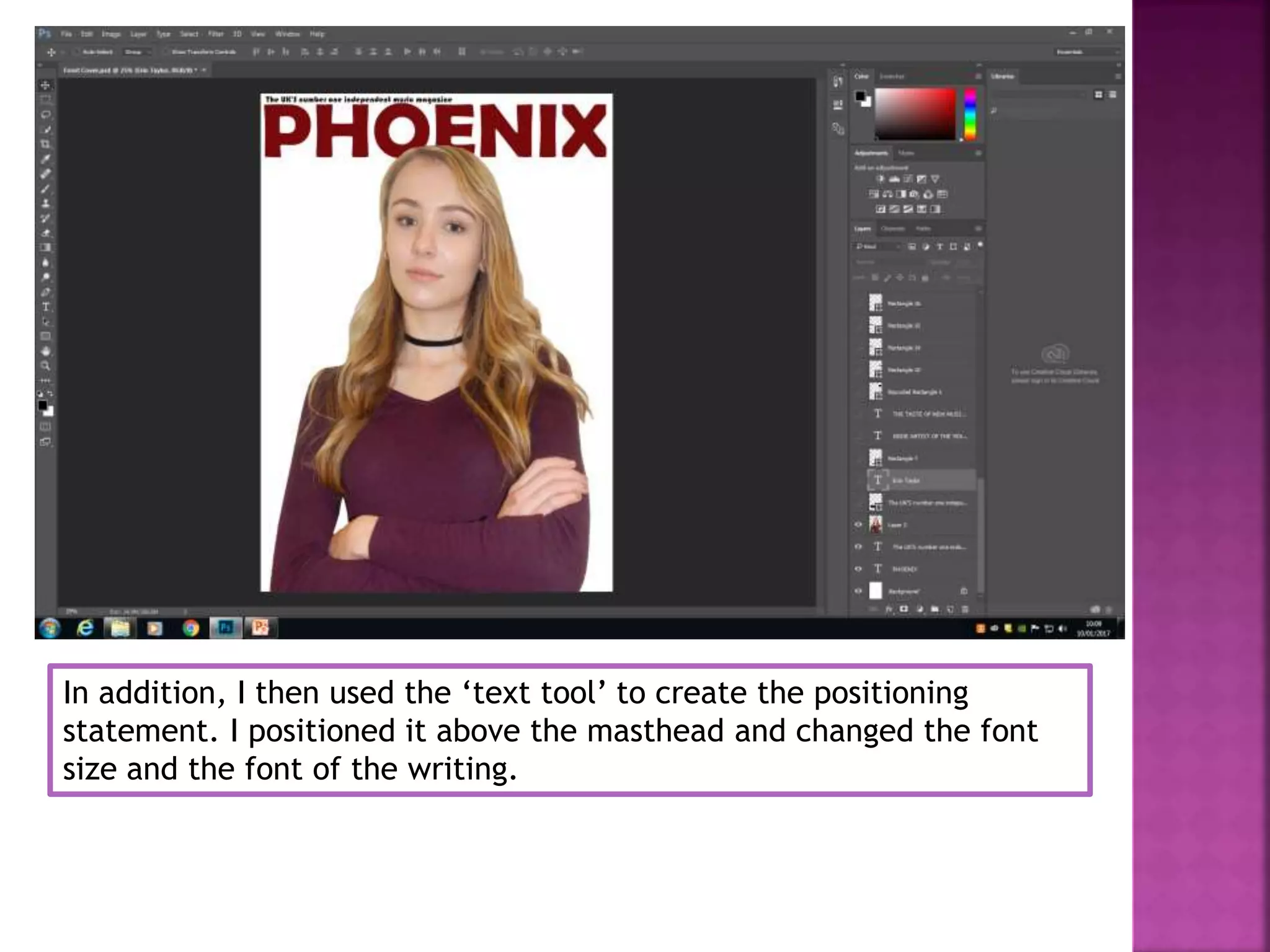
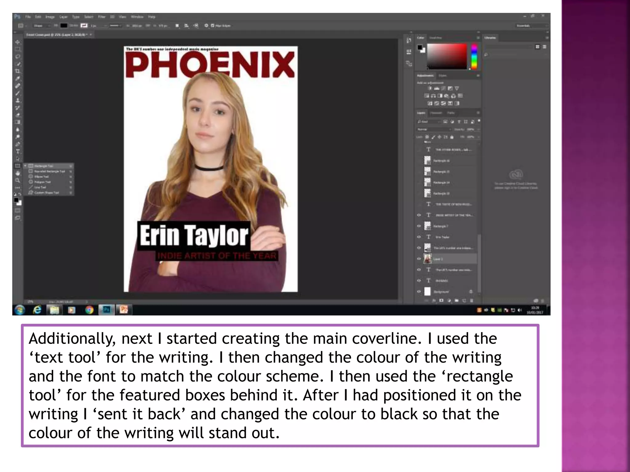
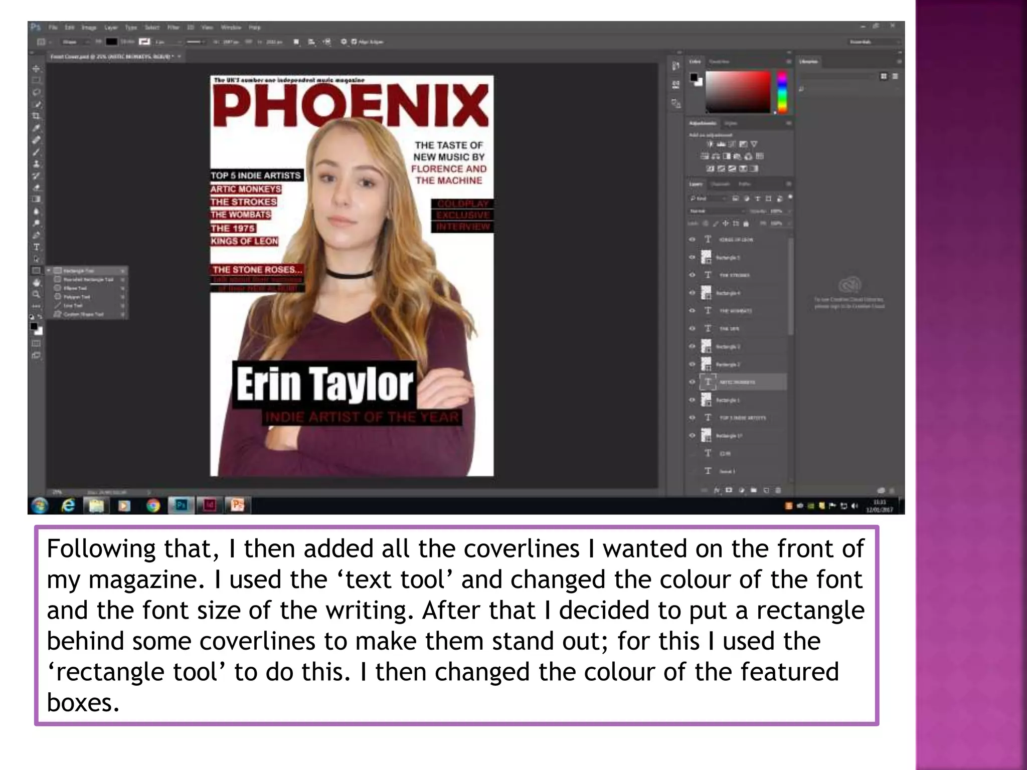
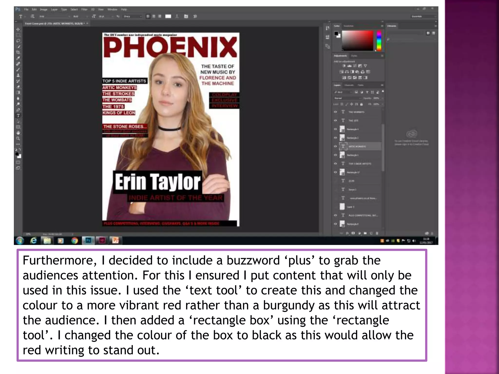
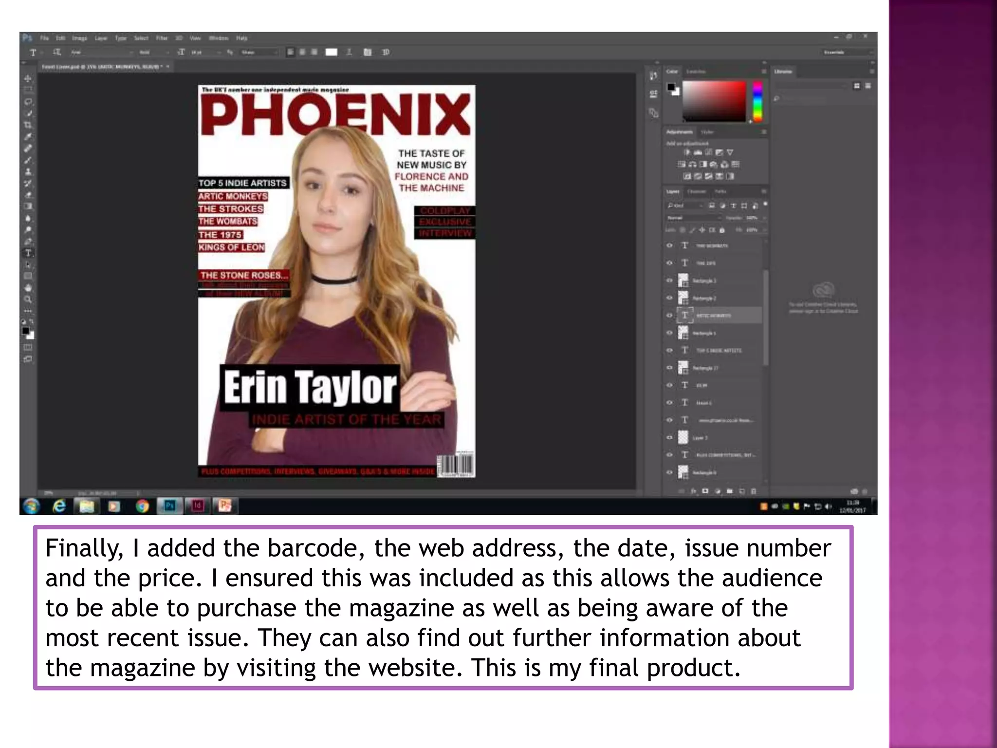
Deemple Morar
Firstly, I started by opening up Photoshop and selecting ‘international
A4 paper’. After I had selected that, I was given a blank page in which
I started to create the front cover of my magazine.
Next, I selected my main image from my documents. I started by
cutting it out using the ‘magnetic lasso tool’. This allowed me to cut
my image out precisely and neatly. I then adjusted the image
brightness and contrast. For this I selected ‘image’, ‘adjustments’ and
then selected ‘brightness and contrast’. This allowed the main image
to stand out, be vibrant and catch the audiences attention.
After that, I selected the ‘text tool’ to start writing the masthead of
my magazine ‘Phoenix’. I then positioned it at the very top of the
page, and centred it in the middle with the main central image
covering it slightly. Next, I adjusted the font and font size. I ensured
the masthead is big, bold and clear as this allows the audience to
clearly see what the magazine is called.
In addition, I then used the ‘text tool’ to create the positioning
statement. I positioned it above the masthead and changed the font
size and the font of the writing.
Additionally, next I started creating the main coverline. I used the
‘text tool’ for the writing. I then changed the colour of the writing
and the font to match the colour scheme. I then used the ‘rectangle
tool’ for the featured boxes behind it. After I had positioned it on the
writing I ‘sent it back’ and changed the colour to black so that the
colour of the writing will stand out.
Following that, I then added all the coverlines I wanted on the front of
my magazine. I used the ‘text tool’ and changed the colour of the font
and the font size of the writing. After that I decided to put a rectangle
behind some coverlines to make them stand out; for this I used the
‘rectangle tool’ to do this. I then changed the colour of the featured
boxes.
Furthermore, I decided to include a buzzword ‘plus’ to grab the
audiences attention. For this I ensured I put content that will only be
used in this issue. I used the ‘text tool’ to create this and changed the
colour to a more vibrant red rather than a burgundy as this will attract
the audience. I then added a ‘rectangle box’ using the ‘rectangle
tool’. I changed the colour of the box to black as this would allow the
red writing to stand out.
Finally, I added the barcode, the web address, the date, issue number
and the price. I ensured this was included as this allows the audience
to be able to purchase the magazine as well as being aware of the
most recent issue. They can also find out further information about
the magazine by visiting the website. This is my final product.

Step by step process of front cover

  • 1.
  • 2.
    Firstly, I startedby opening up Photoshop and selecting ‘international A4 paper’. After I had selected that, I was given a blank page in which I started to create the front cover of my magazine.
  • 3.
    Next, I selectedmy main image from my documents. I started by cutting it out using the ‘magnetic lasso tool’. This allowed me to cut my image out precisely and neatly. I then adjusted the image brightness and contrast. For this I selected ‘image’, ‘adjustments’ and then selected ‘brightness and contrast’. This allowed the main image to stand out, be vibrant and catch the audiences attention.
  • 4.
    After that, Iselected the ‘text tool’ to start writing the masthead of my magazine ‘Phoenix’. I then positioned it at the very top of the page, and centred it in the middle with the main central image covering it slightly. Next, I adjusted the font and font size. I ensured the masthead is big, bold and clear as this allows the audience to clearly see what the magazine is called.
  • 5.
    In addition, Ithen used the ‘text tool’ to create the positioning statement. I positioned it above the masthead and changed the font size and the font of the writing.
  • 6.
    Additionally, next Istarted creating the main coverline. I used the ‘text tool’ for the writing. I then changed the colour of the writing and the font to match the colour scheme. I then used the ‘rectangle tool’ for the featured boxes behind it. After I had positioned it on the writing I ‘sent it back’ and changed the colour to black so that the colour of the writing will stand out.
  • 7.
    Following that, Ithen added all the coverlines I wanted on the front of my magazine. I used the ‘text tool’ and changed the colour of the font and the font size of the writing. After that I decided to put a rectangle behind some coverlines to make them stand out; for this I used the ‘rectangle tool’ to do this. I then changed the colour of the featured boxes.
  • 8.
    Furthermore, I decidedto include a buzzword ‘plus’ to grab the audiences attention. For this I ensured I put content that will only be used in this issue. I used the ‘text tool’ to create this and changed the colour to a more vibrant red rather than a burgundy as this will attract the audience. I then added a ‘rectangle box’ using the ‘rectangle tool’. I changed the colour of the box to black as this would allow the red writing to stand out.
  • 9.
    Finally, I addedthe barcode, the web address, the date, issue number and the price. I ensured this was included as this allows the audience to be able to purchase the magazine as well as being aware of the most recent issue. They can also find out further information about the magazine by visiting the website. This is my final product.