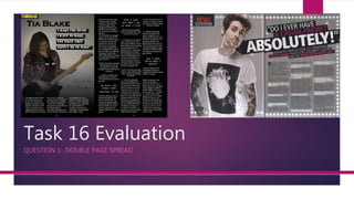
Both magazine spreads use a similar interview layout with questions and answers in columns. However, the key differences are:
- The OP magazine has the title, subtitles, and logo on the left page only, following convention. Q magazine spreads these elements across both pages.
- Q magazine does not include a page number, breaking convention. The OP magazine includes a page number in yellow for branding consistency.
- Quotes are presented differently, with the OP magazine making some quotes larger than others to attract readers. Q magazine does not vary quote sizes.
Overall the OP magazine follows most conventions around layout and branding elements, while Q magazine breaks some conventions in its presentation of elements across the double page.
Palestine last event orientationfvgnh .pptxRaedMohamed3
An EFL lesson about the current events in Palestine. It is intended to be for intermediate students who wish to increase their listening skills through a short lesson in power point.
Unit 8 - Information and Communication Technology (Paper I).pdfThiyagu K
This slides describes the basic concepts of ICT, basics of Email, Emerging Technology and Digital Initiatives in Education. This presentations aligns with the UGC Paper I syllabus.
How to Split Bills in the Odoo 17 POS ModuleCeline George
Bills have a main role in point of sale procedure. It will help to track sales, handling payments and giving receipts to customers. Bill splitting also has an important role in POS. For example, If some friends come together for dinner and if they want to divide the bill then it is possible by POS bill splitting. This slide will show how to split bills in odoo 17 POS.
Welcome to TechSoup New Member Orientation and Q&A (May 2024).pdfTechSoup
In this webinar you will learn how your organization can access TechSoup's wide variety of product discount and donation programs. From hardware to software, we'll give you a tour of the tools available to help your nonprofit with productivity, collaboration, financial management, donor tracking, security, and more.
How to Create Map Views in the Odoo 17 ERPCeline George
The map views are useful for providing a geographical representation of data. They allow users to visualize and analyze the data in a more intuitive manner.
Operation “Blue Star” is the only event in the history of Independent India where the state went into war with its own people. Even after about 40 years it is not clear if it was culmination of states anger over people of the region, a political game of power or start of dictatorial chapter in the democratic setup.
The people of Punjab felt alienated from main stream due to denial of their just demands during a long democratic struggle since independence. As it happen all over the word, it led to militant struggle with great loss of lives of military, police and civilian personnel. Killing of Indira Gandhi and massacre of innocent Sikhs in Delhi and other India cities was also associated with this movement.
Synthetic Fiber Construction in lab .pptxPavel ( NSTU)
Synthetic fiber production is a fascinating and complex field that blends chemistry, engineering, and environmental science. By understanding these aspects, students can gain a comprehensive view of synthetic fiber production, its impact on society and the environment, and the potential for future innovations. Synthetic fibers play a crucial role in modern society, impacting various aspects of daily life, industry, and the environment. ynthetic fibers are integral to modern life, offering a range of benefits from cost-effectiveness and versatility to innovative applications and performance characteristics. While they pose environmental challenges, ongoing research and development aim to create more sustainable and eco-friendly alternatives. Understanding the importance of synthetic fibers helps in appreciating their role in the economy, industry, and daily life, while also emphasizing the need for sustainable practices and innovation.
3. Interview layout
Both of these double page spreads have got the article in three columns.
This is a norm for magazine articles as three leaves enough room to get a
good amount of text in and not seem to crowded, also three is a
symmetrical number so the article looks more appealing than if it was in
two rows. Also both of our articles have the interview questions set out
differently. In my magazine the questions are in the middle of the row and
in the other magazine they have put them on top of a box. This is often
done in magazines to make the text seem less bulky and also makes it
look more like an interview.
My article hasn’t broken any magazine convention codes as it is just a
normal article you would expect to find in a magazine such as the one I
have compared it with.
4. Main model
Both mine and the other magazines double page spread uses only one main
model. This is common in music magazines (especially rock specialised ones)
because it makes the audience feel closer and more intimate with the model
which might make them feel more interactive with the magazine and therefore
might be more likely to buy it. Both mine and the other magazine have
stretched the model to be the full size of the page. This is common because
they are the main attraction for that page and so editors want them to have all
the attention, also the photo makes the page and the article look less word
heavy and boring. I haven’t broke any magazine convention codes by only
using one model and by making her big because it is a normal thing to do for
a magazine and can be seen in most magazines such as the one I'm comparing
it to.
5. No other photos
Both mine and the Q magazine double page spread only have one main
photo on a full page and no other photos. Often magazines will have
other photos on their double page spreads maybe in between
paragraphs or at the side of pages. They do this to make the page look
more spacey and interesting. I did not do this and therefore have broken
magazine convention codes.
I didn’t put these other photos in my magazine as I fel like it would
lighten the mood and maybe make the page seem less edgy and gothic
which is what I wanted because that fits with the rock genre.
7. Magazine logo
My magazine has a small logo of the title of my magazine in the top corner
of the left page. This is a magazine convention code and is important to
have because it shows of the brand and if the brand starts to become
recognisable and iconic it will sell better. I also did this because I felt that the
logo would add a bit more colour to the page so that it didn’t seem all to
dark and therefore boring, also I thought the logo looked edgy and would
make the page look more rock.
8. Page number
My double page spread has a page number in yellow at the bottom of the
page. It is a magazine convention code to have these as it tells readers what
page there on and if they read on the contents page about an article they
like then they can quickly go to that page. I also have put page numbers on
to add more colour because I wanted Thrashes yellow theme to be
consitant through out the magazine.
Q magazine has not put in the page number on this double page spread
and has therefore broke the magazine convention codes.
9. Title and subtitle layout
The title and subtitles of my double page spread are all on the left side of
the page where my model is. I did this as I wanted this to me the main
page and the centre of attention and by doing this I haven’t broke any
magazine convention codes as that is usually what magazines do. I also did
this because I wanted the right page to be heavy on words because I felt
that if there was a lot of spaces and different size writing then the page
would seem more light hearted and not fit in with the rock genre.
Q magazine has not done this and has put the title in large across the whole
of the right page, by doing this they have broke magazine convention
codes.
10. Quotes
On my double page spread I have some quotes bigger than others. I did this
because if the article was all the same in big blocks then the page would
seem dull and not worth reading so by using the big quotes I am attracting
the audience in more. This is a magazine convention code I have followed in
order to make my magazine look better and more easy to read.
Q magazine has not done this and is therefore breaking magazine convention
codes however I think its okay for them to do it as their article is shorter than
mine and they have made their questions stand out more.