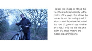
I like this image due to the very
visible woodland background
which makes it easier for the
reader to identify the outdoor
theme. I also like this image as
the bike is shown off well making
the theme even more clear.
However I chose to not use this
photograph as I don’t think it is
focussed enough and I prefer the
low angle shot as opposed to the
mid shot.
I like this image as it manages to
show off the bike very well, I also
like that the gaps in the trees
allowing the sky to be seen is
directly above the model’s head.
However i chose not to use this
image as I feel the model appear
too serious.
I like this image as the focus can be
pulled from the model onto his
clothing, which is what the fashion
spreads are really all about. I also
like the fact that this image does not
make use of direct address which is
a refreshing change from my other
fashion spreads. I chose not to use
this image however as I felt there
was no logical place to position the
text and the picture wasn’t as
focussed as I wanted it to be.
I like this image as I feels it makes
use of depth of field well, drawing
attention to the model as opposed
to his surroundings. I also like this
image as the theme is shown
clearly through the bike and the
plants and trees that are in the
background. However I chose not
to use this picture as the model’s
outfit is not being shown off well
enough due to him facing the other
direction.
I to use this image as I liked the
way the model is basically in the
centre of the page, this allows the
reader to see the background. I
also chose this picture because I
like how far you can see into the
distance. I also like the use of a
slight low angle making the
model appear imposing.

Photograph selection 3

  • 1.
    I like thisimage due to the very visible woodland background which makes it easier for the reader to identify the outdoor theme. I also like this image as the bike is shown off well making the theme even more clear. However I chose to not use this photograph as I don’t think it is focussed enough and I prefer the low angle shot as opposed to the mid shot.
  • 2.
    I like thisimage as it manages to show off the bike very well, I also like that the gaps in the trees allowing the sky to be seen is directly above the model’s head. However i chose not to use this image as I feel the model appear too serious.
  • 3.
    I like thisimage as the focus can be pulled from the model onto his clothing, which is what the fashion spreads are really all about. I also like the fact that this image does not make use of direct address which is a refreshing change from my other fashion spreads. I chose not to use this image however as I felt there was no logical place to position the text and the picture wasn’t as focussed as I wanted it to be.
  • 4.
    I like thisimage as I feels it makes use of depth of field well, drawing attention to the model as opposed to his surroundings. I also like this image as the theme is shown clearly through the bike and the plants and trees that are in the background. However I chose not to use this picture as the model’s outfit is not being shown off well enough due to him facing the other direction.
  • 5.
    I to usethis image as I liked the way the model is basically in the centre of the page, this allows the reader to see the background. I also chose this picture because I like how far you can see into the distance. I also like the use of a slight low angle making the model appear imposing.