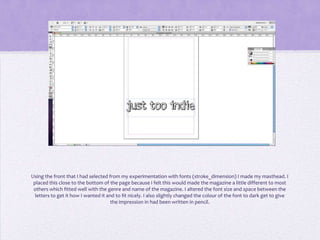
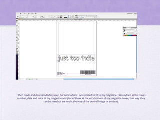
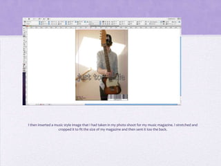
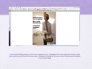
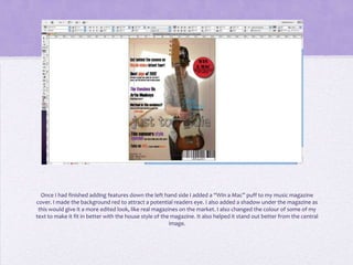
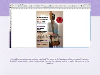
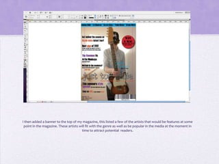
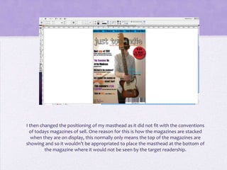
Creating my
 magazine
front cover
Using the front that I had selected from my experimentation with fonts (stroke_dimension) I made my masthead. I
 placed this close to the bottom of the page because I felt this would made the magazine a little different to most
 others which fitted well with the genre and name of the magazine. I altered the font size and space between the
  letters to get it how I wanted it and to fit nicely. I also slightly changed the colour of the font to dark get to give
                                      the impression in had been written in pencil.
I then made and downloaded my own bar code which I customized to fit to my magazine. I also added in the issues
 number, date and price of my magazine and placed these at the very bottom of my magazine cover, that way they
                        can be seen but are not in the way of the central image or any text.
I then inserted a music style image that I had taken in my photo shoot for my music magazine. I stretched and
                    cropped it to fit the size of my magazine and then sent it too the back.
I then started adding features to the music magazine cover. I highlighted the move important words to make
them stand out and fit with the house style. I changed the fittings of the text so that it fitted around the figure
                                              in my central image.
Once I had finished adding features down the left hand side I added a “Win a Mac” puff to my music magazine
cover. I made the background red to attract a potential readers eye. I also added a shadow under the magazine as
 this would give it a more edited look, like real magazines on the market. I also changed the colour of some of my
text to make it fit in better with the house style of the magazine. It also helped it stand out better from the central
                                                         image.
I then added a strapline underneath the masthead. This acts as kind of a slogan would to a product. It’s a catchy
line which would stick in a readers head and help them buy the magazine again or to reader the masthead of the
                                                    magazine.
I then added a banner to the top of my magazine, this listed a few of the artists that would be features at some
 point in the magazine. These artists will fit with the genre as well as be popular in the media at the moment in
                                        time to attract potential readers.
I then changed the positioning of my masthead as it did not fit with the conventions
  of todays magazines of sell. One reason for this is how the magazines are stacked
   when they are on display, this normally only means the top of the magazines are
showing and so it wouldn’t be appropriated to place the masthead at the bottom of
         the magazine where it would not be seen by the target readership.
I then put my music magazine onto Facebook where I could get some audience feed back and make improvements
                                      to my music magazine front cover.

Creating front cover. musicmag

  • 1.
  • 2.
    Using the frontthat I had selected from my experimentation with fonts (stroke_dimension) I made my masthead. I placed this close to the bottom of the page because I felt this would made the magazine a little different to most others which fitted well with the genre and name of the magazine. I altered the font size and space between the letters to get it how I wanted it and to fit nicely. I also slightly changed the colour of the font to dark get to give the impression in had been written in pencil.
  • 3.
    I then madeand downloaded my own bar code which I customized to fit to my magazine. I also added in the issues number, date and price of my magazine and placed these at the very bottom of my magazine cover, that way they can be seen but are not in the way of the central image or any text.
  • 4.
    I then inserteda music style image that I had taken in my photo shoot for my music magazine. I stretched and cropped it to fit the size of my magazine and then sent it too the back.
  • 5.
    I then startedadding features to the music magazine cover. I highlighted the move important words to make them stand out and fit with the house style. I changed the fittings of the text so that it fitted around the figure in my central image.
  • 6.
    Once I hadfinished adding features down the left hand side I added a “Win a Mac” puff to my music magazine cover. I made the background red to attract a potential readers eye. I also added a shadow under the magazine as this would give it a more edited look, like real magazines on the market. I also changed the colour of some of my text to make it fit in better with the house style of the magazine. It also helped it stand out better from the central image.
  • 7.
    I then addeda strapline underneath the masthead. This acts as kind of a slogan would to a product. It’s a catchy line which would stick in a readers head and help them buy the magazine again or to reader the masthead of the magazine.
  • 8.
    I then addeda banner to the top of my magazine, this listed a few of the artists that would be features at some point in the magazine. These artists will fit with the genre as well as be popular in the media at the moment in time to attract potential readers.
  • 9.
    I then changedthe positioning of my masthead as it did not fit with the conventions of todays magazines of sell. One reason for this is how the magazines are stacked when they are on display, this normally only means the top of the magazines are showing and so it wouldn’t be appropriated to place the masthead at the bottom of the magazine where it would not be seen by the target readership.
  • 10.
    I then putmy music magazine onto Facebook where I could get some audience feed back and make improvements to my music magazine front cover.