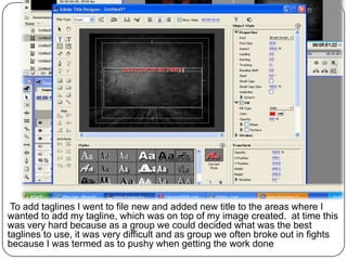
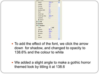
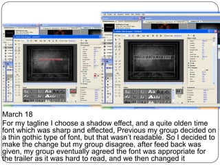
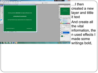
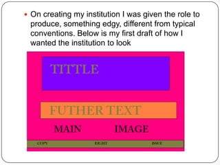
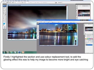
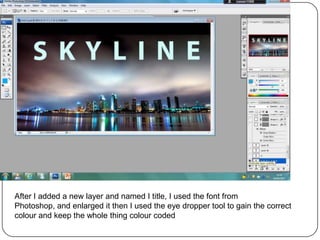
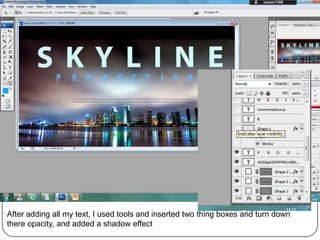
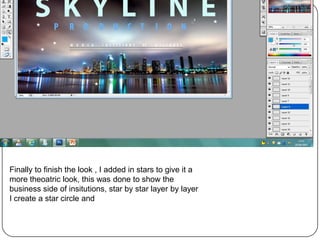
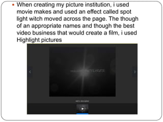
Production Log

           The making of:
Institutions, guidelines and taglines
To add taglines I went to file new and added new title to the areas where I
wanted to add my tagline, which was on top of my image created. at time this
was very hard because as a group we could decided what was the best
taglines to use, it was very difficult and as group we often broke out in fights
because I was termed as to pushy when getting the work done
 To add the effect of the font, we click the arrow
 down for shadow, and changed to opacity to
 138.6% and the colour to white

 We added a slight angle to make a gothic horror
 themed look by titling it at 138.6
March 18
For my tagline I choose a shadow effect, and a quite olden time
font which was sharp and effected, Previous my group decided on
a thin gothic type of font, but that wasn’t readable. So I decided to
make the change but my group disagree, after feed back was
given, my group eventually agreed the font was appropriate for
the trailer as it was hard to read, and we then changed it
Production Log

   guidelines
March 8

After
researchin
g about
guidelines,
 decided
to create
this
institution,
first by
creating a
blank
canvas
and then
changing it
t
great, this
…I then
created a new
layer and tittle
it text
And create all
the vital
information, the
n used effects I
made some
writings bold,
Production Log

   Institutions
 On creating my institution I was given the role to
 produce, something edgy, different from typical
 conventions. Below is my first draft of how I
 wanted the institution to look
Firstly I highlighted the section and use colour replacement tool, to add the
glowing effect this was to help my image to become more bright and eye catching
After I added a new layer and named I title, I used the font from
Photoshop, and enlarged it then I used the eye dropper tool to gain the correct
colour and keep the whole thing colour coded
After adding all my text, I used tools and inserted two thing boxes and turn down
there opacity, and added a shadow effect
G all


Finally to finish the look , I added in stars to give it a
more theoatric look, this was done to show the
business side of insitutions, star by star layer by layer
I create a star circle and
 When creating my picture institution, i used
 movie makes and used an effect called spot
 light witch moved across the page. The though
 of an appropriate names and though the best
 video business that would create a film, i used
 Highlight pictures

Production logsend

  • 1.
    Production Log The making of: Institutions, guidelines and taglines
  • 2.
    To add taglinesI went to file new and added new title to the areas where I wanted to add my tagline, which was on top of my image created. at time this was very hard because as a group we could decided what was the best taglines to use, it was very difficult and as group we often broke out in fights because I was termed as to pushy when getting the work done
  • 3.
     To addthe effect of the font, we click the arrow down for shadow, and changed to opacity to 138.6% and the colour to white  We added a slight angle to make a gothic horror themed look by titling it at 138.6
  • 4.
    March 18 For mytagline I choose a shadow effect, and a quite olden time font which was sharp and effected, Previous my group decided on a thin gothic type of font, but that wasn’t readable. So I decided to make the change but my group disagree, after feed back was given, my group eventually agreed the font was appropriate for the trailer as it was hard to read, and we then changed it
  • 5.
    Production Log guidelines
  • 6.
    March 8 After researchin g about guidelines, decided to create this institution, first by creating a blank canvas and then changing it t great, this
  • 7.
    …I then created anew layer and tittle it text And create all the vital information, the n used effects I made some writings bold,
  • 8.
    Production Log Institutions
  • 9.
     On creatingmy institution I was given the role to produce, something edgy, different from typical conventions. Below is my first draft of how I wanted the institution to look
  • 10.
    Firstly I highlightedthe section and use colour replacement tool, to add the glowing effect this was to help my image to become more bright and eye catching
  • 11.
    After I addeda new layer and named I title, I used the font from Photoshop, and enlarged it then I used the eye dropper tool to gain the correct colour and keep the whole thing colour coded
  • 12.
    After adding allmy text, I used tools and inserted two thing boxes and turn down there opacity, and added a shadow effect
  • 13.
    G all Finally tofinish the look , I added in stars to give it a more theoatric look, this was done to show the business side of insitutions, star by star layer by layer I create a star circle and
  • 14.
     When creatingmy picture institution, i used movie makes and used an effect called spot light witch moved across the page. The though of an appropriate names and though the best video business that would create a film, i used Highlight pictures