
Recommended
More Related Content
What's hot
What's hot (20)
Similar to IDEA GENERATION AND POSTER DESIGN
Similar to IDEA GENERATION AND POSTER DESIGN (20)
More from ChrisIvanov4
More from ChrisIvanov4 (20)
Recently uploaded
Recently uploaded (20)
IDEA GENERATION AND POSTER DESIGN
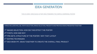
- 1. IDEA GENERATION THIS IS HOW I WAS BUILD UP MY IDEA TOWARDS THE SIMPLE CAMPAING POSTER THINGS INCLUDEDWILL BE, FONTS SELECTION, IMAGE SELECTION, PRESENT'SAND PREVIOUS IDEAS PRESENTEDTOGETHER 1ST IMAGES SELECTION, HOW DID THIS EFFECT THE POSTER 2ND FONTS, HOW AND WHY 3RD PRE-SETS, STRUCTURE OF THE POSTER / WHY THAT LAYOUT 4TH EDITING TECHNIQUES 5TH IDEA MOSH PIT, IDEAS TOGETHER TO CREATE THE OVERALL FINAL PRODUCT
- 2. IMAGE SELECTION The images presented here have been taken for a specific purpose that I was going to use them but then wanted to not continue with that project so I ended up recycling the photos and using them for this project. They are clean have dark colours which is needed for the editing and most importantly are focused . Therefore the images will be used as they are up to standards.
- 3. FONTS SELECTION The selected fonts that I used are from dafont, very popular website for custom fonts that can improve your work these are few examples I choose which looked alike the fonts I seen on some example posters I’ve used only 2 of these font styles. Valiant Times and Valiant Times Italic, they were the best ones fitting the topic/poster theme I was going with.
- 4. PRE-SETS/LAYOUT This is my flat plan which was used as a pre-set for the final outcome towards the simile campaign project. The layout was to basically act like my blueprint for building this project, because of that I also changed some things as going forwards with time. For example one of the main messages wasn't there because how I manipulated my main image was a bit too much so this message box needed to expand more.
- 5. I’ve used different way of manipulating the image I have used for my final product: I’ve done that so the image doesn't lose quality over time and is easier to edit. My background was created while manipulating the image because I wanted to see which colours can mix well and create neutral vibe within everything being so dark I was looking for this background to be light creating diversity. EDITING TECHNIQUES - BACKGROUND As you can see there was multiple chooses I could of chosen but I've stuck with yellow because it looks nice, it has effect on mental health too but most importantly it creates that divide of light and dark that I wanted.
- 6. EDITING TECHNIQUES - IMAGE This the image selected, I moved it enough so only I'm visibly into the editing area and then made a rough selection around me. How the image looked in portrait mode. How the image looked when I re-sized it. How the image looked with the selection before creating a mask.
- 7. EDITING TECHNIQUES – IMAGE SLIDE 2 After making a selection on the image, I wanted it to blend around better so what I did was, make my brush soft and large then took off how much I wanted while still keeping the image intact with the main subject . I’m creating the shadows onto the my main subject by coping the subject cutting off the opposite side. While doing that I tilt the image a bit to the right and then make it all black and change the opacity until I’m happy with it. When continuing this effect make sure the layers don’t interfere too much in the middle because it can darken the image. You can avoid that by putting all the shadows under the main layer.
- 8. IDEAS MIND MAP This is a mind map with multiple ideas that will be constructing the overall project