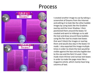
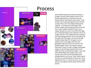
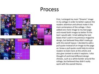
Rebecca Edwards reflects on her process of creating a magazine cover and double page spread for her production. She experimented with layouts, images, and design elements like gradients, shadows and bubbles to enhance the realism and attractiveness of the pieces. Through multiple iterations, revisions and comparisons to other magazines, she refined the designs, such as focusing one page of the spread on a collage of gameplay images and keeping text on the other page.
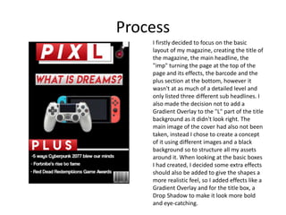


![How Big Brands are Taking Your Traffic in Alberta [Data Inside].pptx](https://cdn.slidesharecdn.com/ss_thumbnails/howbigbrandsaretakingyourtrafficinalbertadatainside-260123180142-42d276f3-thumbnail.jpg?width=640&height=640&fit=bounds)


