Download to read offline
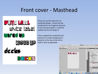
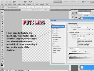
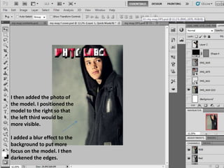
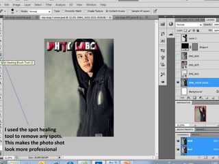
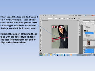
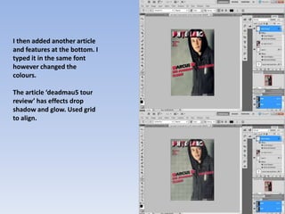
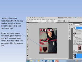
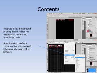
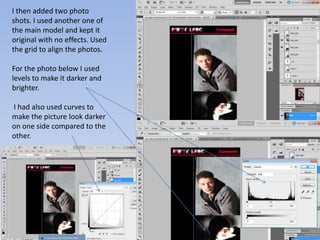
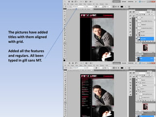
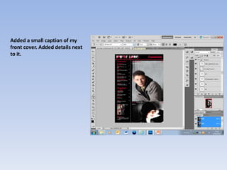
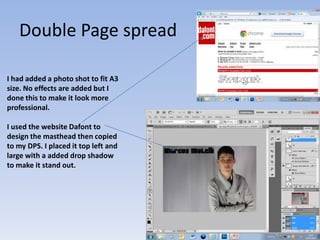
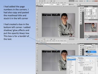
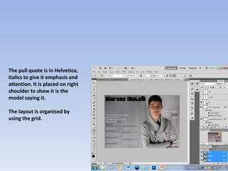
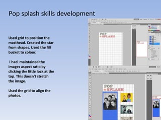

This document summarizes James Dooley's work on designing a magazine masthead and layout for a skills development journal. It describes the various design elements James added, such as effects to the masthead to make it more interesting, positioning a model photo to the right with a blurred background, and adding articles and sections in consistent fonts and colors. James aligned elements using a grid and applied effects like shadows, glows and blurs to elements to make the layout look more polished and professional. The document provides a overview of the key visual design decisions made in creating the magazine format.


