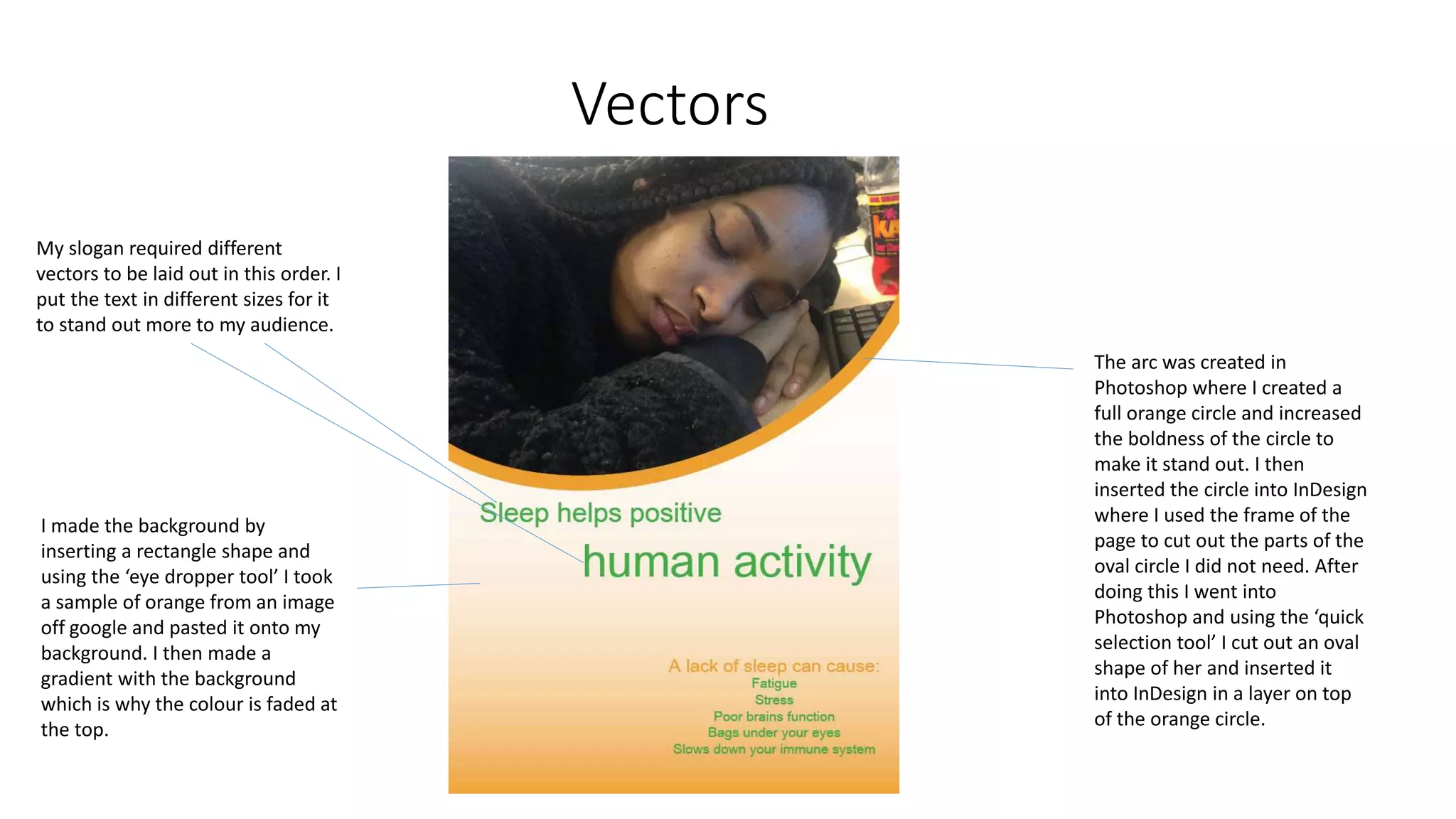
1. The document describes the process of creating a poster in Adobe InDesign and Photoshop, including laying out vectors, inserting text in different sizes, creating a background with an orange circle and gradient, and inserting an image of a person.
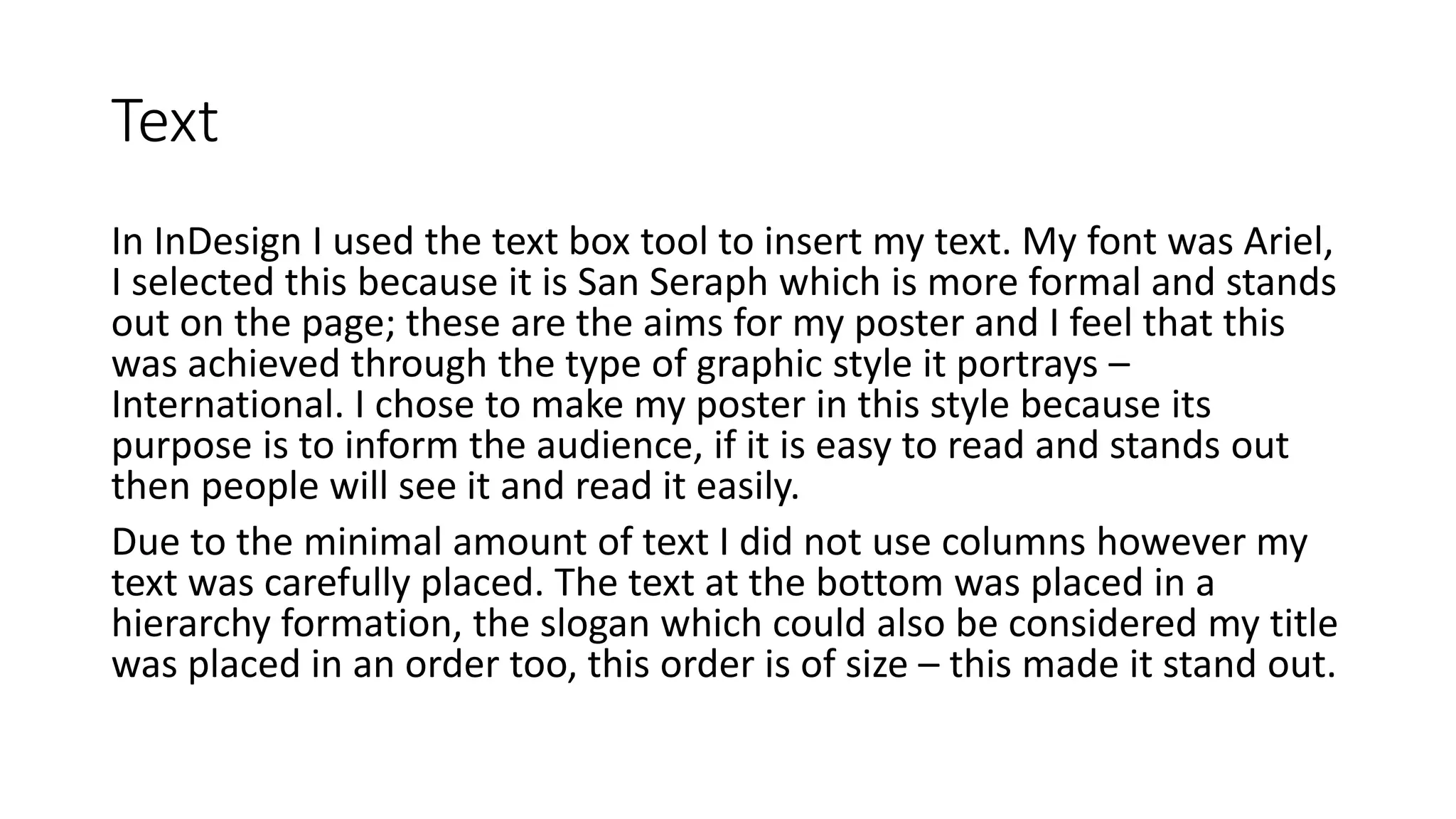
2. Details are provided on text formatting and placement, including using the Arial font and a hierarchy formation for text at the bottom.
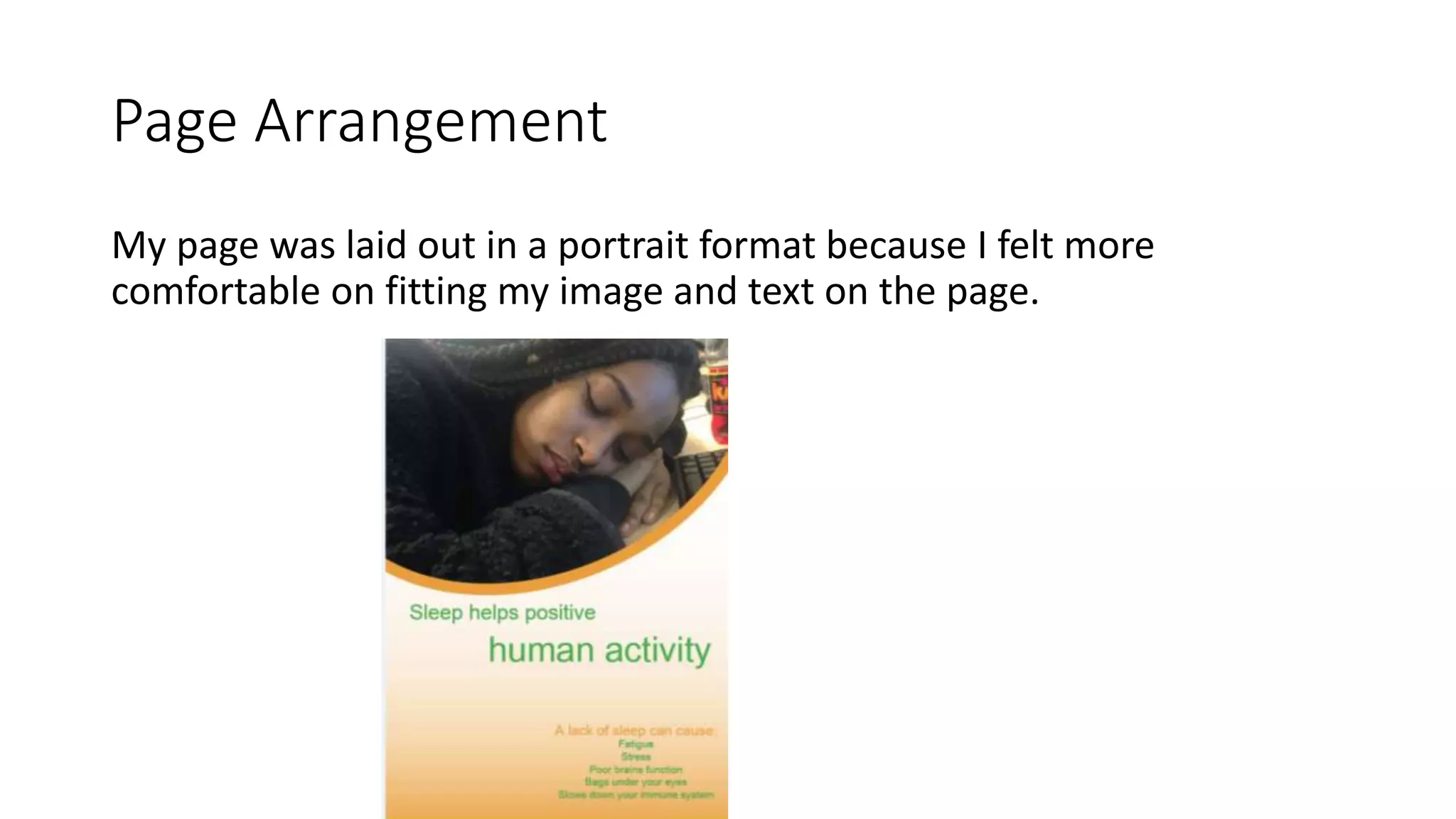
3. The image was inserted from a jpeg photo taken on an iPhone and imported into InDesign, where it was transformed to a suitable angle and size for the poster.