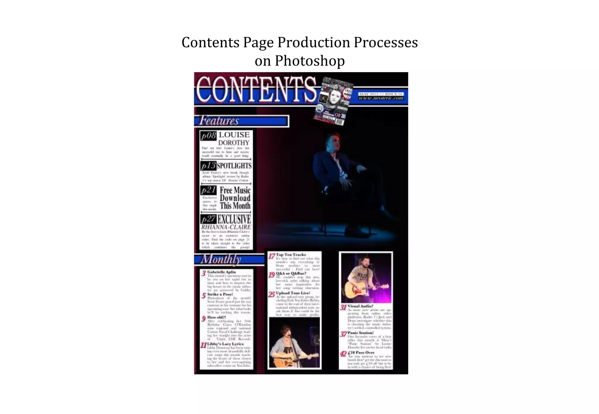
This document summarizes the production process used to create a contents page in Photoshop. Key steps included:
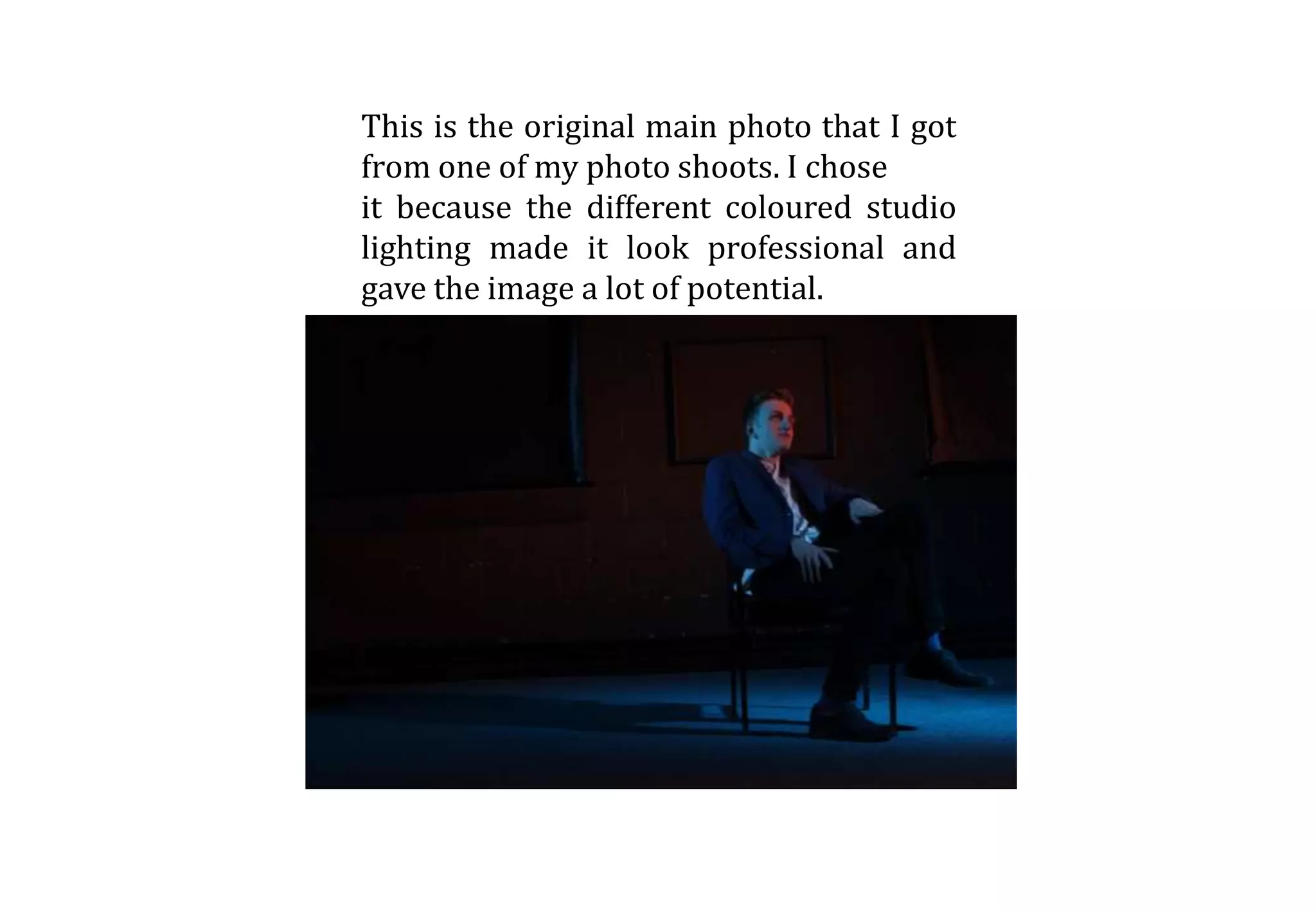
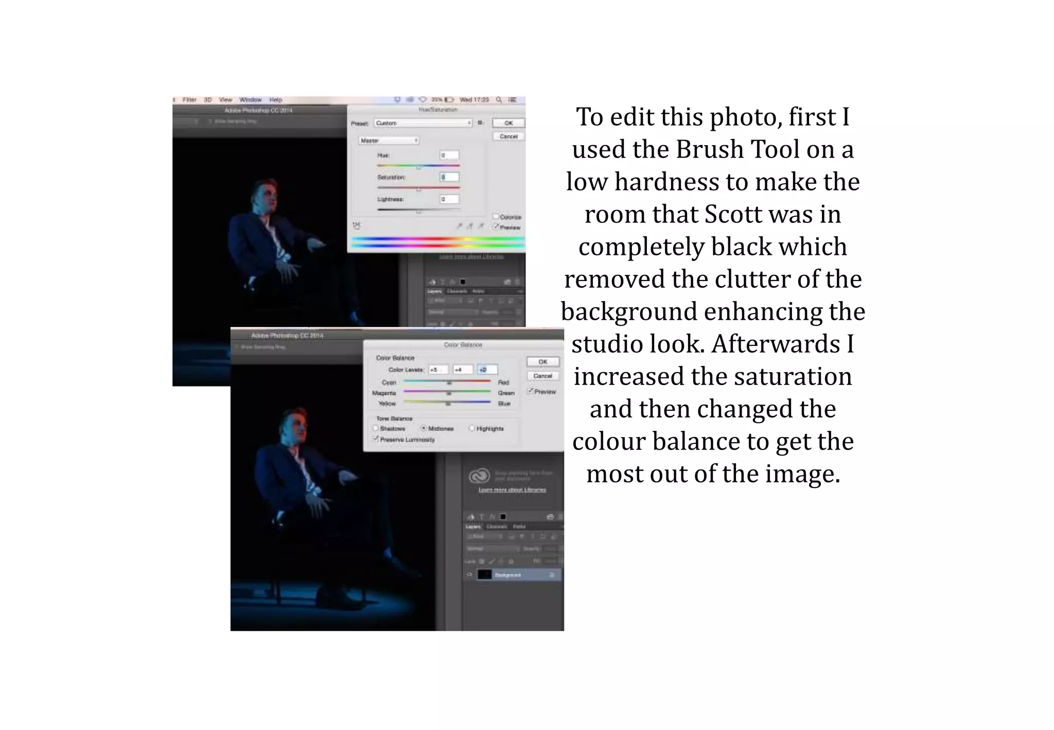
1) Editing the background photo by making parts black to remove clutter and enhance the studio look, and increasing saturation and changing color balance.
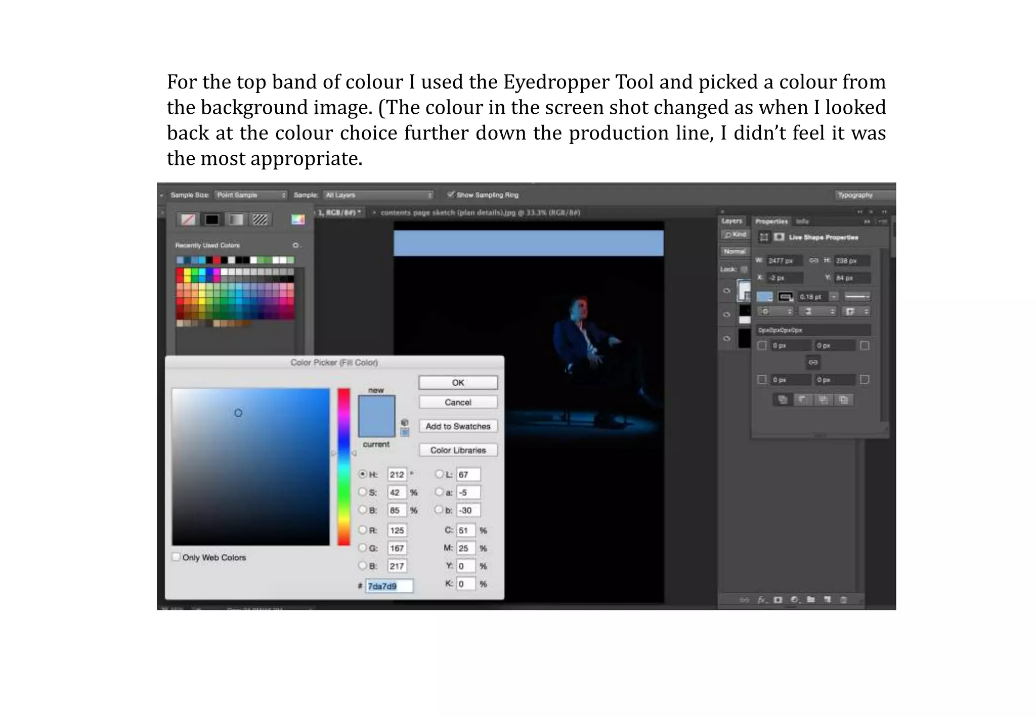
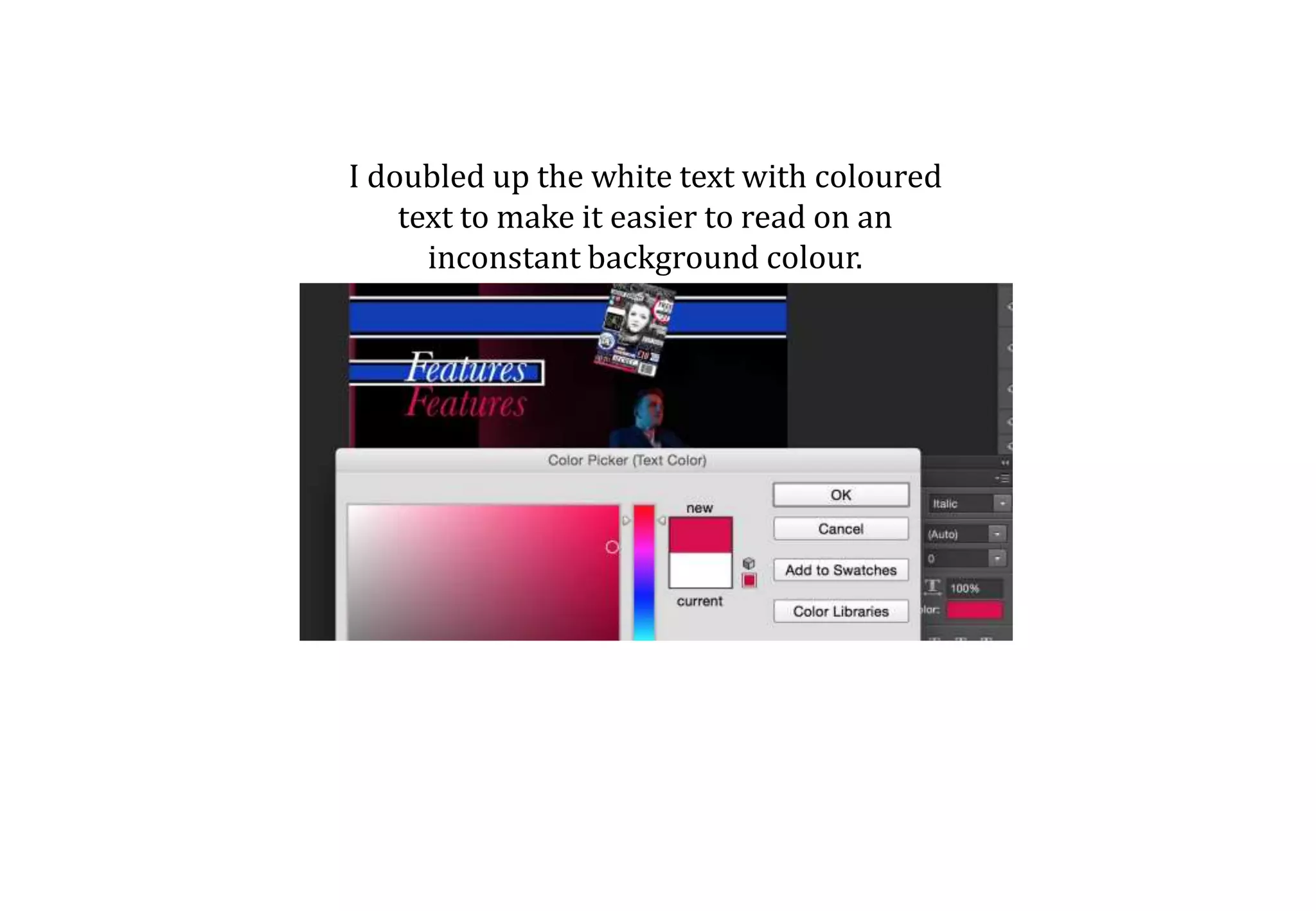
2) Using the Eyedropper Tool to select a color from the background for top color bands, though the color was later changed.
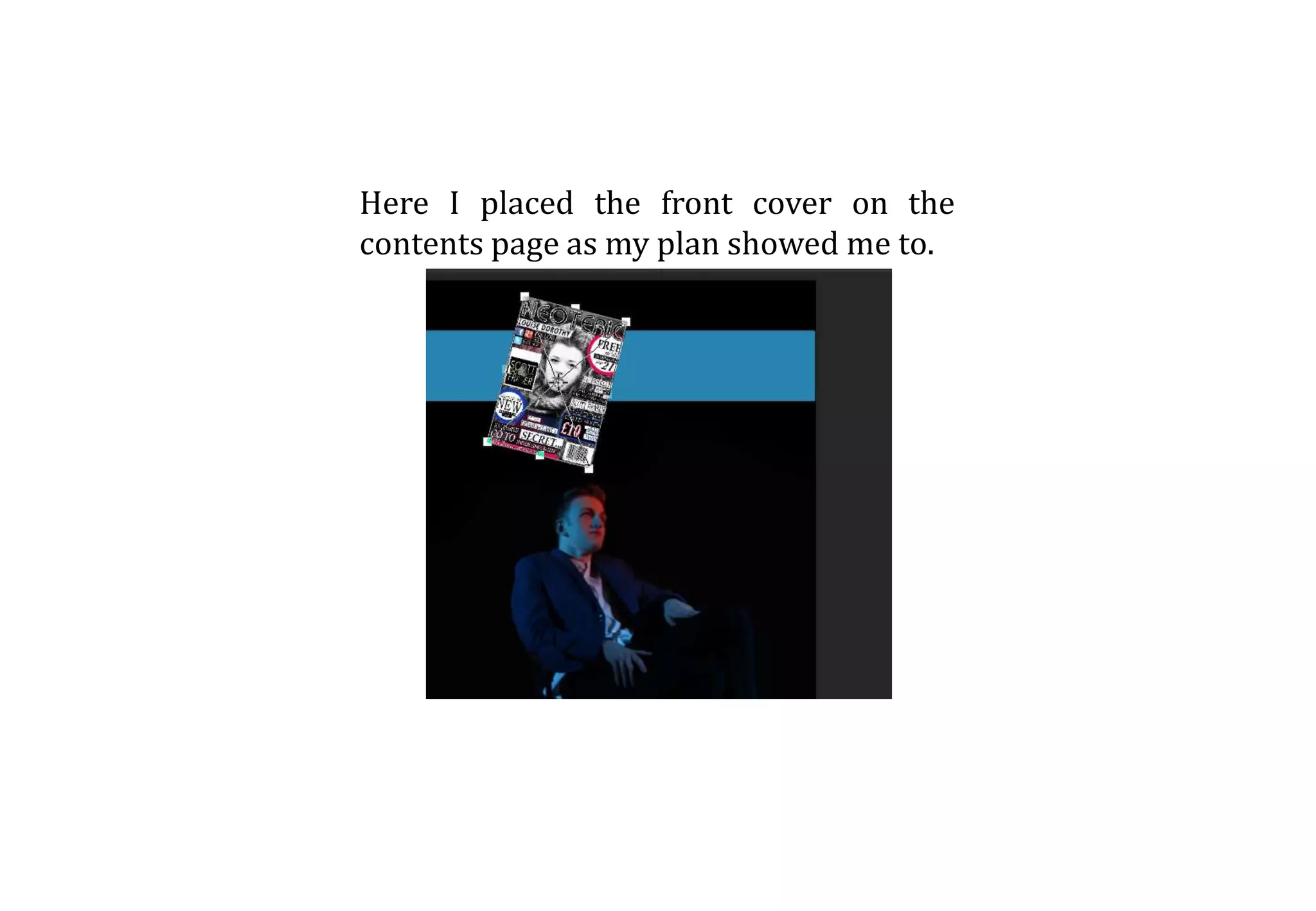
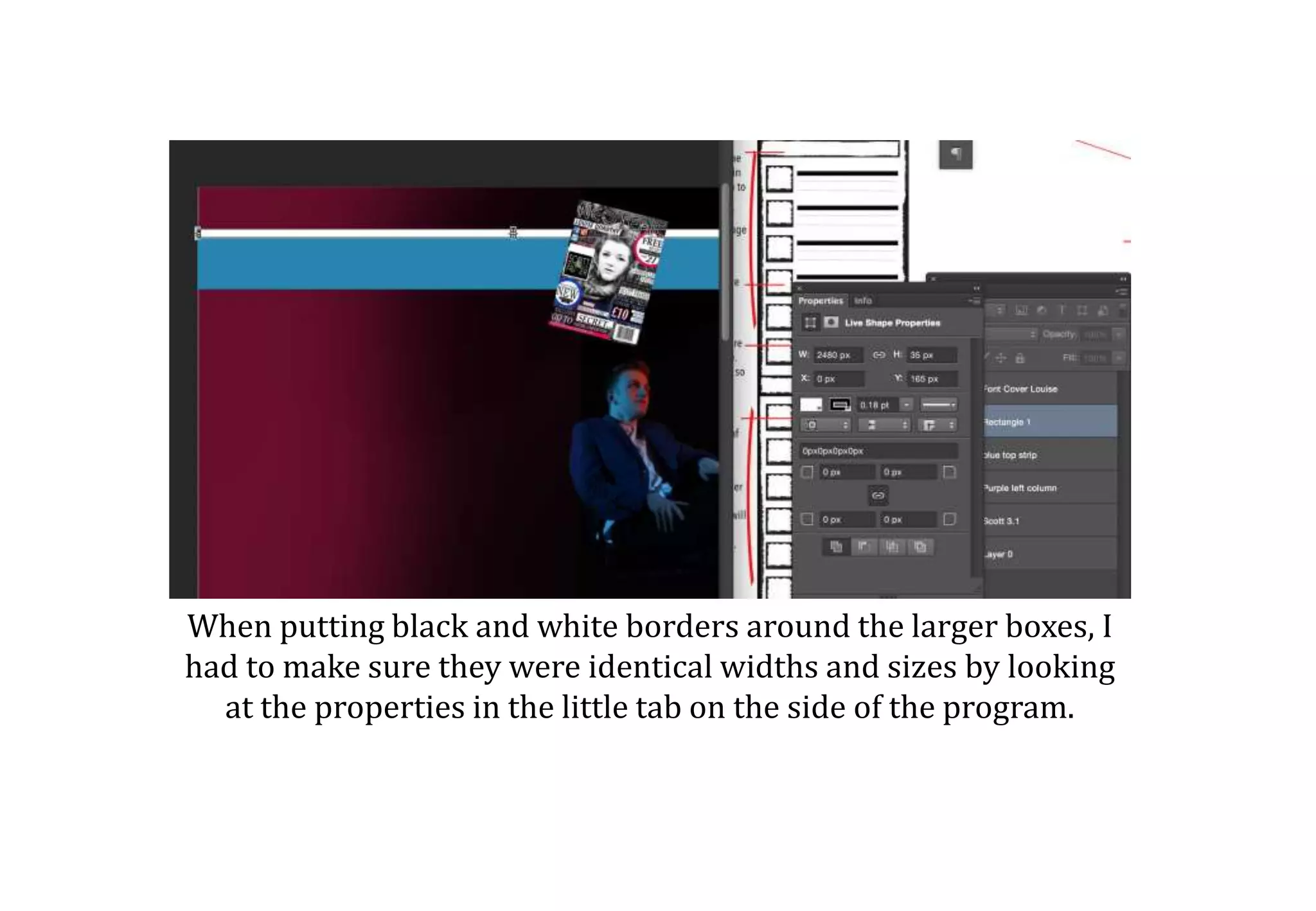
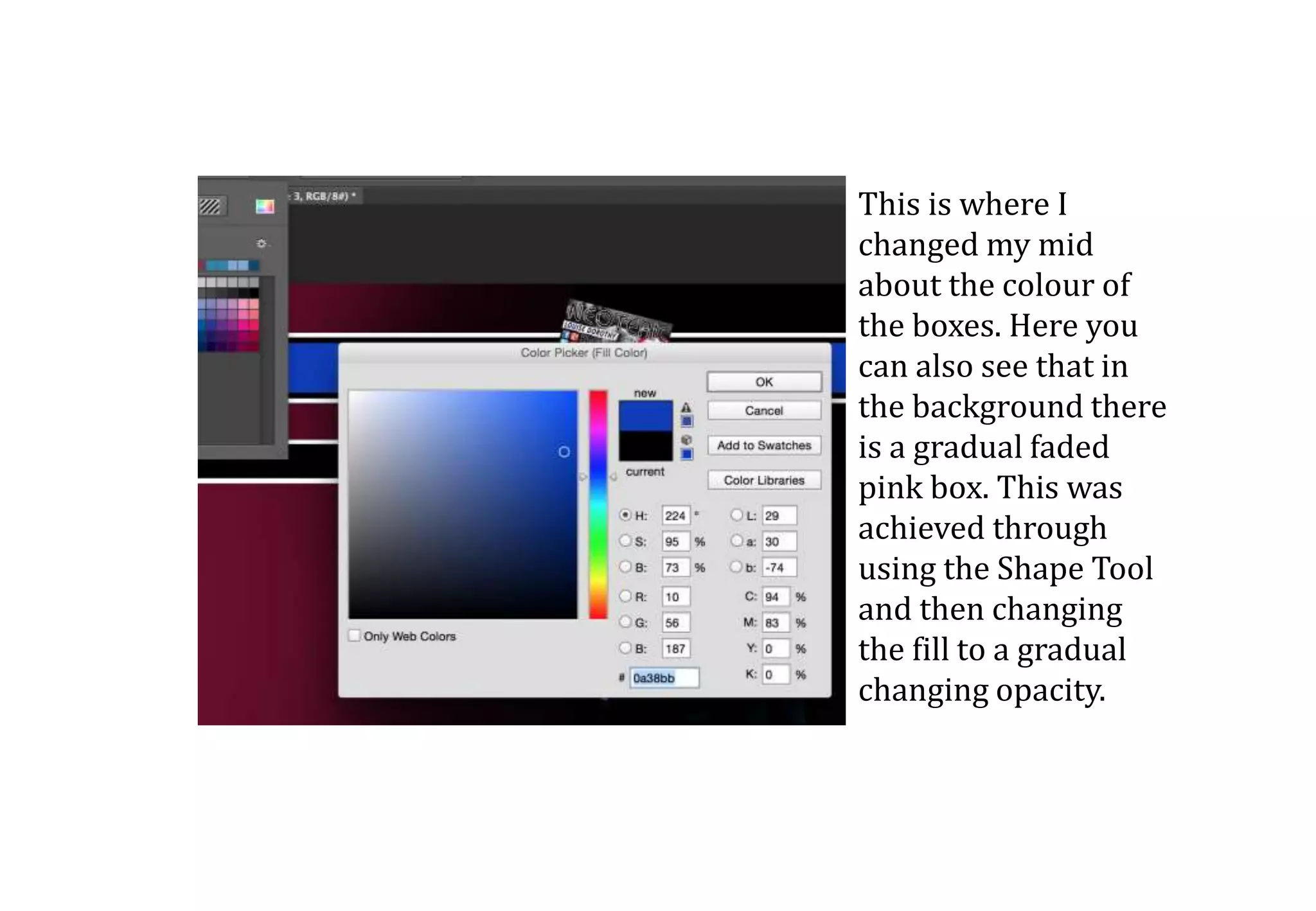
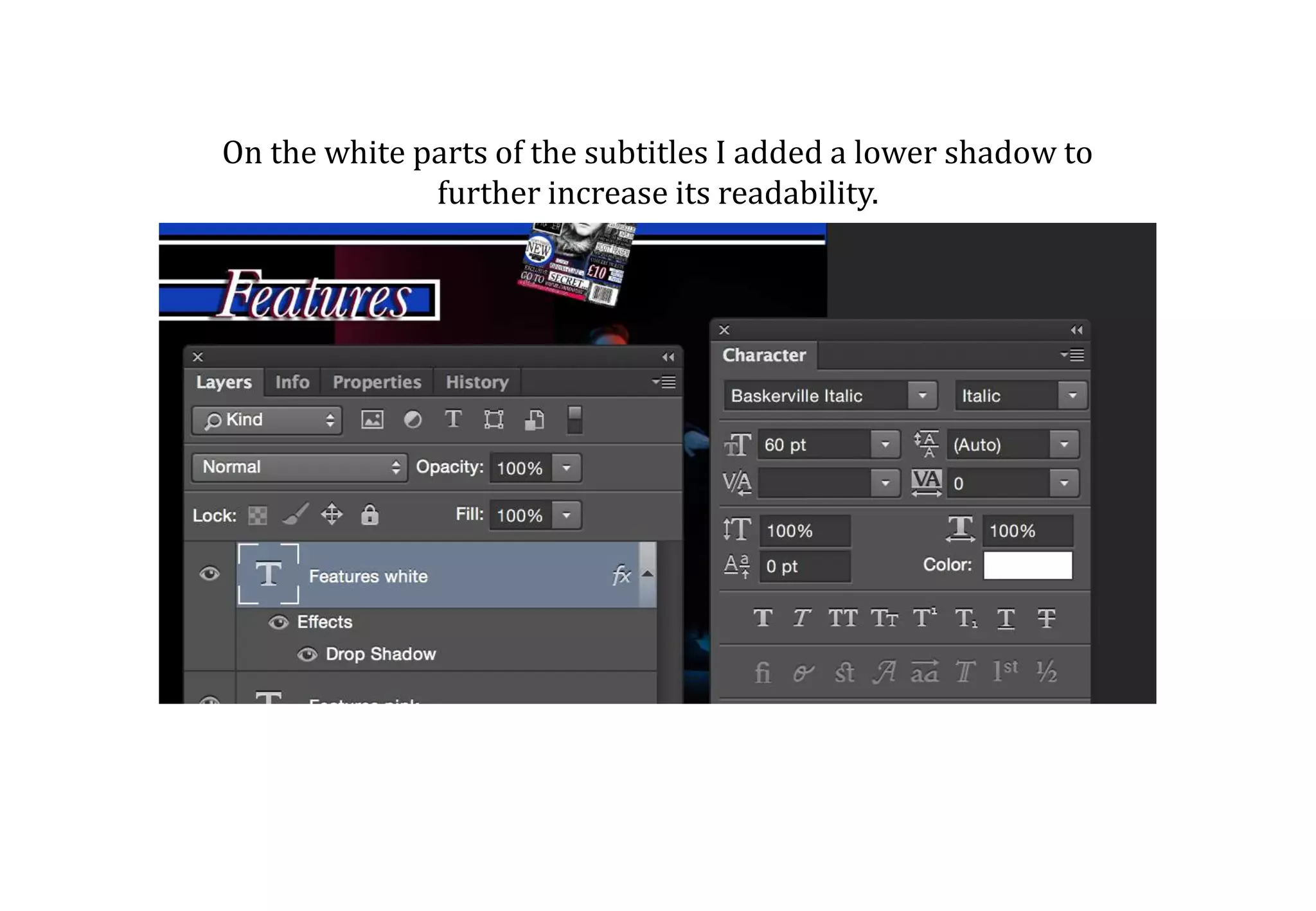
3) Placing elements like the front cover and boxes, adding borders, and using the Shape Tool to add a gradual faded pink box in the background.
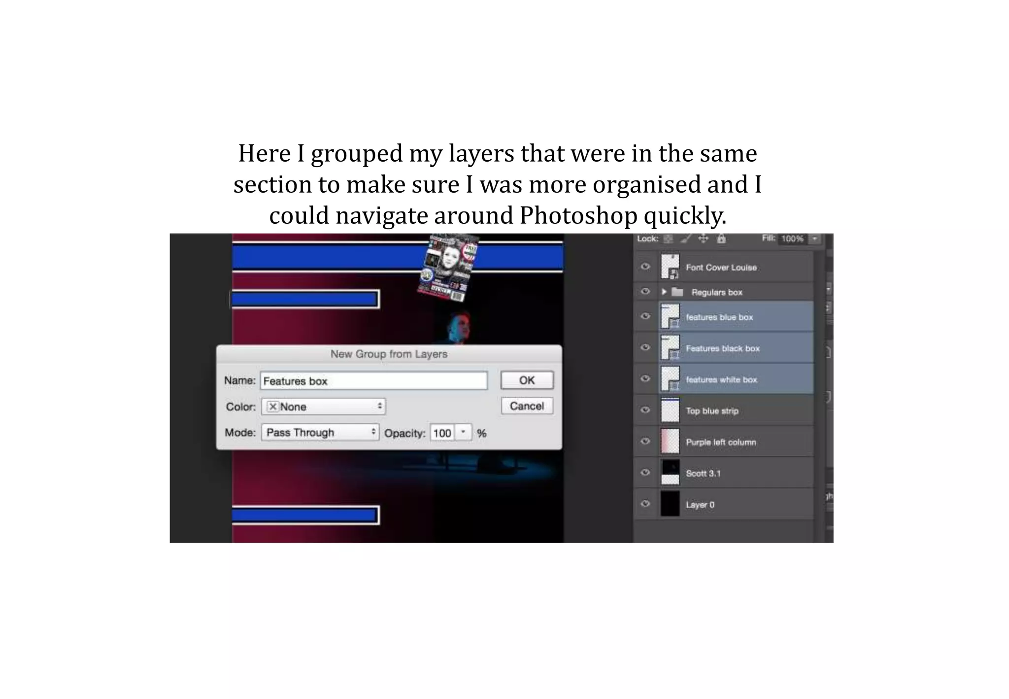
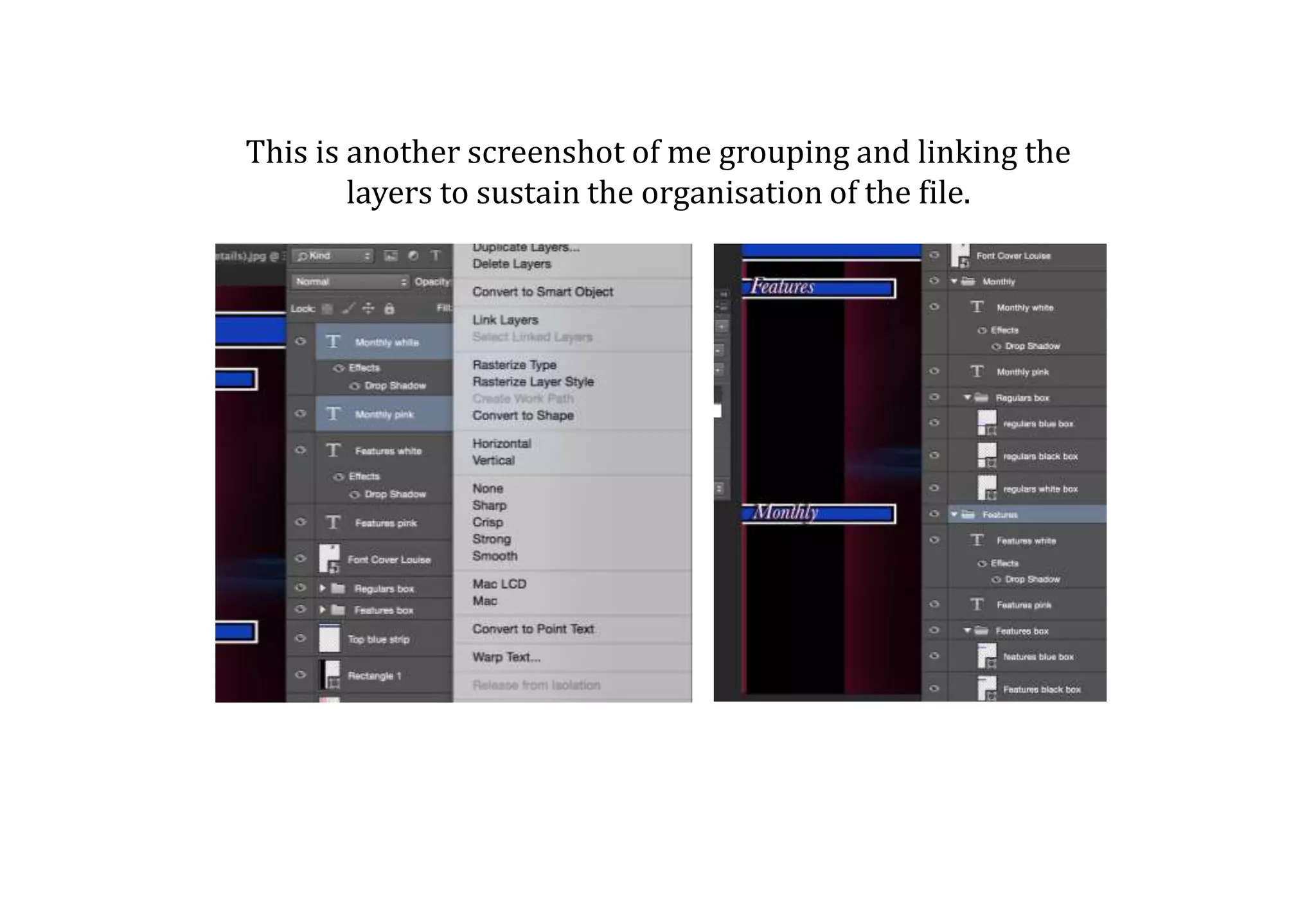
4) Grouping layers by section for organization and ease of navigation in Photoshop.