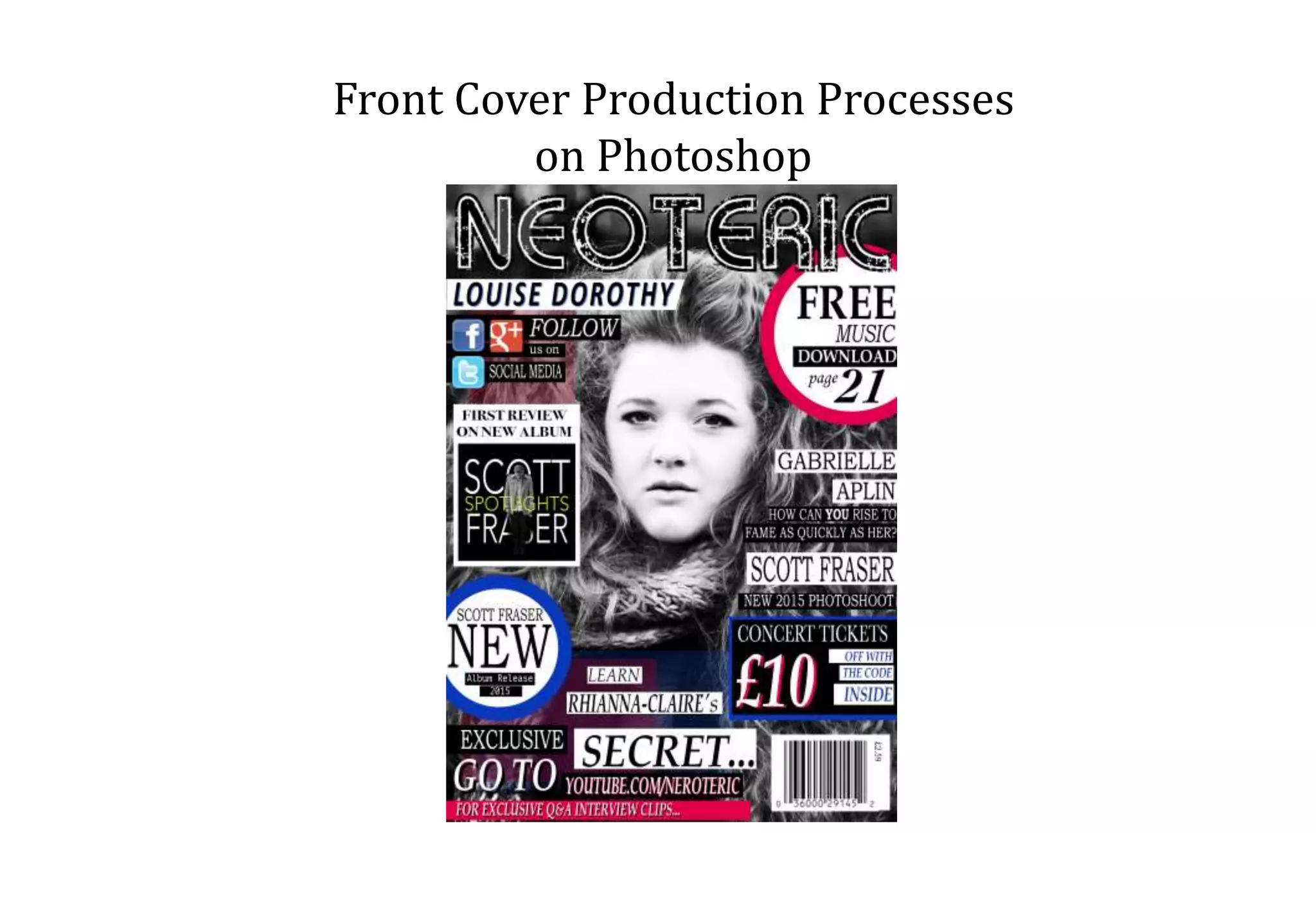
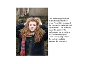
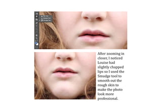
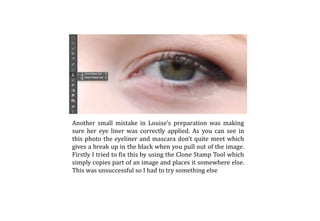
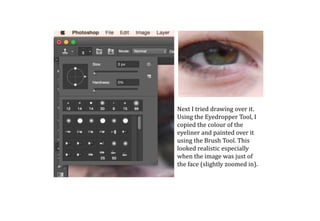
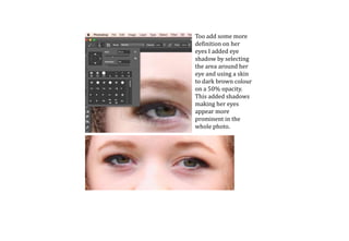
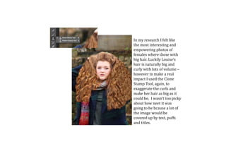
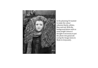
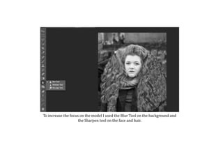
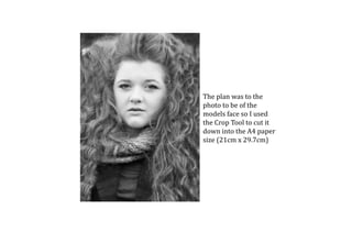
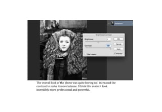
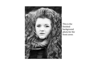
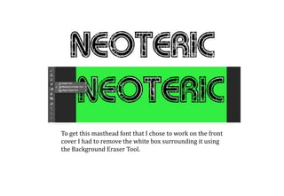
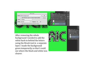
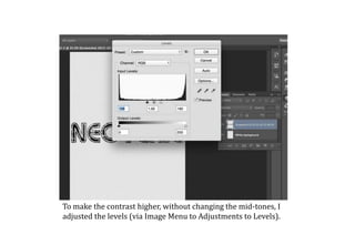
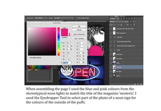
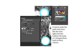
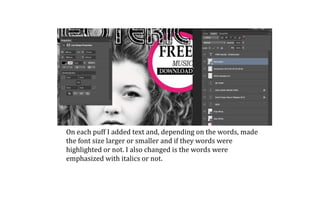
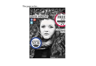
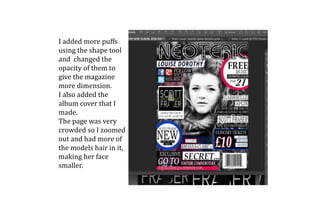
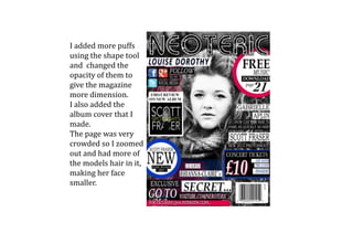
Front Cover Production Processes
on Photoshop
This is the original photo
that I chose for the front
cover. From this I increased
the saturation via image and
adjustments. This, however,
made the green in the
background too prominent
so I used the Polygonal
Lasso Tool to loop around
the back ground and
reduced the saturation.
After zooming in
closer, I noticed
Louise had
slightly chapped
lips so I used the
Smudge tool to
smooth out the
rough skin to
make the photo
look more
professional.
Another small mistake in Louise’s preparation was making
sure her eye liner was correctly applied. As you can see in
this photo the eyeliner and mascara don’t quite meet which
gives a break up in the black when you pull out of the image.
Firstly I tried to fix this by using the Clone Stamp Tool which
simply copies part of an image and places it somewhere else.
This was unsuccessful so I had to try something else
Next I tried drawing over it.
Using the Eyedropper Tool, I
copied the colour of the
eyeliner and painted over it
using the Brush Tool. This
looked realistic especially
when the image was just of
the face (slightly zoomed in).
Too add some more
definition on her
eyes I added eye
shadow by selecting
the area around her
eye and using a skin
to dark brown colour
on a 50% opacity.
This added shadows
making her eyes
appear more
prominent in the
whole photo.
In my research I felt like
the most interesting and
empowering photos of
females where those with
big hair. Luckily Louise’s
hair is naturally big and
curly with lots of volume –
however to make a real
impact I used the Clone
Stamp Tool, again, to
exaggerate the curls and
make her hair as big as it
could be. I wasn’t too picky
about how neet it was
going to be bcause a lot of
the image would be
covered up by text, puffs
and titles.
In the planning I’d wanted
to make the colour
cohesion blacks, whites,
blue and red. With the
background photo with so
many bright colours I
thought it necessary to put
the photo into greyscale
(using the Image menu to
Mode to Greyscale).
To increase the focus on the model I used the Blur Tool on the background and
the Sharpen tool on the face and hair.
The plan was to the
photo to be of the
models face so I used
the Crop Tool to cut it
down into the A4 paper
size (21cm x 29.7cm)
The overall look of the photo was quite boring so I increased the
contrast to make it more intense. I think this made it look
incredibly more professional and powerful.
This is the
finished
background
photo for the
front cover.
To get this masthead font that I chose to work on the front
cover I had to remove the white box surrounding it using
the Background Eraser Tool.
After removing the whole
background I needed to add the
white back to behind the letters
using the Brush tool in a separate
layer. I made the background
green temporarily so that I could
see where the black and white was
clearer.
To make the contrast higher, without changing the mid-tones, I
adjusted the levels (via Image Menu to Adjustments to Levels).
When assembling the page I used the blue and pink colours from the
stereotypical neon lights to match the title of the magazine ‘neoteric’. I
used the Eyedropper Tool to select part of the photo of a neon sign for
the colours of the outside of the puffs.
I tried to make the
puffs look more
like the neon
lights but this
looked a bit tacky
so I changed them
back to block
colours.
On each puff I added text and, depending on the words, made
the font size larger or smaller and if they words were
highlighted or not. I also changed is the words were
emphasized with italics or not.
The page so far…
I added more puffs
using the shape tool
and changed the
opacity of them to
give the magazine
more dimension.
I also added the
album cover that I
made.
The page was very
crowded so I zoomed
out and had more of
the models hair in it,
making her face
smaller.
I added more puffs
using the shape tool
and changed the
opacity of them to
give the magazine
more dimension.
I also added the
album cover that I
made.
The page was very
crowded so I zoomed
out and had more of
the models hair in it,
making her face
smaller.

Front Cover Production Processes

  • 1.
    Front Cover ProductionProcesses on Photoshop
  • 2.
    This is theoriginal photo that I chose for the front cover. From this I increased the saturation via image and adjustments. This, however, made the green in the background too prominent so I used the Polygonal Lasso Tool to loop around the back ground and reduced the saturation.
  • 3.
    After zooming in closer,I noticed Louise had slightly chapped lips so I used the Smudge tool to smooth out the rough skin to make the photo look more professional.
  • 4.
    Another small mistakein Louise’s preparation was making sure her eye liner was correctly applied. As you can see in this photo the eyeliner and mascara don’t quite meet which gives a break up in the black when you pull out of the image. Firstly I tried to fix this by using the Clone Stamp Tool which simply copies part of an image and places it somewhere else. This was unsuccessful so I had to try something else
  • 5.
    Next I trieddrawing over it. Using the Eyedropper Tool, I copied the colour of the eyeliner and painted over it using the Brush Tool. This looked realistic especially when the image was just of the face (slightly zoomed in).
  • 6.
    Too add somemore definition on her eyes I added eye shadow by selecting the area around her eye and using a skin to dark brown colour on a 50% opacity. This added shadows making her eyes appear more prominent in the whole photo.
  • 7.
    In my researchI felt like the most interesting and empowering photos of females where those with big hair. Luckily Louise’s hair is naturally big and curly with lots of volume – however to make a real impact I used the Clone Stamp Tool, again, to exaggerate the curls and make her hair as big as it could be. I wasn’t too picky about how neet it was going to be bcause a lot of the image would be covered up by text, puffs and titles.
  • 8.
    In the planningI’d wanted to make the colour cohesion blacks, whites, blue and red. With the background photo with so many bright colours I thought it necessary to put the photo into greyscale (using the Image menu to Mode to Greyscale).
  • 9.
    To increase thefocus on the model I used the Blur Tool on the background and the Sharpen tool on the face and hair.
  • 10.
    The plan wasto the photo to be of the models face so I used the Crop Tool to cut it down into the A4 paper size (21cm x 29.7cm)
  • 11.
    The overall lookof the photo was quite boring so I increased the contrast to make it more intense. I think this made it look incredibly more professional and powerful.
  • 12.
  • 13.
    To get thismasthead font that I chose to work on the front cover I had to remove the white box surrounding it using the Background Eraser Tool.
  • 14.
    After removing thewhole background I needed to add the white back to behind the letters using the Brush tool in a separate layer. I made the background green temporarily so that I could see where the black and white was clearer.
  • 15.
    To make thecontrast higher, without changing the mid-tones, I adjusted the levels (via Image Menu to Adjustments to Levels).
  • 16.
    When assembling thepage I used the blue and pink colours from the stereotypical neon lights to match the title of the magazine ‘neoteric’. I used the Eyedropper Tool to select part of the photo of a neon sign for the colours of the outside of the puffs.
  • 17.
    I tried tomake the puffs look more like the neon lights but this looked a bit tacky so I changed them back to block colours.
  • 18.
    On each puffI added text and, depending on the words, made the font size larger or smaller and if they words were highlighted or not. I also changed is the words were emphasized with italics or not.
  • 19.
  • 20.
    I added morepuffs using the shape tool and changed the opacity of them to give the magazine more dimension. I also added the album cover that I made. The page was very crowded so I zoomed out and had more of the models hair in it, making her face smaller.
  • 21.
    I added morepuffs using the shape tool and changed the opacity of them to give the magazine more dimension. I also added the album cover that I made. The page was very crowded so I zoomed out and had more of the models hair in it, making her face smaller.