The document provides an evaluation of cans, posters, and web banners designed to promote an energy drink called Irn-Bru. It describes the design process and decisions made for each element. For the cans, the designer experimented with color schemes and images from old Irn-Bru cans to create a retro yet modern look. Posters incorporated the cans with sports or music themes. Web banners continued the color scheme and used 3D text for visual interest. Overall, the designer felt time constraints limited the work but that the core elements of color, images, and text were effectively used across the pieces.
Sleepy Mr Sloth
Age Group: Toddlers
He’s quite good at climbing. He knows how to swing. But sleeping’s his favourite, favourite thing! A playful rhyming story about a sloth. Another great creative commons book from BookDash. Found at freekidsbooks.com
Illustrated by Graham Paterson. Written by Paul Kennedy. Designed by Nick Mulgrew. Edited by Arthur Attwell and Tarryn-Anne Anderson with the help of the Book Dash participants at Cape Town on 10 May 2014, listed here: www.bookdash.org/20140510-cape-town.
Bid маркетинг- снимите деловой костюм и заработайте большеTrade Hub
Известный украинский предприниматель в сфере информационных технологий и стартапов, Board member zakupki.prom.ua, гостевой спикер «Школы глобальных рынков» Kyiv Mohyla Business School и ментор WannaBiz Евгений Саранцов рассказал о том, что же такое bid-специалисты, почему они выгоднее для предпринимателей, чем традиционные менеджеры, а также о влиянии, которое bid-маркетинг окажет на все сферы экономики уже в самое ближайшее время.
Sécuriser les communications sur Internet de bout-en-bout avec le protocole DANEAfnic
Alors que la sécurisation des communications sur Internet n’a jamais été autant d’actualité, l’Afnic lance un dossier thématique consacré au protocole DANE
OBRAS DE INGENIERÍA
• LA CONSTRUCCIÓN EN GENERAL.
• CARRETERAS. TIPOS Y PARTES.
• PRESAS. TIPOS Y PARTES.
• PUENTES. TIPOS Y PARTES.
• RESERVORIOS Y TANQUES.
• OBRAS HIDRÁULICAS.
• MAQUINARIA PESADA.
The early effects of the reform programme have triggered a surge in the Japanese stock market, accelerated by the anticipation of growth revival. So far, so good for the markets and traders. But how will Abenomics accommodate public debt of over 200% GDP, and will Abe’s radical policies inspire a long-term economic recovery in Japan? Do you think fiscal stimulus, monetary policy and structural reforms will revitalise the Japanese economy? Check out Saxo’s latest infographic and join the debate on Twitter @SaxoMarkets.
Transcript: Selling digital books in 2024: Insights from industry leaders - T...BookNet Canada
The publishing industry has been selling digital audiobooks and ebooks for over a decade and has found its groove. What’s changed? What has stayed the same? Where do we go from here? Join a group of leading sales peers from across the industry for a conversation about the lessons learned since the popularization of digital books, best practices, digital book supply chain management, and more.
Link to video recording: https://bnctechforum.ca/sessions/selling-digital-books-in-2024-insights-from-industry-leaders/
Presented by BookNet Canada on May 28, 2024, with support from the Department of Canadian Heritage.
Essentials of Automations: Optimizing FME Workflows with ParametersSafe Software
Are you looking to streamline your workflows and boost your projects’ efficiency? Do you find yourself searching for ways to add flexibility and control over your FME workflows? If so, you’re in the right place.
Join us for an insightful dive into the world of FME parameters, a critical element in optimizing workflow efficiency. This webinar marks the beginning of our three-part “Essentials of Automation” series. This first webinar is designed to equip you with the knowledge and skills to utilize parameters effectively: enhancing the flexibility, maintainability, and user control of your FME projects.
Here’s what you’ll gain:
- Essentials of FME Parameters: Understand the pivotal role of parameters, including Reader/Writer, Transformer, User, and FME Flow categories. Discover how they are the key to unlocking automation and optimization within your workflows.
- Practical Applications in FME Form: Delve into key user parameter types including choice, connections, and file URLs. Allow users to control how a workflow runs, making your workflows more reusable. Learn to import values and deliver the best user experience for your workflows while enhancing accuracy.
- Optimization Strategies in FME Flow: Explore the creation and strategic deployment of parameters in FME Flow, including the use of deployment and geometry parameters, to maximize workflow efficiency.
- Pro Tips for Success: Gain insights on parameterizing connections and leveraging new features like Conditional Visibility for clarity and simplicity.
We’ll wrap up with a glimpse into future webinars, followed by a Q&A session to address your specific questions surrounding this topic.
Don’t miss this opportunity to elevate your FME expertise and drive your projects to new heights of efficiency.
GraphRAG is All You need? LLM & Knowledge GraphGuy Korland
Guy Korland, CEO and Co-founder of FalkorDB, will review two articles on the integration of language models with knowledge graphs.
1. Unifying Large Language Models and Knowledge Graphs: A Roadmap.
https://arxiv.org/abs/2306.08302
2. Microsoft Research's GraphRAG paper and a review paper on various uses of knowledge graphs:
https://www.microsoft.com/en-us/research/blog/graphrag-unlocking-llm-discovery-on-narrative-private-data/
Generating a custom Ruby SDK for your web service or Rails API using Smithyg2nightmarescribd
Have you ever wanted a Ruby client API to communicate with your web service? Smithy is a protocol-agnostic language for defining services and SDKs. Smithy Ruby is an implementation of Smithy that generates a Ruby SDK using a Smithy model. In this talk, we will explore Smithy and Smithy Ruby to learn how to generate custom feature-rich SDKs that can communicate with any web service, such as a Rails JSON API.
LF Energy Webinar: Electrical Grid Modelling and Simulation Through PowSyBl -...DanBrown980551
Do you want to learn how to model and simulate an electrical network from scratch in under an hour?
Then welcome to this PowSyBl workshop, hosted by Rte, the French Transmission System Operator (TSO)!
During the webinar, you will discover the PowSyBl ecosystem as well as handle and study an electrical network through an interactive Python notebook.
PowSyBl is an open source project hosted by LF Energy, which offers a comprehensive set of features for electrical grid modelling and simulation. Among other advanced features, PowSyBl provides:
- A fully editable and extendable library for grid component modelling;
- Visualization tools to display your network;
- Grid simulation tools, such as power flows, security analyses (with or without remedial actions) and sensitivity analyses;
The framework is mostly written in Java, with a Python binding so that Python developers can access PowSyBl functionalities as well.
What you will learn during the webinar:
- For beginners: discover PowSyBl's functionalities through a quick general presentation and the notebook, without needing any expert coding skills;
- For advanced developers: master the skills to efficiently apply PowSyBl functionalities to your real-world scenarios.
Epistemic Interaction - tuning interfaces to provide information for AI supportAlan Dix
Paper presented at SYNERGY workshop at AVI 2024, Genoa, Italy. 3rd June 2024
https://alandix.com/academic/papers/synergy2024-epistemic/
As machine learning integrates deeper into human-computer interactions, the concept of epistemic interaction emerges, aiming to refine these interactions to enhance system adaptability. This approach encourages minor, intentional adjustments in user behaviour to enrich the data available for system learning. This paper introduces epistemic interaction within the context of human-system communication, illustrating how deliberate interaction design can improve system understanding and adaptation. Through concrete examples, we demonstrate the potential of epistemic interaction to significantly advance human-computer interaction by leveraging intuitive human communication strategies to inform system design and functionality, offering a novel pathway for enriching user-system engagements.
State of ICS and IoT Cyber Threat Landscape Report 2024 previewPrayukth K V
The IoT and OT threat landscape report has been prepared by the Threat Research Team at Sectrio using data from Sectrio, cyber threat intelligence farming facilities spread across over 85 cities around the world. In addition, Sectrio also runs AI-based advanced threat and payload engagement facilities that serve as sinks to attract and engage sophisticated threat actors, and newer malware including new variants and latent threats that are at an earlier stage of development.
The latest edition of the OT/ICS and IoT security Threat Landscape Report 2024 also covers:
State of global ICS asset and network exposure
Sectoral targets and attacks as well as the cost of ransom
Global APT activity, AI usage, actor and tactic profiles, and implications
Rise in volumes of AI-powered cyberattacks
Major cyber events in 2024
Malware and malicious payload trends
Cyberattack types and targets
Vulnerability exploit attempts on CVEs
Attacks on counties – USA
Expansion of bot farms – how, where, and why
In-depth analysis of the cyber threat landscape across North America, South America, Europe, APAC, and the Middle East
Why are attacks on smart factories rising?
Cyber risk predictions
Axis of attacks – Europe
Systemic attacks in the Middle East
Download the full report from here:
https://sectrio.com/resources/ot-threat-landscape-reports/sectrio-releases-ot-ics-and-iot-security-threat-landscape-report-2024/
Slack (or Teams) Automation for Bonterra Impact Management (fka Social Soluti...Jeffrey Haguewood
Sidekick Solutions uses Bonterra Impact Management (fka Social Solutions Apricot) and automation solutions to integrate data for business workflows.
We believe integration and automation are essential to user experience and the promise of efficient work through technology. Automation is the critical ingredient to realizing that full vision. We develop integration products and services for Bonterra Case Management software to support the deployment of automations for a variety of use cases.
This video focuses on the notifications, alerts, and approval requests using Slack for Bonterra Impact Management. The solutions covered in this webinar can also be deployed for Microsoft Teams.
Interested in deploying notification automations for Bonterra Impact Management? Contact us at sales@sidekicksolutionsllc.com to discuss next steps.
Elevating Tactical DDD Patterns Through Object CalisthenicsDorra BARTAGUIZ
After immersing yourself in the blue book and its red counterpart, attending DDD-focused conferences, and applying tactical patterns, you're left with a crucial question: How do I ensure my design is effective? Tactical patterns within Domain-Driven Design (DDD) serve as guiding principles for creating clear and manageable domain models. However, achieving success with these patterns requires additional guidance. Interestingly, we've observed that a set of constraints initially designed for training purposes remarkably aligns with effective pattern implementation, offering a more ‘mechanical’ approach. Let's explore together how Object Calisthenics can elevate the design of your tactical DDD patterns, offering concrete help for those venturing into DDD for the first time!
Encryption in Microsoft 365 - ExpertsLive Netherlands 2024Albert Hoitingh
In this session I delve into the encryption technology used in Microsoft 365 and Microsoft Purview. Including the concepts of Customer Key and Double Key Encryption.
Designing Great Products: The Power of Design and Leadership by Chief Designe...
Evaluation
1. Evaluation
The first two cans are the simple traditional styles, these have
been made by bringing something old in to something new, to
do this when conducting my research I looked at Irn-Bru in all
it’s different states, so I thought that it would be a really good
idea to put parts from old Irn-Bru cans on to a new can but with
a twist so that it’s still original, as you can see I have kept a clear
colour theme running using the blue and orange, and the other
less traditional colours from previous Irn-Bru adverts. This can
ranges from 1990 to now.
I have decided to use the font that I have because to me it fits in with the typical stereotype for
energy drinks, sport, I think that this font represent being outside because of the chunks that are
missing out of it, it also reminds me of street kind of writing which can be found outside, so this is
why I stuck to this kind of image.
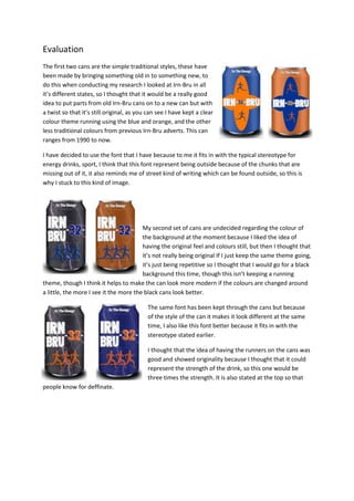
My second set of cans are undecided regarding the colour of
the background at the moment because I liked the idea of
having the original feel and colours still, but then I thought that
it’s not really being original If I just keep the same theme going,
it’s just being repetitive so I thought that I would go for a black
background this time, though this isn’t keeping a running
theme, though I think it helps to make the can look more modern if the colours are changed around
a little, the more I see it the more the black cans look better.
The same font has been kept through the cans but because
of the style of the can it makes it look different at the same
time, I also like this font better because it fits in with the
stereotype stated earlier.
I thought that the idea of having the runners on the cans was
good and showed originality because I thought that it could
represent the strength of the drink, so this one would be
three times the strength. It is also stated at the top so that
people know for deffinate.
2. The third version of cans have the splash on them, for this
one I have gone for something simple and easy, this is
because my other two designs were quite a detailed
background design so this time I thought that I would go for
something simple so that its different to the rest, but in the
same way it looks busy at the same time because of all the
tones in the background from the splash.
I thought that I would go for a splash because this
represents liquid; this connects it to the drink. The two droplets at the bottom represent the
strength of the drink, by showing that it’s two times the energy as well as mentioning it on the can
itself.
The text that I have used for this can has still stayed the same through out, reasons for this is
because I think that it looks better if the text and colour scheme stayed the same, I also think that
this font works well with whatever background because it’s so bold so it will be easy for the
audience to see.
As you can tell from reading about the cans above they are all more or less made up of the same
factors, text, images and colour. I think that it will help to make it look different if I where to use
different techniques but then as the same time I like how they are all made up of the same factors.
The overall look of this packaging is good because it’s been kept nice and simple but because of the
design it makes it look busy, so it’s a trick of the eye. When creating my work it was all quite
technical because I had to warp things and insert things so that they fit in properly. To do these
things I had to use the warp tool, for example, on the first set of cans I did I made an oval in the
middle, then I needed two parts coming from the sides so that it joined up around the back, I found
this quite difficult because whenever I moved it to curve the edge in to the same shape as the oval
their was either the orange of the background showing or their was a darker block of blue from
where the two shapes would interlink.
3. Can back
The back of my can will look like it does for every design, when
creating this I made sure that I included the necessary logos and
information, including a GB logo, the BARR logo, a recyclable logo,
the contents and how its best served.
When completing the back of the can I don’t think that it was very
difficult because all I had to do was add a couple of logos and
some text. I thought of the idea of adding what ingredients is in
the drink by doing some research in to what goes on the back of
cans and I found out that most companies do put ingredients on
the back.
4. Poster
In the process of making the posters I thought of
putting the lightning cans with the lightning
background, but then I thought that it might look too
busy so I changed the backgrounds around so that
they were different to each other, so that the pain
cans where with the lightning background, I thought
that this worked really well and it helped to make
different parts on each poster stand out and the
different elements compliment each other.
The next poster is on sports, this fits the energy drink
stereotype. But this is a sports fanzine.
I thought that by cloning the Irn-Bru can in to the rugby
players hands would look really good and work really well to
help Irn-Bru gain more of an audience.
When the Irn-Bru can was placed in to their arms, I noticed
that you can’t really see the Irn-Bru can because the image is
to bright and vibrant, so by changing the colours and contrast
of the image so that it helped to make the can stand out
more, this worked really well for me as it enables you to be able to see the can more.
The font on this has been changed because with the kind of background that it is you wouldn’t be
able to tell what it said, so I thought that I would change it to something simple and bold so that it’s
easier for the audience to see. I also thought that I would put something quick and catchy so that it
keeps the audiences attention and gets the message across, by putting ‘Everyone goes crazy for…’
then having a can of Irn-Bru makes the audience think for themselves rather than being given the
message.
Overall this part of my poster was technical because I had to use the
polygonal lasso and make sure that everything was visible, for example
when the can was placed on to the image it was covering parts of the
rugby player, but after I cut parts out it was then fine.
While I was on the fanzine subject, I also decided to do one of a singer,
so this is what I did.
This one I made was of Rita Ora, when doing this I did the same thing
putting the item in the celebrities hands, but it didn’t work out so well
on this one, this is because her thumbs where holding on to the straps
5. on her top, so when I cut out the can so that it wasn’t covering her thumbs, there was a black line
going across, so this didn’t work very well, you can see this in the image on the left. When I noticed
that this had happened I tried cutting it out from the image, but it wouldn’t let me delete it, so I
decided that I would try and colour over it, but for some reason that didn’t work either.
Web Banner
For this task we where to create web banners
in the same form as the posters but move
them around a bit, so this is what I did, all my
web banners are again made up of the same
thing, they were all really quick and simple
designs and it was really quick and simple to
make.
The colour scheme for these has stayed the
same as the colour schemes for the cans and
the magazine page, I thought that this would
be a good idea so that the audience can see
clear professionalism; I thought to do this also
because the audience might think that it’s a
different product if the colours suddenly
changed.
When the text was put on the banners, it all
looked really flat and boring, so this
persuaded me to make it look 3D, to do this I
used a bevel to make it stand out. It also helps
to make it look more realistic because of the way
that the text is sticking of the page a bit so this
helps to show the meaning of why it’s sticking off
the page a bit. I thought that I would do this also
so that it looks different when and if it where to
appear on a computer.
The technical aspects of this poster are very
minimal as I didn’t use any images I just used
blocks of colour and text.
6. Once I had completed three I created another fanzine
style one, mine was based on Barack Obama. Even
though Barack Obama isn’t Scottish I thought that I
would use him as he is a well known representative, it
shows that people in high up places like the small
things lower people do. I think that this web banner
will bring each social working class together.
The stages that I went through to create the poster
like I did that done in the same way as the others, I
made it so that the Irn-Bru was in his hands and cut
out the parts that where covering his hands, I thought that this worked really well but I think that it
could have been better. When I did this you could still see parts of the other thing that he was
holding in his hands, so I deleted those parts from the layer so that it was no longer visible.
Once I did this I then added some text too it to try and make it comical, again when I wrote ‘I don’t
always drink, but when I do…’ I made sure that I didn’t finish the end of the sentence so that the
audience have to think to their self.
The text that I used have to be changed so that it was easier for the audience to sent that I had to
cut out the original because there is so much going on in the background, so I just used a simple font
in bold and put an outline around it so that it stands out more and helps readability.
I think that this web banner was quite technical as I had to be able to put the can in his hands and try
to make it look realistic.
Overall if I where to do this project again I think that I would challenge myself more and put more in
to the product, I think that I didn’t do this this time because there wasn’t much time for us to create
mock products so it didn’t really give us much flexibility, I also think that because of the product we
are doing this for it hasn’t given us much freedom.
Comparing and Contrasting
Compared to existing products, for example Coca Cola, I think that there is better looking and more
professional because they will have experienced people to create things for them, whereas I don’t,
so I feel this was quite challenging for me to create something of that standard.
They will also have a lot more time to complete things so because of this and with mine being
rushed it also helps to make theirs look better.
I think that the backs of our cans look very similar because it contains all the same information about
the product and it is also made up of the same logos. When you compare the front of my can to the
front of theirs you can tell straight away which is professional and which isn’t. If I had more time do
to this project I feel that I could make it so that it’s difficult to tell which is which, but for someone of
my knowledge and experience I think that I have done okay to come up with what I have.
7. Comparing the posters to each other If I didn’t know which was which I don’t think you would be
able to tell which is professional and which isn’t, this is because they are both really simple and get
to the point, they are also made up of the same things, text, colours, and images.
When I asked a friend to look at both a coke poster and mine they said that my poster caught their
eye first because of the bright colours, I found this interesting because I thought that they would
have noticed the coca cola one first just because of the name.
When looking for web banners from existing energy drink products I couldn’t seem to find many, but
because when I was looking and they were actually popping up on the internet unlike mine I think
that there’s looks as if more work has been put in to it, it also looks more professional because from
looking at mine the text is sticking off the page to try and make it look 3D.