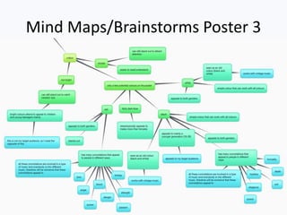
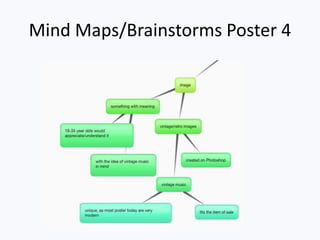
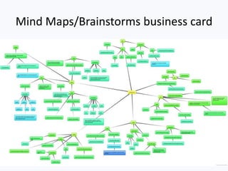
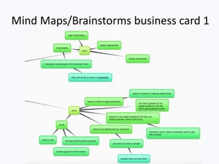
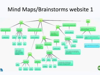
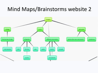
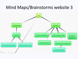
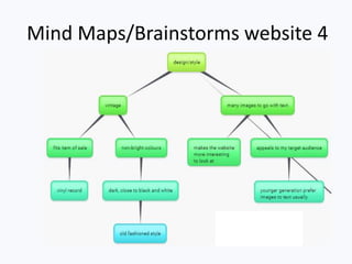
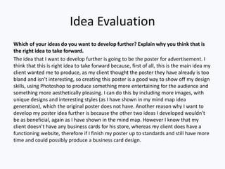
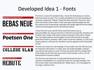
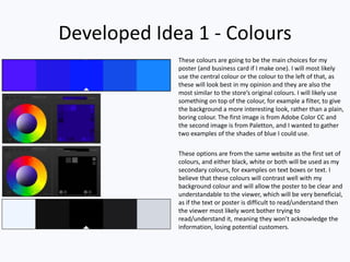
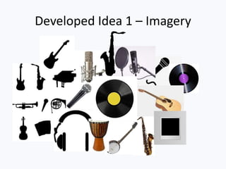
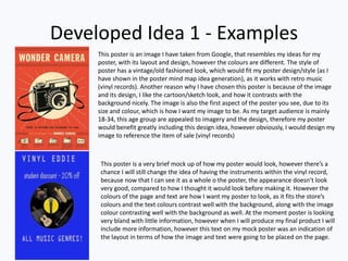
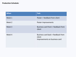
Client Project Pro- Forma
name
Mind Maps/Brainstorms Poster
Mind Maps/Brainstorms Poster 1
Mind Maps/Brainstorms Poster 2
Mind Maps/Brainstorms Poster 3
Mind Maps/Brainstorms Poster 4
Mind Maps/Brainstorms business card
Mind Maps/Brainstorms business card 1
Mind Maps/Brainstorms business card 2
Mind Maps/Brainstorms business card 3
Mind Maps/Brainstorms business card 4
Mind Maps/Brainstorms business card 5
Mind Maps/Brainstorms website
Mind Maps/Brainstorms website 1
Mind Maps/Brainstorms website 2
Mind Maps/Brainstorms website 3
Mind Maps/Brainstorms website 4
Mind Maps/Brainstorms website 5
Mind Maps/Brainstorms website 6
Idea Evaluation
Which of your ideas do you want to develop further? Explain why you think that is
the right idea to take forward.
The idea that I want to develop further is going to be the poster for advertisement. I
think that this is right idea to take forward because, first of all, this is the main idea my
client wanted me to produce, as my client thought the poster they have already is too
bland and isn’t interesting, so creating this poster is a good way to show off my design
skills, using Photoshop to produce something more entertaining for the audience and
something more aesthetically pleasing. I can do this by including more images, with
unique designs and interesting styles (as I have shown in my mind map idea
generation), which the original poster does not have. Another reason why I want to
develop my poster idea further is because the other two ideas I developed wouldn’t
be as beneficial, again as I have shown in the mind map. However I know that my
client doesn’t have any business cards for his store, whereas my client does have a
functioning website, therefore if I finish my poster up to standards and still have more
time and could possibly produce a business card design.
Development Idea –
Advertisement Poster
Developed Idea 1 - Fonts
This font is a classic for standard titles. I chose this font because it is clear,
bold and stands out well. This is a likely possibility for the main headings on
my poster, along with “Rebute” being the other potential. This font is very
plain and simple, which makes it clear and easily understandable but also
too ordinary and uninteresting, especially with people aged 18-34 (my target
audience) would appeal more to something creative.
I chose this font to be used for fairly small information such as
discounts/offers etc. because this font is informal and note-like, therefore will
fit better with smaller information and less important information. People
from my target audience would appeal to more informal text as younger
generations tend to, however I didn’t want it to be too ‘sketchy’ as a lot of my
target audience is still over 65, therefore I want to appeal to them if possible
as well.
This font was chosen for sub headings or text smaller than the title but used
for important information. It is bold, clear and understandable, making it
very easy for the viewer to read. This font also works with the vintage style
of the poster (to link with the store and its vinyl records), as this is an old
fashioned font I found on Dafont.
This font was also chosen for its style (old fashioned) and due to its
sharpness and boldness it is a potential choice for my large headings. This
font is also a little more interesting than “Bebas Neue”, so it may appeal to
my target audience more.
Developed Idea 1 - Colours
These colours are going to be the main choices for my
poster (and business card if I make one). I will most likely
use the central colour or the colour to the left of that, as
these will look best in my opinion and they are also the
most similar to the store’s original colours. I will likely use
something on top of the colour, for example a filter, to give
the background a more interesting look, rather than a plain,
boring colour. The first image is from Adobe Color CC and
the second image is from Paletton, and I wanted to gather
two examples of the shades of blue I could use.
These options are from the same website as the first set of
colours, and either black, white or both will be used as my
secondary colours, for examples on text boxes or text. I
believe that these colours will contrast well with my
background colour and will allow the poster to be clear and
understandable to the viewer, which will be very beneficial,
as if the text or poster is difficult to read/understand then
the viewer most likely wont bother trying to
read/understand it, meaning they won’t acknowledge the
information, losing potential customers.
Developed Idea 1 – Imagery
Developed Idea 1 - Examples
This poster is an image I have taken from Google, that resembles my ideas for my
poster, with its layout and design, however the colours are different. The style of
poster has a vintage/old fashioned look, which would fit my poster design/style (as I
have shown in the poster mind map idea generation), as it works with retro music
(vinyl records). Another reason why I have chosen this poster is because of the image
and its design, I like the cartoon/sketch look, and how it contrasts with the
background nicely. The image is also the first aspect of the poster you see, due to its
size and colour, which is how I want my image to be. As my target audience is mainly
18-34, this age group are appealed to imagery and the design, therefore my poster
would benefit greatly including this design idea, however obviously, I would design my
image to reference the item of sale (vinyl records)
This poster is a very brief mock up of how my poster would look, however there’s a
chance I will still change the idea of having the instruments within the vinyl record,
because now that I can see it as a whole o the poster, the appearance doesn’t look
very good, compared to how I thought it would look before making it. However the
colours of the page and text are how I want my poster to look, as it fits the store’s
colours and the text colours contrast well with the background, along with the image
colour contrasting well with the background as well. At the moment poster is looking
very bland with little information, however when I will produce my final product I will
include more information, however this text on my mock poster was an indication of
the layout in terms of how the image and text were going to be placed on the page.
Development Idea –
Business Card
Developed Idea 2 - Fonts
This chosen font is a classic, and similar to my poster, I have chosen
this font for the title, as it is large, bold and simple. Simplicity is a
good idea for a business card title, as it is very small, therefore you
should usually only have one focus point (and I want this to be the
imagery). I will be creating my poster first and I will use the same font
for the title on the poster and business card.
This is the most likely font for my title, however as I have already said,
it will all depend on which font looks best on my poster. I like the style
of this font, as it looks unique and different to most fonts. Although
this font isn’t relatable to the vintage style I am looking to create, this
is one the best fonts I found on Dafont, as all the vintage styled fonts
looked too childish as such, which wouldn’t suit my target audience.
I have chosen this font for the information text. It is simple, fairly
informal (so it will appeal to my target audience) and clear, making it
easy to read. Because this text will be very small as it’s not the focus
point and the card itself will be small, this font doesn’t have to portray
much meaning apart from being aesthetically pleasing when looking
at the card as a whole.
Kenyan Coffee isn’t a very likely font choice for my business card,
however I could change my mind, depending how well Coolvetica font
looks on the business card. This font is simple and just a little bit
different to a standard sans serif font, which is what I was looking for,
as I don’t want it to draw attention. The purpose of this font is to
present the information clearly, and look good as a whole.
Developed Idea 2 - Colours
All of these colours are the same
potential colour choices I have
chosen for my poster design. This is
because I want all the products that
I make for my client to link with
each other, and I want the colour
scheme to stay the same. I have
discussed on my ‘Developed Idea 1
– Colours’ page, why I have chosen
these colours.
Developed Idea 2 - Imagery
Developed Idea 2 - Examples
This design for a business card is a very strong possibility for my
product, as I think the imagery used is very effective, with the
sound waves, however I would use a different centre image,
which would most likely be a vinyl record. I would also use
different colours, as I want to use the same colours as my poster
and make the products relevant to the store, therefore using the
store’s colours (blue).
This design for a business card is my second choice for my
product. I want the imagery of my business card to be the main
focus, and I believe this image/design is very aesthetically
pleasing, with the background and guitar blending into each
other. However I want to make my product noticeably relevant to
the store, therefore I will use a vinyl record as the image (instead
of the guitar) and this may make the design hard to achieve, to
make it as aesthetically pleasing as I would like.
I created this brief design quickly on Photoshop, just to show how
I am looking to create my business card (following a similar design
to my first choice). I like the initial look of this design with the
vinyl record image. I was also thinking to use the same vinyl
record image that I created for my poster.
Assessment of final ideas
I think that my audience will engage with my ideas because I will include interesting
imagery which many people of my target audience (18-34) will appreciate, especially
compared to people of an older generation as they traditionally don’t know how these
such images are created therefore they wouldn’t appreciate them as much. I also think I
have chosen good colours to suit my audience as blue and black/white are quite universal
and unisex, therefore both genders are likely to be attracted to them.
My client asked me to create a poster and potentially a business card, as his current
poster was very old, uninteresting and included incorrect information, so I think with my
ideas I will fulfil the brief my client gave me as I will make a more exciting and updated
version of his poster and business card.
I believe that my project is manageable in the time I have, as long as I don’t waste time. I
also think that my project isn’t too hard to complete with my experience using
Photoshop. I can always use YouTube to follow tutorials to learn and use new skills to
improve my work.
Production Schedule:
When Task
Week 1 Poster + feedback from client
Week 2 Poster improvements
Week 3 Business card front + feedback from
client
Week 4 Business card back + feedback from
client
Improvements on business card

Ideas and Planning VE

  • 1.
  • 2.
  • 3.
  • 4.
  • 5.
  • 6.
  • 7.
  • 8.
  • 9.
  • 10.
  • 11.
  • 12.
  • 13.
  • 14.
  • 15.
  • 16.
  • 17.
  • 18.
  • 19.
  • 20.
    Idea Evaluation Which ofyour ideas do you want to develop further? Explain why you think that is the right idea to take forward. The idea that I want to develop further is going to be the poster for advertisement. I think that this is right idea to take forward because, first of all, this is the main idea my client wanted me to produce, as my client thought the poster they have already is too bland and isn’t interesting, so creating this poster is a good way to show off my design skills, using Photoshop to produce something more entertaining for the audience and something more aesthetically pleasing. I can do this by including more images, with unique designs and interesting styles (as I have shown in my mind map idea generation), which the original poster does not have. Another reason why I want to develop my poster idea further is because the other two ideas I developed wouldn’t be as beneficial, again as I have shown in the mind map. However I know that my client doesn’t have any business cards for his store, whereas my client does have a functioning website, therefore if I finish my poster up to standards and still have more time and could possibly produce a business card design.
  • 21.
  • 22.
    Developed Idea 1- Fonts This font is a classic for standard titles. I chose this font because it is clear, bold and stands out well. This is a likely possibility for the main headings on my poster, along with “Rebute” being the other potential. This font is very plain and simple, which makes it clear and easily understandable but also too ordinary and uninteresting, especially with people aged 18-34 (my target audience) would appeal more to something creative. I chose this font to be used for fairly small information such as discounts/offers etc. because this font is informal and note-like, therefore will fit better with smaller information and less important information. People from my target audience would appeal to more informal text as younger generations tend to, however I didn’t want it to be too ‘sketchy’ as a lot of my target audience is still over 65, therefore I want to appeal to them if possible as well. This font was chosen for sub headings or text smaller than the title but used for important information. It is bold, clear and understandable, making it very easy for the viewer to read. This font also works with the vintage style of the poster (to link with the store and its vinyl records), as this is an old fashioned font I found on Dafont. This font was also chosen for its style (old fashioned) and due to its sharpness and boldness it is a potential choice for my large headings. This font is also a little more interesting than “Bebas Neue”, so it may appeal to my target audience more.
  • 23.
    Developed Idea 1- Colours These colours are going to be the main choices for my poster (and business card if I make one). I will most likely use the central colour or the colour to the left of that, as these will look best in my opinion and they are also the most similar to the store’s original colours. I will likely use something on top of the colour, for example a filter, to give the background a more interesting look, rather than a plain, boring colour. The first image is from Adobe Color CC and the second image is from Paletton, and I wanted to gather two examples of the shades of blue I could use. These options are from the same website as the first set of colours, and either black, white or both will be used as my secondary colours, for examples on text boxes or text. I believe that these colours will contrast well with my background colour and will allow the poster to be clear and understandable to the viewer, which will be very beneficial, as if the text or poster is difficult to read/understand then the viewer most likely wont bother trying to read/understand it, meaning they won’t acknowledge the information, losing potential customers.
  • 24.
    Developed Idea 1– Imagery
  • 25.
    Developed Idea 1- Examples This poster is an image I have taken from Google, that resembles my ideas for my poster, with its layout and design, however the colours are different. The style of poster has a vintage/old fashioned look, which would fit my poster design/style (as I have shown in the poster mind map idea generation), as it works with retro music (vinyl records). Another reason why I have chosen this poster is because of the image and its design, I like the cartoon/sketch look, and how it contrasts with the background nicely. The image is also the first aspect of the poster you see, due to its size and colour, which is how I want my image to be. As my target audience is mainly 18-34, this age group are appealed to imagery and the design, therefore my poster would benefit greatly including this design idea, however obviously, I would design my image to reference the item of sale (vinyl records) This poster is a very brief mock up of how my poster would look, however there’s a chance I will still change the idea of having the instruments within the vinyl record, because now that I can see it as a whole o the poster, the appearance doesn’t look very good, compared to how I thought it would look before making it. However the colours of the page and text are how I want my poster to look, as it fits the store’s colours and the text colours contrast well with the background, along with the image colour contrasting well with the background as well. At the moment poster is looking very bland with little information, however when I will produce my final product I will include more information, however this text on my mock poster was an indication of the layout in terms of how the image and text were going to be placed on the page.
  • 26.
  • 27.
    Developed Idea 2- Fonts This chosen font is a classic, and similar to my poster, I have chosen this font for the title, as it is large, bold and simple. Simplicity is a good idea for a business card title, as it is very small, therefore you should usually only have one focus point (and I want this to be the imagery). I will be creating my poster first and I will use the same font for the title on the poster and business card. This is the most likely font for my title, however as I have already said, it will all depend on which font looks best on my poster. I like the style of this font, as it looks unique and different to most fonts. Although this font isn’t relatable to the vintage style I am looking to create, this is one the best fonts I found on Dafont, as all the vintage styled fonts looked too childish as such, which wouldn’t suit my target audience. I have chosen this font for the information text. It is simple, fairly informal (so it will appeal to my target audience) and clear, making it easy to read. Because this text will be very small as it’s not the focus point and the card itself will be small, this font doesn’t have to portray much meaning apart from being aesthetically pleasing when looking at the card as a whole. Kenyan Coffee isn’t a very likely font choice for my business card, however I could change my mind, depending how well Coolvetica font looks on the business card. This font is simple and just a little bit different to a standard sans serif font, which is what I was looking for, as I don’t want it to draw attention. The purpose of this font is to present the information clearly, and look good as a whole.
  • 28.
    Developed Idea 2- Colours All of these colours are the same potential colour choices I have chosen for my poster design. This is because I want all the products that I make for my client to link with each other, and I want the colour scheme to stay the same. I have discussed on my ‘Developed Idea 1 – Colours’ page, why I have chosen these colours.
  • 29.
  • 30.
    Developed Idea 2- Examples This design for a business card is a very strong possibility for my product, as I think the imagery used is very effective, with the sound waves, however I would use a different centre image, which would most likely be a vinyl record. I would also use different colours, as I want to use the same colours as my poster and make the products relevant to the store, therefore using the store’s colours (blue). This design for a business card is my second choice for my product. I want the imagery of my business card to be the main focus, and I believe this image/design is very aesthetically pleasing, with the background and guitar blending into each other. However I want to make my product noticeably relevant to the store, therefore I will use a vinyl record as the image (instead of the guitar) and this may make the design hard to achieve, to make it as aesthetically pleasing as I would like. I created this brief design quickly on Photoshop, just to show how I am looking to create my business card (following a similar design to my first choice). I like the initial look of this design with the vinyl record image. I was also thinking to use the same vinyl record image that I created for my poster.
  • 31.
    Assessment of finalideas I think that my audience will engage with my ideas because I will include interesting imagery which many people of my target audience (18-34) will appreciate, especially compared to people of an older generation as they traditionally don’t know how these such images are created therefore they wouldn’t appreciate them as much. I also think I have chosen good colours to suit my audience as blue and black/white are quite universal and unisex, therefore both genders are likely to be attracted to them. My client asked me to create a poster and potentially a business card, as his current poster was very old, uninteresting and included incorrect information, so I think with my ideas I will fulfil the brief my client gave me as I will make a more exciting and updated version of his poster and business card. I believe that my project is manageable in the time I have, as long as I don’t waste time. I also think that my project isn’t too hard to complete with my experience using Photoshop. I can always use YouTube to follow tutorials to learn and use new skills to improve my work.
  • 32.
    Production Schedule: When Task Week1 Poster + feedback from client Week 2 Poster improvements Week 3 Business card front + feedback from client Week 4 Business card back + feedback from client Improvements on business card