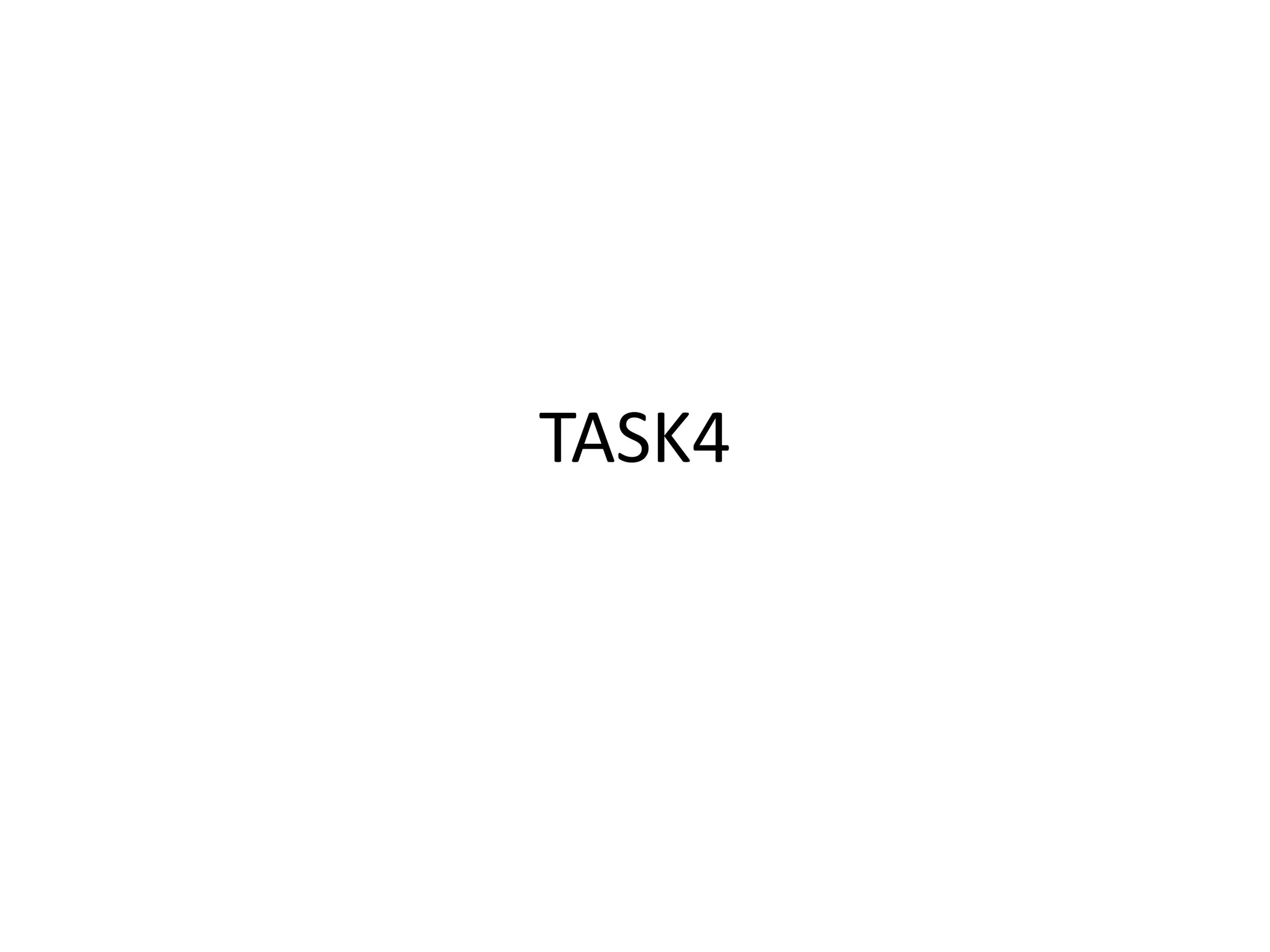
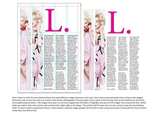
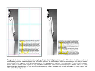
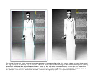
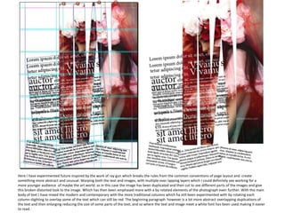
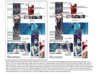
This document discusses experiments with layout and design for a fashion magazine article. It begins by using a pink and pastel color scheme with cropped face images to suggest femininity. The article is laid out in three columns. Subsequent experiments include a simplistic 5x3 grid with clean lines, wrapping text around a model silhouette, and warping overlapping text and images in multiple layers for a more abstract style appealing to younger audiences. The final design emphasizes layering cut photographs underneath text in columns of varying sizes to maintain an abstract style.