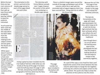
This document analyzes the layout and design of a double page magazine spread featuring an interview with Emma Watson. Key elements discussed include:
- The use of two columns of text split into paragraphs to keep the audience engaged
- A pull quote taken from the interview in the center to highlight part of the content
- Images and text blended together seamlessly through positioning and negative space
- Traditional magazine styles like serif fonts, line spacing and margins incorporated into the minimalist design.