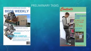
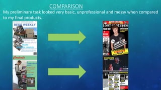
3. PRELIMINARY TASK
Looking back at my original preliminary group task, I feel I have progressed immensely and have now managed to create
products that are both professional looking and unique to my genre. The conventions that I have used throughout this task,
have helped me to adapt and improve my knowledge on Photoshop. On my preliminary front cover, I liked how my sub-
heading of ‘brand new Bede campus’ was really simple and straight to the point about the purpose of the magazine. The
word’s ‘brand new’ was used to persuade and encourage my audience to purchase the magazine, implying it must contain
exclusive and important content on the new campus. The dominant image was effective because it gave the reader an
insight into what the campus had to offer. All of our images were still professional and focused. The interview sub-line at
the bottom suggests the college cares about their students and their views.
The basic conventions of a magazine front cover are seen all throughout my groups front cover, such as a masthead, a plug,
sub-headings, sell-lines and sub-images. Also there were basic conventions used on my contents page which includes a
masthead, contents list and sub-images. Throughout both our front cover and contents page, we have kept a constant
colour scheme of blues and greens. This is an effective feature as it gives our magazine a clear identity that will be noticed
and memorable because the colour scheme is the same colours as the actual college’s. Also the colours we have used are
very professional and are classed as unisex colours. Another reason why we chose these particular colours is they add a
natural/simplistic effect which I feel relates to the audience, the students, as they only include facts or information about
the college.
4. After I had completed this, I carried out some more research into various music magazines and industries. By
doing this I had gained more experience and knowledge when it came to working with/using Photoshop. I
came to realise I hadn’t used Photoshop to it’s full potential when making my preliminary task, as I had a
minimal amount of knowledge using the software. Although, I have included a few main conventions and
the way they were presented on the page, were messy and unprofessional, as though no effort was used
when creating my products.
6. IMPROVEMENT
I feel I was able to improve massively after producing my preliminary task because it enabled me to gain more
experience by using new technology and software programmes. I was also able to do further research and
planning to gain more inspiration from current/existing music magazines which helped me a lot when improving
my layouts and conventions. I later improved in the following areas:
- My Blogger
- Layout and Composition
- Colour Scheme
- Fonts
- Image Quality
- Mise-En-Scene
- Conventions
7. MY BLOGGER
When creating my preliminary products I has a very short time period to actually complete the tasks
therefore I couldn’t manage to get any audience feedback or make any changed/improvements. I wasn’t
able to do any research and planning of current magazines and their various conventions, so it lacked in
looking professional. Yet in the lead up to designing my final products, I was able to carry out a lot of
research, which helped me develop my own ideas, which widened my imagination. I did a lot of
deconstructions on existing magazines, looking at similar products, researching inspirations into my genre
and conventions and also organising my photoshoots. All of this helped massively to the success of my final
products as I managed to learn a lot more about how to ensure it is a professional looking magazine and
how to improve my skills.
8. LAYOUT AND COMPOSITION
When designing my preliminary products, I was aware that I had lacked in knowledge about the magazine codes
and conventions and I was not aware that there had to be a specific layout to how my magazine front covers and
contents pages should be structured. Unfortunately this then led me to position all of my conventions across the
two pages in a messy and unstructured way, which wouldn’t appeal to any audience as they wouldn’t know
where to focus their attention. It also meant I had a lot of empty space on my page which made the magazine
look bare and basic, therefore my target audience would feel it lacked in content and wouldn’t purchase it. Also I
had no idea how big or small all of my features would have had to be. Whilst doing my research I learned that a
few stereotypical techniques within a music magazine and how the layout should be set out. For example, in
some magazines the dominant image overlaps the masthead, as the dominant image should be the biggest and
boldest thing on the page. Also the contents page should be put into categories. I also learned about a technique
called framing which helped me a lot to make the dominant image on my front cover stand out a lot more, and it
also helped make my contents page easier to navigate around. My final products turned out a lot more ideal and
appropriate for my rock genre and audience as I found that the pages should be full with no empty spaces to
show it has more content and learn where my conventions and features should be placed to attract my target
audience.
9. COLOUR SCHEME
Although the colours I used in my preliminary task work well together and link in with the college logo,
they made the magazine look flat and dull. In addition to this after I did my research on colour schemes
from existing magazines and learning about each individual connotation. I have chosen four colours that
represent my genre and will stand out to my audience. One of the main problems within my preliminary
products were the colours as they were really dull and clashed together making the magazine look messy.
By advancing all of my skills further, I found out how to ensure a direct audience’s eye-line to the colours
and how to make important information stand out and more outgoing. For example I layered red and
yellow , both vibrant colours over the top of a black background to highlight important information. I used
my colour scheme throughout my magazine and incorporated it into a few of my features. I did this as I
wanted to make sure the colours were evenly balanced and I found out it is especially important to give
the magazine a brand identity through the use of colour.
10. FONTS
In my preliminary task I had no idea that it was possible to download fonts from websites such as
Dafont.com, therefore my fonts were simplistic and basic. To create my front cover and contents page I
used default Photoshop fonts which had a very limited selection of fonts that I could actually choose from,
they were all quite plain also, this then made the magazine look dull and uninteresting. When I found out
that certain texts such as the masthead, will need to stand out and attract my reader’s attention, more
than some of the other features. From seeing this I decided that I wanted better fonts for my final
products. For my front page and contents page I downloaded most of my fonts from Dafont.com in which I
was able to search for fonts that were eye-catching and would represent my genre clearly. For example I
used words such as ‘jagged’, ‘gothic’ and ‘bold’ to narrow down my search and choose the best suited
ones. Also I wanted this to represent the attitudes and feelings of my genre. This improvement with my
fonts has allowed my magazine to be more appealing to my target audience and look more professional.
11. IMAGE QUALITY
Throughout this course I was able to improve/develop my software skills to ensure the quality and
professionalism with my images. Also I was able to use more advanced tools within Photoshop such as blur,
smudge and healing brushes which allows me to disguise any imperfections on my models face to give
them all a flawless, professional look and finish. On my front cover I made my image much sharper, so that
it stood out more and looked clearer which had allowed me to focus my audience towards the image. By
completing my changed it allowed me to make my images look more professional and intriguing to my
target audience. Although I was using the same camera technology for my final products and my
preliminary products, I gained a greater understanding of all the camera settings, such as the flash, angles
and shots therefore the outcome was greater with my final photographs and shows more of a diverse
range of skills.
12. MISE-EN-SCENE
When I was creating my preliminary products, I had a very short time to plan, and organise the main
photoshoot for them. This then meant that there was bi thought went into the clothing, hair and make-up
choices as we had to have it finished in that time limit. Also we weren’t given the option to choose our
location meaning it was difficult for our group to decide/think about the meaning and effects behind our
choices. However. For my final products I gave all of my models instructions of clothing, if I wanted them to
be wearing make-up and how I wanted them to have their hair. Also I was able to choose three locations
which enabled me to have more variation and link to my genre with my images. These decisions were
based on all of my research into stereotypical clothing and attitudes of my audience. Also I had a lot more
time to sit and think about my sub-images, therefore my images from concerts and of my models would
look more appealing and effective.
13. CONVENTIONS
Since my preliminary tasks I have developed my codes and conventions to make sure they look advanced and professional as with
my research, I have learned that certain conventions were vital and would need to stand out more than others.
My masthead stands out more with a
unique font and appeals to my audience.
Research showed magazines usually separate
their contents into groups, used various fonts/colours
for titles and articles, and added sub-headings for
categories to make it more attractive.
I learned that editor’s notes are vital to put
more thought into it. I added images, signatures
and more detailed and direct text. It makes my audience
feel more involved.
14. CONCLUSION
In conclusion, as I was looking back through my preliminary work I feel that I have progressed massively
and continued to advance my skills to create my products and have them looking established and
professional. My research and planning allowed me to have a better understanding of what makes a
magazine successful and how I can show this through different software.