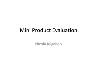
2. My poster has the origional can on, the Barr logo and the website along with icons which show you can follow the
latest news on Twitter and Facebook. On my poster there are cans that are also energy drinks that have been in a
battle on which is the best energy drink. All the other cans are crushed at the bottom with an angry can of Cola stood
on them, as he didn’t win but Irn-Bru did. I like this idea because it is humorous yet it makes Irn-Bru out to be the best
as he shoots off with energy and all others are crushed. I think this idea was simple yet effective because it makes the
Irn-Bru can look nicer than all of the others. I like the font because it is simple and similar to the origional Irn-Bru font
and I also like the silver stroke I put on it to keep it to the correct origional colour scheme. I like the can, it is the
origional one with an effect on to make it look more like a cartoon version of a can.
3. What I’d like to improve about my poster is the amount of space that is left free and the slogan. I think the
space could have been filled better but then the things that are important wouldn’t be as noticeable. For
the slogan, I could have changed it to different ones and ones that make it more noticeable that it is an
energy drink rather than just the usual Irn-Bru. I think my slogan could have been more creative. To do
this, I could think of more creative slogans and see if they look good, I could also change the pictures
around a bit and try and take up more room.
4. This poster is the one with my can design on rather than
Irn-Bru’s can. I think the colours of my can fit my poster
better as its orange and dark blue rather than light blue.
The can is also wider so it fills up more space in the corner.
I like this slogan because it’s more writing so it looks
better on the poster, taking up more room. It also shows
that it brings out the best in you, meaning if you were in a
sports race it will bring out the best in you and help you
win with it’s energy.
5. The slogan ‘it will do the trick for you’ indicates that IrnBru is the best because people have tried energy drinks
before and been unsatisfies, yet if you have this Irn-Bru32
you will get the energy that you’ve been looking for.
This slogan ‘Does what others can’t do for you’ is my favorite
because it fits best with the idea of my poster and all the
other energy drinks have lost. Irn-Bru 32 can give you the
energy you need which is what the others can’t do.
6. I have chosen this one as my final advert as the slogan has been shortened and is more
short and effective now. I have made it look very central and it shows that Irn-Bru is the
best, which is also the idea that my advert says.
7. For this poster, it is the only version I have as I only did the design once and I liked it the way it was.
It is the best slogan to fit with the theme of the river of Irn-Bru, and there is plenty for you. The
picture is of the Lochness in Scotland so I brought the specifically to Scotland. I turned the
saturation and hue up on the river to make it brighter and make it the colour orange. I got an image
of a water ripple and did the same thing, I tried to match the colour yet make it more distinctive by
making it a bit brighter, I did the same for the flowing water out of the can. I made sure I had the
social networking sites on and the logo to keep it recognized and popular. I like the idea that there
is a lot of space on the poster as the background image makes up for it.
8. Once I made my posters, I made this banner from my preferred one. The one I liked best was the ‘does what
others can’t do’ slogan. I kept the same house style and colour scheme and just put all of the images into a
smaller canvas in a similar position. I put the can shooting upwards a little off the canvas to make it more 3D
and different. I want people to recognize my products and by doing this I need to keep things similar to the
other advertisements that they will see.
My second banner is a copy of my advert 2. The only difference apart from the canvas size and the
image position is the font. I thought this banner looked better with a thicker font as the one in the
poster was too thin. It didn’t take up enough room on the banner and it didn’t look good against the
big ‘32’. I made the can and the spikes on the 32 rise up out of the canvas so on the computer screen it
looks better and more interesting.
9. This was my only can design, I kept it simple like Irn-Bru do themselves, I kept to the colour
scheme and used a simple font. I thought this looked best as the colours that they use are
all in there, the more noticeable ones are the blue and orange, which wrap around my can
and the 32 is in yellow to make it stand out from a normal Irn-Bru can. I have put the lion in
the background to keep it well known to the Scottish and have simple nutritional
information on the back so it’s easy to read because to some people it is important. The
Barr logo is in there to keep it theirs and it has specifically ‘Energy Drink’ written all the way
around it at the top to keep it distinct to the origional Irn-Bru.