The document describes the process of creating a magazine mockup in Photoshop and InDesign. Key steps include:
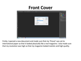
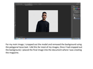
1) Setting up document presets and resolution in Photoshop and cropping images.
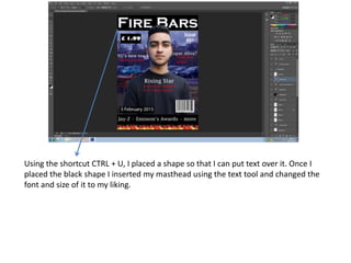
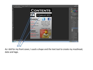
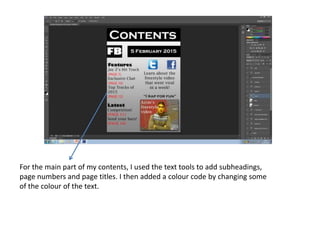
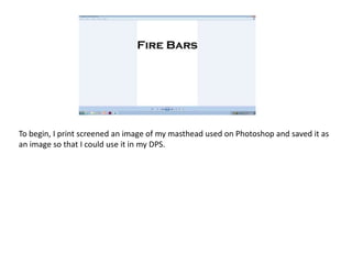
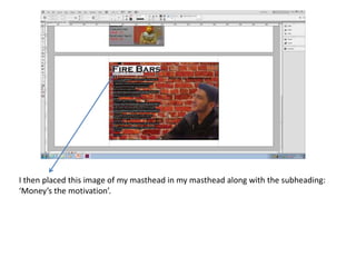
2) Adding design elements like mastheads, shapes, and text using tools in Photoshop and InDesign.
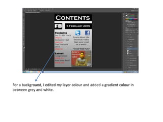
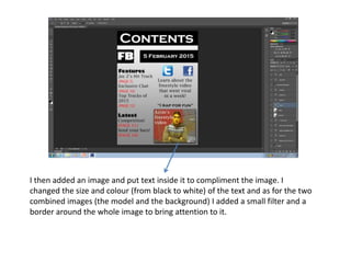
3) Arranging layers and images, and applying effects like filters and gradients.
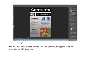
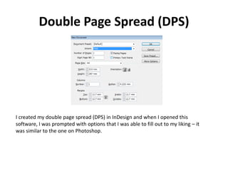
4) Adding final touches like barcodes and social media links across pages.