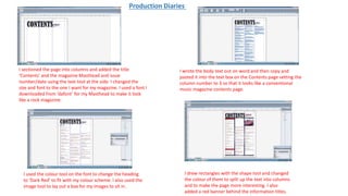
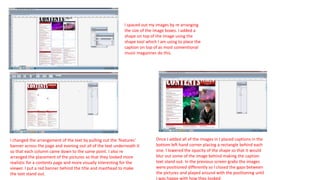
I sectioned the page into columns and added the title
‘Contents’ and the magazine Masthead and issue
number/date using the text tool at the side. I changed the
size and font to the one I want for my magazine. I used a font I
downloaded from ‘dafont’ for my Masthead to make it look
like a rock magazine.
I wrote the body text out on word and then copy and
pasted it into the text box on the Contents page setting the
column number to 3 so that it looks like a conventional
music magazine contents page.
I used the colour tool on the font to change the heading
to ‘Dark Red’ to fit with my colour scheme. I also used the
image tool to lay out a box for my images to sit in.
I drew rectangles with the shape tool and changed
the colour of them to split up the text into columns
and to make the page more interesting. I also
added a red banner behind the information titles.
Production Diaries
I spaced out my images by re arranging
the size of the image boxes. I added a
shape on top of the image using the
shape tool which I am using to place the
caption on top of as most conventional
music magazines do this.
I changed the arrangement of the text by pulling out the ‘features’
banner across the page and evening out all of the text underneath it
so that each column came down to the same point. I also re
arranged the placement of the pictures so that they looked more
realistic for a contents page and more visually interesting for the
viewer. I put a red banner behind the title and masthead to make
the text stand out.
Once I added all of the images in I placed captions in the
bottom left hand corner placing a rectangle behind each
one. I lowered the opacity of the shape so that it would
blur out some of the image behind making the caption
text stand out. In the previous screen grabs the images
were positioned differently so I closed the gaps between
the pictures and played around with the positioning until
I was happy with how they looked
In order to make the image of Tom look like he’s at a gig, I
cut him out using the lasso tool and edited him on to the
back ground of a live gig which I took.
I created a green fade over
him coming from one side
of the image to make it
appear that the lighting
was shining on him
I used a similar technique to create the
image of Dan’s made up persona. I cut
him out from the picture I took of him
and placed it on top of a background I
made using the shape tool.

Contents page screengrabs

  • 1.
    I sectioned thepage into columns and added the title ‘Contents’ and the magazine Masthead and issue number/date using the text tool at the side. I changed the size and font to the one I want for my magazine. I used a font I downloaded from ‘dafont’ for my Masthead to make it look like a rock magazine. I wrote the body text out on word and then copy and pasted it into the text box on the Contents page setting the column number to 3 so that it looks like a conventional music magazine contents page. I used the colour tool on the font to change the heading to ‘Dark Red’ to fit with my colour scheme. I also used the image tool to lay out a box for my images to sit in. I drew rectangles with the shape tool and changed the colour of them to split up the text into columns and to make the page more interesting. I also added a red banner behind the information titles. Production Diaries
  • 2.
    I spaced outmy images by re arranging the size of the image boxes. I added a shape on top of the image using the shape tool which I am using to place the caption on top of as most conventional music magazines do this. I changed the arrangement of the text by pulling out the ‘features’ banner across the page and evening out all of the text underneath it so that each column came down to the same point. I also re arranged the placement of the pictures so that they looked more realistic for a contents page and more visually interesting for the viewer. I put a red banner behind the title and masthead to make the text stand out. Once I added all of the images in I placed captions in the bottom left hand corner placing a rectangle behind each one. I lowered the opacity of the shape so that it would blur out some of the image behind making the caption text stand out. In the previous screen grabs the images were positioned differently so I closed the gaps between the pictures and played around with the positioning until I was happy with how they looked
  • 3.
    In order tomake the image of Tom look like he’s at a gig, I cut him out using the lasso tool and edited him on to the back ground of a live gig which I took. I created a green fade over him coming from one side of the image to make it appear that the lighting was shining on him
  • 4.
    I used asimilar technique to create the image of Dan’s made up persona. I cut him out from the picture I took of him and placed it on top of a background I made using the shape tool.