AS Media
Double-Page Spread Production
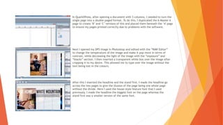
In QuarkXPress, after opening a document with 3 columns, I needed to turn the
single page into a double-paged format. To do this, I duplicated the A-Master A
page to create ‘B’ and ‘C’ versions of this and placed them beneath the ‘A’ page
to ensure my pages printed correctly due to problems with the software.
Next I opened my DPS image in Photoshop and edited with the “RAW Editor”
to change the temperature of the image and make it pop more in terms of
contrast, while decreasing the light of the image with the “exposure” and
“blacks” section. I then inserted a transparent white box over the image after
cropping it to my desire. This allowed me to type over the image without the
text being lost in the colours.
After this I inserted the headline and the stand first. I made the headline go
across the two pages to give the illusion of the page being one whole page
without the divide. Here I used the house-style feature font that I used
previously. I made the headline the biggest font on the page whereas the
stand first was a smaller version of the same font.
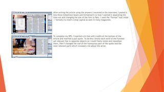
After writing the article using the answers I received in the interview, I pasted it
into three linked text boxes and formatted it to how I wanted it separating the
lines out and changing the size of the font to 9pts. I used the “format” tool (style
-> formats) to insert a drop capital as seen in many magazines.
To complete my DPS, I inserted a bi-line with credits at the bottom of the
article and inserted a pull quote. To do this I wrote each word of the funniest
yet relevant line in separate objects so I could freely resize and reposition
them, then I changed the size of the humourous part of the quote and the
most relevant parts which revealed a lot about the artist.

DPS Production

  • 1.
  • 2.
    In QuarkXPress, afteropening a document with 3 columns, I needed to turn the single page into a double-paged format. To do this, I duplicated the A-Master A page to create ‘B’ and ‘C’ versions of this and placed them beneath the ‘A’ page to ensure my pages printed correctly due to problems with the software. Next I opened my DPS image in Photoshop and edited with the “RAW Editor” to change the temperature of the image and make it pop more in terms of contrast, while decreasing the light of the image with the “exposure” and “blacks” section. I then inserted a transparent white box over the image after cropping it to my desire. This allowed me to type over the image without the text being lost in the colours. After this I inserted the headline and the stand first. I made the headline go across the two pages to give the illusion of the page being one whole page without the divide. Here I used the house-style feature font that I used previously. I made the headline the biggest font on the page whereas the stand first was a smaller version of the same font.
  • 3.
    After writing thearticle using the answers I received in the interview, I pasted it into three linked text boxes and formatted it to how I wanted it separating the lines out and changing the size of the font to 9pts. I used the “format” tool (style -> formats) to insert a drop capital as seen in many magazines. To complete my DPS, I inserted a bi-line with credits at the bottom of the article and inserted a pull quote. To do this I wrote each word of the funniest yet relevant line in separate objects so I could freely resize and reposition them, then I changed the size of the humourous part of the quote and the most relevant parts which revealed a lot about the artist.