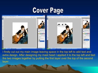
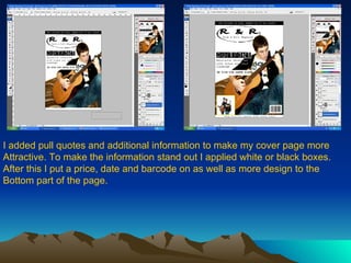
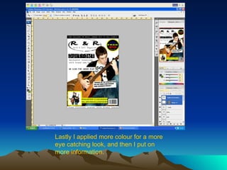
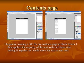
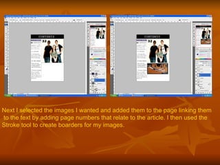
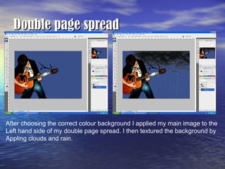
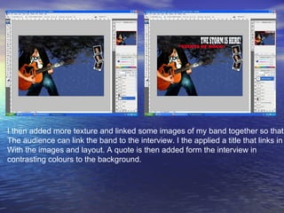
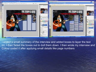
Production Print screen shots
Cover Page I firstly cut out my main image leaving space in the top left to add text and  extra design. After designing my mast head I applied it to the top left and tied  the two images together by putting the first layer over the top of the second  layer.
I added pull quotes and additional information to make my cover page more Attractive. To make the information stand out I applied white or black boxes. After this I put a price, date and barcode on as well as more design to the  Bottom part of the page.
Lastly I applied more colour for a more eye catching look, and then I put on more information.
Contents page I began by creating a title for my contents page in block letters. I then applied the majority of the text to the left hand side linking it together so I could move the text as one unit.
Next I selected the images I wanted and added them to the page linking them to the text by adding page numbers that relate to the article. I then used the  Stroke tool to create boarders for my images.
I applied more text about more general issues the magazine deals with. Lastly I added texture to the background and extra detail.
Double page spread After choosing the correct colour background I applied my main image to the  Left hand side of my double page spread. I then textured the background by  Appling clouds and rain.
I then added more texture and linked some images of my band together so that  The audience can link the band to the interview. I the applied a title that links in  With the images and layout. A quote is then added form the interview in  contrasting colours to the background.
I added a small summery of the interview and added boxes to layer the text  on. I then faded the boxes out to dull them down. I then wrote my interview and  Colour coded it after applying small details like page numbers

Print Screen Shots

  • 1.
  • 2.
    Cover Page Ifirstly cut out my main image leaving space in the top left to add text and extra design. After designing my mast head I applied it to the top left and tied the two images together by putting the first layer over the top of the second layer.
  • 3.
    I added pullquotes and additional information to make my cover page more Attractive. To make the information stand out I applied white or black boxes. After this I put a price, date and barcode on as well as more design to the Bottom part of the page.
  • 4.
    Lastly I appliedmore colour for a more eye catching look, and then I put on more information.
  • 5.
    Contents page Ibegan by creating a title for my contents page in block letters. I then applied the majority of the text to the left hand side linking it together so I could move the text as one unit.
  • 6.
    Next I selectedthe images I wanted and added them to the page linking them to the text by adding page numbers that relate to the article. I then used the Stroke tool to create boarders for my images.
  • 7.
    I applied moretext about more general issues the magazine deals with. Lastly I added texture to the background and extra detail.
  • 8.
    Double page spreadAfter choosing the correct colour background I applied my main image to the Left hand side of my double page spread. I then textured the background by Appling clouds and rain.
  • 9.
    I then addedmore texture and linked some images of my band together so that The audience can link the band to the interview. I the applied a title that links in With the images and layout. A quote is then added form the interview in contrasting colours to the background.
  • 10.
    I added asmall summery of the interview and added boxes to layer the text on. I then faded the boxes out to dull them down. I then wrote my interview and Colour coded it after applying small details like page numbers