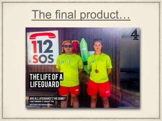
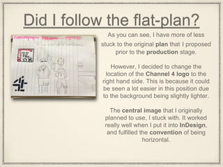
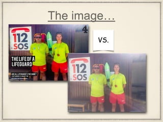
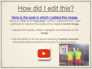
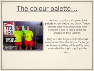
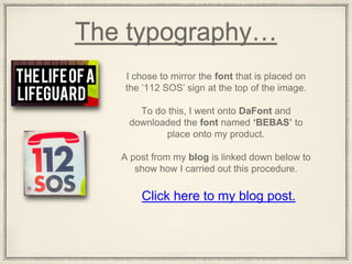
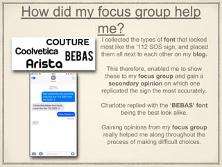
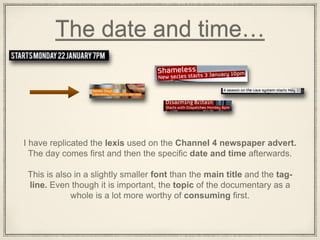
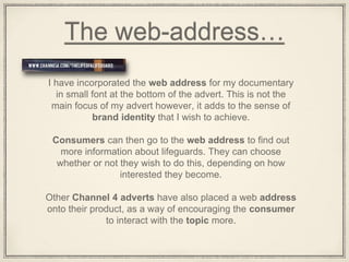
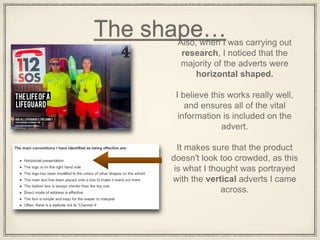
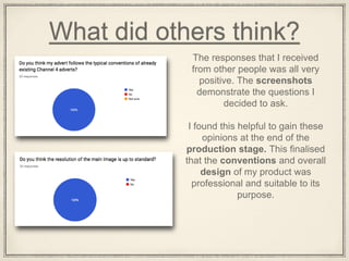
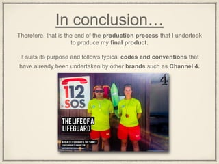
This is my evaluation for A2 media coursework. For my coursework I completed a five mintute extract for a documentary about teenage driving followed by two ansillary tasks of a radio trailer and an advert.
Book Formatting: Quality Control Checks for DesignersConfidence Ago
This presentation was made to help designers who work in publishing houses or format books for printing ensure quality.
Quality control is vital to every industry. This is why every department in a company need create a method they use in ensuring quality. This, perhaps, will not only improve the quality of products and bring errors to the barest minimum, but take it to a near perfect finish.
It is beyond a moot point that a good book will somewhat be judged by its cover, but the content of the book remains king. No matter how beautiful the cover, if the quality of writing or presentation is off, that will be a reason for readers not to come back to the book or recommend it.
So, this presentation points designers to some important things that may be missed by an editor that they could eventually discover and call the attention of the editor.
Expert Accessory Dwelling Unit (ADU) Drafting ServicesResDraft
Whether you’re looking to create a guest house, a rental unit, or a private retreat, our experienced team will design a space that complements your existing home and maximizes your investment. We provide personalized, comprehensive expert accessory dwelling unit (ADU)drafting solutions tailored to your needs, ensuring a seamless process from concept to completion.
Can AI do good? at 'offtheCanvas' India HCI preludeAlan Dix
Invited talk at 'offtheCanvas' IndiaHCI prelude, 29th June 2024.
https://www.alandix.com/academic/talks/offtheCanvas-IndiaHCI2024/
The world is being changed fundamentally by AI and we are constantly faced with newspaper headlines about its harmful effects. However, there is also the potential to both ameliorate theses harms and use the new abilities of AI to transform society for the good. Can you make the difference?
Top 5 Indian Style Modular Kitchen DesignsFinzo Kitchens
Get the perfect modular kitchen in Gurgaon at Finzo! We offer high-quality, custom-designed kitchens at the best prices. Wardrobes and home & office furniture are also available. Free consultation! Best Quality Luxury Modular kitchen in Gurgaon available at best price. All types of Modular Kitchens are available U Shaped Modular kitchens, L Shaped Modular Kitchen, G Shaped Modular Kitchens, Inline Modular Kitchens and Italian Modular Kitchen.
3. Did I follow the flat-plan?
As you can see, I have more of less
stuck to the original plan that I proposed
prior to the production stage.
However, I decided to change the
location of the Channel 4 logo to the
right hand side. This is because it could
be seen a lot easier in this position due
to the background being slightly lighter.
The central image that I originally
planned to use, I stuck with. It worked
really well when I put it into InDesign,
and fulfilled the convention of being
horizontal.
5. How did I edit this?
Above is a link to the blog post in which I explained how I used
Lightroom to improve the quality of my original central image.
I adjusted the blacks, whites, highlights and shadows on the
image.
I had the ability to do this due to watching Youtube tutorials
that clearly demonstrated how to carry out the procedure.
Here is the post in which I edited this image.
6. The colour palette…
I decided to go for a simple colour
palette of red, yellow and black. These
colours tend to be associated with
lifeguard’s due to these being the
shades on their uniform.
They are also bright shades that will
easily attract the attention of the target
audience, and they will hopefully also
know what the topic is going to be
about.
7. The typography…
I chose to mirror the font that is placed on
the ‘112 SOS’ sign at the top of the image.
To do this, I went onto DaFont and
downloaded the font named ‘BEBAS’ to
place onto my product.
A post from my blog is linked down below to
show how I carried out this procedure.
Click here to my blog post.
8. How did my focus group help
me?
I collected the types of font that looked
most like the ‘112 SOS sign, and placed
them all next to each other on my blog.
This therefore, enabled me to show
these to my focus group and gain a
secondary opinion on which one
replicated the sign the most accurately.
Charlotte replied with the ‘BEBAS’ font
being the best look alike.
Gaining opinions from my focus group
really helped me along throughout the
process of making difficult choices.
9. How I have presented the
font…I have replicated the convention that is used by
Channel 4. The main title of the show is
presented within boxes, with a white coloured
font.
Therefore, it stands out vividly against the lighter
coloured background, and can be interpreted
easily by the consumer.
This is simple yet looks effective because it
avoids the font being to crowded and hard to
see.
Here is a link to a blog post where I have listed
all of the typical conventions I should aim to
include.
10. The logo…After deciding that my documentary
would most suit being aired on
channel 4, I have decided to include
the logo in the top right hand corner
of my advert.
In addition, I ensured that the colour
of the logo was black. This is
because it then matches the
background of the shape behind the
font.
I used Photoshop to remove the
white background behind the logo, as
seen in the blog post I have linked
here.
11. The tag-line…
I have used the same tag-line that also appears on my double page
spread, due to wanting to maintain a sense of brand identity.
I have also decided to present this in the form of an interrogative, as a
way of subtly engaging with the reader, and encouraging them to think
about their own views before consuming what I have to say in the
documentary.
I have also decided to place the tag-line below the masthead due to it
being of slightly less importance than the main title.
12. The date and time…
I have replicated the lexis used on the Channel 4 newspaper advert.
The day comes first and then the specific date and time afterwards.
This is also in a slightly smaller font than the main title and the tag-
line. Even though it is important, the topic of the documentary as a
whole is a lot more worthy of consuming first.
13. The web-address…
I have incorporated the web address for my documentary
in small font at the bottom of the advert. This is not the
main focus of my advert however, it adds to the sense of
brand identity that I wish to achieve.
Consumers can then go to the web address to find out
more information about lifeguards. They can choose
whether or not they wish to do this, depending on how
interested they become.
Other Channel 4 adverts have also placed a web address
onto their product, as a way of encouraging the consumer
to interact with the topic more.
14. The shape…Also, when I was carrying out
research, I noticed that the
majority of the adverts were
horizontal shaped.
I believe this works really well,
and ensures all of the vital
information is included on the
advert.
It makes sure that the product
doesn't look too crowded, as this
is what I thought was portrayed
with the vertical adverts I came
across.
15. What did others think?
The responses that I received
from other people was all very
positive. The screenshots
demonstrate the questions I
decided to ask.
I found this helpful to gain these
opinions at the end of the
production stage. This finalised
that the conventions and overall
design of my product was
professional and suitable to its
purpose.
16. In conclusion…
Therefore, that is the end of the production process that I undertook
to produce my final product.
It suits its purpose and follows typical codes and conventions that
have already been undertaken by other brands such as Channel 4.