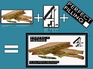
My Media product was created to fit into the
stylistic elements and the visual expectations of
Channel 4. To do this I had to research what makes
the Channel 4 documentaries, posters and radio
adverts so discernable from the rest.


                                              From my research into newspaper adverts for Channel
                                              4 I discovered that there was a specific style and if I
                                              was going to create a Channel 4 documentary then I
                                              had to stick to the specific conventions of the
                                              Channel.


                                                     This is a newspaper advert for a Channel 4
                                                     documentary and this is the template that
                                                     I had to follow. My product had to have
                                                     the Channel 4 logo, some form of text box
                                                     with the colours white and black used for
                                                     text or the box itself and I had to have a
                                                     picture that represents the theme of my
                                                     documentary
As you can see my newspaper advert displays the
                                          same layout as the real Channel 4 documentary
                                          adverts.

                                          It has a picture which is relevant to my theme which
                                          was sandwiches. Also my advert has the traditional
                                          Channel 4 black or white text and text box .Also it has
                                          the ever present Channel 4 Logo.
                                          So my product matched with these ancillary ones is
                                          very effective as it shows the audience of my
                                          documentary what Channel it will be showed on and
                                          also it allows them to have an understanding of what
                                          to expect as Channel 4 documentaries also have a
                                          specific style on screen as well as print.


My other products were the documentary itself and the radio advert. The radio advert for my
documentary did not really need to follow many codes and conventions as there is no specific
style for Channel 4. However there are some conventions that needed to be followed so that I
could make it sound like a real radio advert to my audience, and to do this is researched real
radio adverts on the internet to find out the structure that they follow.
Here is an example of a real radio advert for a
documentary:


                   BBC Radio 4 advert - History           This radio advert has information from the
                   of the World                           documentary, when it is on, what it is about
                                                          and also it has music from the documentary
                                                          so that it links the two together and also so it
                                                          will be recognisable to people who hear the
                                                          advert and then want to watch the
                                                          documentary.

My product follows the same path as it has
information about the topic of the documentary
and also what time it is on and the date. Also it
features sound clips from the documentary and
the music used so that it creates a link between              Perfect Filling
the two and also it makes it more entertaining.               Documentary
Here is my radio advert so you can see how they
compare:
                                   As you can hear the real advert follow a similar pattern to one
                                   and other and this makes the combination of a real radio adverts
                                   structure and my advert is very strong as it has created a real
                                   feel to the advert and from my research that I gathered as
                                   feedback on my project my audience members found it hard to
                                   discern between a real advert and my own
Once I had created a radio advert and a print advert that suited and matched
the typical codes and conventions of Channel 4, I had to make sure that these
codes and conventions of a real documentary were visible within my own
production.


As you can see the picture of an
interview from real documentary               I believe that the use of the
on the left and the still from my             conventions in my own product based
own production on the right are               on other media productions is very
not to dissimilar as the both use the         effective as the two documentaries
3rds rule and they both use plain             follow a pattern and also use the same
white graphics in the bottom left             codes and conventions which creates a
corner so that the audience is less           realistic look to my own production
distracted.
Question 2

Question 2

  • 2.
    My Media productwas created to fit into the stylistic elements and the visual expectations of Channel 4. To do this I had to research what makes the Channel 4 documentaries, posters and radio adverts so discernable from the rest. From my research into newspaper adverts for Channel 4 I discovered that there was a specific style and if I was going to create a Channel 4 documentary then I had to stick to the specific conventions of the Channel. This is a newspaper advert for a Channel 4 documentary and this is the template that I had to follow. My product had to have the Channel 4 logo, some form of text box with the colours white and black used for text or the box itself and I had to have a picture that represents the theme of my documentary
  • 4.
    As you cansee my newspaper advert displays the same layout as the real Channel 4 documentary adverts. It has a picture which is relevant to my theme which was sandwiches. Also my advert has the traditional Channel 4 black or white text and text box .Also it has the ever present Channel 4 Logo. So my product matched with these ancillary ones is very effective as it shows the audience of my documentary what Channel it will be showed on and also it allows them to have an understanding of what to expect as Channel 4 documentaries also have a specific style on screen as well as print. My other products were the documentary itself and the radio advert. The radio advert for my documentary did not really need to follow many codes and conventions as there is no specific style for Channel 4. However there are some conventions that needed to be followed so that I could make it sound like a real radio advert to my audience, and to do this is researched real radio adverts on the internet to find out the structure that they follow.
  • 5.
    Here is anexample of a real radio advert for a documentary: BBC Radio 4 advert - History This radio advert has information from the of the World documentary, when it is on, what it is about and also it has music from the documentary so that it links the two together and also so it will be recognisable to people who hear the advert and then want to watch the documentary. My product follows the same path as it has information about the topic of the documentary and also what time it is on and the date. Also it features sound clips from the documentary and the music used so that it creates a link between Perfect Filling the two and also it makes it more entertaining. Documentary Here is my radio advert so you can see how they compare: As you can hear the real advert follow a similar pattern to one and other and this makes the combination of a real radio adverts structure and my advert is very strong as it has created a real feel to the advert and from my research that I gathered as feedback on my project my audience members found it hard to discern between a real advert and my own
  • 6.
    Once I hadcreated a radio advert and a print advert that suited and matched the typical codes and conventions of Channel 4, I had to make sure that these codes and conventions of a real documentary were visible within my own production. As you can see the picture of an interview from real documentary I believe that the use of the on the left and the still from my conventions in my own product based own production on the right are on other media productions is very not to dissimilar as the both use the effective as the two documentaries 3rds rule and they both use plain follow a pattern and also use the same white graphics in the bottom left codes and conventions which creates a corner so that the audience is less realistic look to my own production distracted.