Download to read offline


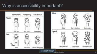

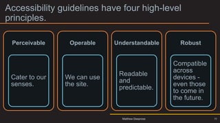
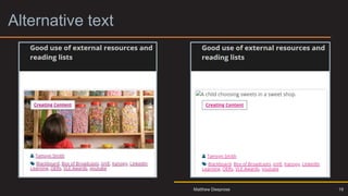
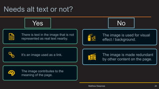
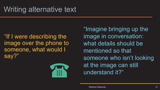
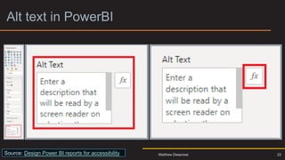
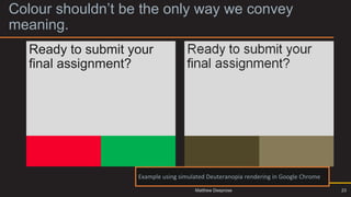

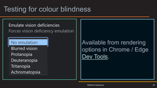
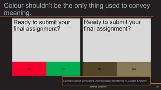
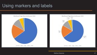
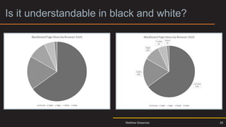

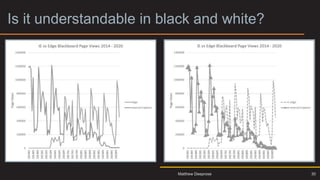


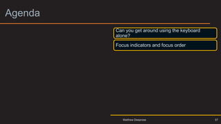

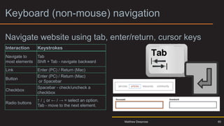
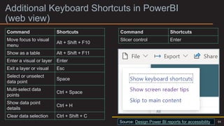
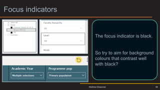


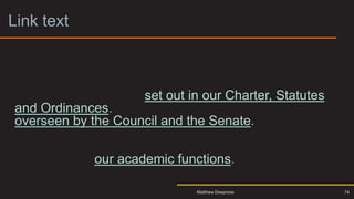

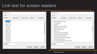

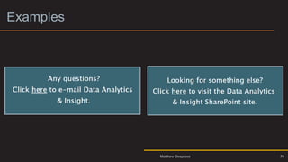
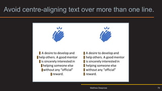
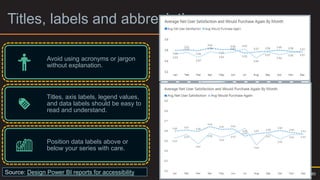
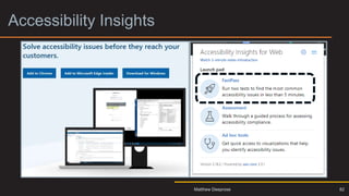


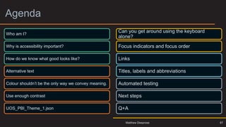


Matthew Deeprose discusses the importance of accessibility in Power BI, emphasizing that good design must consider diverse user needs. Key topics include the significance of alternative text, sufficient color contrast, and keyboard navigation for usability. The presentation outlines principles for creating accessible content, such as ensuring it is perceivable, operable, understandable, and robust.


![[v1.0.3]-PowerBI-Interactive-Tutorial.pptx](https://cdn.slidesharecdn.com/ss_thumbnails/v1-230405211556-60a0f605-thumbnail.jpg?width=640&height=640&fit=bounds)
![[v1.0.3]-PowerBI-Interactive-Tutorial.pptx](https://cdn.slidesharecdn.com/ss_thumbnails/v1-240306091134-1909b0fc-thumbnail.jpg?width=640&height=640&fit=bounds)

![[v1.0.3]-PowerBI-Interactive-Tutorial.pptx](https://cdn.slidesharecdn.com/ss_thumbnails/v1-230427235045-e740199c-thumbnail.jpg?width=640&height=640&fit=bounds)
![[v1.0.3]-PowerBI-Interactive-Tutorial.pptx](https://cdn.slidesharecdn.com/ss_thumbnails/v1-231221113903-ec65b532-thumbnail.jpg?width=640&height=640&fit=bounds)
![[v1.0.3]-PowerBI-Interactive-Tutorial (1).pptx](https://cdn.slidesharecdn.com/ss_thumbnails/v1-220408051137-thumbnail.jpg?width=640&height=640&fit=bounds)


