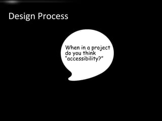
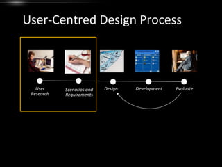
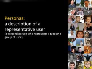
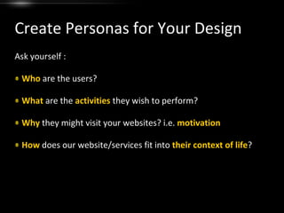
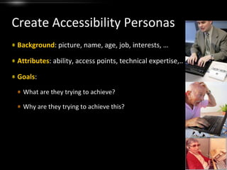
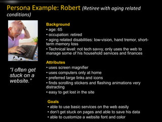
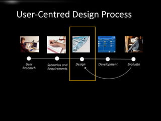
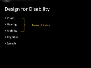
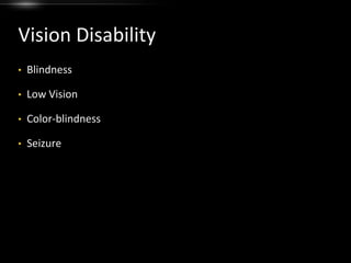
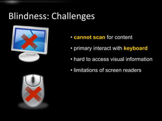
Designing for AccessibilityAfter successfully completing this module, you will be able to:create accessibility personasunderstand the challenges of users with disabilitiesapply design tips for different disability types
OutlineAccessibility Hit or MythDesign Process and PersonasDesign for DisabilityType definitionChallenges users faceDesign tipsSummary and Design Resource
Hit or MythAccessible sites look boring“Text-only” pages are a good way to provide accessibility(Myth)(Myth)
Hit or MythAccessible sites look boring“Text-only” pages are a good way to provide accessibilityIt’s possible to design a single version of web content that is accessible across all spectrum of disabilities(Myth)(Myth)(Myth)Universal Design
Design ProcessWhen in a project do you think “accessibility?”
User-Centred Design ProcessEvaluateUser ResearchDesignDevelopmentScenarios and Requirements
Personas:a description of a representative user(a pretend person who represents a type or a group of users)
Create Personas for Your DesignAsk yourself :Who are the users?What are the activities they wish to perform?Why they might visit your websites? i.e. motivationHow does our website/services fit into their context of life?
Create Accessibility PersonasBackground: picture, name, age, job, interests, …Attributes: ability, access points, technical expertise,..Goals: What are they trying to achieve?Why are they trying to achieve this?
Persona Example: Robert(Retiree with aging related conditions)Background age: 65
 occupation: retired
 aging related disabilities: low-vision, hand tremor, short-term memory loss
 Technical level: not tech savvy, only uses the web to manage some of his household services and financesAttributes uses screen magnifier
 uses computers only at home
 preferred large links and icons
 finds scrolling stickers and flashing animations very distracting
 easy to get lost in the site“I often get stuck on a website.”Goals able to use basic services on the web easily
 don’t get stuck on pages and able to save his data
 able to customize a website font and colorTips for Creating PersonasEmpathy: focus on our target users and their pain pointsConcrete:  include details of your personas and make them realApply a face to your personaInclude disability condition and AT information for accessibility personas
User-Centred Design ProcessEvaluateUser ResearchDesignDevelopmentScenarios and Requirements
Design for DisabilityVisionHearingMobilityCognitiveSpeechFocus of today
The Four POUR PrinciplesThe Four POUR PrinciplesWCAG 2.0 principles:Perceivable
Operable
Understandable
Robust Vision DisabilityBlindness
Low Vision
Color-blindness
SeizureBlindnessLet’s experience it!What are the challenges?
Blindness: Challengescannotscan for content
 primary interact with keyboard
 hard to access visual information
 limitations of screen readersBlindness: Design TipsPerceivable: include detailed text description for graphics, video, animationOperable: fully operable with keyboardUnderstandable: make sure your page has a clear, and consistent structure, and avoid using complex tablesRobust: be careful with new technologies that will raise incapability with AT
Low-VisionLet’s Experience it!What are the challenges?
Low-Vision: Challenges cannot see without magnifier
text in graphics is hard to read
 cannot see pages with low contrastLow-Vision: Design TipsPerceivable:To make text more legible when enlarged, use true text as much as possible, rather than text in graphics.To the extent possible, use percentages, rather than absolute units (e.g. pixels), in your document layout.To the extent possible, maximize the contrast of your web pages, including graphics, fonts, and backgrounds
Color-BlindnessAssessment SamplesTest Plate 1Test Plate 2Test Image(The number 12 should be visible by all.)Test Plate 3Test Plate 4
Color-Blindness: TypesProtanopia and protanomaly (red deficiencies)Deuteranopia and deuteranomaly (green deficiencies)Tritanopia (blue deficiencies)Rod monochromacy or achromacy (no color)
Color BlindnessLet’s Experience it!What are the challenges?
Color-Blindness: Challenges problem color combinations
 color used as the only way to convey informationColor Basics: Hue
Color Basics: Lightness & Saturation
Effective Color Contrast Guidelines1Exaggerate lightness differences between foreground and background colors
Effective Color Contrast Guidelines2Choose dark colors from the bottom half of the circle against light colors from the top half of the circle.Light ColorsDark Colors
Effective Color Contrast Guidelines3Avoid contrasting hues from adjacent parts of the hue circle, especially if the colors do not contrast sharply in lightness.Light ColorsDark Colors
Color-Blindness: Design TipsPerceivable:Avoid colors or color pairs that cause problems for people who are colorblind.Provide sufficient contrast between foreground and background colors.Make sure that colors are not your only method of conveying important information.
Seizure Disorders
Hearing DisabilityLet’s hear it!What are the challenges?
Hearing: Challenges auditory prompts without visual signposts
 lacking caption/transcript for video and audio contentHearing: Design TipsPerceivable:Make sure they can perceive (hear) auditory content Alternative text for animation
 Synchronized captioning
 Transcript
 Text description (e.g. for audio instructions)Allow for user control of start/stop, animations, and other equivalent options.
Hearing Disabilitya word about sign language…
Mobility Disability
MobilityLet’s hear it!What are the challenges?
Motor: Assistive Technologies
Mobility: Challenges may not be able to control mouse or keyboard well
 may become fatigue very easily when using ATTheir biggest challenge is…Navigating on the web
How we read online...
How do we read online?People almost always scan your pagesUserswon't read your text thoroughlyin a word-by-word mannerMost readers have 2 key questions:Am I on the right page? If not, where do I go next? Headingslinks
"Provide clear and consistent navigation mechanisms to increase the likelihood that a person will find what they are looking for at a site."Web Content Accessibility Guideline 13
Mobility: Design TipsOperable:build a good navigation structuregive feedback to user actionshelp users navigate efficiently through keyboard

Design for Accessibility