
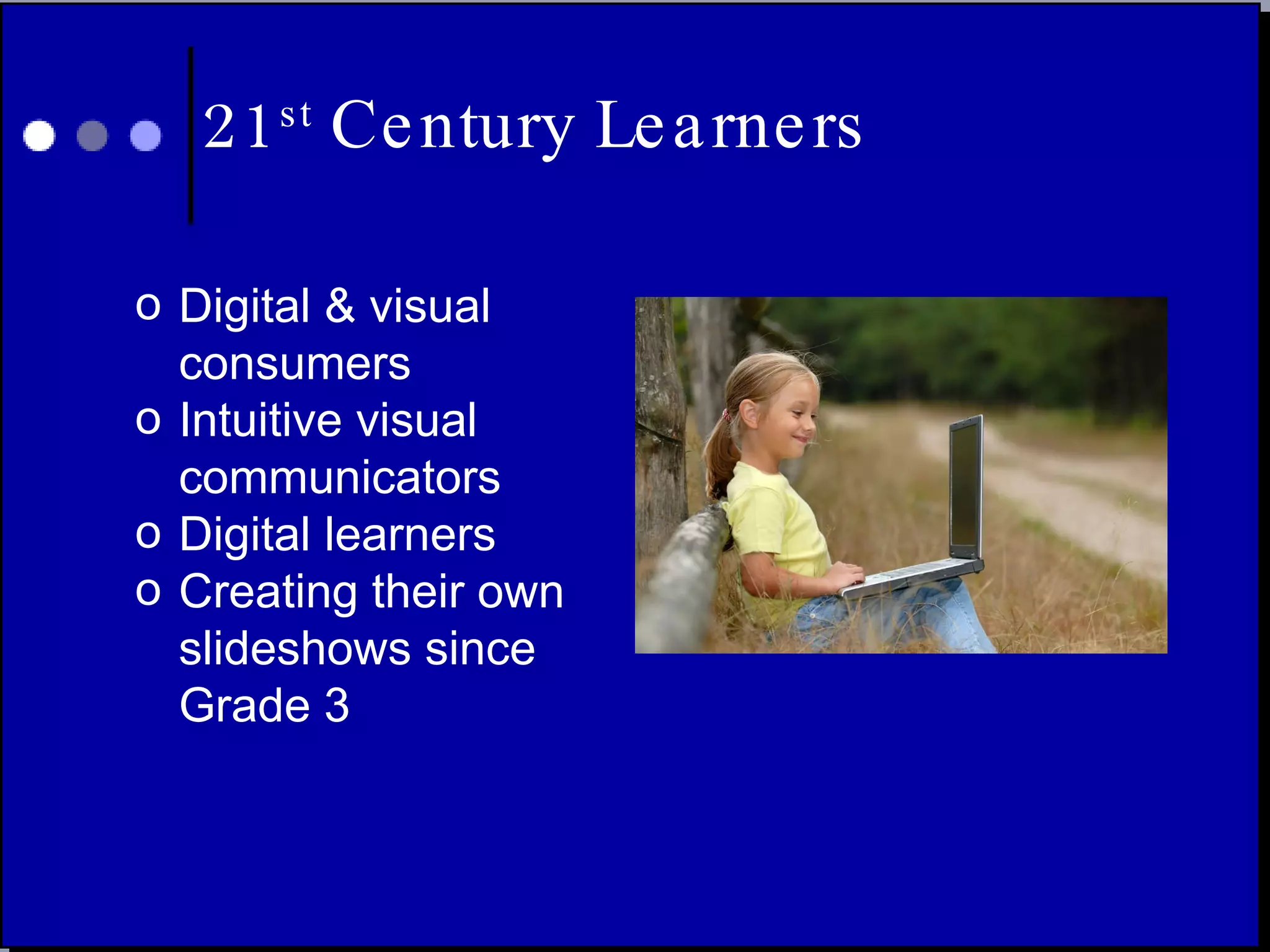


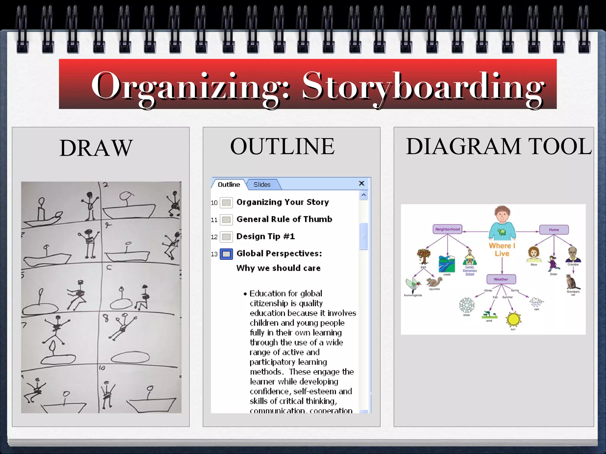
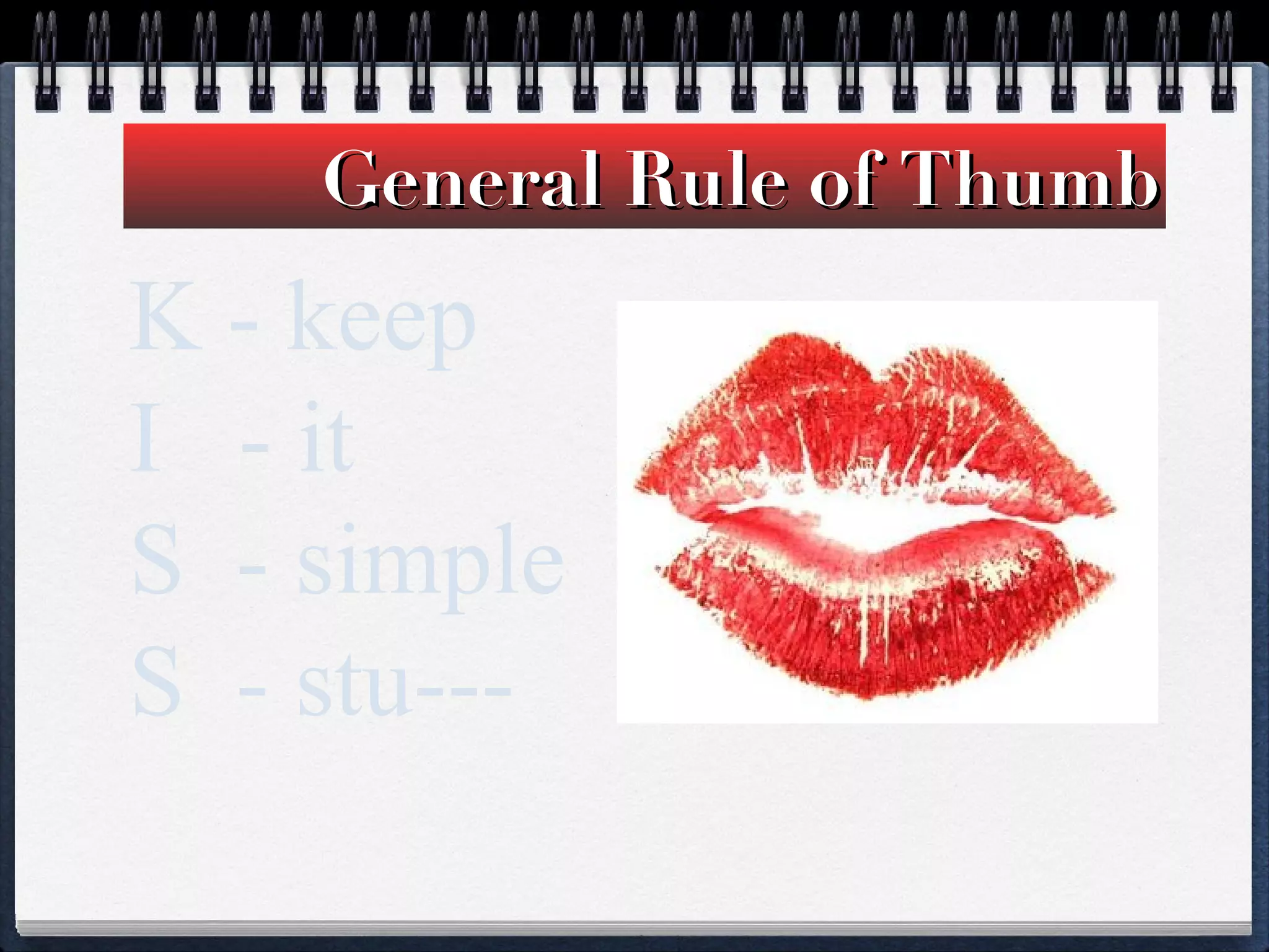


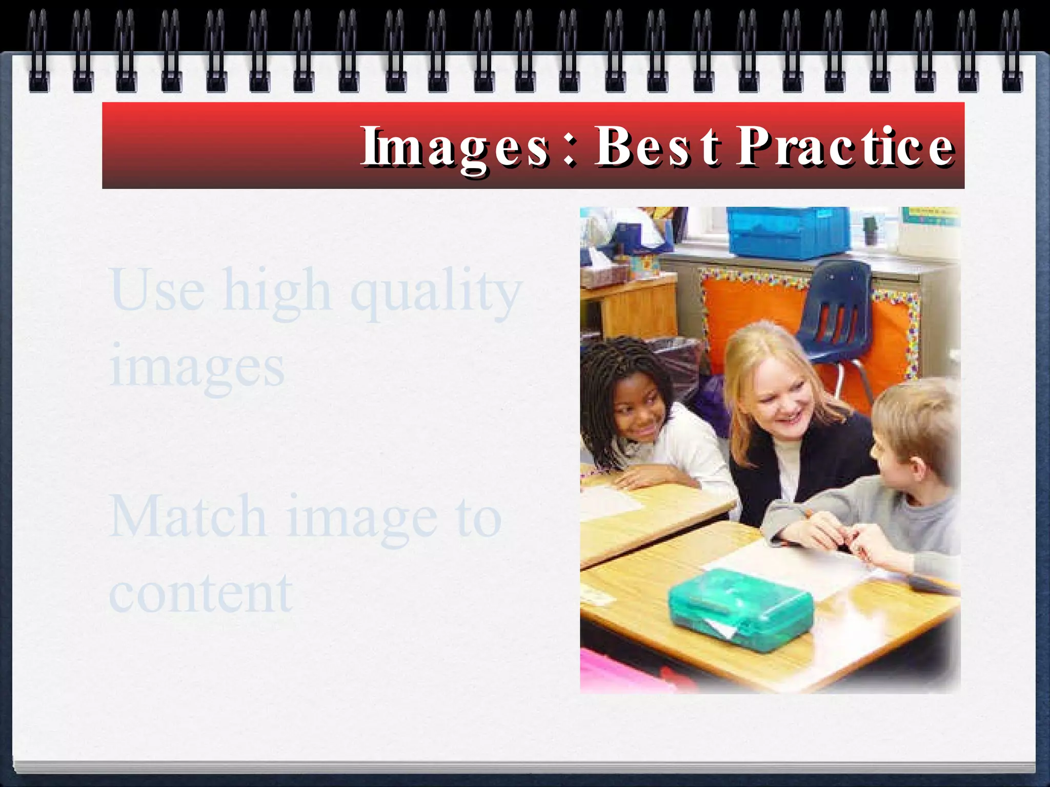

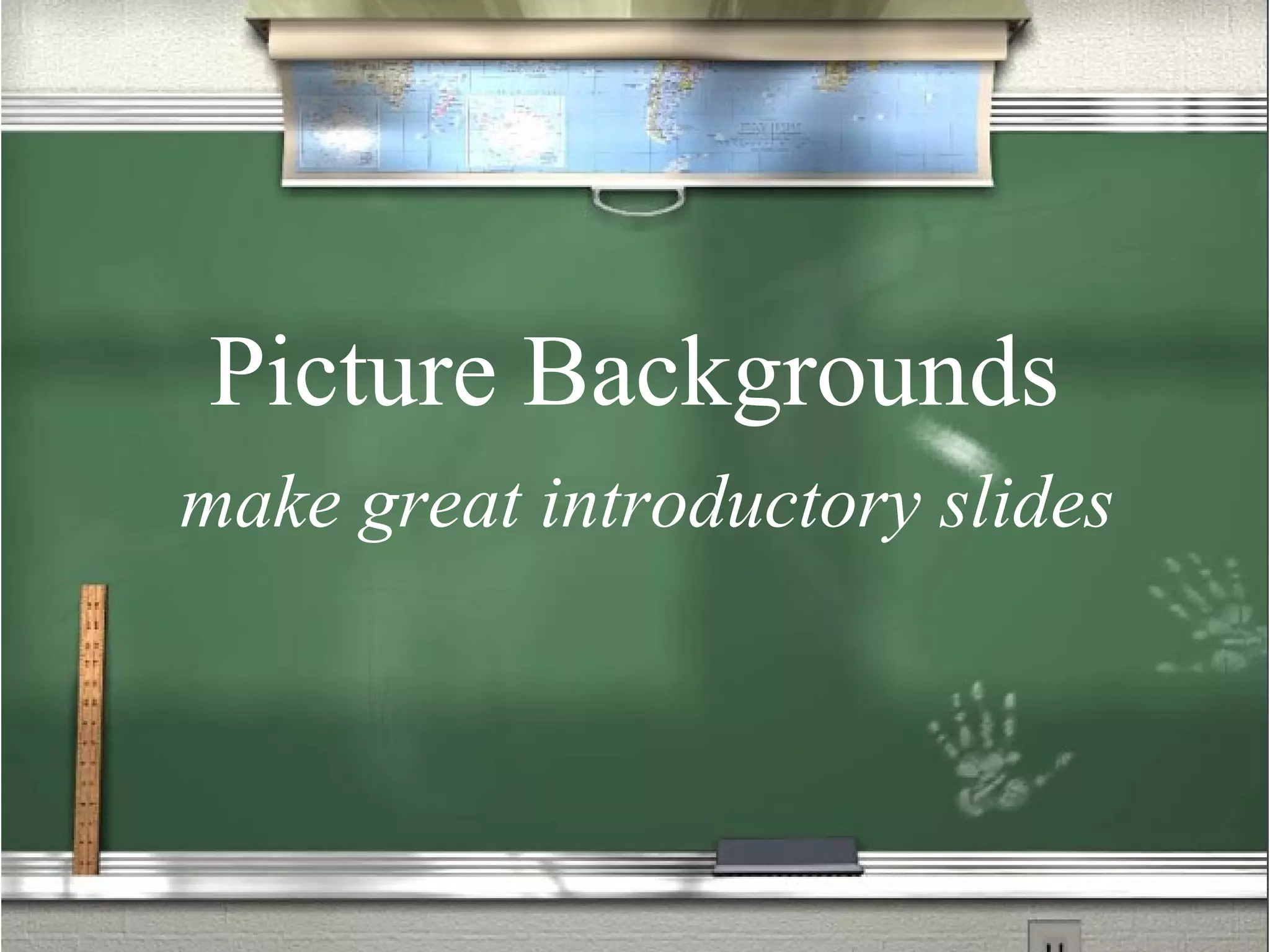
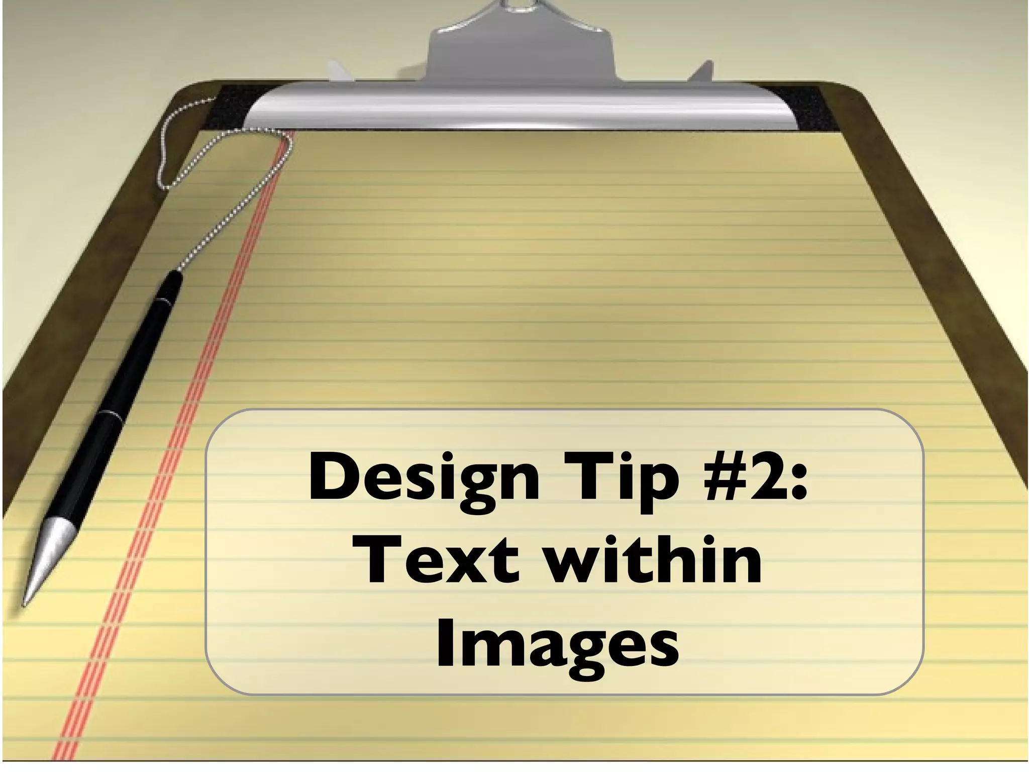
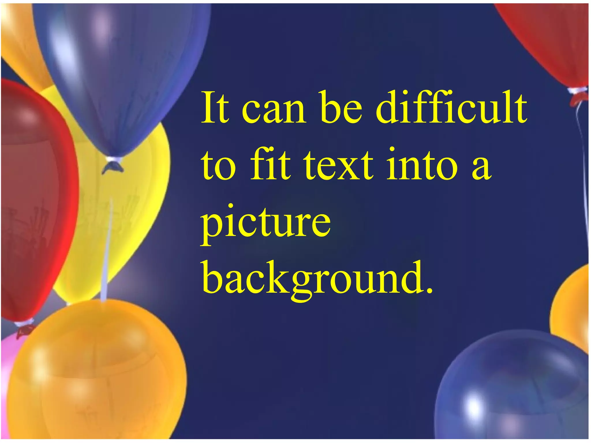

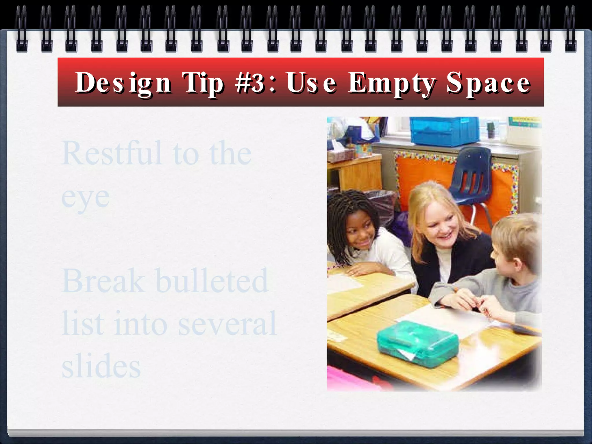
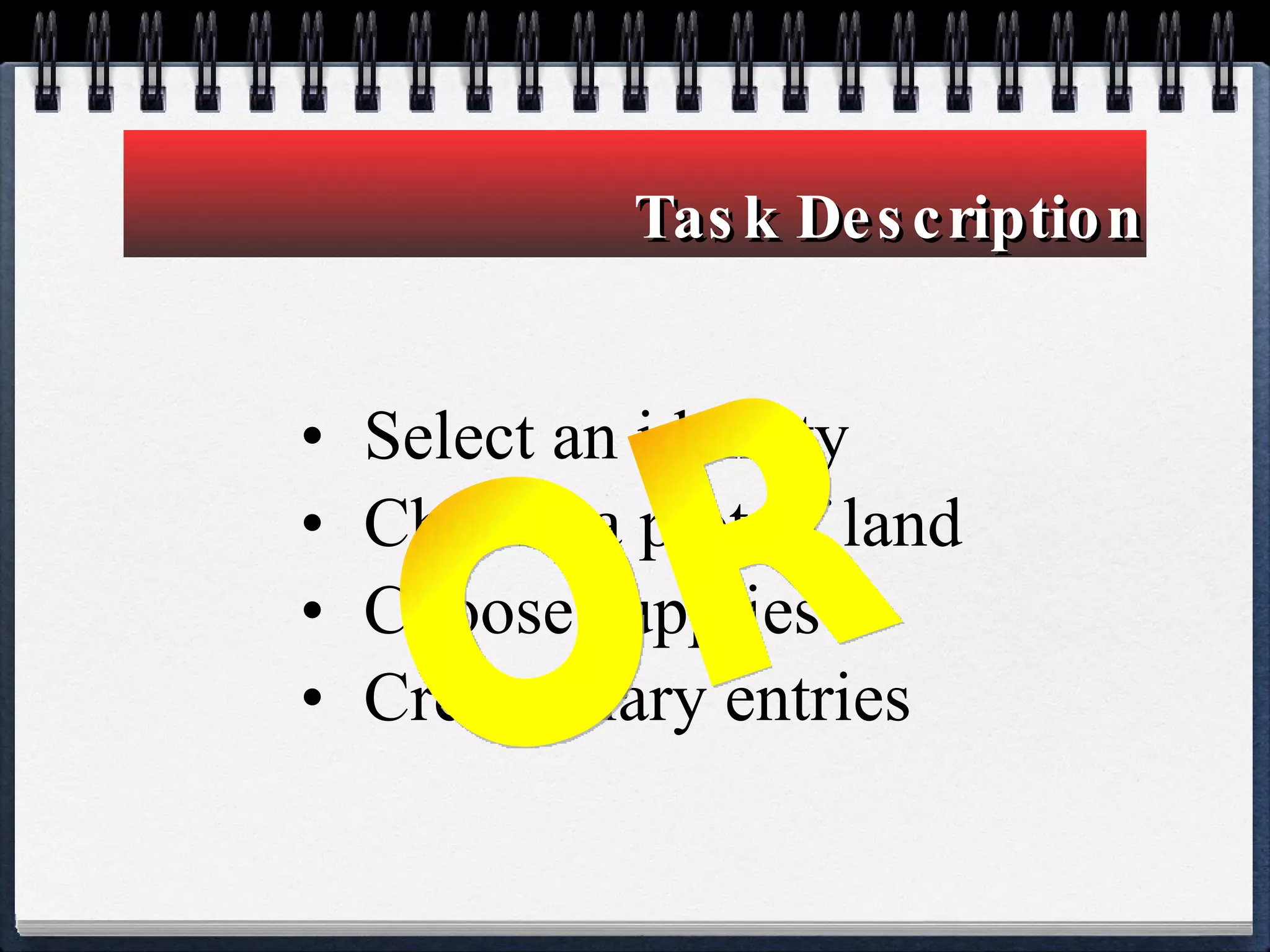

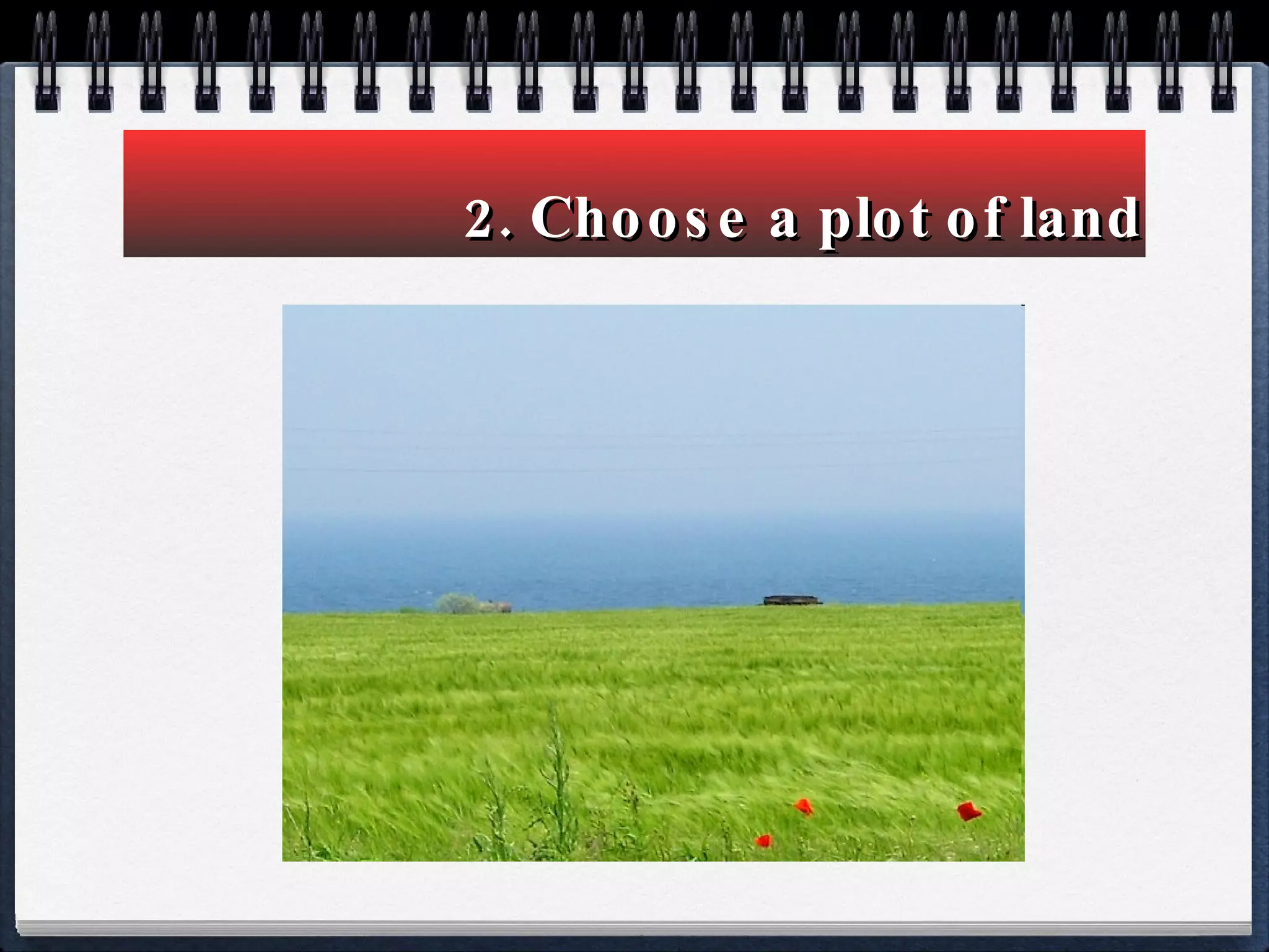


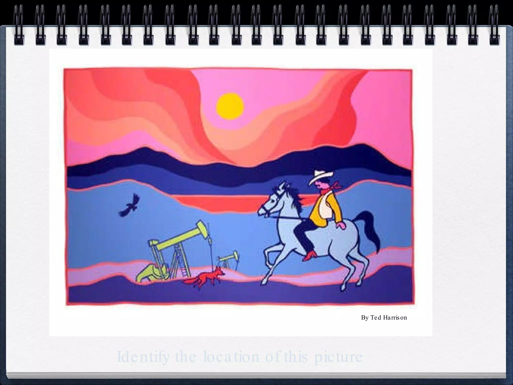

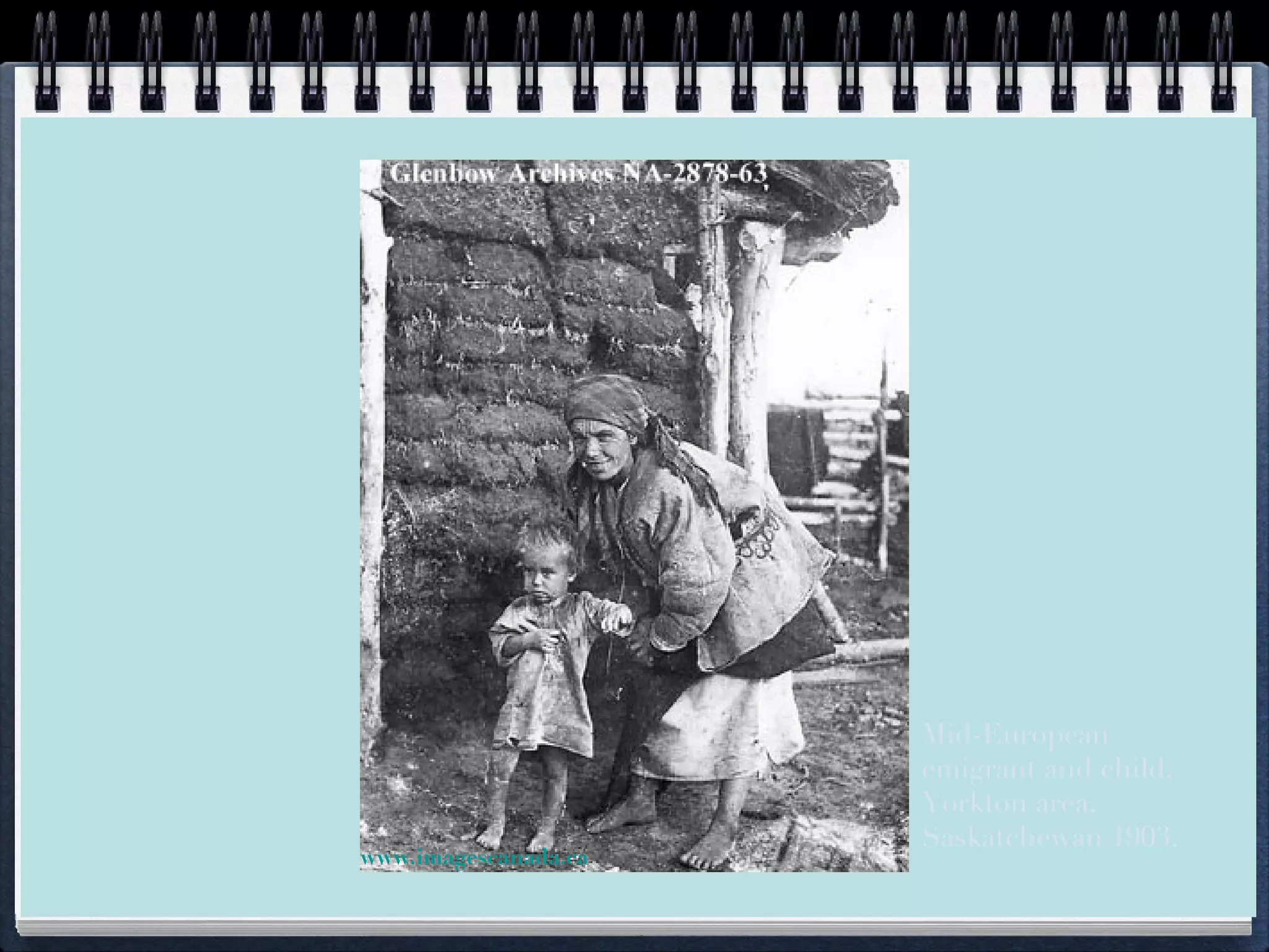

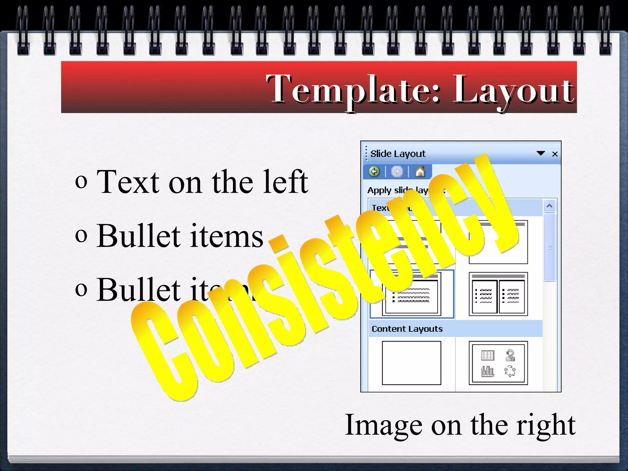
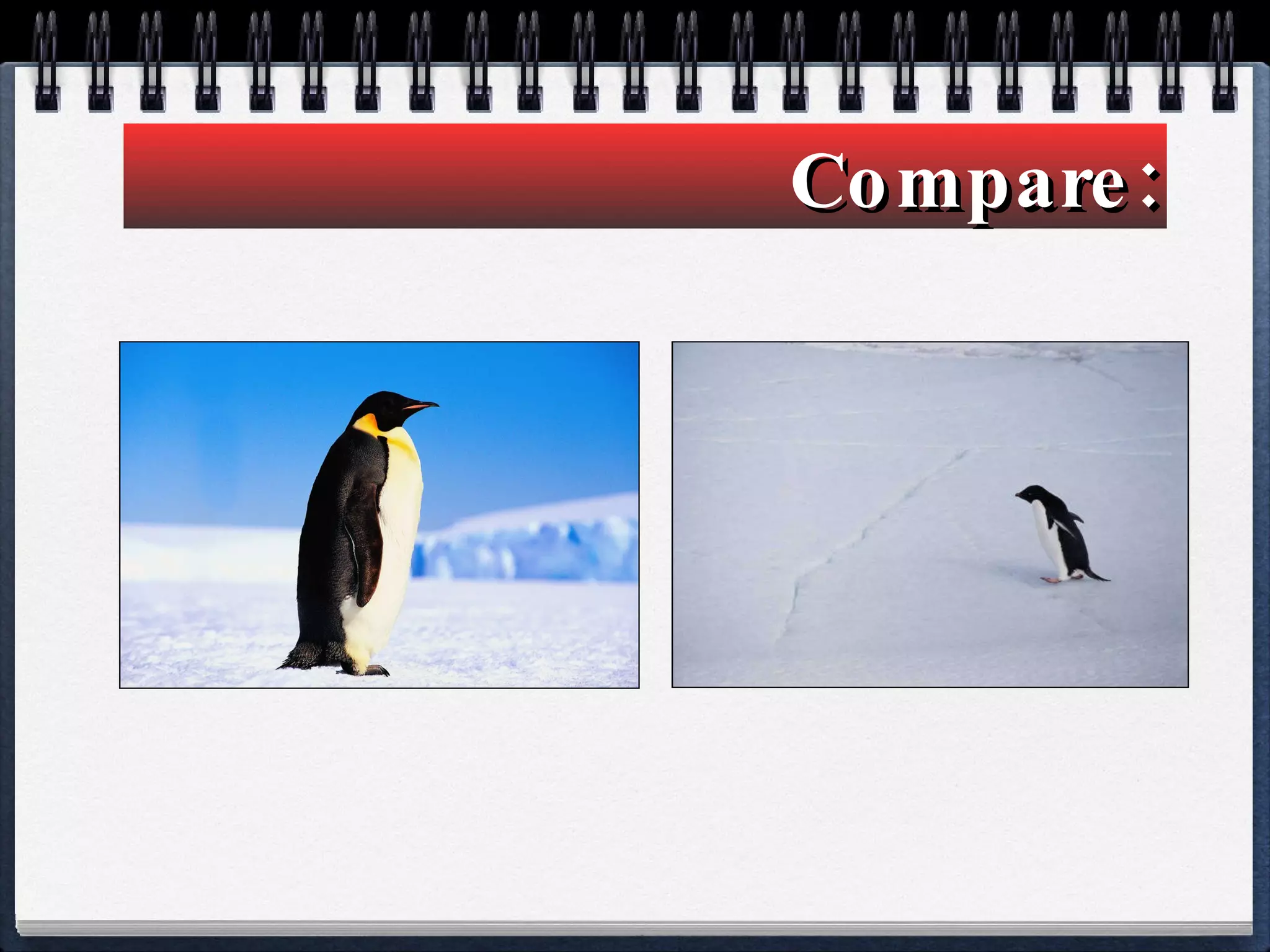
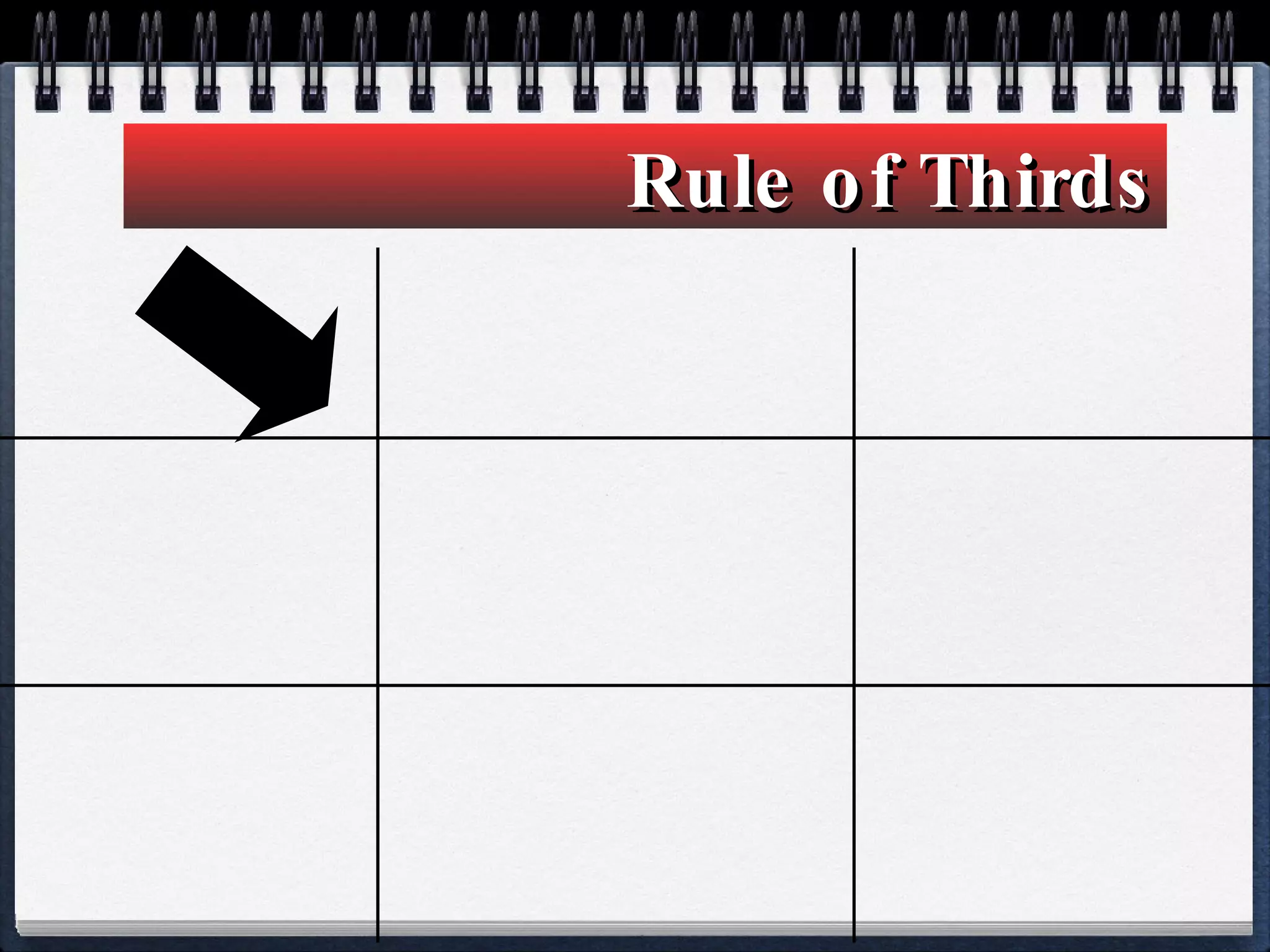


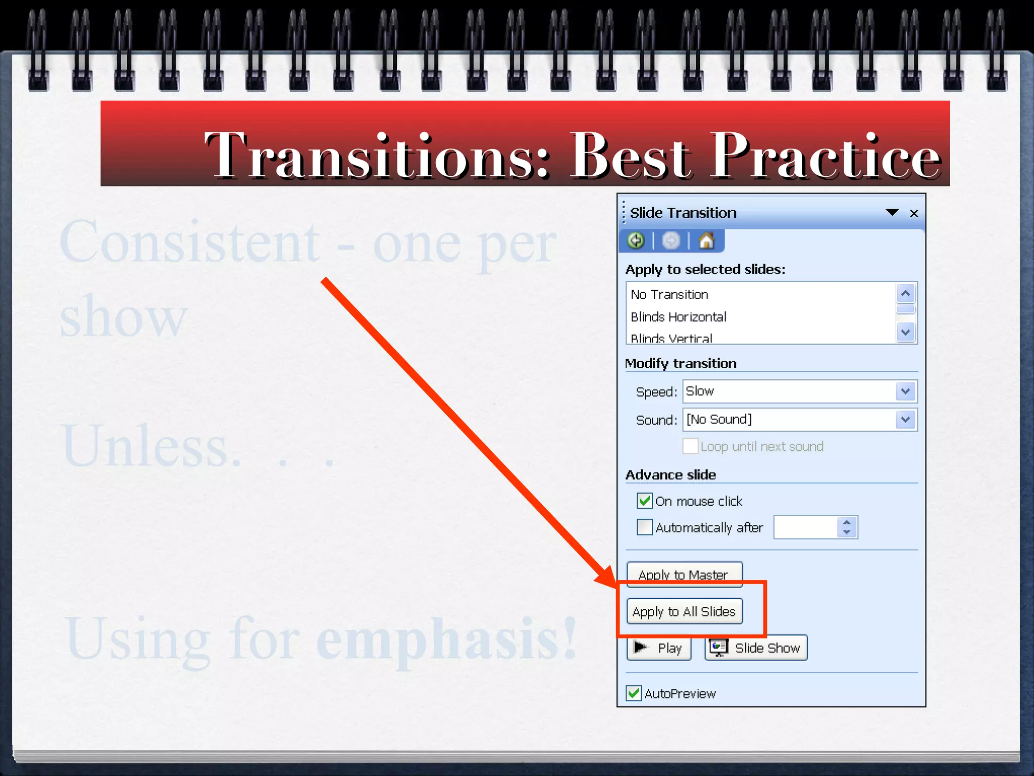


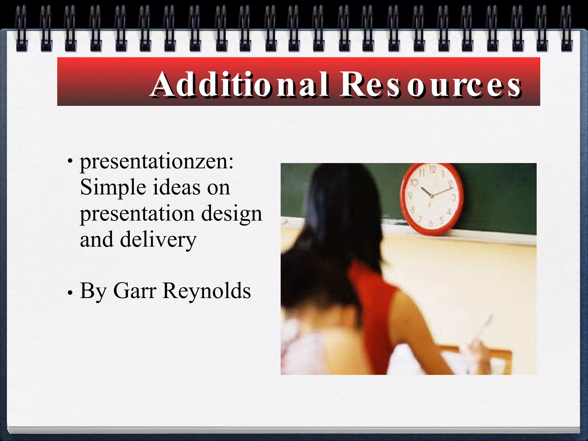

This document provides tips for creating effective PowerPoint presentations. It recommends keeping designs simple with no more than 3 fonts and using images that match content. Bullets should include only key points, not full stories. Text within images can be difficult to read, and empty space makes presentations more restful. Balance and proper image placement according to rules of thirds enhances visual design. Animations and transitions should be used sparingly to avoid distraction. The goal is to organize information clearly and tell a story through visuals to engage 21st century learners.


