Download as PDF, PPTX


![Education…
revolve[s] around non-
sales selling: the ability
to influence, to
persuade, and to
change behavior while
striking a balance
between what others
want and what you can
provide them.
Daniel Pink, To Sell is Human
Daniel
Pink](https://image.slidesharecdn.com/unconventionalwisdom-130922091739-phpapp01/85/Unconventional-wisdom-Putting-the-WHY-Before-the-WHAT-of-Presentation-Design-17-320.jpg)


![As emerging disciplines
[information graphics and
visualization]…are a hodge-podge
of concepts, methods, and
procedures borrowed from many
areas: the principles of map
design…guidelines on how to
better display data on a chart…
rules on best practices for the use
of type, layout, and color
palettes…principles of writing
style…and more…
Alberto
Cairo](https://image.slidesharecdn.com/unconventionalwisdom-130922091739-phpapp01/85/Unconventional-wisdom-Putting-the-WHY-Before-the-WHAT-of-Presentation-Design-67-320.jpg)


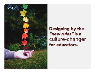
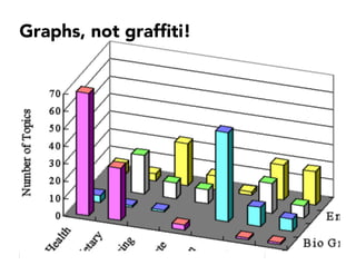
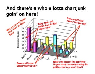
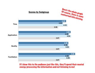
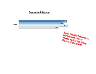
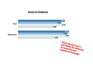
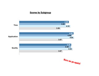
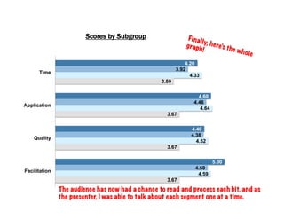
This document emphasizes the importance of understanding the 'why' behind presentation design, particularly for educators, as it significantly impacts teaching effectiveness. It argues against traditional practices such as cluttered slides filled with text, advocating for strategies like 'chunking' information to enhance audience engagement. The author also provides insights on effective visuals and communication principles that support better learning outcomes.


