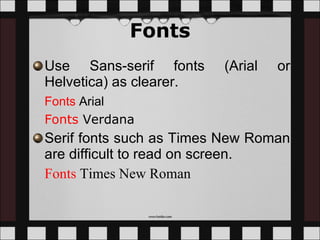
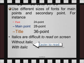
Assignment 3:  Best Power Point Slide Design Practice Group A Present for:  Dr.Ahmad Zamzuri Bin Mohamad Ali
Tan Yu Heng D20061027603 Seah Mei Yin D20061027623 Ho Chin Sue D20061027602 Ong Xian Rou D20061027604 Phoong Seuk Wai D20061027621 Prepared by the following group members
Colour Graphics and Design Video and Audio Final Confirmation Introduction References Fonts
Introduction The principles are divided into five main aspects: Fonts Graphics and design Colour Video and audio Final confirmation Menu
Fonts Use Sans-serif fonts (Arial or Helvetica) as clearer.  Fonts   Arial Fonts   Verdana   Serif fonts such as Times New Roman are difficult to read on screen.  Fonts   Times New Roman
The font size used should be at least 24. Make the text big.  This is Arial 12 This is Arial 18 This is Arial 24  This is Arial 28 This is Arial 32 This is Arial 36 This is Arial 44
Use different sizes of fonts for main points and secondary point. For instance Font   24-point Main point  28-point Title   36-point Italics are difficult  to read on screen Without italic With italic
Normal   or  bold  fonts are clearer Underlines may signify hyperlinks Do not use too many styles and colours of fonts.  T o o  m a n y   c o l o u r s Too   Many   Fonts   and   Styles
Use the 6 x 6 Rule.  No more than 6 words per line and no more than 6 lines per slide. Educational technology is the study and ethical practice of facilitating learning and improving performance by creating, using and managing appropriate technological processes and resources. This term is often associated with, and encompasses, instructional theory and learning theory. Educational technology is not only include software and hardware but also include the internet applications and activities as well. Not follow 6 x 6 rule.  Too detailed Font size too small
Change the font size: Educational technology is the study and ethical practice of facilitating learning and improving performance by creating, using and managing appropriate technological processes and resources. This term is often associated with, and encompasses, instructional theory and learning theory. Educational technology is not only include software and hardware but also include the internet applications and activities as well. Not follow 6 x 6 rule.  Too detailed
Make the text simple in point form: Educational technology is a study and ethical practice facilitate learning, improve performance  create, use, manage appropriate processes and resources.  instructional theory and learning theory.  Include software, hardware, internet Much Simple
3- 6 bullets per slide For instance, Use Sans-serif fonts Do not use too many styles of fonts Avoid from using Serif fonts Make the text big Normal or bold fonts are clearer Limit italics.
Use dark text on light background or light text on dark background in order to achieve high contrast.   Text Background White   Blue Black    White Yellow   Black White   Black
Do not use  complementary colours for the font as it causes low contrast. Use contrasting colours Light on dark vs dark on light   Use complementary colours   These colours complement Low contrast
ALL CAPITAL LETTERS ARE DIFFICULT TO READ, SO THE COMBINATION OF UPPER AND LOWER CASE LETTERS ARE EASIER TO READ.  Menu
Graphic and Design Keep the background consistent. The text should be simple and straight to the point when there are charts and  tables  on the slide Do not put pictures or animations that are not related to the contents.  Make sure there is an empty space around the text and graphics
Falling Leaves Observed Too detailed Delhi Mumbai Goa January 11,532,234 14,123,654 3,034,564 February 1,078,456 12,345,567 16,128,234 March 17,234,778 6,567,123 16,034,786 April 16,098,897 10,870,954 7,940,096 May 8,036,897 10,345,394 14,856,456 June 16,184,345 678,095 4,123,656 July 8,890,345 15,347,934 18,885,786 August 8,674,234 18,107,110 17,230,095 September 4,032,045 18,923,239 9,950,498 October 2,608,096 9,945,890 5,596,096 November 5,864,034 478,023 6,678,125 December 12,234,123 9,532,111 3,045,654
Falling Leaves Observed Much Simpler In 10 6 Delhi Mumbai Goa January 11 14 3 February 1 12 16 March 17 6 16 April 16 10 7 May 8 10 14 June 16 0 4 July 8 15 18 August 8 18 17 September 4 18 9 October 2 9 5 November 5 0 6 December 12 9 3 Back
Have a good balance of text and graphics Make  graphs  and figures large Make sure all diagrams and graphics are meaningful Remain the same pattern graphics throughout the presentation.  Minimize the number of graphics on each slide.
Falling Leaves Make graph large Back
Skip flashy graphics, fancy transition, noisy and fancy animation effects unless they relate directly to the slide.   Do not use too much of transitions. Start with an outline slide. End with a summary or conclusion slide Menu
Colour Do not use too much of colours on a single screen. Use no more than 4 colors on one chart. Use contrasting colours for the background and the text. For instance,  White   Blue
Choose the appropriate colour according to the background of the students.  Use colour to emphasize the point. Eg: Subtraction means  take away . Menu
Video and Audio Limit the video and audio. Avoid unnecessary sounds and video Menu
Final Confirmation Check the spelling and grammar. Make sure the content appear on the screen is in a consistent, simple manner. Check the sound and the video Menu
References Damon Brown (2008).  10 Ways to Make PowerPoint Presentations Powerful.  Retrieved August 20, 2009 from   http://technology.inc.com/managing/articles/200610/tips_powerpoint.html Garr Reynolds.  Top Ten Slide Tips .  Retrieved August 22, 2009 from  http://www.garrreynolds.com/Presentation/slides.html Julie and Karen.  Making Good PowerPoint Presentations.  Retrieved August 21, 2009 from   http://www.slideshare.net/hiratufail/making-good-ppt-presentations
Tips for Effective PowerPoint Presentations .  Retrieved August 20, 2009 from  http://www.cheney268.com/training/PowerPoint/PowerPointTips.htm Satyajeet Singh.  Designing Effective “PowerPoint Presentations”. Retrieved August 22, 2009 from  http://www.slideshare.net/satyajeet_02/how-to-make-effective-presentation Yusup Hashim (2008). Rekabentuk Instruksional Teknologi (Edisi Ke-6). Tanjung Malim: Yusup.h.  Menu
Hello Goodbye

Presentation Assignment 3 2009

  • 1.
    Assignment 3: Best Power Point Slide Design Practice Group A Present for: Dr.Ahmad Zamzuri Bin Mohamad Ali
  • 2.
    Tan Yu HengD20061027603 Seah Mei Yin D20061027623 Ho Chin Sue D20061027602 Ong Xian Rou D20061027604 Phoong Seuk Wai D20061027621 Prepared by the following group members
  • 3.
    Colour Graphics andDesign Video and Audio Final Confirmation Introduction References Fonts
  • 4.
    Introduction The principlesare divided into five main aspects: Fonts Graphics and design Colour Video and audio Final confirmation Menu
  • 5.
    Fonts Use Sans-seriffonts (Arial or Helvetica) as clearer. Fonts Arial Fonts Verdana Serif fonts such as Times New Roman are difficult to read on screen. Fonts Times New Roman
  • 6.
    The font sizeused should be at least 24. Make the text big. This is Arial 12 This is Arial 18 This is Arial 24 This is Arial 28 This is Arial 32 This is Arial 36 This is Arial 44
  • 7.
    Use different sizesof fonts for main points and secondary point. For instance Font 24-point Main point 28-point Title 36-point Italics are difficult to read on screen Without italic With italic
  • 8.
    Normal or bold fonts are clearer Underlines may signify hyperlinks Do not use too many styles and colours of fonts. T o o m a n y c o l o u r s Too Many Fonts and Styles
  • 9.
    Use the 6x 6 Rule.  No more than 6 words per line and no more than 6 lines per slide. Educational technology is the study and ethical practice of facilitating learning and improving performance by creating, using and managing appropriate technological processes and resources. This term is often associated with, and encompasses, instructional theory and learning theory. Educational technology is not only include software and hardware but also include the internet applications and activities as well. Not follow 6 x 6 rule. Too detailed Font size too small
  • 10.
    Change the fontsize: Educational technology is the study and ethical practice of facilitating learning and improving performance by creating, using and managing appropriate technological processes and resources. This term is often associated with, and encompasses, instructional theory and learning theory. Educational technology is not only include software and hardware but also include the internet applications and activities as well. Not follow 6 x 6 rule. Too detailed
  • 11.
    Make the textsimple in point form: Educational technology is a study and ethical practice facilitate learning, improve performance create, use, manage appropriate processes and resources. instructional theory and learning theory. Include software, hardware, internet Much Simple
  • 12.
    3- 6 bulletsper slide For instance, Use Sans-serif fonts Do not use too many styles of fonts Avoid from using Serif fonts Make the text big Normal or bold fonts are clearer Limit italics.
  • 13.
    Use dark texton light background or light text on dark background in order to achieve high contrast.  Text Background White Blue Black White Yellow Black White Black
  • 14.
    Do not use complementary colours for the font as it causes low contrast. Use contrasting colours Light on dark vs dark on light Use complementary colours These colours complement Low contrast
  • 15.
    ALL CAPITAL LETTERSARE DIFFICULT TO READ, SO THE COMBINATION OF UPPER AND LOWER CASE LETTERS ARE EASIER TO READ. Menu
  • 16.
    Graphic and DesignKeep the background consistent. The text should be simple and straight to the point when there are charts and tables on the slide Do not put pictures or animations that are not related to the contents. Make sure there is an empty space around the text and graphics
  • 17.
    Falling Leaves ObservedToo detailed Delhi Mumbai Goa January 11,532,234 14,123,654 3,034,564 February 1,078,456 12,345,567 16,128,234 March 17,234,778 6,567,123 16,034,786 April 16,098,897 10,870,954 7,940,096 May 8,036,897 10,345,394 14,856,456 June 16,184,345 678,095 4,123,656 July 8,890,345 15,347,934 18,885,786 August 8,674,234 18,107,110 17,230,095 September 4,032,045 18,923,239 9,950,498 October 2,608,096 9,945,890 5,596,096 November 5,864,034 478,023 6,678,125 December 12,234,123 9,532,111 3,045,654
  • 18.
    Falling Leaves ObservedMuch Simpler In 10 6 Delhi Mumbai Goa January 11 14 3 February 1 12 16 March 17 6 16 April 16 10 7 May 8 10 14 June 16 0 4 July 8 15 18 August 8 18 17 September 4 18 9 October 2 9 5 November 5 0 6 December 12 9 3 Back
  • 19.
    Have a goodbalance of text and graphics Make graphs and figures large Make sure all diagrams and graphics are meaningful Remain the same pattern graphics throughout the presentation. Minimize the number of graphics on each slide.
  • 20.
    Falling Leaves Makegraph large Back
  • 21.
    Skip flashy graphics,fancy transition, noisy and fancy animation effects unless they relate directly to the slide.  Do not use too much of transitions. Start with an outline slide. End with a summary or conclusion slide Menu
  • 22.
    Colour Do notuse too much of colours on a single screen. Use no more than 4 colors on one chart. Use contrasting colours for the background and the text. For instance, White Blue
  • 23.
    Choose the appropriatecolour according to the background of the students. Use colour to emphasize the point. Eg: Subtraction means take away . Menu
  • 24.
    Video and AudioLimit the video and audio. Avoid unnecessary sounds and video Menu
  • 25.
    Final Confirmation Checkthe spelling and grammar. Make sure the content appear on the screen is in a consistent, simple manner. Check the sound and the video Menu
  • 26.
    References Damon Brown(2008). 10 Ways to Make PowerPoint Presentations Powerful. Retrieved August 20, 2009 from http://technology.inc.com/managing/articles/200610/tips_powerpoint.html Garr Reynolds. Top Ten Slide Tips . Retrieved August 22, 2009 from http://www.garrreynolds.com/Presentation/slides.html Julie and Karen. Making Good PowerPoint Presentations. Retrieved August 21, 2009 from http://www.slideshare.net/hiratufail/making-good-ppt-presentations
  • 27.
    Tips for EffectivePowerPoint Presentations . Retrieved August 20, 2009 from http://www.cheney268.com/training/PowerPoint/PowerPointTips.htm Satyajeet Singh. Designing Effective “PowerPoint Presentations”. Retrieved August 22, 2009 from http://www.slideshare.net/satyajeet_02/how-to-make-effective-presentation Yusup Hashim (2008). Rekabentuk Instruksional Teknologi (Edisi Ke-6). Tanjung Malim: Yusup.h. Menu
  • 28.