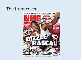
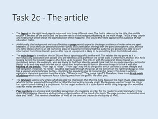
The front cover of NME magazine from September 2009 focuses on the rap artist Dizzee Rascal. The layout uses a 4-strip format to highlight Dizzee Rascal's name and image. The color scheme of red, white, and black appeals to a male audience. Dizzee Rascal's casual clothing style and the graffiti background relate to rap music. The target audience is identified as males aged 17-30 who are interested in alternative and indie music genres.
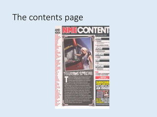
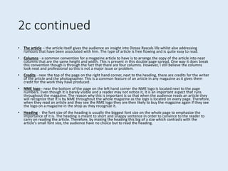
The contents page continues the color scheme with a modern font. Images and language create a concert-like atmosphere. Subheadings and page numbers guide readers to specific articles.
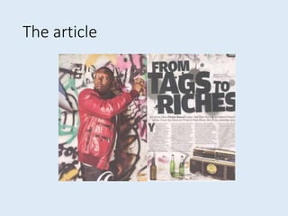
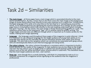
The article layout separates the title, text, and main image