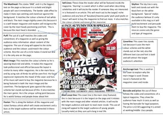
The Masthead: This states ‘NME’ and it is the biggest 
text on the page so because it is so bold and bright 
people will see it immediately. The border adds effect to 
make it more eye-catching and stand out against the 
background. It matches the colour scheme of red white 
and black. The main image slightly covers this because it 
is a well-known magazine and readers will recognise the 
cover by the mast heads positioning and font. This is 
because the mast head is branded. 
Sell Lines: These show the reader what will be featured inside the 
magazine. ‘Starring’ is a word which is often used when describing 
celebrities and it will excite the reader if someone they are interested 
in is featured in an article. This will reach out to the target/ niche 
audience and any fans of ‘Kasabian/maximo park/ yeah yeah yeahs or 
muse’ will want to buy the magazine to find out more. It also matches 
the colour scheme and genre of the magazine. 
Skyline: The sky line is very 
bold and stands out with the 
black font on the white 
background. ‘Special’ makes 
the audience believe it’s only 
available in this mag so it will 
build excitement and persuade 
them to buy the magazine. The 
mise en scene suits the genre 
and type pf magazine. 
Coverline: This cover line stands 
out because it uses the main 
colour scheme and the white 
stands out on the red, also the 
different text size and font is bold 
and will attract the target 
audience’s attention. 
Puff: The use of a puff matches the codes and 
conventions of a magazine as well as giving the 
audience extra information about content of the 
magazine. The use of slang will appeal to the niche 
audience and the colours used match the colour 
scheme. Also the use of a circle makes it stand out and 
it is the only one on the page. 
Anchorage text: This is used on 
the cover to explain why the 
main image is used. Dizzee 
rascal is featured on the 
magazine cover and inside. 
Main cover line: This cover line is the main story featured, 
this is clear because it is the largest on the page and it relates 
with the main image and other related articles. It will excite 
the target audience and want to read more inside. This use of 
slang will appeal to the target audience of young people 
(usually male) as they use such slang in real life. 
Barcode and price: the use of these 
follows the codes and conventions of a 
typical magazine. They show the 
audience how much it costs as well as 
having the barcode for legal purposes. 
The price is £2.50 suggesting it is aimed 
at working/middle class people. 
Main image: This matches the colour scheme as he is 
wearing black red and white. It makes the magazine 
look professional and official because the layout is 
similar to many other magazines. He is the main focus 
and by using rule of thirds he will be seen first. His facial 
expression represents the mood of the cover and fans 
of his music will want to buy the magazine because he is 
being featured in both the main image and the 
coverlines. The background goes against the colour 
scheme but stands out because of this. It also matches 
the main genre. He is the unique selling point because 
he is world famous and people know about him 
Footer: This is along the bottom of the magazine and 
states famous artists which will create excitement and a 
buzz as the target audience will be interested in these 
artists.

Mag 1

  • 1.
    The Masthead: Thisstates ‘NME’ and it is the biggest text on the page so because it is so bold and bright people will see it immediately. The border adds effect to make it more eye-catching and stand out against the background. It matches the colour scheme of red white and black. The main image slightly covers this because it is a well-known magazine and readers will recognise the cover by the mast heads positioning and font. This is because the mast head is branded. Sell Lines: These show the reader what will be featured inside the magazine. ‘Starring’ is a word which is often used when describing celebrities and it will excite the reader if someone they are interested in is featured in an article. This will reach out to the target/ niche audience and any fans of ‘Kasabian/maximo park/ yeah yeah yeahs or muse’ will want to buy the magazine to find out more. It also matches the colour scheme and genre of the magazine. Skyline: The sky line is very bold and stands out with the black font on the white background. ‘Special’ makes the audience believe it’s only available in this mag so it will build excitement and persuade them to buy the magazine. The mise en scene suits the genre and type pf magazine. Coverline: This cover line stands out because it uses the main colour scheme and the white stands out on the red, also the different text size and font is bold and will attract the target audience’s attention. Puff: The use of a puff matches the codes and conventions of a magazine as well as giving the audience extra information about content of the magazine. The use of slang will appeal to the niche audience and the colours used match the colour scheme. Also the use of a circle makes it stand out and it is the only one on the page. Anchorage text: This is used on the cover to explain why the main image is used. Dizzee rascal is featured on the magazine cover and inside. Main cover line: This cover line is the main story featured, this is clear because it is the largest on the page and it relates with the main image and other related articles. It will excite the target audience and want to read more inside. This use of slang will appeal to the target audience of young people (usually male) as they use such slang in real life. Barcode and price: the use of these follows the codes and conventions of a typical magazine. They show the audience how much it costs as well as having the barcode for legal purposes. The price is £2.50 suggesting it is aimed at working/middle class people. Main image: This matches the colour scheme as he is wearing black red and white. It makes the magazine look professional and official because the layout is similar to many other magazines. He is the main focus and by using rule of thirds he will be seen first. His facial expression represents the mood of the cover and fans of his music will want to buy the magazine because he is being featured in both the main image and the coverlines. The background goes against the colour scheme but stands out because of this. It also matches the main genre. He is the unique selling point because he is world famous and people know about him Footer: This is along the bottom of the magazine and states famous artists which will create excitement and a buzz as the target audience will be interested in these artists.