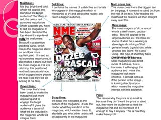
NME- DIZZLE 
RASCAL 
ANALYSIS!
Cover lines : 
The cover line's have 
been used, to make the 
magazine look more 
appealing and to 
engage the target 
audience! It gives the 
audience a taster of 
what will be included in 
the magazine which will 
intrigue them 
Main image: 
The main image is of dizze rascal 
who is a well known, popular 
artist. This will appeal to the 
target audience as, the mise en 
scene of what he is wearing is 
stereotypical clothing of that 
genre of music ( gold chain, white 
vest top and jeans) he is also 
using. The type of shot they have 
used is long shot 
Direct mode of address: 
Most magazines use direct 
mode of address, this is 
because, it will engage the 
audience and make the 
magazine look more 
effective. It almost looks as 
if the person in the image , 
is looking directly at you 
which makes the magazine 
interact with the audience. 
Sell lines: 
It contains the names of celebrities and artists 
who appear in the magazine which is 
mentioned to try and attract the reader, and 
reach a bigger audience. 
Puffs: 
This puff is a attention 
grabbing panel, which 
makes the magazine stand 
out and look more 
sophisticated. It is red as 
red connotes importance, it 
also makes it stand out from 
the main image as it is eye 
catching. It is positioned 
next to dizze rascals face, 
which suggest more people 
will read it as they will be 
looking at his face. 
Price: 
The reason why the price is so small is 
because they don’t want the price to stand 
out, they want the audience to read the 
magazine first and be interested in it 
enough to buy it anyway. This is how they 
make there profit 
Strap lines: 
the strap line is located at the 
bottom of the magazine, it tells the 
reader what they can find in the 
magazine, which excites them. It 
also tells you what other artists will 
be appearing in the magazine 
Main cover line: 
This main cover line is the biggest text 
on the page, it is meant to stand out from 
the rest of the text. After reading the 
masthead the readers will then straight 
away read this. 
Masthead: 
It is big, bright and bold, 
which will appeal and 
stand out the target 
audience! The title is in 
red, the colour red 
connotes importance 
which suggests you have 
to red the magazine. It 
has been placed at the 
top where it is eye level 
with the costumers.
Masthead/title: 
The “NME” logo is placed at the 
top of the page for constancy and 
to make the magazine look more 
sophisticated. It is positioned 
next to the word “contents” which 
implies that they want the reader 
to memories the NME slogan. 
The title contents suggests that it 
is going to tell you what the 
magazine includes in it. 
Side headings: 
There are a variation of side 
headings such as “news” and 
“reviews” this follows the 
codes and conventions of a 
music magazine by including 
things such as the above and 
more like interviews, artists, 
behind the scene pictures and 
competitions. They have been 
placed at the side of the 
magazine so it doesn’t take 
the attention away from the 
main article. Each side 
heading as a small description 
next to it and the page number 
of what the page will contain. 
Main image: this is the only image on the 
page! It is in the centre above the article. It 
also has a border around it which makes it 
stand out. 
Extras: This gives the reader a option to subscribe to the 
magazine. They are also able to see what the magazine 
offers. They include links to social networking sites such as 
Twitter, Facebook and Instagram. 
Side index: 
This has been included 
in the contents page as 
it allows the reader to 
decide what they want 
to read by the pages 
being numbered. They 
have made the text red 
as it connotes 
importance and 
suggest you should 
read what's in side the 
magazine. The colour 
red will also catch the 
readers eye. 
Main Article: 
The main article has 
been placed at the 
bottom, to create space 
for the rest of the 
features in the magazine. 
The image is placed in 
the middle of the page to 
engage the audience. 
The first line begins with 
a white bold letter to use 
up space and emphasise 
the statement, as it will 
attract the audiences 
attention. 
Background: The white background connotes 
purity. However it is also a very boring colour which 
will not appeal to the audience. In this case is does 
not matter as the masthead, side headings articles 
and other features take away the focus from this. 
The colour white works quite well as it makes the 
rest of the contents page stand out more.
Main title: 
The main title is bold and black which suggests, which 
contrasts with the white background. It is positioned at the 
top corner of the page, this is because it will be the first thing 
on the page the readers see. The anchorage text is effective 
as it uses a variety of sized letters which makes the title look 
more appealing and intrigues the audience. The title is 
effective as it looks as if dizze rascal is spraying it on, This 
contrast with the graffiti on the wall. This fits in nicely with the 
genre of music as its rap/hippop. The line “tags to riches” 
implies dizzle rascals wealth. This is shown in his 
stereotypical clothing. 
Background: 
The background 
is white and 
dull, although it 
contains 
splashes of 
colours that are 
meant to 
represent the 
spray from the 
spray can, 
which is 
Other images: effective. 
There are other images placed on the page, which 
relate to the theme and article. The show his 
passion for music and reflects abit about his life. 
The alcohol suggest he likes to party. 
Main image: 
The main image of two pages is effective 
as it as it grabs the readers attention. It 
includes a variety of colours and a wild 
background which will also appeal to the 
target audience. It contains the main 
person featured in the magazine, who is 
dizze rascal. Dizzle rascals facial 
expressions are very suspicious and 
mysterious. This is going against the 
codes and convections of a music 
magazine as he is not using direct mode 
of address. 
Main article: 
The main article is 
placed in the middle 
of the page, to 
attracted the readers 
attention. It is also 
set in columns to 
make the page look 
more sophisticated 
and presentable. It 
is also surrounded 
by images related to 
it, which makes it 
easier for the reader 
to visuals what is 
going on.

Dizze rascal

  • 1.
  • 2.
    Cover lines : The cover line's have been used, to make the magazine look more appealing and to engage the target audience! It gives the audience a taster of what will be included in the magazine which will intrigue them Main image: The main image is of dizze rascal who is a well known, popular artist. This will appeal to the target audience as, the mise en scene of what he is wearing is stereotypical clothing of that genre of music ( gold chain, white vest top and jeans) he is also using. The type of shot they have used is long shot Direct mode of address: Most magazines use direct mode of address, this is because, it will engage the audience and make the magazine look more effective. It almost looks as if the person in the image , is looking directly at you which makes the magazine interact with the audience. Sell lines: It contains the names of celebrities and artists who appear in the magazine which is mentioned to try and attract the reader, and reach a bigger audience. Puffs: This puff is a attention grabbing panel, which makes the magazine stand out and look more sophisticated. It is red as red connotes importance, it also makes it stand out from the main image as it is eye catching. It is positioned next to dizze rascals face, which suggest more people will read it as they will be looking at his face. Price: The reason why the price is so small is because they don’t want the price to stand out, they want the audience to read the magazine first and be interested in it enough to buy it anyway. This is how they make there profit Strap lines: the strap line is located at the bottom of the magazine, it tells the reader what they can find in the magazine, which excites them. It also tells you what other artists will be appearing in the magazine Main cover line: This main cover line is the biggest text on the page, it is meant to stand out from the rest of the text. After reading the masthead the readers will then straight away read this. Masthead: It is big, bright and bold, which will appeal and stand out the target audience! The title is in red, the colour red connotes importance which suggests you have to red the magazine. It has been placed at the top where it is eye level with the costumers.
  • 3.
    Masthead/title: The “NME”logo is placed at the top of the page for constancy and to make the magazine look more sophisticated. It is positioned next to the word “contents” which implies that they want the reader to memories the NME slogan. The title contents suggests that it is going to tell you what the magazine includes in it. Side headings: There are a variation of side headings such as “news” and “reviews” this follows the codes and conventions of a music magazine by including things such as the above and more like interviews, artists, behind the scene pictures and competitions. They have been placed at the side of the magazine so it doesn’t take the attention away from the main article. Each side heading as a small description next to it and the page number of what the page will contain. Main image: this is the only image on the page! It is in the centre above the article. It also has a border around it which makes it stand out. Extras: This gives the reader a option to subscribe to the magazine. They are also able to see what the magazine offers. They include links to social networking sites such as Twitter, Facebook and Instagram. Side index: This has been included in the contents page as it allows the reader to decide what they want to read by the pages being numbered. They have made the text red as it connotes importance and suggest you should read what's in side the magazine. The colour red will also catch the readers eye. Main Article: The main article has been placed at the bottom, to create space for the rest of the features in the magazine. The image is placed in the middle of the page to engage the audience. The first line begins with a white bold letter to use up space and emphasise the statement, as it will attract the audiences attention. Background: The white background connotes purity. However it is also a very boring colour which will not appeal to the audience. In this case is does not matter as the masthead, side headings articles and other features take away the focus from this. The colour white works quite well as it makes the rest of the contents page stand out more.
  • 4.
    Main title: Themain title is bold and black which suggests, which contrasts with the white background. It is positioned at the top corner of the page, this is because it will be the first thing on the page the readers see. The anchorage text is effective as it uses a variety of sized letters which makes the title look more appealing and intrigues the audience. The title is effective as it looks as if dizze rascal is spraying it on, This contrast with the graffiti on the wall. This fits in nicely with the genre of music as its rap/hippop. The line “tags to riches” implies dizzle rascals wealth. This is shown in his stereotypical clothing. Background: The background is white and dull, although it contains splashes of colours that are meant to represent the spray from the spray can, which is Other images: effective. There are other images placed on the page, which relate to the theme and article. The show his passion for music and reflects abit about his life. The alcohol suggest he likes to party. Main image: The main image of two pages is effective as it as it grabs the readers attention. It includes a variety of colours and a wild background which will also appeal to the target audience. It contains the main person featured in the magazine, who is dizze rascal. Dizzle rascals facial expressions are very suspicious and mysterious. This is going against the codes and convections of a music magazine as he is not using direct mode of address. Main article: The main article is placed in the middle of the page, to attracted the readers attention. It is also set in columns to make the page look more sophisticated and presentable. It is also surrounded by images related to it, which makes it easier for the reader to visuals what is going on.